
Twice a year, people in every hemisphere of the world adjust their clocks to adhere to Daylight Saving Time (DST). Whether you prefer these biannual changes or you’d rather leave your clock alone, cartographer Andy Woodruff has made an interactive map to help you make your case when complaining about it on social media. In this episode, we discuss how maps can show us what we want to see, the nuances of mapping time across space, and what our individual opinions on ideal sunset times reveal about how humans think about the enigmatic phenomenon.

Andy has lived most of his life in the Eastern Time zone. As a stereotypical geography kid from Ohio, he could be found poring over atlases and maps on family road trips before attending Ohio Wesleyan University for Geography. He furthered this education in Central Time at the University of Wisconsin – Madison where he met his current business partners who went on to establish Axis Maps. Andy moved back to Eastern Time where he now resides in the Boston area. He’s worked on everything from striking typographical maps and exploring a variety of ways to create flowing terrain maps.
After witnessing differences in sunlight in the eastern edge of the same time zone he grew up in and seeing folks complain about time changes, Andy wanted to create a map to explore what the United States would look like if you always kept or completely abolished DST.
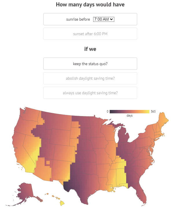
Inspired in part by Keith Collins’ visualization of daylight actually saved with DST, Andy used the SunCalc library by Vladimir Agafonkin to explore the interplay between geographic location and daylight within our man-made boundaries and rules around DST. The resulting map allows users to change the sunrise and sunset times, brightly displaying places with more days that meet the criteria and casting those with fewer of those days. His choice of a gradient to represent the range of days hints at the challenge of mapping a continuous phenomenon—like time—with discrete boundaries—like time zones.
Throughout this process, Andy realized how personal these preferences were, with many folks sharing differing versions of the map to support their disparate opinions on DST. He leaned into that with his second version of the map, sarcastically named the “Daylight Saving Time Gripe Assistant Tool.” The tool gives you a “definitive” answer on if your personal sunrise and sunset preferences support the abolition or preservation of DST. But woven into the language and experience of the tool is a blatant statement succinctly stated by Andy in our conversation: “this is a map that also shows you how maps can tell you what you want them to tell you.”
Play around with Daylight Saving Gripe Assistant Tool and see if your opinions on DST are cartographically supported. What does your preferred map look like? Show us on Twitter! If you enjoyed the episode, please rate and review on your favorite podcast platform and help us share it with other folks who’d also enjoy it!
Transcript — +
[music]
You’re listening to PLN8, a podcast on data, design, and the people that bring them to life. Brought to you by Stamen Design.
Ross Thorn (RT): Permanent daylight saving time, the cartographic challenge of temporal mapping, and how to use maps to tell us what we already want to see. These are some of the things that come up in today’s episode. I’m Ross Thorn, a cartographer at Stamen. Today, I chat with the cartographer behind the viral daylight saving maps and how he built a tool to help you prove your point when complaining about time changes. Please welcome my guest.
Andy Woodruff (AW): I’m Andy Woodruff. I am a cartographer with Axis Maps.
RT: Awesome. Well, thank you, Andy, for being here and coming on the podcast to talk about time and time zones and daylight savings time as it will be, terrible pun intended, timely with fallback happening. Yeah. If you just want to start off, I’d love to get to know a little bit more about you in your upbringing and education and kind of how you got to your current position.
AW: Sure. Well, I was always kind of a geography kid, the one that’s on the family road trip looking at the atlas in the back seat, plotting where we are, where we’re going, and stuff. And so when I eventually went to college, my undergrad degree, it was in geography at Ohio Wesleyan University. I mostly grew up in Ohio around Dayton which turned into what we’ll talk about later as kind of on the western side of a time zone. So I studied geography as an undergraduate, and then I went to do my master’s degree in cartography and GIS at University of Wisconsin-Madison. That’s where I really got into interactive cartography which was a focus there in those days. It was with Flash. And I worked in the cartography lab there, and we would do some university projects that were these fun interactive map explorations of some data or some part of the campus or something. We were super heavily inspired by the kind of early-ish days of Stamen at that time. This is like in 2007 or so. So I think Stamen had been around for a few years by that point, but it was still young.
AW: Yeah. That was one of our huge inspirations was looking at all this cool stuff Stamen had done. And we were like, “How can we do that for this research project that somebody at the university has brought to us?” And then, while there, my current partners at Axis Maps had started Axis Maps while studying for their graduate degrees. And at the time, they were trying to do more of a kind of traditional cartography shop, design some atlas pages or something for somebody. And then within a couple of years, they really shifted to interactive web cartography. And that’s when I joined on board after I– I guess I joined in 2008. So we’ve been doing this for a long time now. We’re kind of a bespoke interactive map shop, I guess, which is still a small group of four people. And we’ve been designing anything from small nice-looking maps that just have a few points you click on up to kind of full mapping platforms for somebody’s data where we design the database and how it’s served up and what the map looks like for all kinds of topics.
RT: Wow. Yeah. So you do everything from data to the design and everything in between in that interactive stack, huh?
AW: Yeah. I mean, my particular role is mostly on the front-end web development part of the projects and then often spinning that off into some side projects which sometimes turn into something and sometimes they don’t. I made these typographic city maps a while back just for fun, and that turned into posters that we sold at Axis Maps. But we still sell them. But for a while there, a big thing of ours was these maps. And it was totally different from our regular work that we do.
RT: I’m also a Wisconsin alum, as I think you know.
AW: Right. Yeah.
RT: So we’ll try not to make it too Wisconsin-centric.
AW: Yeah. Not too much cheese and badger stuff.
RT: Exactly. I might just throw a random spotted cow in there.
AW: Sure.
RT: But the first I saw of your work was also in school and was your “Ohio is a Piano” map, which I enjoyed playing around with. And it was also just like something that’s just like fun, quirky, that one. And also, yes, the typographic ones. And I was looking at those again recently and looking at the attention to detail, especially in the Madison one too, of just, “Oh, there’s the Union Terrace symbols. There’s definitely some heart and there’s care within those and they’re just so cool.” How did you start working on those ones?
AW: So it was while I was still in Madison, there was the AAG Conference, which I know it’s American Association of Geographers was having its conference actually in Boston before I moved out here. And the geography department always throws a little party during that conference, usually in conjunction with another school. And whoever was in charge of organizing that had asked for a map invitation. I don’t remember how I came up with the idea, but I did it in that typographic style that showed where this party was going to be and where the conference hotel was and how to get there. I had certainly been inspired by assorted typography maps I’d seen in the past. They’re a little more artistic, but I don’t think I had really seen one that was actually supposed to be kind of an accurate city map made of type and thought it was a fun idea. So I did that. And then a couple of years later, I tried to do it for a bigger area, like a whole city. So I made a Boston one first, and then my partners also worked on another map, I think, Chicago. And then we just started doing all these other cities and we caught some attention somehow on social media or whatever and if they kind of blew up. So we kept going for a few years, making a few of these maps and selling them until it was no longer profitable, basically.
RT: But you still do sell them? Shameless plug.
AW: Yeah, shameless plug. They are available. We sell like a couple of months, I think, at this point. One of our guys was renting a storage unit that just had all these printed maps in it and the tubes to mail them in and everything. We had a real thing going on.
RT: Yeah, there’s a bunch of good ones. And at the time of the release of this episode, NASA 2022 will have already happened in Minneapolis. And there’s a great Minneapolis map, too, San Francisco and Boston, Chicago, London, Madison. Awesome. So, yeah, definitely. If you’re listening, go check that out. There’s tons of great stuff at Axis Maps and Andy’s site, which we’ll all plug as well in the blog post, too. Also, I want to talk a little bit before we move on to the specific time maps, you’ve had a lot of work recently that you’ve posted that I’ve seen has been sort of about terrain maps and, like, you’ve got these gorgeous flowing terrain and these contour maps and the contour mapping tool that’s a really big, hot thing in cartography and always seems to always be like, a hot thing in cartography. But I love the way that you’ve done things a little bit differently. We had a blog post. Alan McConchie had a blog post recently about the Blender maps. But I love your different interpretations and different visualizations of terrain. If you want to talk a little bit about any of those.
AW: Sure. Terrain maps are always beautiful, going back centuries. I love even the kind of simple Ashurst styles and things like that. I don’t know what it is. They make every map look great. Not every map, but a lot of maps. I think the reason I got into it was just kind of a coding practice exercise some years back. This was back when I used to find coding a little more fun. I had a little challenge to myself of rendering a hill shade in, I guess Flash. It was Flash at the time based on DEM Raster elevation data, because I think I was flipping through my cartography textbook and saw, like, there’s a really simple formula for how to calculate the lighting and stuff. So I wanted to try it, and I did that in Flash. I put in this image and, like, a button, and it renders this thing, like, in a web browser, which was certainly unusual at the time. It wasn’t efficient, but it’s just a fun proof of concept. Ever since I started tinkering around, you know, with the pixel data like that, then I kind of progressively got a little crazier with what to do with that. But, yeah, I guess I realized I can do stuff myself with some pixels and not rely on software for everything. So I’ve just been experimenting with different ways of displaying terrain. It’s fun because the output is often just really nice to look at. Kind of what drives me now is like, “Oh, I can make a thing that looks cool.”
RT: I love that even in some of these processes too, even your intermediate ones, they all look cool. Seemingly, every single step of creating terrain maps can look look cool.
AW: Yeah, for sure.
RT: There’s more on Andy’s website about flowing terrain maps and some of these DIY hill shades and the Contour Map Generator, lots of great stuff. Among that great stuff is the time zone and the Daylight Savings map. This is sort of a hot topic this year with potentially a permanent Daylight Savings, or I can’t remember. I think it’s permanent Daylight Savings, which is very specific because it’s not permanent standard time which was proposed in legislation in what is called the quote-unquote “Sunshine Protection Act”. I want to give that a little brief introduction, but then I kind of want to take a step back and talk a little bit about time and time zones themselves. But can you just tell us a little bit about the Daylight Savings map tool that you made and I guess both iterations of it?
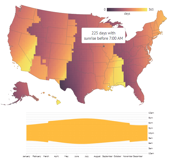
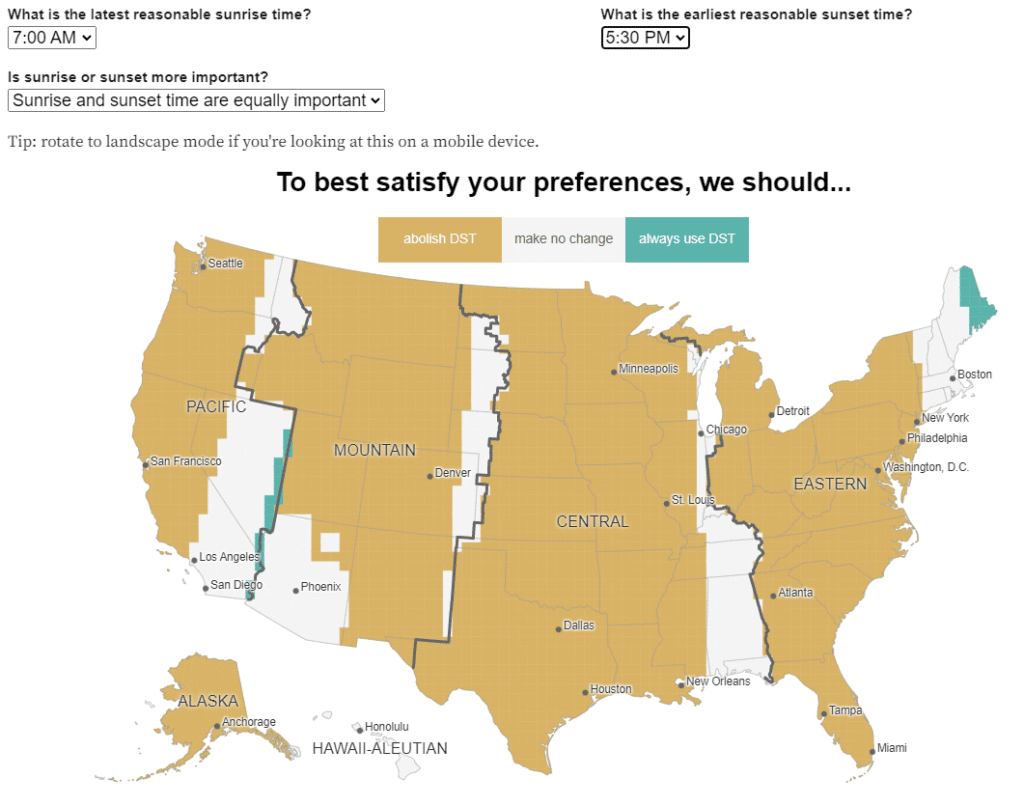
AW: Yeah, sure. Yeah. Like you said, there’s a couple versions of this. But the gist of each one is they analyze the number of days during the year when sunrise is no later than a specified time and sunset is no earlier than a specified time. It does this across the United States in a kind of gridded manner, then tries to show you a summary of under different scenarios, if you had Daylight Saving all the time, how many of these acceptable days would you have and how many unacceptable days would you have or if you abolish Daylight Saving and never used it, or if you just stick with the system you currently have. So I have one map that just kind of shows you the number of days that satisfy those time preferences that you put in and another one that tries to summarize that into kind of a score which suggests whether you should abolish Daylight Saving time, you should keep it all the time, or you should make no changes. So it’s something you can kind of put in your own preferences and see how Daylight Saving time affects those for you where you are.
RT: Yeah. I’ll wrap back around to a lot of that too, just having it be something that the user sort of maintains and the user defines things for. We could go really deep with time, but I’m going to try not to do that because I’m not very fluent on things like relativity or anything. But I’m curious if you had any revelations or some maybe definitions or explanations that you might have come across while you were researching or working on this that maybe changed the way you thought about time in general.
AW: It has been driven home to me that our kind of working and social world is getting really detached from the sunlight world. It’s a strange way of putting it, but.
RT: Yeah. What do you mean by that?
AW: So we no longer live by the sun, essentially, for many of us at least. And I think that’s become clear in how people have reacted to Daylight Saving and all of this. We live by what the clock says, and we want to make the clock match the sun rather than our lives match the sun, which is how it used to be prior to a couple centuries ago. And that’s kind of like the root of a lot of this debate. And the whole reason for Daylight Saving time is to try to align working hours more to sun hours, or rather the clock, I guess the working clock time. I’m getting myself mixed up here. Sorry.
RT: No, that’s all right. That’s okay.
AW: With Daylight Saving time, it’s trying to address that we are going to be awake and working at the same kind of clock hours no matter what the sun is doing. So we’re trying to change what those clock hours align to rather than change how we operate in our lives.
RT: I think that even the ambiguity that we’re thinking about right now too is a testament to how weird this system is and how weird time and how humans categorize and display time. As I was exploring the maps, particularly the first iteration that’s on your site that has the gradient color scheme, it just really occurred to me that time zones as we use them are probably not the best way to think about time. And especially across space, time is a continuous phenomena on our earth, or at least as we think about it. Like I said, I’m going to tread lightly here about trying to define what time is, but it’s something that’s not easy to map.
AW: Yeah, that’s right. I think when I first made this first map, I guess, I was surprised. I just hadn’t really seen a map of this kind of thing. I see a lot of people complaining, essentially, when we have to change the clock. They hate it one way or another, and it occurred to me what that effect is depends on where you are. And it’s kind of hard to show what time is it. I don’t know. Like you said, it’s a little hard to map, so my maps are really cumulative. That’s why they’re kind of a summary of the whole year in map form. You can map what time, what solar time is it, right now, across the world. That’s pretty straightforward, but kind of trying to summarize that in any cartographic way is a little more tricky to do while also making a useful point for anything.
RT: Right. Did you see that they are having these official time zone maps because they didn’t really exist?
AW: No.
RT: Yeah, there’s actually something that Kelsey Taylor, who is a cartographer here at Stamen– she had formerly worked with the Department of Transportation and worked on some of these maps too. It’s a little side point, but yeah, it’s something that is difficult and something that is not super well documented. Some of these, too, from what I’ve seen, are defined kind of like how old parcel maps are defined with that really dumb language, the northwestern quarter of the southwestern half, by this tree, by this rock, 40 paces, just some of these things. But kind of in that thread of this, looking at this and talking about this, Alan, who helped prep this episode, was kind of mentioning how they remind him of these election maps and specifically gerrymandered districts. You look at these time zones and these gerrymandered maps and see that these look incredibly crazy. There has to be some sort of better way to do this. And so many people don’t like it for different reasons, so you’re never going to make everybody happy as well. It’s just one of these, like a crapshoot of trying to create maps of a phenomenon, that a map might not even be the best answer to.
AW: Yeah. I’m really not familiar with why the time zones are exactly where they are. You likened it to gerrymandering or Alan that some is obvious, like northwestern Indiana, for example, wants to be in the same time zone as Chicago. But otherwise, I really don’t know why some of them are so weird and jagged and take some chunk out of somewhere else that clearly should be in a different time zone.
RT: It really got me thinking about borders. You mentioned that northwestern Indiana, because that’s culturally– there’s probably a lot of people commuting to Chicago, so they want to be in the same time. So many times, our borders are shaped by natural things too. We have, for instance, the western side of Wisconsin is the Mississippi River, which defines a lot of it, and that’s a border. And that’s a geographic bound that we’ve made into a political boundary. And this one is like we’re saying that our cultural thing, our perception, and our ways of life are defining how time should be this natural phenomenon, which is just kind of wild. So I’d love to talk a little bit more about these maps. They’ve been mentioned in Bloomberg, and every year I think someone shares them and I love seeing them and interacting with it and getting that reminder twice a year, I guess. But I was kind of wondering – you talked a little bit about this – about seeing people gripe about it, and what kind of other inspirations do you have for creating these maps?
AW: I think a little bit of it is based on where I grew up versus where I live now, which is they’re both in the same time zone, but one of them is pretty far west in Ohio, where I grew up. And now, I live around Boston, which is very far east in the time zone and a little more north. And there is a kind of stark difference between when daylight is between those two places, so I kind of got used to sunset in the summer out there being after 9:00 PM I think trade-off being there were a couple days where the sun didn’t rise till after 8:00 AM. And then I eventually moved out here to Boston. And we started having these dark at 4:30 days in the winter, which was really depressing, I guess. And that helped get me thinking about, in a geographic context, where you are matters for how daylight saving affects you. At first, I was out here with these early sunsets in the winter and thinking we should always have daylight saving time so that it’s at least light until 5:00 or something like that. We don’t have to have these sad dark afternoons. So I wanted to kind of map out how that would play out if you were to do that, if you were to keep daylight saving time or whatever else, and kind of see, am I right about that? Do I really want daylight saving all the time or would the price be too high?
AW: And the flip side of it here too is in the summertime the sunrise is at 5 o’clock or something like that. And yeah, I could get up earlier and start my day earlier but I’m not going to do that. So it’s wasted sunlight. Yeah. So thinking about that kind of thing just from my own experiences, I think, with some inspiration. The other thing which you mentioned is starting to see– I guess when I got into the period of my life where I just kind of scrolled Twitter all day long, I’d see so many gripes one way or the other about why the time change is horrible and how it should always be this way or it should always be that way. And then that, again, got me thinking, well, this is different depending on where you are. So I wanted to map that out and see which is also why I started doing the second version of this which tries to get more to the point like, does reality support the argument you’re trying to make? It just gives you kind of a yes or no, this is the way it should be or not.
RT: There’s a pointedness to it that I just absolutely adore of being labeled as the daylight saving time gripe assistant tool. And you use this sort of sarcastic language saying its purpose is to help you make your case when whining about a biannual time change and to help prove that you’re right or wrong and that it’s a map that can be used to sway folks kind of either way, which I think is just a brilliant thing. And it’s important to me to have maps like these, maps that are cognizant and vocal about their intention. You’re even forthright about your own process and saying, “This might not be the most rigorous– this is kind of just this system I came up with. It might not be great. If it doesn’t support your argument, you can blame that,” or something like that. But kind of on this deeper meta level, I think it’s important for us to interact with tools and things even as cheeky as something like a daylight savings gripe assistant, and especially good for people to see like, I can manipulate these buckets of data. I can manipulate my inputs to have this output. And as I was kind of going through this, I was like, so what is the best map? I want to see– I want to be shown the best map for daylight savings. And it wasn’t too long before, I’m like, it’s just showing me what I want it to show me based on my interests, and I can adjust that. Were you thinking about that much when you were creating this? Does this sort of position come through in other parts of your work too?
AW: Yeah. That’s interesting. I guess I hadn’t thought about it quite on that level. But yeah, this is a map that also shows you how maps can tell you what you want them to tell you. There’s no single truth. I guess I probably thought a little bit about that in– just insofar as I added these user inputs. You can choose what your parameters are. I could have just said, well, I like 7:00 AM for sunrise and just made a map of that. But instead, I wanted it to be a little more personal and let you see how you can use a map to make your case. It’s all based on the same data. I don’t know if that’s come through in much of my other work. If it has, I hadn’t really considered it. And it was by accident, I guess. It became clear to me in seeing reactions to some of these and that I would see people– I get tagged in their tweets or whatever. And they show a screenshot and say, like, see, this is how it should be. And then somebody else does the same thing and says the same thing but from a complete opposite perspective. Maps can be manipulated like that. Yeah. And I think this is a pretty harmless case of that, but can also be dangerous.
RT: Yeah exactly. I think that something like this is just that great use case. But it also goes to show you that this is now potentially becoming policy and people will make cases for it, maybe even using maps.
AW: Yeah. I mean, I guess I hadn’t considered. Hopefully there isn’t a senator who is going to have a big 36-inch poster board, a print out of this in their talk on the floor of it.
RT: Pull out that sharpie and say, “See.” [laughter] That would be wild. To me, that’s a great resume builder of [crosstalk] we used to help change policy without me intending them to be.
AW: Yeah, I mean, I think there’s other cases, a lot of cases, where it’s maybe not so ethical to just be neutral, make a neutral map that lets you say whatever you want with it. But in this case, I think it’s okay and kind of fun. And you learn a little bit along the way while using it, hopefully.
RT: Yeah, I know I did. And even as I was interacting with it, and as someone who’s even trained in cartography and to know these things, it’s always just refreshing to be reminded of, oh, this map is telling me what I want to see and I can use this. It’s kind of just a reminder moment of, there’s a lot of power in something like this, hopefully palpable to people that use it.
AW: It is interesting. In all the reactions I’ve seen, I’m not sure if I’ve seen anybody say, “Oh, this map actually shows me that I’m wrong.” I kind of wonder if some people have looked at it and like, “Oh, this isn’t what I thought it would be.” And then they just changed the settings to make it what they want. I think I was kind of proven wrong by my own map. I thought daylight saving is better to just keep where I am. I mean, to have it permanent is what I thought was good, but I think what I’ve learned is my preference is just to leave it alone, keep doing what we’re doing, and that’s the best compromise all around. So I guess I was wrong. Also, maybe I started getting up earlier in the morning now that I have a child and everything, so. [laughter]
RT: Right. What is time?
AW: It’s nice to have some daylight. Yeah. If we’re going to be up at like 5:30 for some reason, it’s better if it’s sunny and not dark.
RT: Right. Speaking of what you’ve seen people say about this, we have kind of gone through some of the comments too, and some of them are a little bit wild. There’s people that are posting these new ways of, maybe we should just totally do it this way, completely reset how we think about it. What are some of the most interesting conversations and things you’ve seen surrounding these maps?
AW: So I’ve seen some that say, “Well, we should just draw the time zones totally differently.” I actually even started on kind of a third version of this that takes the next step to say, “Based on these preferences, what should our time zone boundaries be?” I think I might have posted somewhere just some static maps of that, but– so there’s a little bit of that, proposals for redrawing the time zones. But probably the more interesting ones are abolishing time zones, is something that people suggest. And that could mean either everybody just goes by the same Universal Greenwich time and we just, instead of my store being open in Boston from 9:00 to 5:00, it’s open from whatever that would be, like 02:00 PM to something else. I’ll go by the same clock and then adjust our working hours accordingly. I don’t know if I’ve really seen people propose just going back to local solar time everywhere. That’s probably impossible at this point. This used to be a railway problem; the railroad schedules needed to be consistent, but now it’s kind of the whole world needs to be at least on the same page somehow about time. So it’s a little far fetched. So I don’t know if I’ve really seen anybody say, “Abolish standard times.” It was a good one. Somebody said we should have the sun rises at 06:30 AM very day, so we fix the clock to that. Every day will no longer last 24 hours. You have to make up minutes earlier or later each day of the year. There’s some interesting proposals.
RT: Yeah, right. And who’s to say what’s– like we were talking about, to our system and our perception of time and the way that we make sense of it is already flawed. A rock floating through space, spinning and going around, the concept of time and how we visualize it is just so simplified and reductive to what it actually is.
AW: Yeah. As I understand it – and I definitely don’t understand it – [laughter] there is no such thing as absolute time in the universe. So it’s all a little bit made up.
RT: Yeah. Yeah. And even broadening this, your maps looked at the United States specifically, but broadening this, there’s a number of different time zone anomalies and quirks throughout the world specifically. The one that comes to mind is China is all one time zone. It’s a very big country. It’s a very big east-west kind of oriented country. So it kind of spans five, quote-unquote, “normal” time zone widths.
AW: Yeah. I don’t know much about how that works in practice. Does everybody really kind of operate on the same schedule or is it parts of the country, things kind of happen later in the day.
RT: Yeah. I got to thinking about that when you were talking about the solar time. If someone is on the eastern side and it’s like 6:00 PM, then across to the western side of China, it’s going to be 6:00 PM, but the sun is way higher in the sky.
AW: Yeah. It’s like the middle of the day, right. Yeah, there are some interesting cases like that.
RT: As we’re finding out with that official time zone map that was released, is that it’s something we kind of just don’t think about too much and we sort of just like– kind of wrapping back to this is all very individualized. We kind of just think about it as it works for us. And if it works for us, then we’re kind of done thinking about it, which is probably why we talk about it twice a year. [laughter]
AW: Yeah, yeah, it’s just an endless debate about whether it does work for us or worked for enough people. Just kind of a tangent, I did want to mention that the reason I’m able to make any of these maps is there’s a nice JavaScript library by Vladimir Agafonkin, the Ukrainian developer. He’s well known for making Leaflet, a mapping library. But he’s got so many other open-source amazing little projects, and this is one of them. He made this thing that can just calculate for anywhere in the world what the sunrise time is and all this stuff for any day. I use that in these maps. And if I get around to working on these even more, I’d like to use that and try to expand it across the world and just see how this kind of thing affects everybody in different parts of the world. Then I could kind of add up the different sides of China, for example.
RT: What sort of lessons or any sort of takeaways–? did you go in maybe having expectations and after you made these–? I guess you kind of touched on this a little bit of like you thought daylight savings would work for you one way, and it doesn’t. I guess is there anything else that sort of changed your mind or either about time, time zones, and anything in general?
AW: Yeah, like you said, I changed my mind a little bit about what I would prefer here in Boston. I think I learned a little bit more about how location affects kind of daylight hours. Latitude controls how much sunlight you get, and longitude determines what your clock says. And kind of just seeing how those play together to create this map of time, it made sense on a basic level. But seeing what that means on a map is a little new to me. A lot of my maps, usually, depending on what you plug into them, you’ll see kind of these slanting diagonal lines, which has to do with just how longitude affects things and how latitude does as well.
RT: Yeah. It’s making me think. Longitude’s already arbitrary where we put it. And latitude is sort of not. And it’s reflected in this, too. Latitude is how much sun you’ll get. And longitude is what your clock says. So it’s mirroring these socially constructed lines versus the latitude as more of a this is a little bit more accurate as to how far you are from something actually natural.
AW: Yeah. And you can see that in kind of the history of, I guess, navigation. And latitude’s always been really easy because it’s pretty tied to something physical. And then figuring out your longitude took the invention of these super accurate clocks, basically. We didn’t really mention this, but this is another thing that is a factor in the debate about whether daylight saving is good for you or not. The lower your latitude, the less this matters. Your days don’t vary that much. Then it’s the higher latitudes. I think you’re in Minnesota, right? You have long summer days and very short winter days. I wonder if there’s a map of the US, or anywhere, that would propose only doing this in the north and not in the south.
RT: Right. Yeah, maybe there’s a latitude cutoff. Well, thank you, Andy, so much. I’m looking forward if there is a V3. What you talked about a little bit sounds really cool and to see a worldwide one and to further continue this conversation in the cartographic sphere and the data visualization sphere of how we look at time. And really appreciate you taking the time to come on and talk about it.
AW: Yeah, thanks so much for having me. It’s been great talking to you about this, Ross.
[music]
Thank you for listening to Pollinate. Thanks to Andy for our great conversation today. This episode of Pollinate was written by Alan McConchie, Benning Lichtner, Kelsey Taylor, and myself, Ross Thorn. Music for Pollinate was created by Julian Russell. You can find the Daylight Saving Gripe Assistant tool and other work of Andy’s at andywoodruff.com and axismaps.com. If you liked the show today, share it with folks who might find it interesting. You can also tweet at us on Twitter at @stamen using the #PLN8. For a summary and full transcript of today’s conversation, along with some other visual examples discussed in the episode, check out the blog at stamen.com blog.