Airbnb
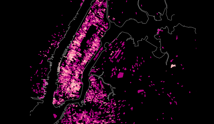
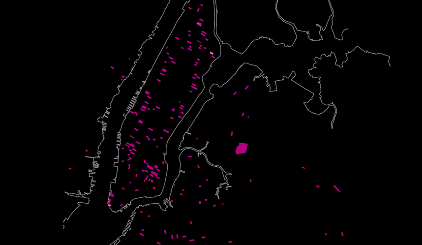
A map of Airbnb's growth in service from 2008 to 2011
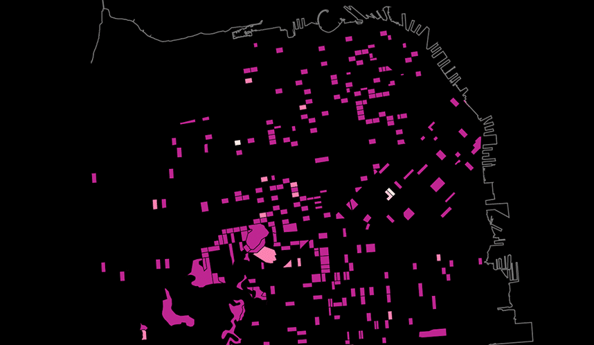
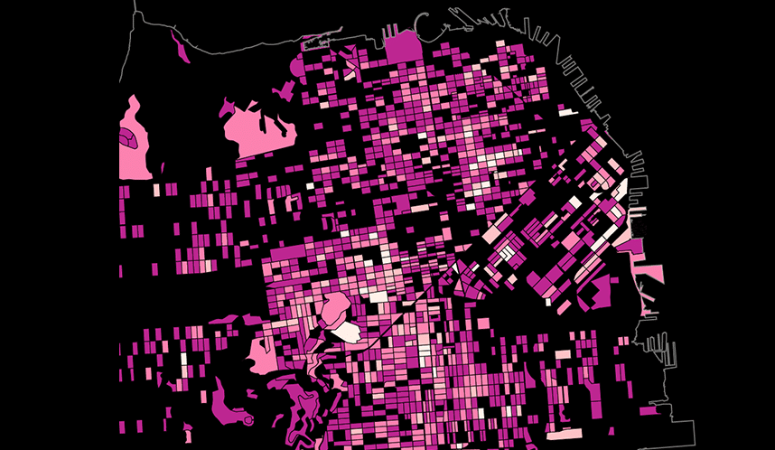
We designed a set of maps for Airbnb, showing the explosive growth of the service from the time it started in 2008 to 2011. The first visualization represents Airbnb’s top 50 markets. The thickness of the lines corresponds to the relative volume of travels between each pair. Below that are maps of NYC and SF. Darker city blocks have fewer listings; brighter blocks have more. It’s amazing to see how quickly some areas fill in as more and more people discover they can list their apartments—and to see which areas stay dark.