Where Does The Money Go?
Mapping a new way of looking at America.
Background
In mid-2011, Esquire magazine challenged five designers, architects, and artists to recreate the map of America to reflect the state of the union in 2012. Stamen was one of them, and Esquire’s instructions to us were simple: forget about all the tired and divisive ideas of red states and blue states, big states and small states, northern states and southern states, and instead design a new map that somehow reflects something that’s happening in the country today. WHERE DOES THE MONEY GO? is our response.
What we made
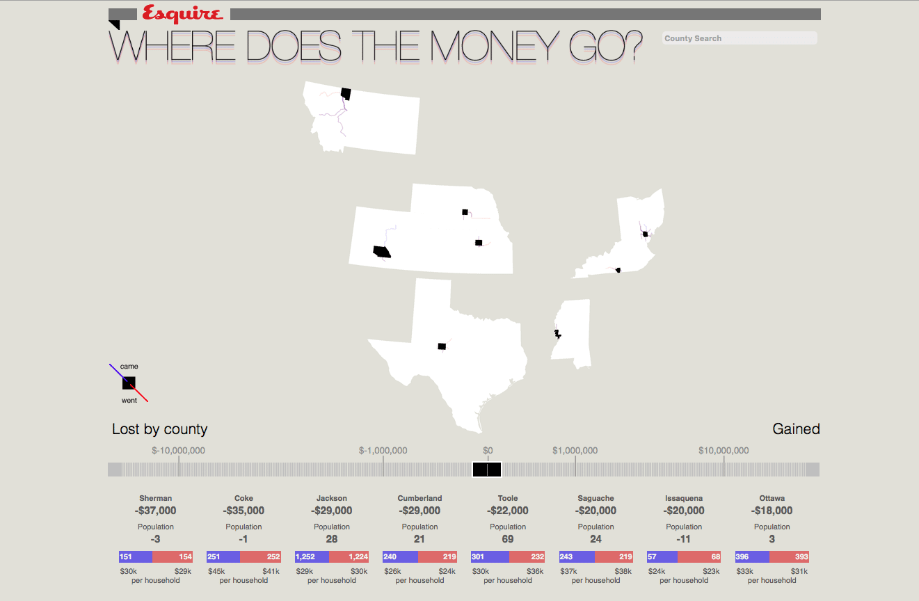
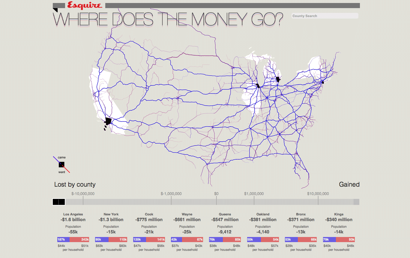
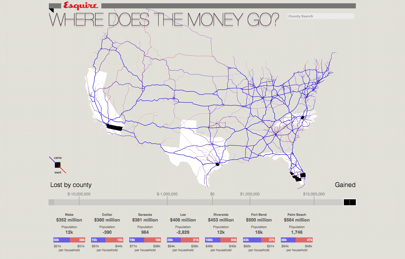
When people report a new address on their tax return, the Internal Revenue Service (IRS) assumes you’ve moved. They make a note of this and generate a county-to-county view on migration in the US, which is released as a dataset annually. In this project, we looked specifically at population movements some time in the 2009 tax year. By combining the IRS data with Open MapQuest route information, we were able to illustrate interstate movement.
Click around the map, use the slider or search to explore county-by-county gains and losses. When you see blue trails on the map (like this influx into Yuma County, Arizona), that means that people were moving to a particular county; red lines (like this exodus from Bristol County, Rhode Island to Florida) means they were leaving that county.