A Day of Financial Transactions
A day's worth of trading data on the NASDAQ


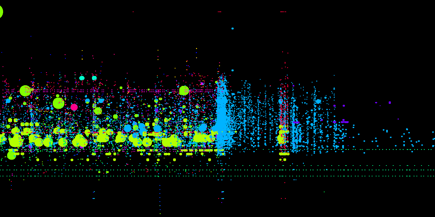
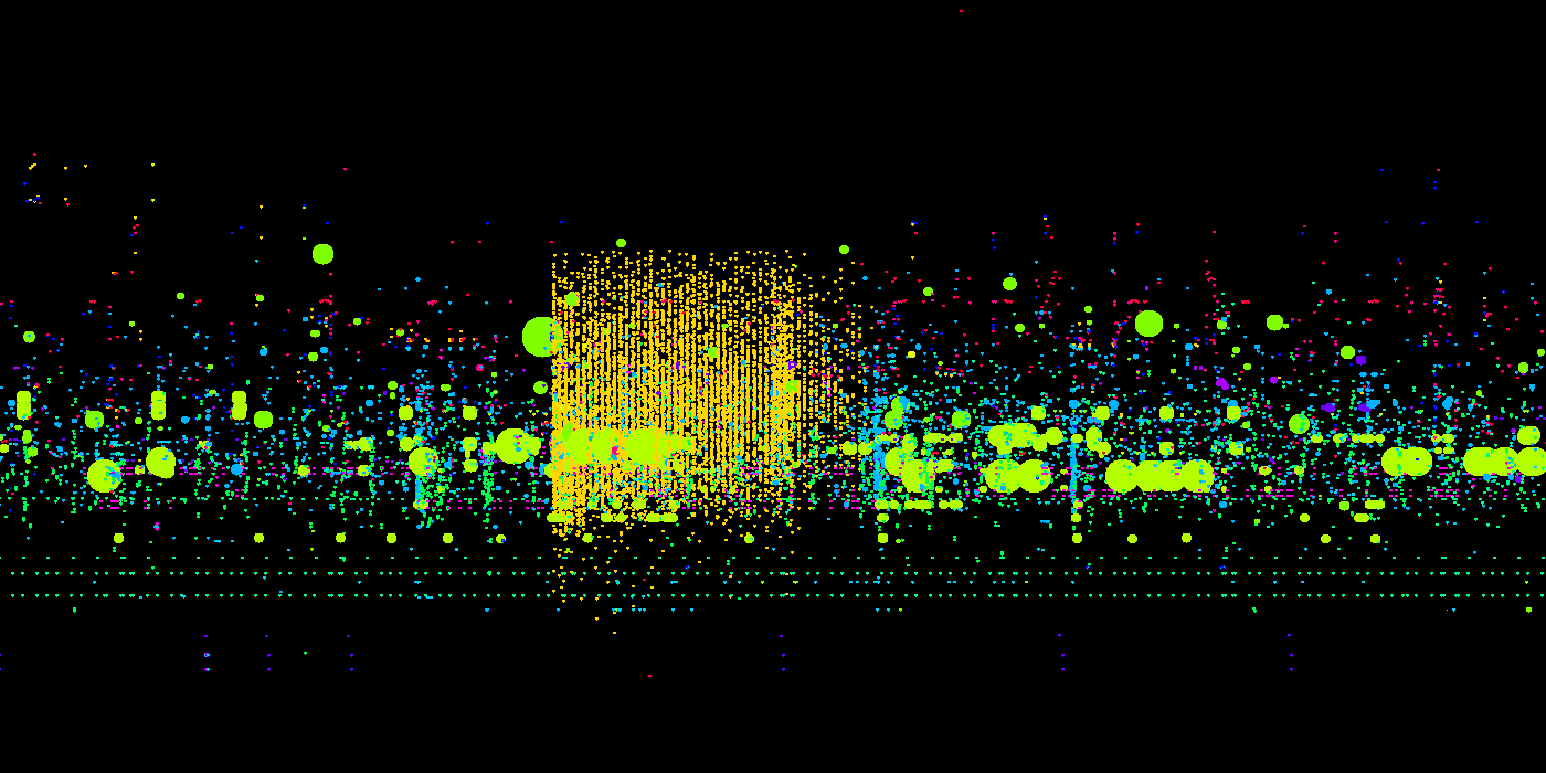
This is a visualization of a day’s worth of trading data on the NASDAQ stock exchange. In the examples that follow, each of which represents a single minute of trading, the images on top use a unique color to represent each trader, and the images on bottom use a unique color to represent each stock. On the top (trader), a big grouping of the same color means that a single trader is buying or selling stocks. And on the bottom (stock), a big color block means a single stock being purchased in lots of different transactions.
