We’ve been designing custom data visualizations and interactive experiences for over two decades. We believe better data communication empowers people to have more informed conversations about everything – from climate change and the environment to education, healthcare, and gun control. Data visualization is a rich source of sympathetic magic for ourselves and the world.
Our aim is to help our clients solve the most challenging communication problems by making their data insightful and actionable. We dig deep to find the stories in the numbers, the hidden fascination in the banal. We actively pursue strategies to display, understand and navigate through rich and varied flows of information, and deliver uncommon creative experiences borne out of data insights.
We continue to find inspiration and delight in every project that we do. The following are some of our favorite data visualization and interactive projects from over the years.

The Atlas of Emotions for the Dalai Lama and Paul Ekman
Visualizing the continents, states, and actions of emotion
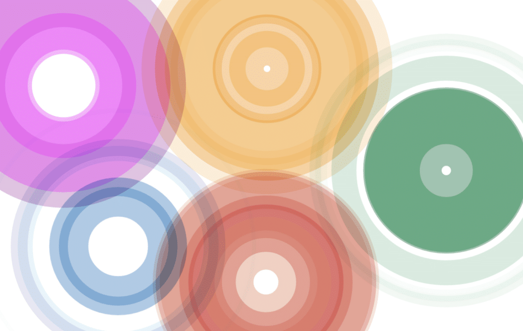
In 2014, the Dalai Lama asked his friend, scientist Dr. Paul Ekman, to design him an Atlas of Human Emotion, and Paul asked us to help him. Over time, the idea grew into a collection of maps, each representing a different aspect of the science of emotion.

Global Superdiversity with the Max Planck Institute
Illustrating the changing nature of diversity in urban areas
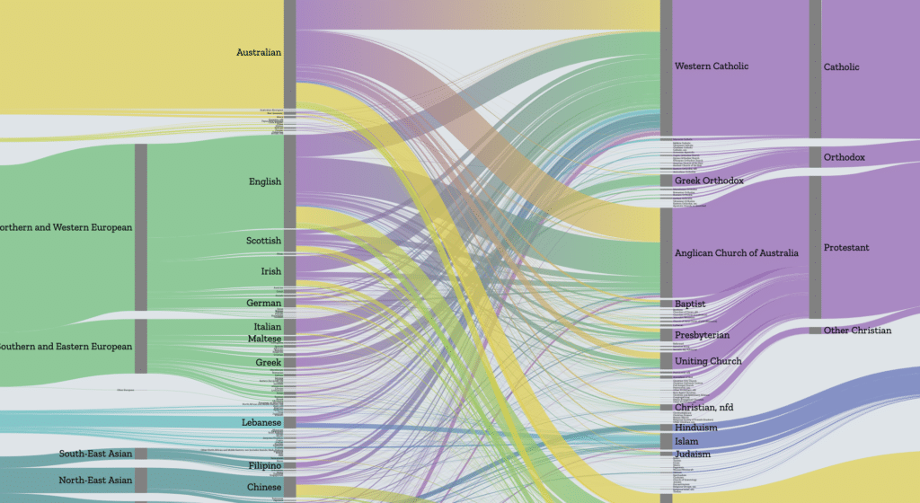
Urban populations today show fluctuating combinations of nationality, ethnicity, language, religion, age, gender, legal status, class and human capital. We explored the idea that not only have the countries that people come change over time, but the makeup of the people who are migrating has changed as well.

Metagenomics with The Banfield Lab
Illustrating new landscapes of genetic diversity
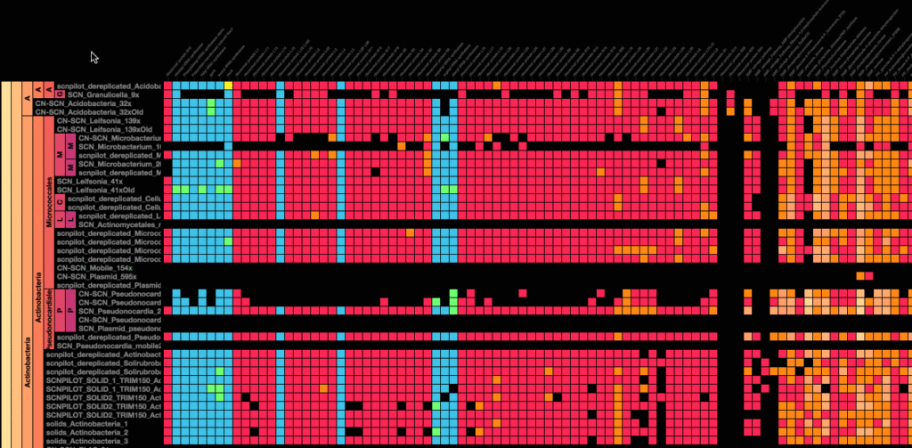
In the last few years, the price of genetic sequencing has plummeted to the point where scientists can now study ecosystems in their entirety, not just the parts of it that they already know how to identify. The Banfield Lab collaborated with Stamen to bring their data to life, using advanced data interaction and visualizations to make it easier to understand these vast new landscapes of genetic diversity.

A Day of Financial Transactions
Digging into a day’s worth of trading data on the NASDAQ
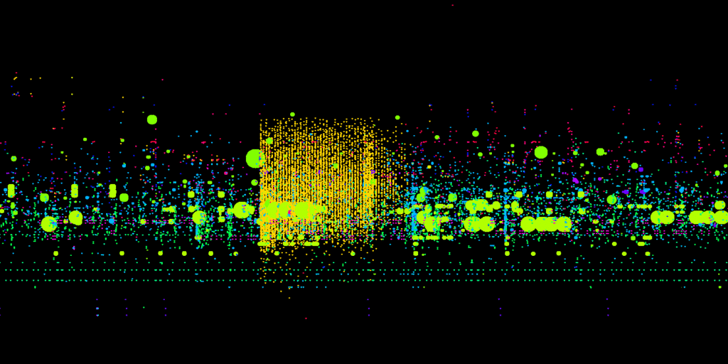
Individual traders, market makers, and algorithmic automated trading all present themselves as different and unique visual signatures in this highly dynamic landscape of marketplace activity. This work was intended for use on internal dashboards by by NASDAQ.
Looking for maps? Find some of our favorite interactive map examples here. You can also view additional projects on our work page.
Ready to make some data viz magic happen?
