
Online-Karten, so schön wie gemalt
Der Spiegel
04.05.2012
(translated from the German)
The developers of Google Maps have worked on the colors and shapes of their maps several times in the past few years. Because the cards of the corporations can be easily embedded and provided with your own markings, the standard gray now pervades the web.
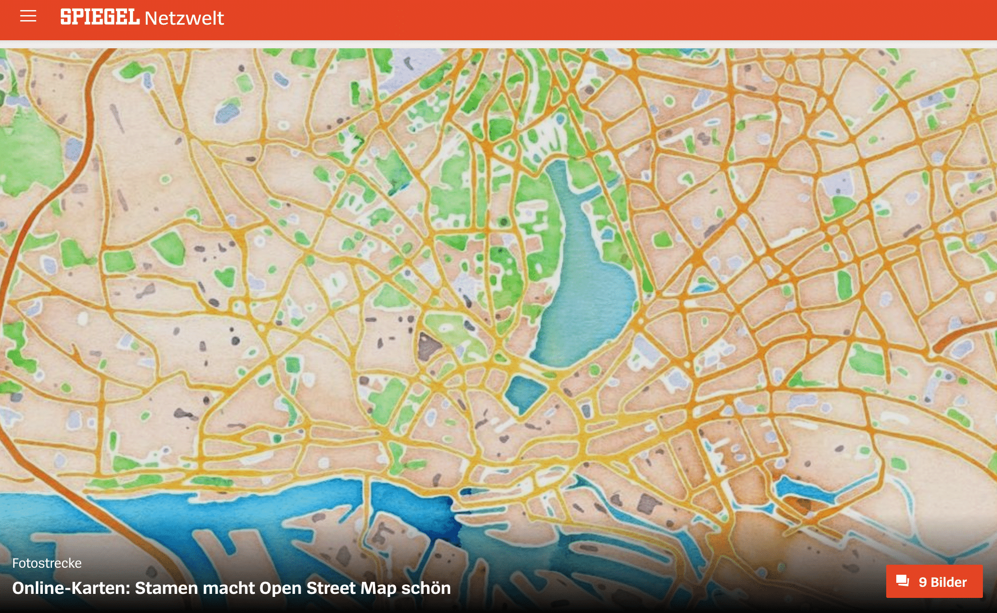
How boring! Designers now want to counter the map mainstream. For example, Stamen, a small studio from San Francisco that combined digital data with watercolor images. Color fields with all their irregularities painted on paper by graphic designer Geraldine Sarmiento served as the basis for “Watercolor”. The scanned images were processed so that surfaces can be seamlessly filled.
The Stamen developers also calculated color effects so that the watercolor map looks like it has been painted. To do this, they took the street data and used a soft focus filter to darken the colored areas towards the outer edges. The map pieces in the various scales that the user can display are calculated by a program.