
Watch Bitcoin Become a Financial Battlefield in These Amazing Charts
Wired Magazine
03.27.2014
WHEN HACKERS POSTED 750 megabytes of data pilfered from the bankrupt bitcoin exchange Mt. Gox, many people seized on it as a kind of treasure map, hoping it would help locate the nearly half a billion dollars in digital currency that went missing from the exchange.
But not Kai Chang and Mary Becica.
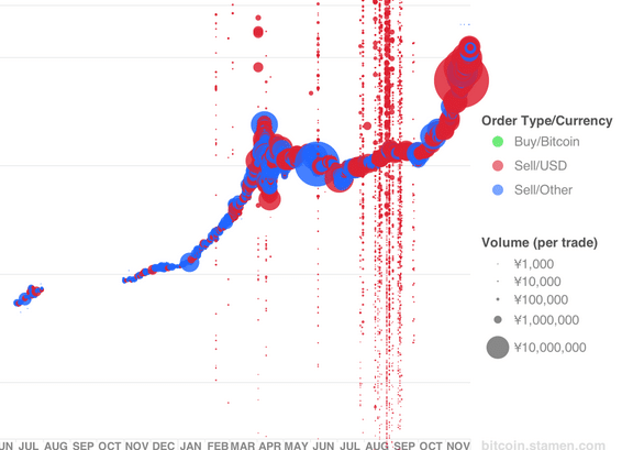
Chang is a design technologist at San Francisco visualization studio Stamen Design, and Becica is a product manager at cloud management outfit AppDirect, also in San Francisco. Both love to geek out on data. When the Gox data was released into the wild, they weren’t interested in finding the allegedly stolen bitcoins. They went looking for patterns in the way the digital currency was flowing across the net. The result is a set of some 500 visualizations that show the activity of the 500 Gox accounts that traded the most bitcoin, a graphical representation of the exchange that shows how it progressed from a casual trading table for a small group of cryptocurrency enthusiasts to a hyper-speed market dominated by fairly sophisticated traders. “As you get later in the data,” Chang says, you see the development of “more consistent techniques.”
The visualizations provide a window into not just Mt. Gox but bitcoin as a whole (see photos above and below; click to view larger versions). Until it ran into regulatory and security problems, Mt. Gox was the world’s first major bitcoin exchange and by far the most popular. In recent years, the digital currency has evolved into a rather complex financial market – though there are still many kinks to iron out.
In an effort to explain some of their graphs, Chang and Becica invented larger-than-life characters to represent various types of market behavior. There are the up-by-their-bootstraps winners, who got in early, bought low, and made a killing, and there are the losers, who accumulated scads of bitcoin just before Gox imploded