
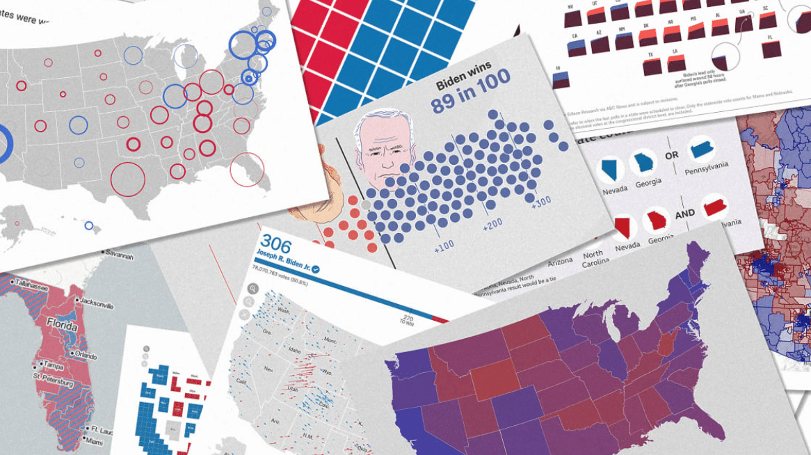
We design maps for a living. Here’s who got the 2020 election right
Fast Company
11.17.2020
Every election season, maps and charts take center stage on major news outlets and across social media. The public is hungry for numbers and understanding, and data visualizers and cartographers race to produce their best work under tight deadlines, adapting familiar tropes to keep up with unpredictable and fast-moving developments.
As a cartography and data visualization studio, we follow the election map deluge with keen interest. We’re constantly sharing election maps and charts in our internal Slack group, discussing which ones are our favorites, and also closely watching which ones seem to get the most attention in the public. As you can imagine, we have opinions. Here are some of our favorite charts and maps from the 2020 election.