National Geographic: Amazonia Under Threat
Bringing the best of National Geographic’s classic map design into the digital world
Background
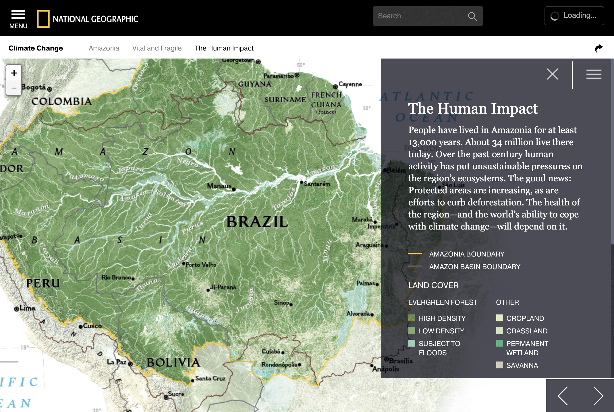
Since 1915, the National Geographic Society has been making some of the best maps the world has ever seen. So we were honored, humbled, and maybe even a little nervous when we got the opportunity to work closely with the Nat Geo team designing and building an interactive feature all about the Amazon, based off one of their gorgeous print maps. The goal was to help people gain a better understanding of the world’s largest river basin, through looking at the geography, natural systems, and human-driven factors that make up this dynamic ecosystem.
What we made
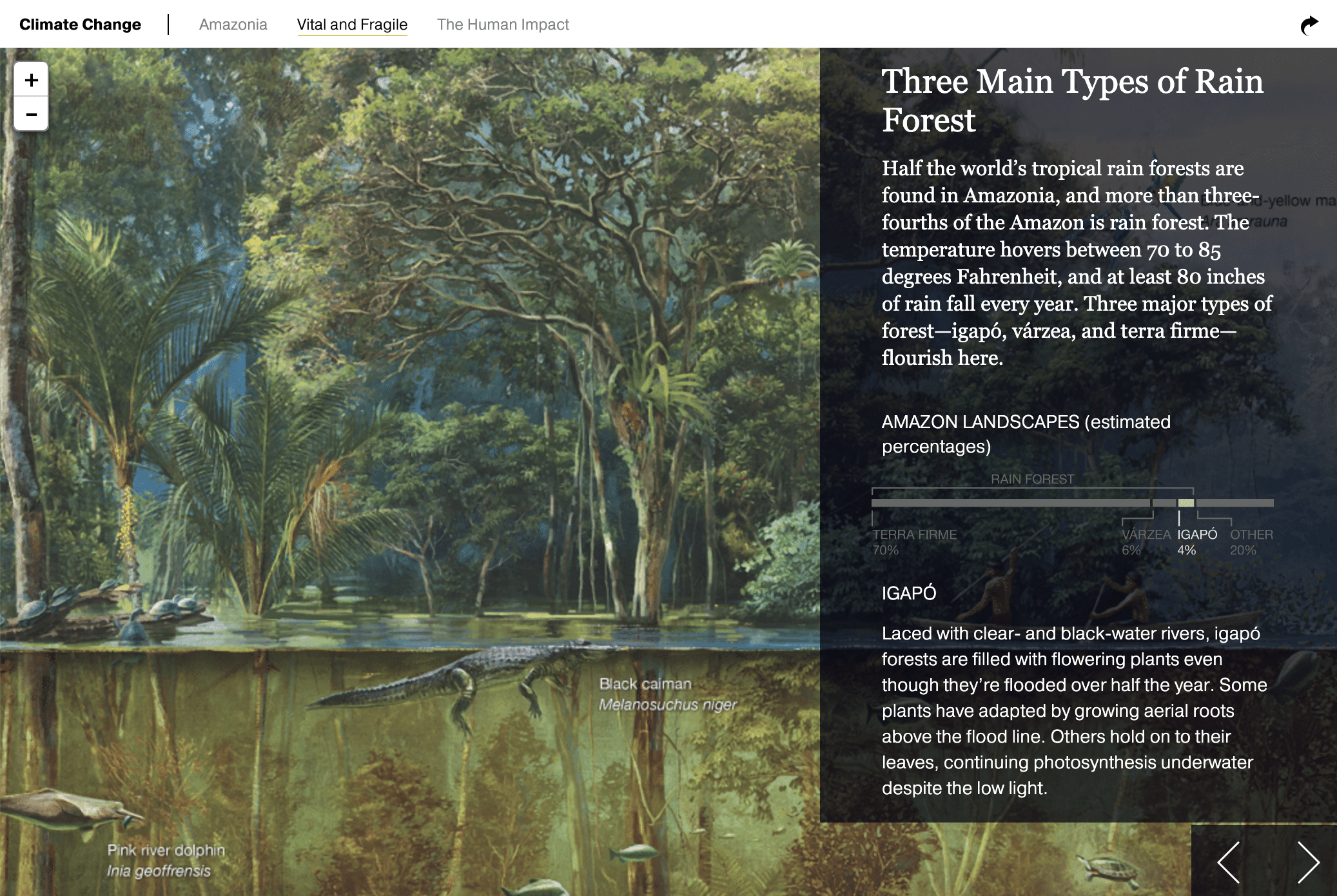
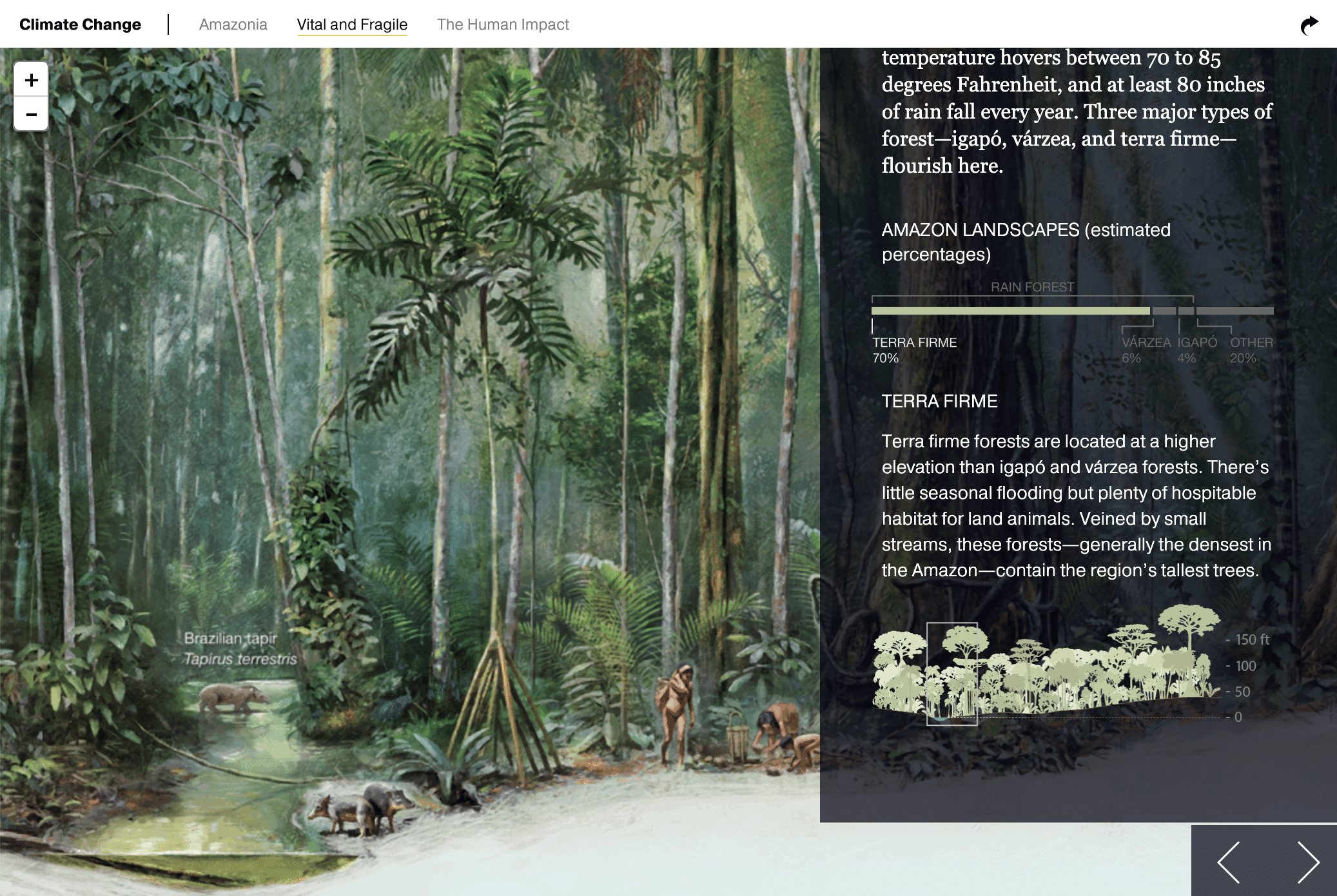
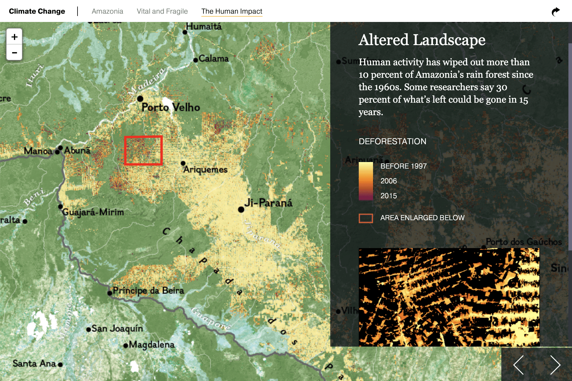
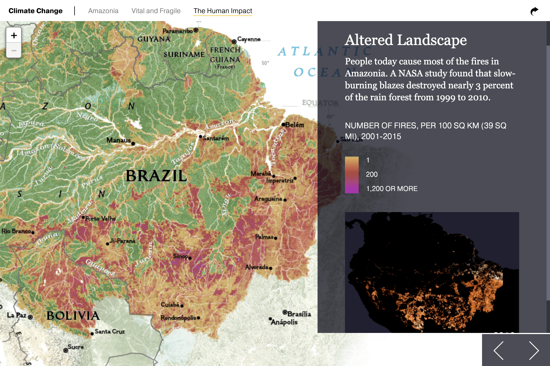
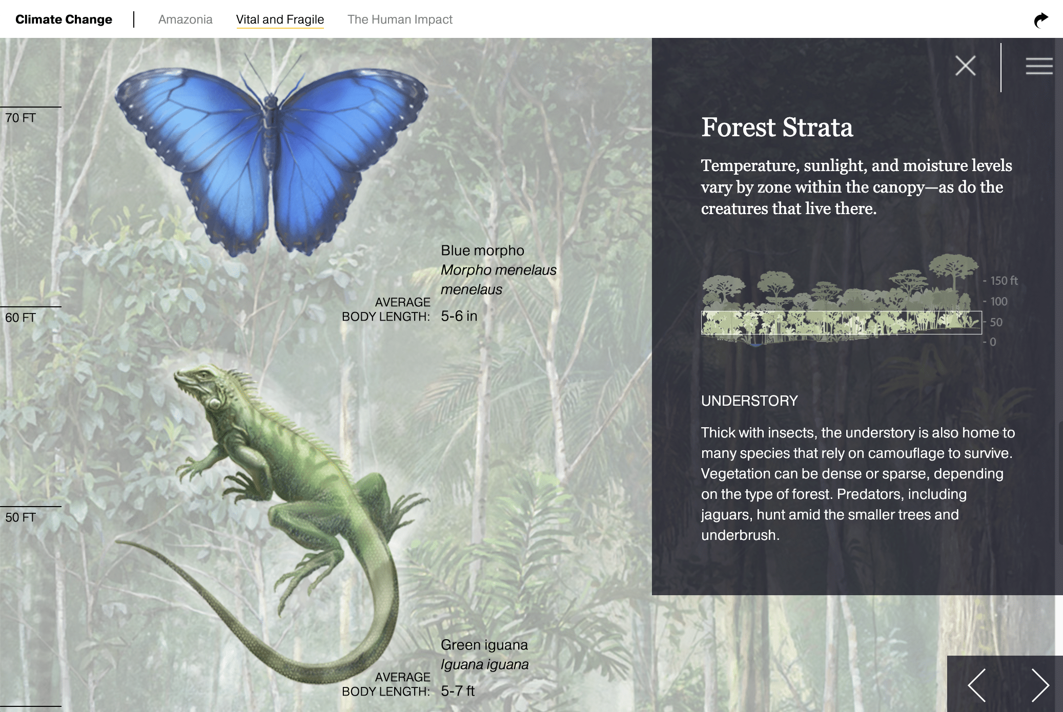
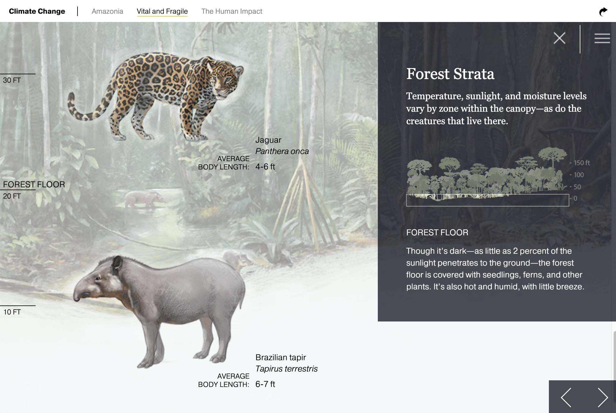
As soon as we dug into the work, we discovered we were making a lot more than a map. Yes, the foldout print piece featured a detailed set of maps on one side, but it also showcased beautifully detailed illustrations of the three main types of forest in the Amazon, along with a dozen stand-alone renderings of species ranging from a harpy eagle to a jaguar (elements which some map nerds call the “epimap”). And it drew on a wide range of data that could be visualized in new ways on the web.
Bringing the iconic, high-quality National Geographic print maps and infographics to the interactive medium required extensive use of MapPublisher and ArcGIS. We painstakingly adapted Nat Geo’s print icons and labels into a seamless interactive experience across multiple zoom levels, using all custom tile map layers in a unique non-Mercator projection.
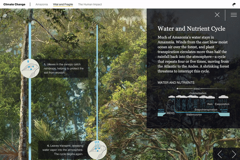
If the maps give you the lay of the land, the illustrations bring you into the heart of the forest – taking the flat map plane and turning it vertical, where so much of rainforest diversity comes to life. To honor the beauty of these illustrations, we took high-resolution source files and turned them into zoomable and pannable images. Just like a map, you can zoom out for an overview or zoom in to see intricate details and reveal labels on the various animals in the scene.