Digg Labs
Some of the first realtime visualizations of social media on the internet
Digg.com was, for a time, one of the most-visited sites on the internet. The site’s ever-changing content, all submitted by members, provides a vivid window onto what was interesting online, right now.
Digg moved very quickly, and had a great many stories submitted every day, so good material could sometimes fly by before you even know it. Stamen’s live interactive visualizations at labs.digg.com looked beneath the surface of this active community’s activities, and allowed for a broader (and deeper) view of Digg.
Digg Swarm:
Digg Swarm was a lyrical view of Digg. Stories came in as circles with the title inside of them, and diggers “swarmed” around these stories when they dugg them. Every time a story got dugg, it increased in size—so the bigger the story, the more active it was. As people dugg more stories, they moved from circle to circle, and increased in size. You might see enormous diggers moving quickly from story to story; those seemed to be people digging without taking the time to read stories…
Stories that were closer together were being dugg by the same users, and you could roll over stories to see these connections. The thicker the line, the more diggers in common that story had—which starts to suggest connections between stories over time.
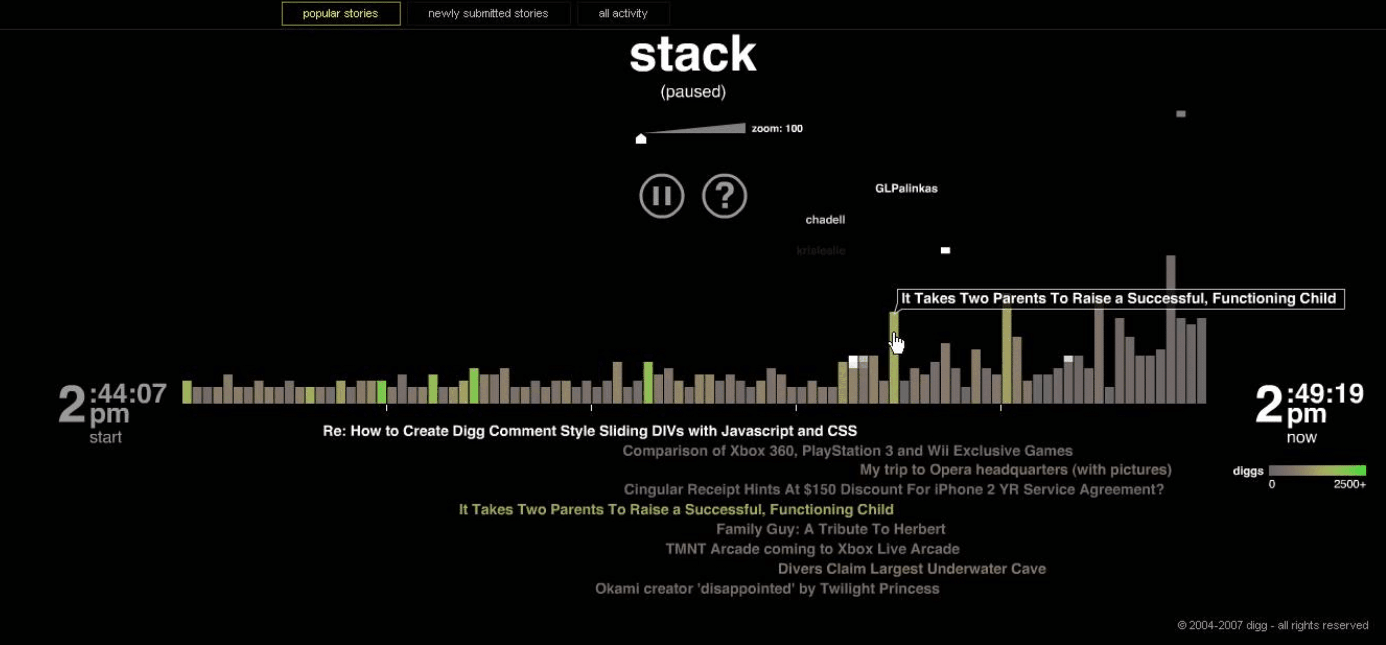
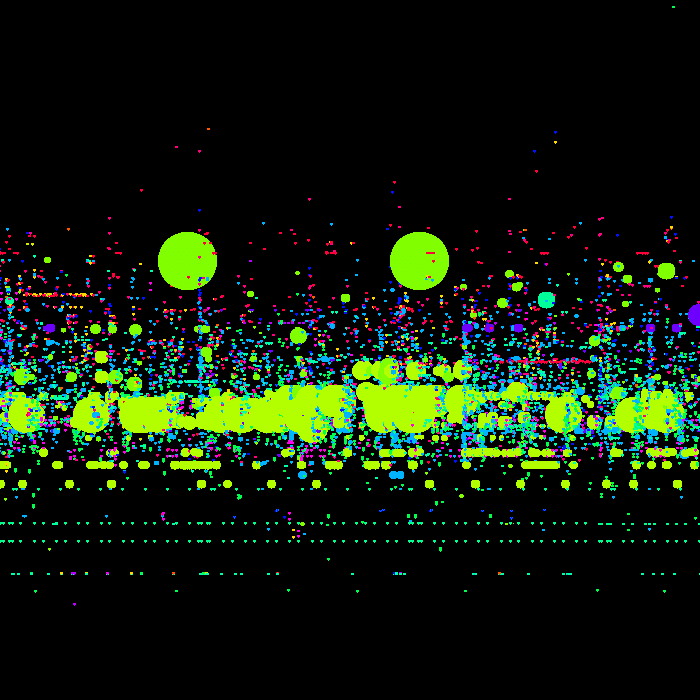
Digg Stack:
Digg Stack showed diggs occuring in real time on up to 100 stories at once. As stories were dugg, they appeared along the bottom of the screen, colored according to how popular they are. Users digging these stories appeared as falling blocks that stack up as activity increases. The zoom level was adjustable, so you could focus in on the most recent stories, or pull back for a broader overview. You could also pause the visualization if it was flying by too quickly, or if you wanted to focus on a specific story more readily.
Clicking on an individual item pulled up more information on that story — who dugg it, how many comments it had, etc. — as well as providing a sparkline-style graph that showed a more detailed hour-by-hour display of activity on that story.
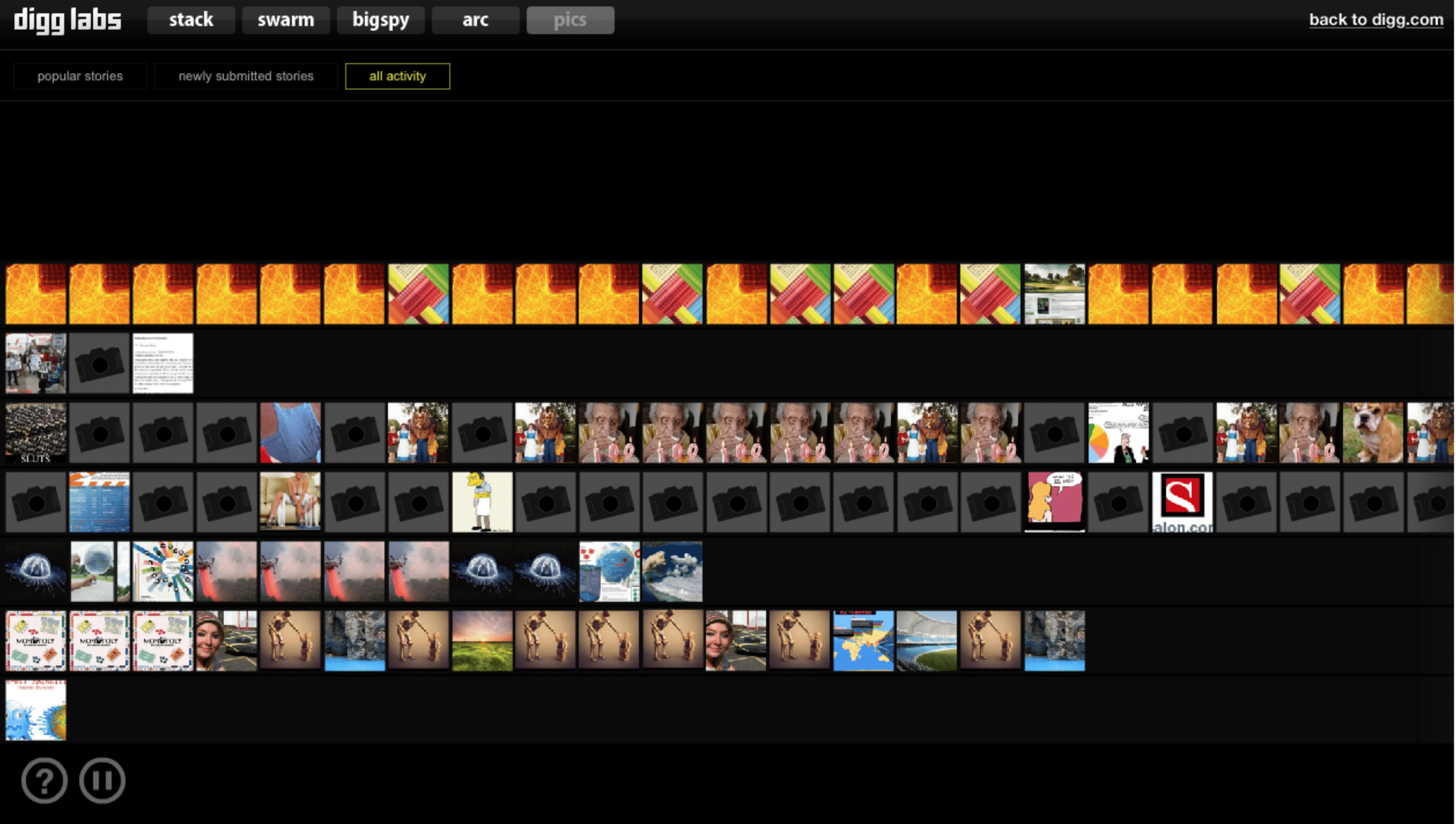
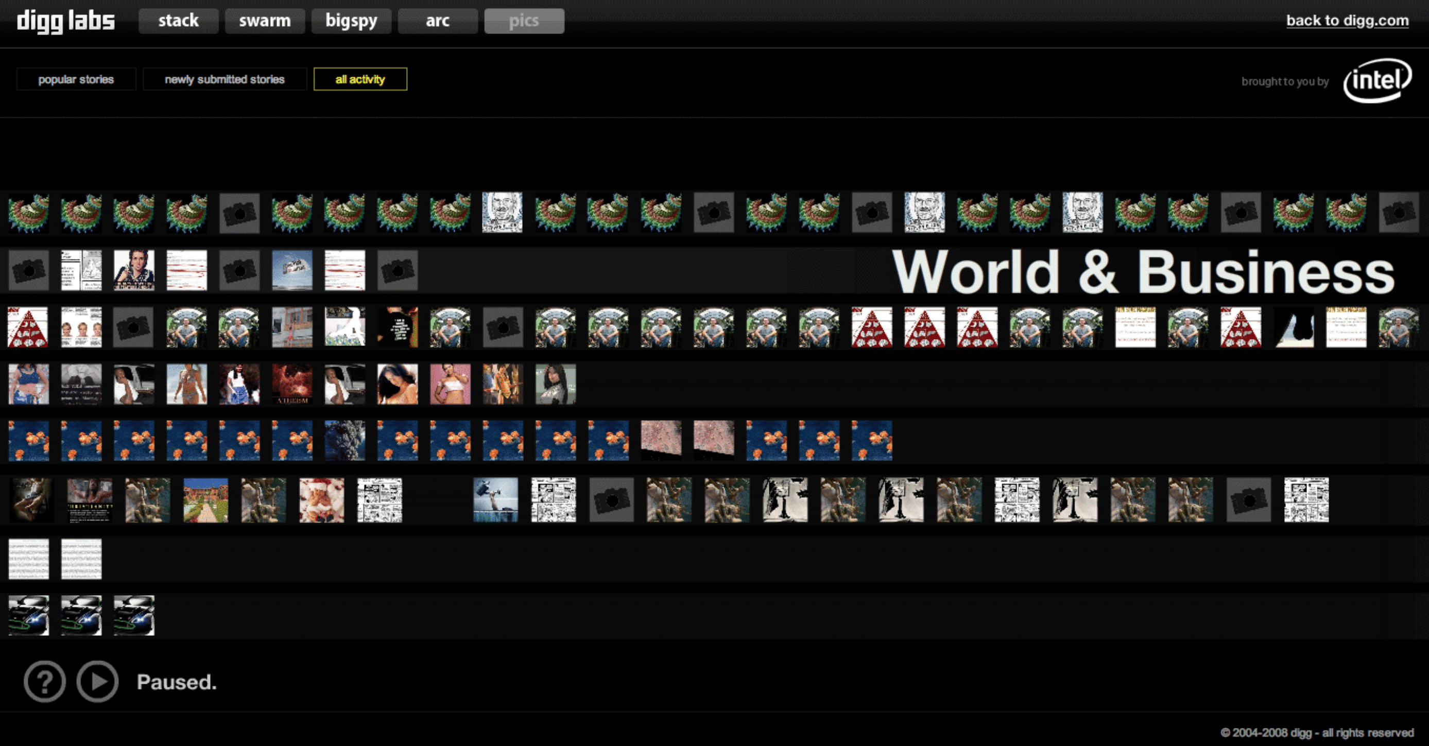
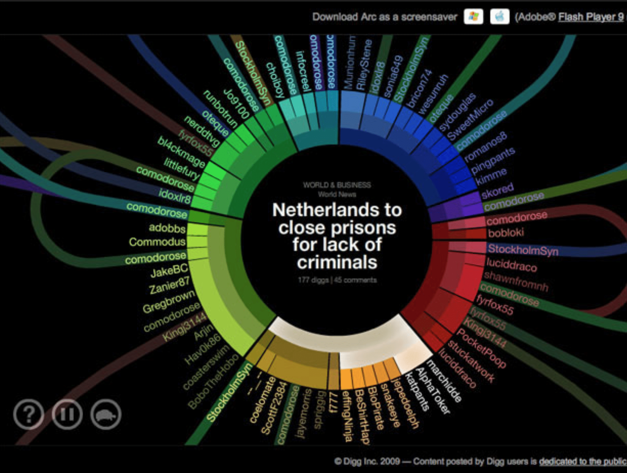
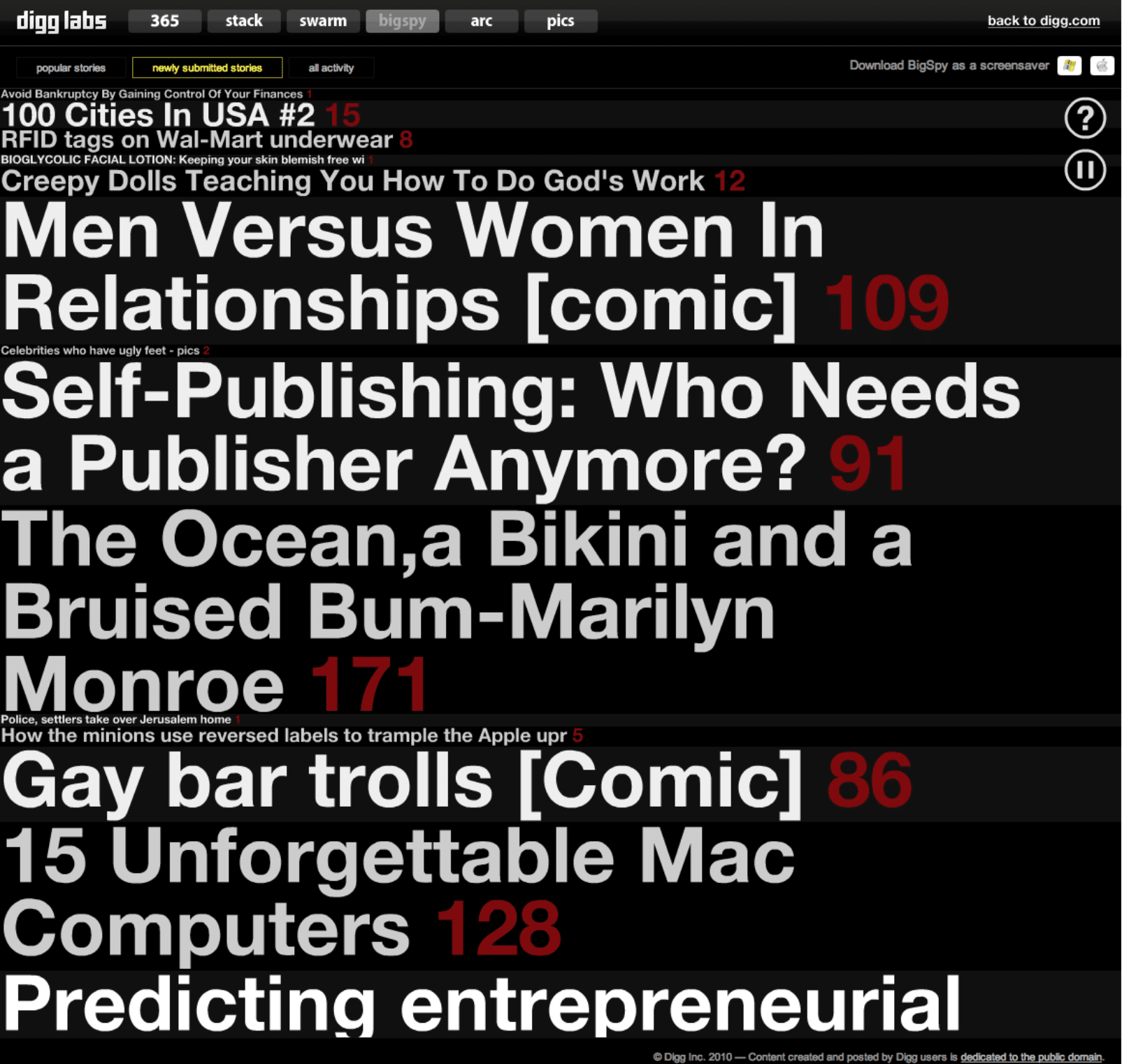
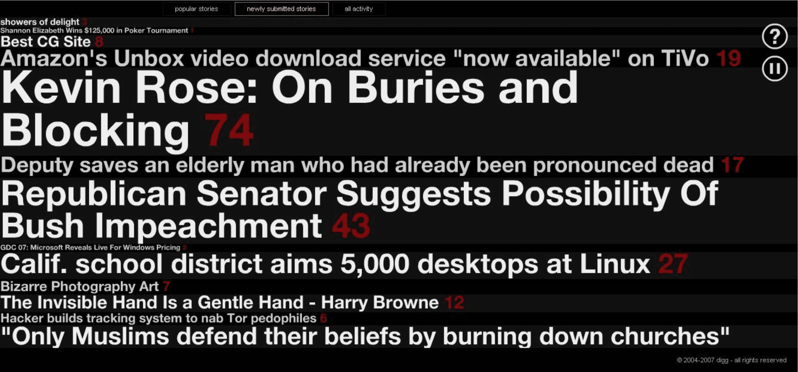
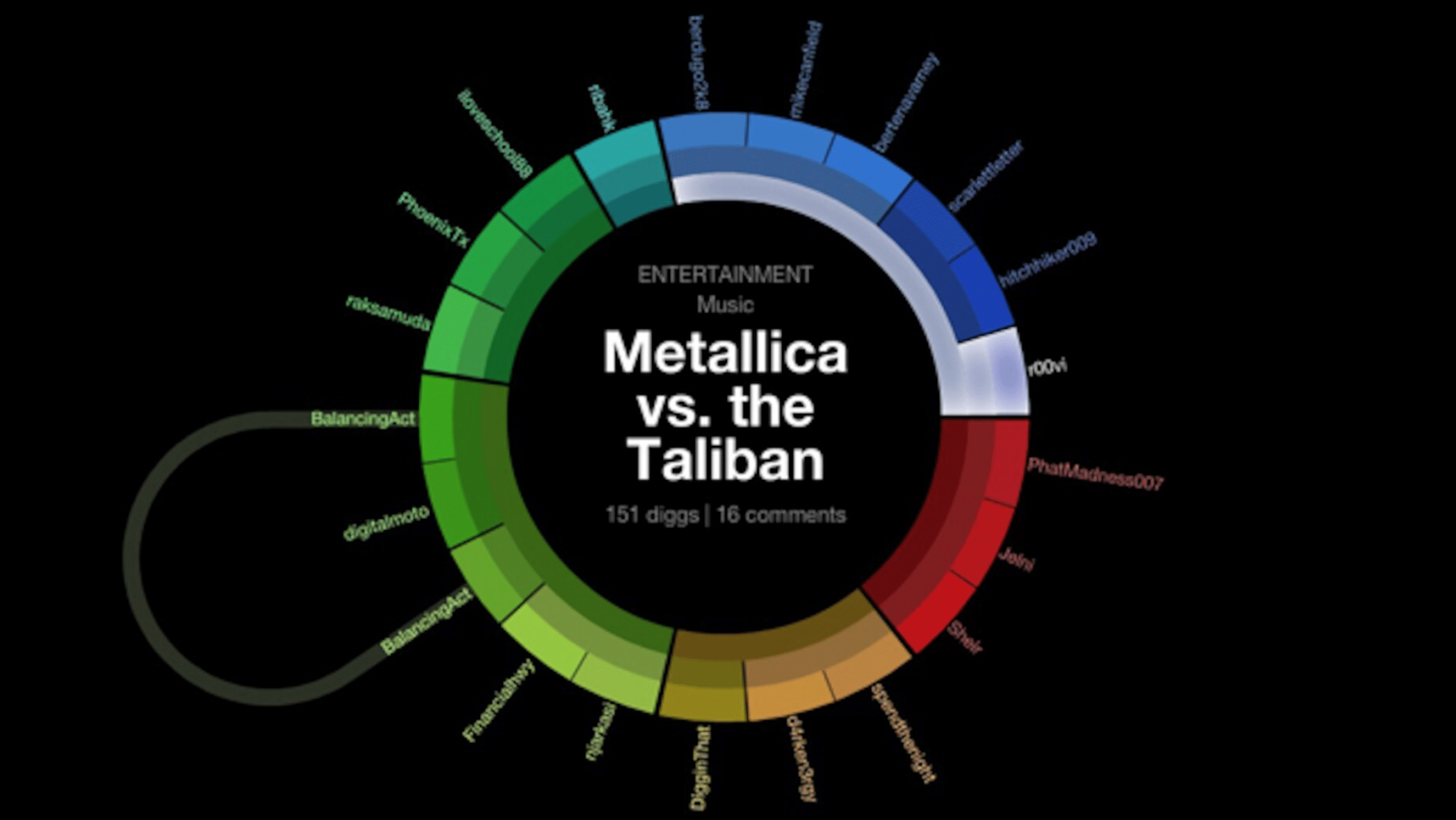
Other visualizations included BigSpy, a continuously scrolling list of headlines sized by how popular they were, and Digg Arc, a way to look at the different categories that people were submitting stories to and how they were interrelated.
BigSpy was infamously once used during Digg Nation, the annual Digg conference, as source material for live spountaneous rap performance: