maps.stamen.com
Our own open-source maps are free for anyone to use
Background
For almost two decades, Stamen has been exploring cartography with our clients and in research. These maps are presented here for your enjoyment and use wherever you display OpenStreetMap data.
What we made
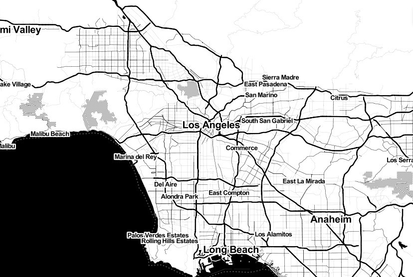
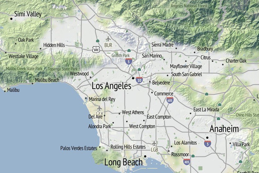
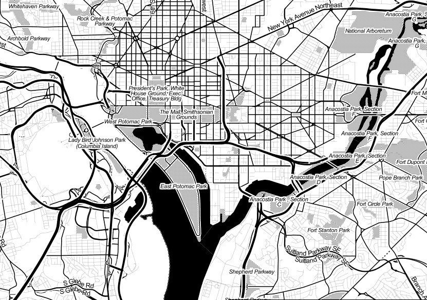
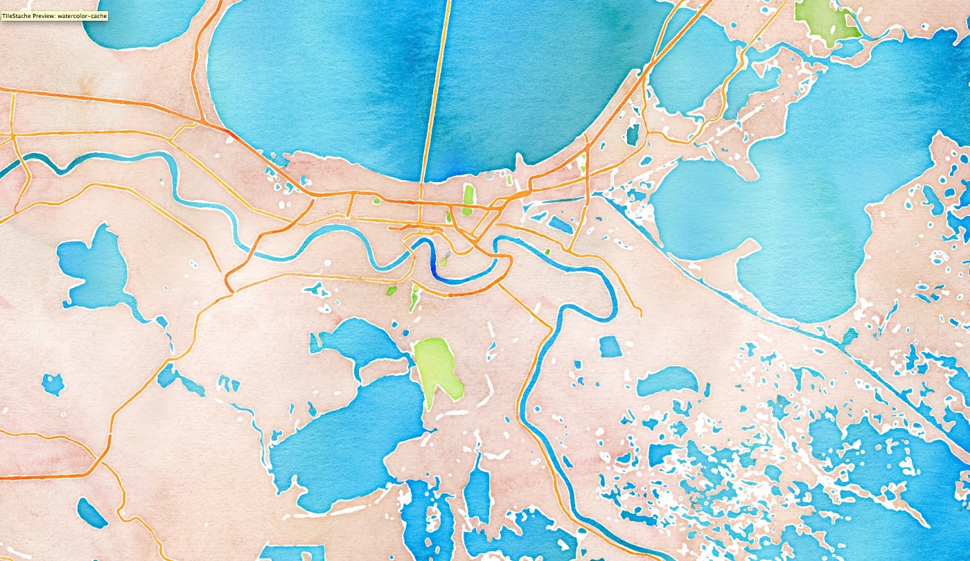
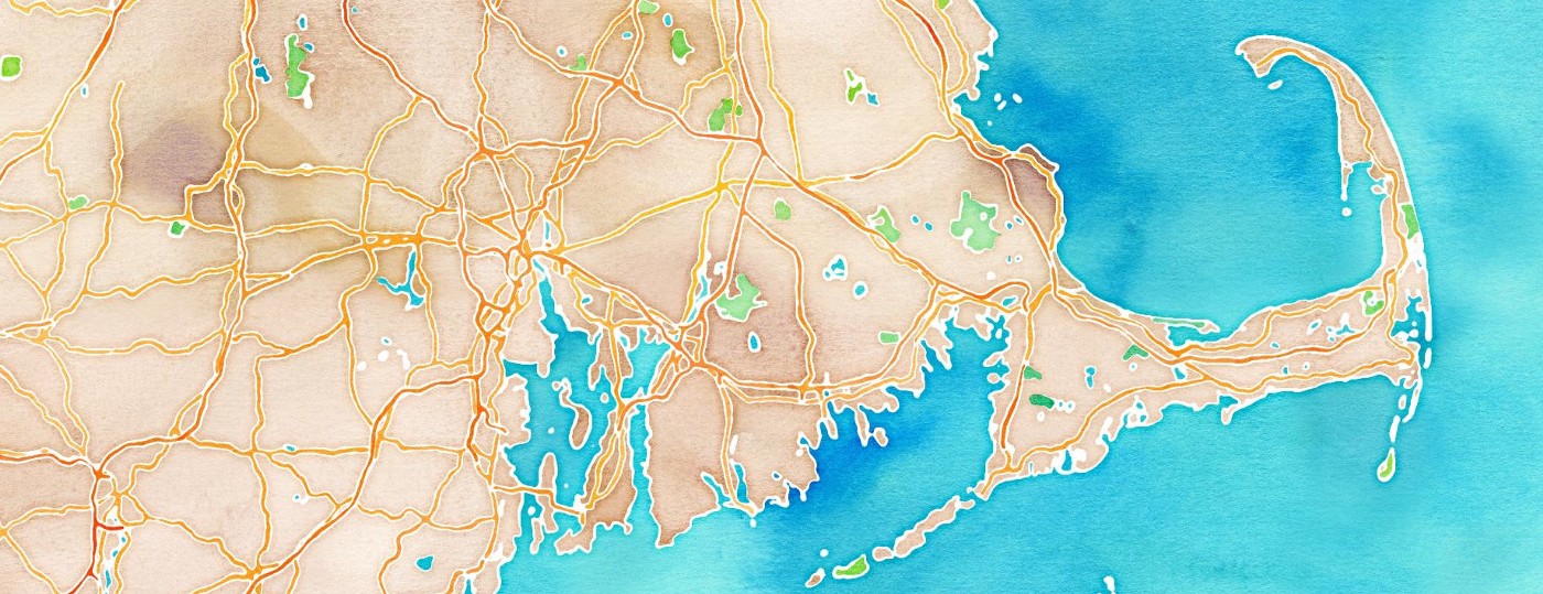
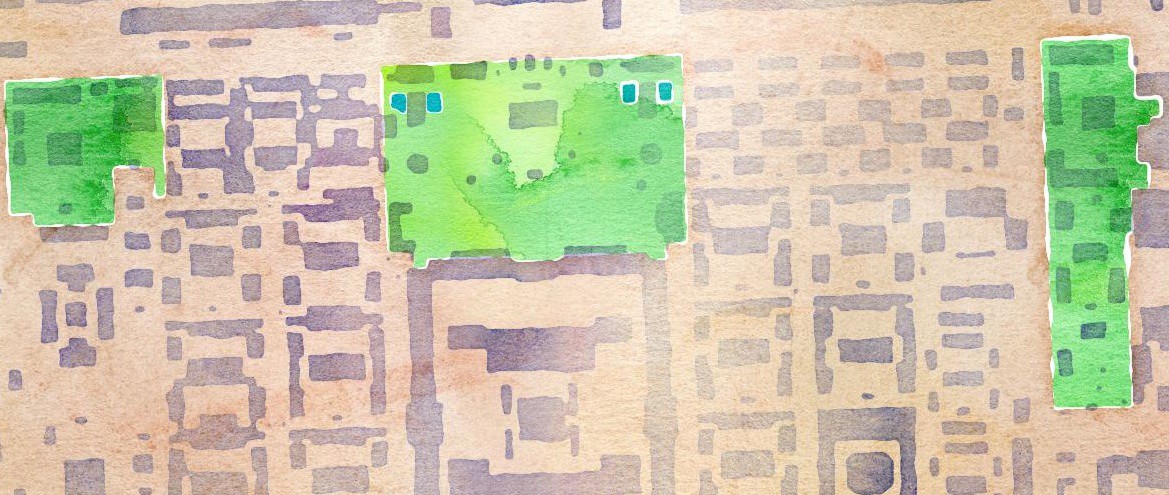
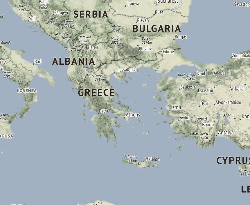
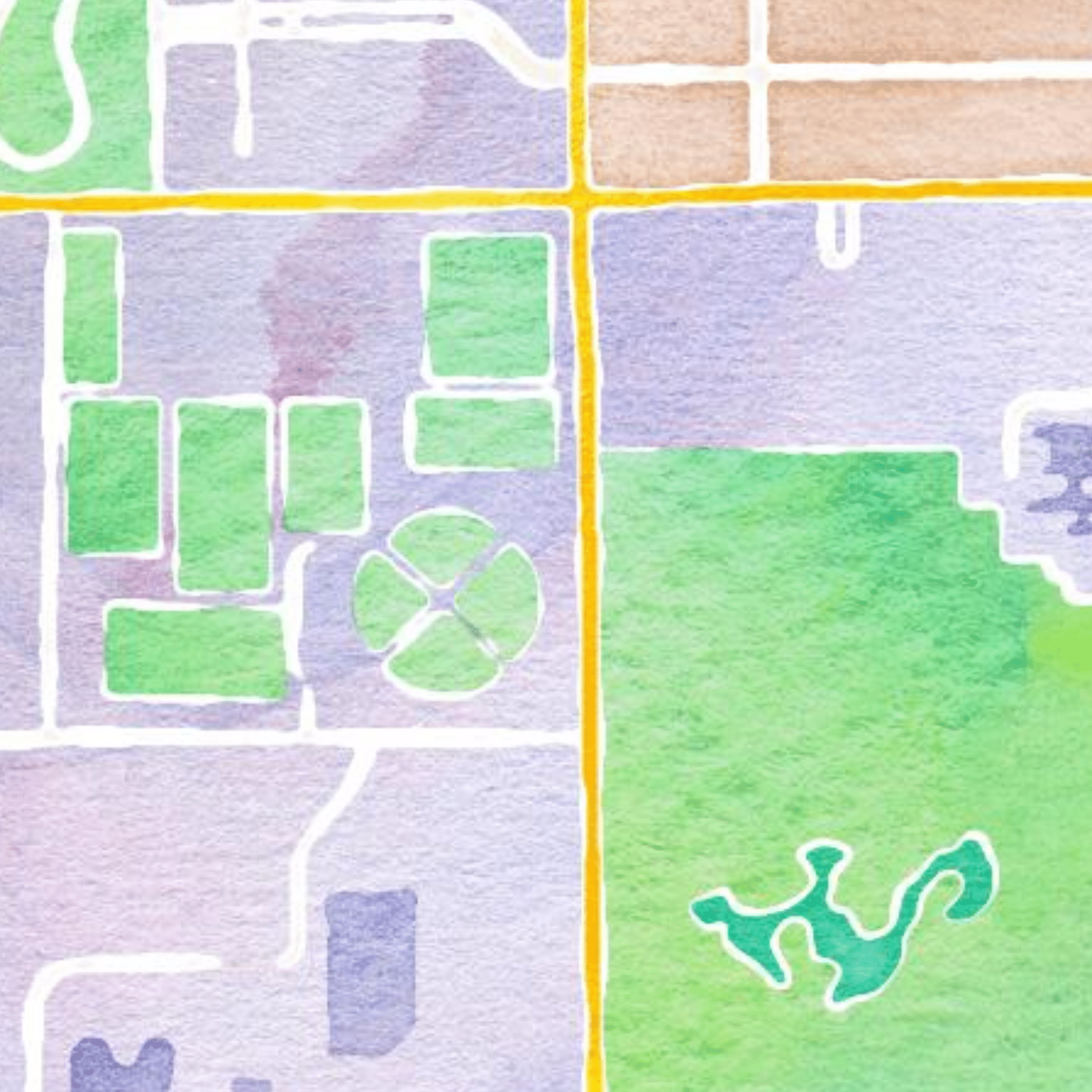
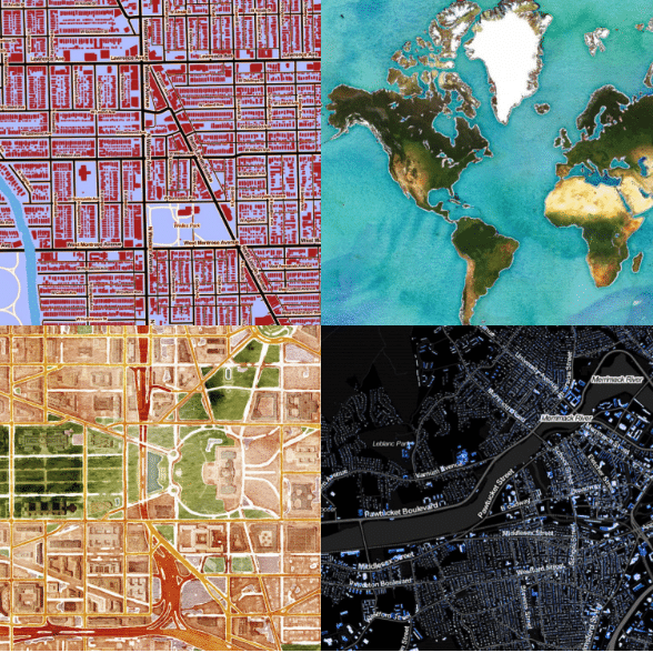
There are three styles available: toner, terrain, and watercolor:
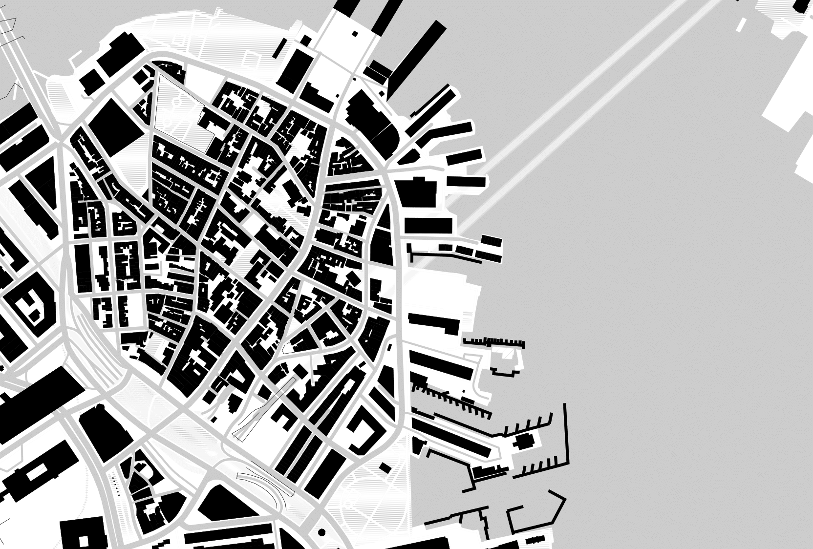
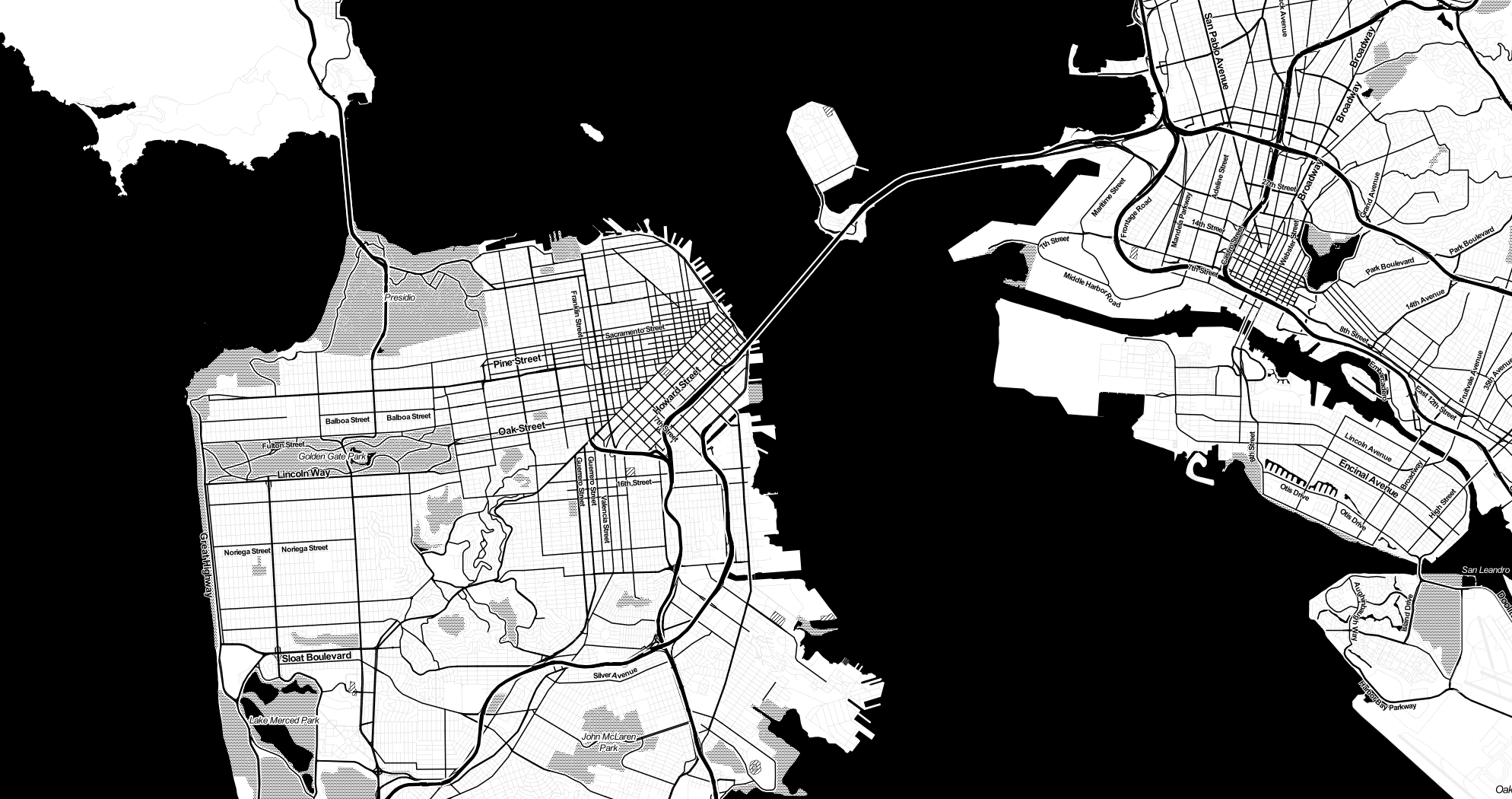
- Toner is about stripping online cartography down to its absolute essentials. It uses just black and white, describing a baseline that other kinds of data can be layered on. Stripping out any kind of color or image makes it easier to like focus on the interactive nature of online cartography: when do different labels show up for different cities? what should the thickness of freeways be at different zoom levels? and so forth.
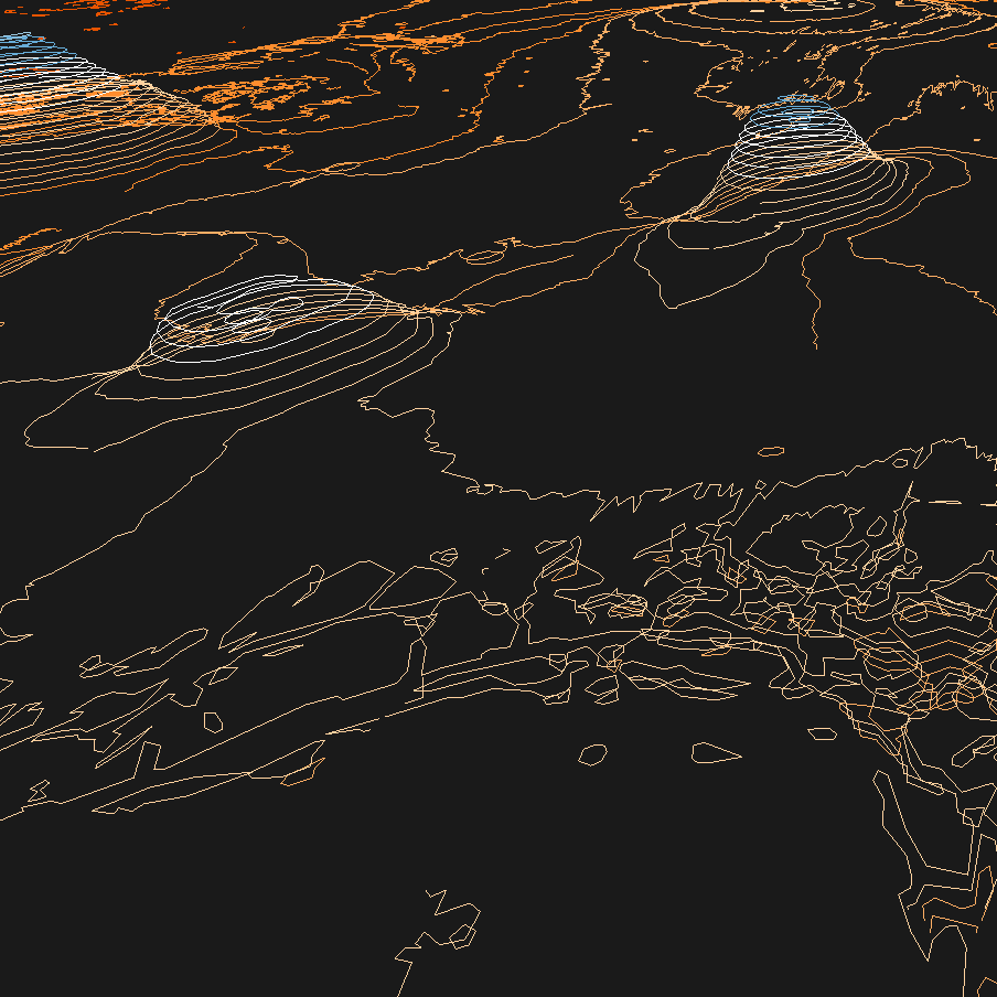
- Terrain occupies a middle ground: “shaded hills, nice big text, and green where it belongs.” This is an open-source alternative to Google’s terrain maps, and it uses all open-source software like Skeletron to improve on the base line cartographic experience.
- Watercolor pushes through to the other side of normal, bending the rules of traditional legibility in order to explore some new terrain. It incorporates hand-painted textures and algorithmic rule sets into a design that looks like each square inch was painted by a person, but is rendered on the fly.
These maps are ubiquitous on the web, and are used in thousands of open-source projects around the world.
A grant from the John S. and James L. Knight Foundation provided initial funding for this work.
At Esri, we are big fans of the leading-edge maps, apps, and web designs created by Stamen. When it comes time for us to choose great map designs that reflect the best of cartography, we often turn to the work of Stamen Design, which they share so graciously with the world. Jack Dangermond President, Esri