
Our aim is to help our clients make their data insightful and actionable. We actively pursue strategies to display, understand and navigate through rich and varied flows of information, and deliver uncommon creative experiences borne out of data insights.
We specialize in creative, evocative and highly bespoke map design and development. With a team of talented cartographers and designers on staff, we are here to help find the best interactive form for your data story. We’ve developed everything from simple maps to complex spatial visualizations to groundbreaking analytic dashboards.
Our clients are arts organizations, giant corporations, tiny startups, healthcare clients, nonprofits, and government agencies. We pride ourselves on tailoring our approach and designs to our individual clients, So what you get is uniquely yours.
Here are a few examples of our unique approach to interactive data experiences:
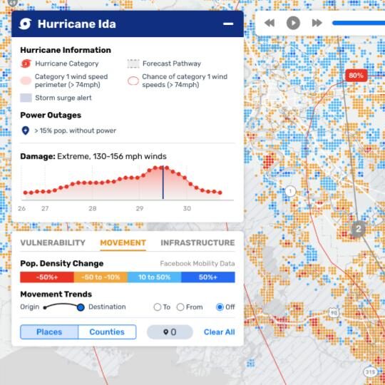
Optimizing disaster response with ReadyMapper
Realtime natural disaster visualization and response workflows re-imagined
CrisisReady, a research collaboration between the Harvard Data Science Initiative and Direct Relief, aims to advance data-driven decision making in emergency scenarios. They reached out to Stamen to work with emergency and disaster response teams globally to provide real-time disaster reports and analysis, thereby increasing situational awareness and preparedness.

Redesigning the Distressed Communities Index
Creating a map-focused platform for analyzing well-being at the community level
The Economic Innovation Group approached Stamen with the goal of redesigning their renowned Distressed Communities Index while preserving the integrity of the data and pre-existing resources. Our goal was to refresh the interface by incorporating new features that add new insight to the data as well as creating a new immersive feel.
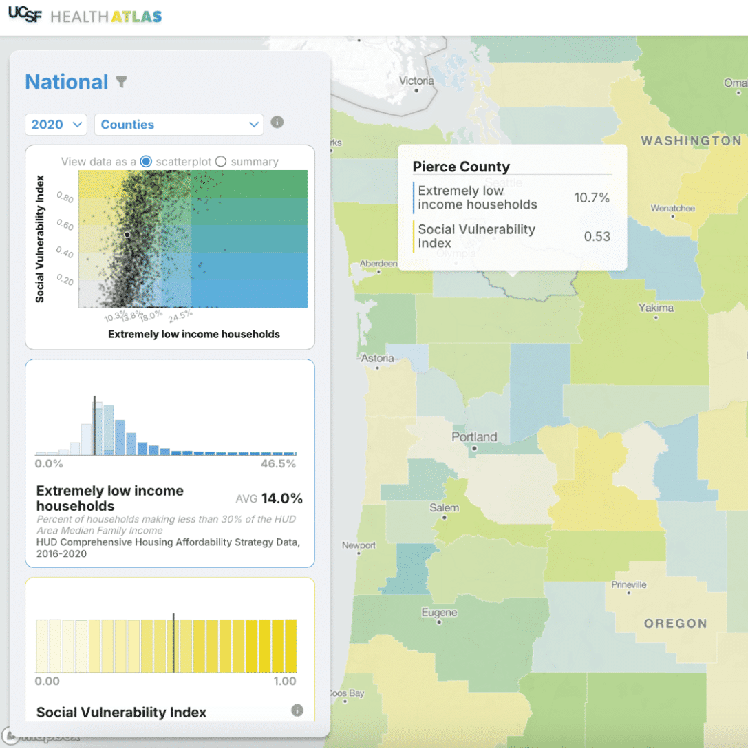
UCSF Health Atlas
Exploring how environment influences health in California
The Health Atlas was designed with health researchers, policy makers, and community advocates in mind to allow exploration of over a hundred social determinants of health and health metrics across the state at the census tract and county levels. This tool helps researchers explore and gain new insight into how our environment influences our health at a local level across California.
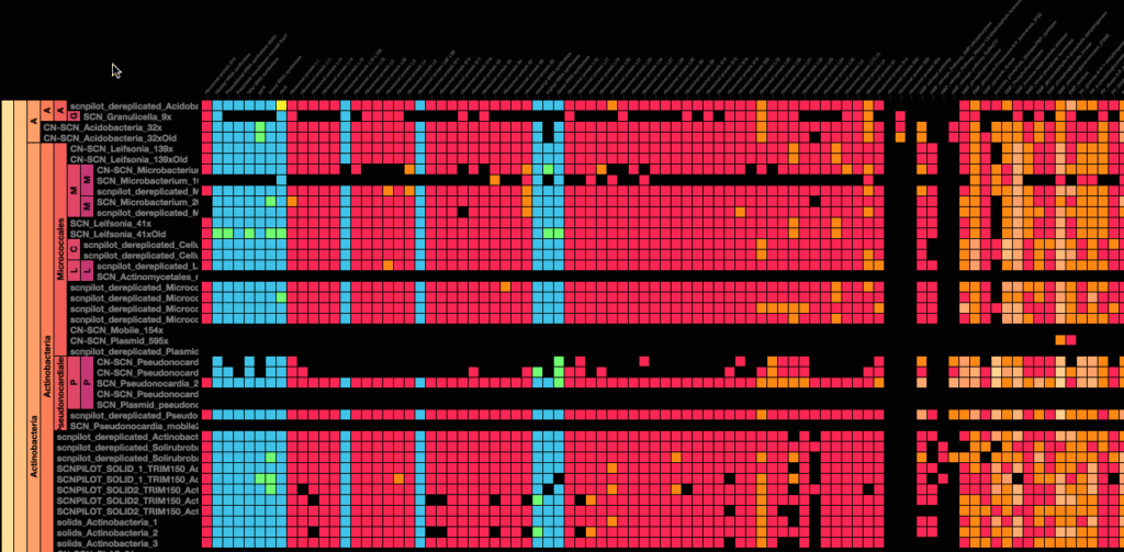
Metagenomics for UC Berkeley
Illustrating new landscapes of genetic diversity
The price of genetic sequencing has plummeted to the point where scientists can now study ecosystems in their entirety, not just the parts of it that they already know how to identify. The Banfield Lab collaborated with Stamen to bring their data to life, using advanced data interaction and visualizations to make it easier to understand these vast new landscapes of genetic diversity.
Looking for something with more narrative emphasis? Find some of our favorite data storytelling projects here. You can also view additional projects on our work page.
Ready to make your own beautiful maps?