Last month I was lucky enough to give a talk at the North American Cartographic Information Society’s annual meeting in Minneapolis, about the golden ratio & how we apply it to our cartographic & data visualization practice at Stamen. The video recording of the talk is here, for those who prefer to watch and listen than to read.
It’s a practical talk: it recommends specific ways to do more with limited resources, or how to work when you don’t know how many resources you have. It starts to get philosophical as well: there’s something about having a structured way to make progress without knowing what your final plan is that I find beguiling and a useful antidote to linear, over-planned thinking and working. The golden ratio can help you go infinitely deep or just as deep as you need to go, and both of these things are deeply appealing to me as a mapmaker and data visualizer and entrepreneur and storyteller.
Fundamentally this is a conversation between me and the amazing Charlie Loyd; many of the images (and all of the animations) are Charlie’s. If you’re into any or many or some of these meanderings, I hope it’ll appeal to the explorer in you. So let’s get into it! We’ll talk about:
- What the golden ratio is and how to find it
- What you can do with it
- How you can use it in making maps
It starts with #showandtell, a weekly Friday afternoon meeting and Slack channel we have at Stamen where the whole team gathers (virtually) and Stamens are encouraged to show work in progress, things they’re in the middle of, things they find interesting. It’s pretty loose; much less a formal design or tech review (we have plenty of those) and much more a sharing session to involve Stamens in the work that you’re doing. If you’ve been working, you’ll always have something to show, even if it’s a first draft of a document or a nicely-arranged dataset. It’s not really a meeting to discuss client-ready or launchable work. Last week Ross Thorn brought his ukulele guitar (Ross is exceptionally large) and sang a song. It’s my favorite meeting of the week.
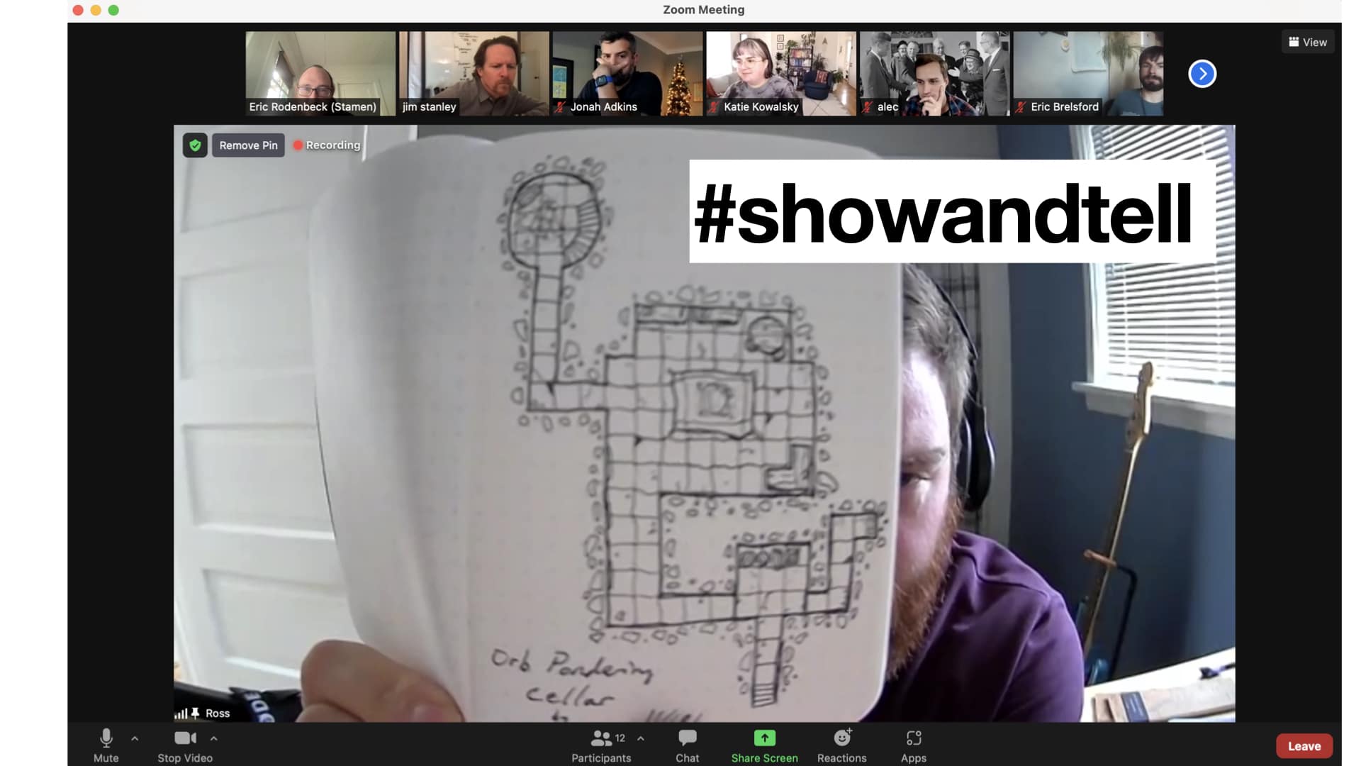
Below is Ross’ Dungeons & Dragons maps project, which he draws many of in a tiny grid paper notebook. #showandtell is a way to keep us all comfortable with the notion that work doesn’t always have to be formally presented; good ideas can come from anywhere, and many of my favorite things about Stamen prove this out.
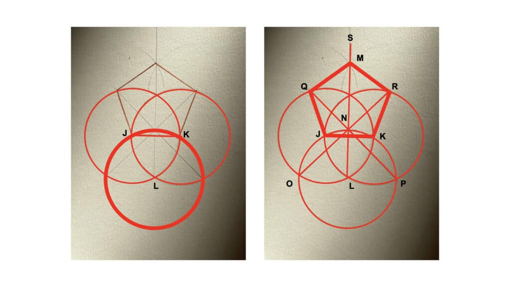
In my case, the project I brought to a #showandtell meeting earlier this year was some work I’ve been doing on my own generating geometric shapes on paper. Most of my work life is digital but I find there’s a certain ease & spontaneity that comes from paper, and I still use it to think with, if that makes sense. The task I set myself was, specifically: what can I get done with a pencil, a straightedge (not a ruler; no measuring of inches/centimeters), and a compass? It turns out you can do quite a bit. After making a couple of hexagons and other shapes I started looking into more complex and less obvious shapes. It’s really easy to generate a pentagon & other shapes with just a circle and a couple of lines:
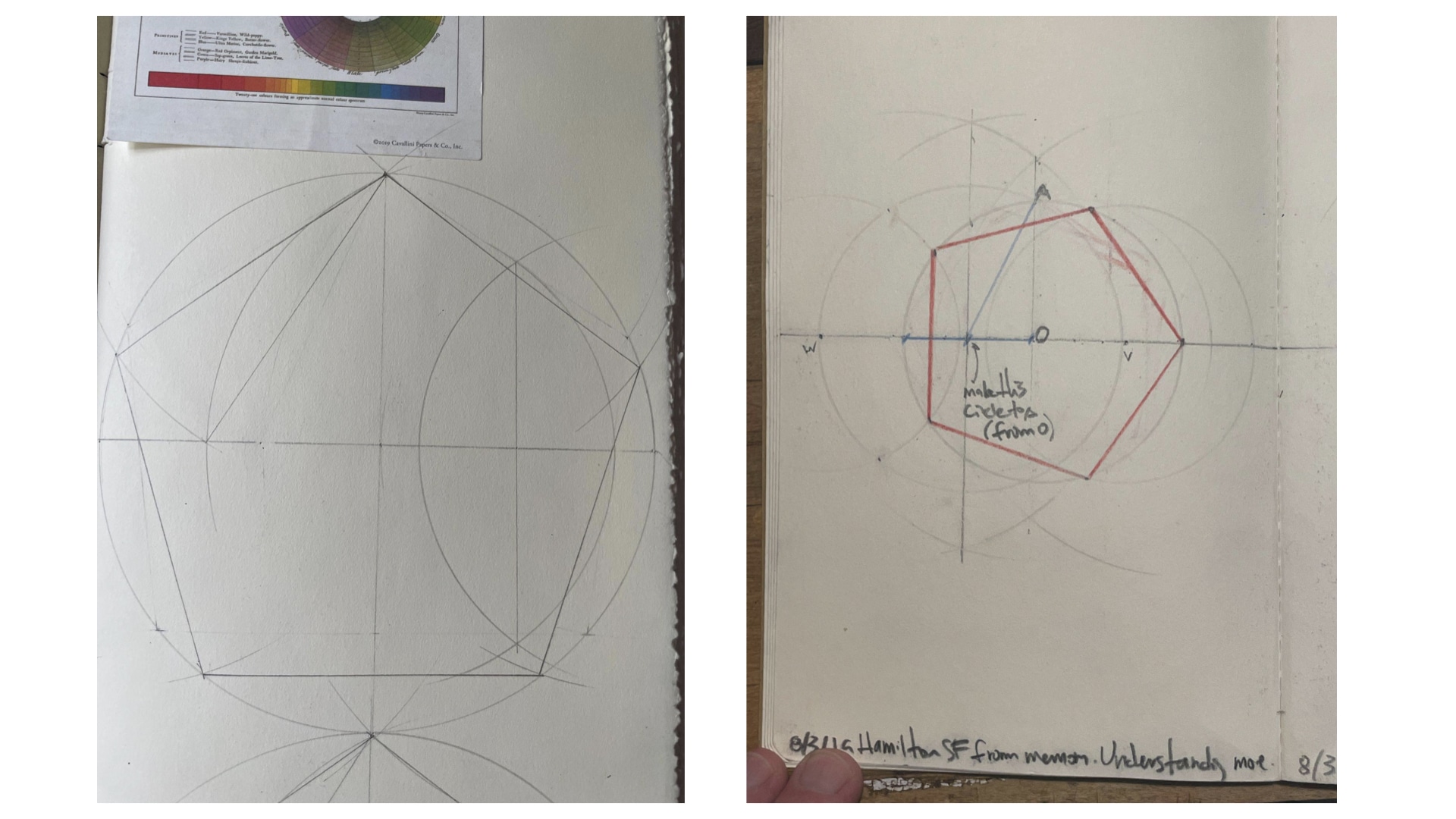
I shared this work with my very good pal Josh Draper, with whom I have a long history of playing with geometry. He introduced me to the relationship between pentagons and something called the golden ratio. When I shared this at #showandtell, I thought it was just another moment to share something tangentially related to how Stamen works, a side project of interest. Then my colleague Charlie Loyd came back with this beauty:
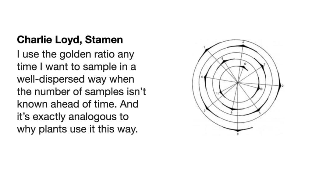
We’ll get to the details of this in a minute, but: here’s one of my favorite things about Stamen: it’s not at all uncommon that ideas and connections will come in from the edges, from someone’s personal interest, from an offhand comment in a meeting, that totally changes what’s in front of us. This is one of those times.
What is the golden ratio?
There’ve been all kinds of claims made about it, that it’s the basis for classical architecture, the Pyramids at Giza, it’s baked into the fabric of the cosmos, people get spiritual about it…I don’t want to do any of that. I just want to talk about what it is, and how to get to it, and how it can be useful. It’s been well known since Euclid, so it’s not like I’m saying anything new here, but as we sometimes say at Stamen: “It’s been done before, but not as well, and not by us.” I wanted to try getting to it for myself, and one of the things I like about it is that you don’t need to know very much to get to it.
Simply put, the golden ratio is the relationship between the long and short sides of this rectangle, the blue & orange sides. What follows is the simple geometrical construction you can use to make this rectangle:
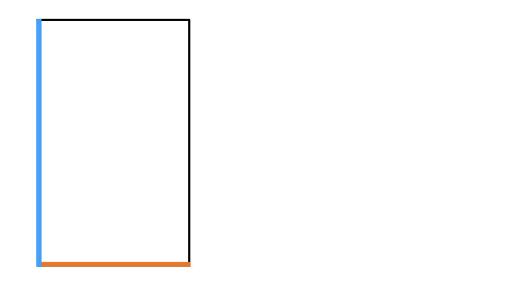
Start with a line:

Turn that line into a square. In the images that follow, the thicker lines are the new bits:
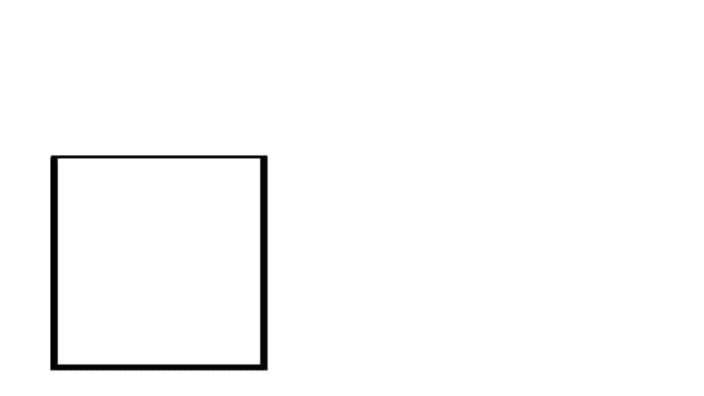
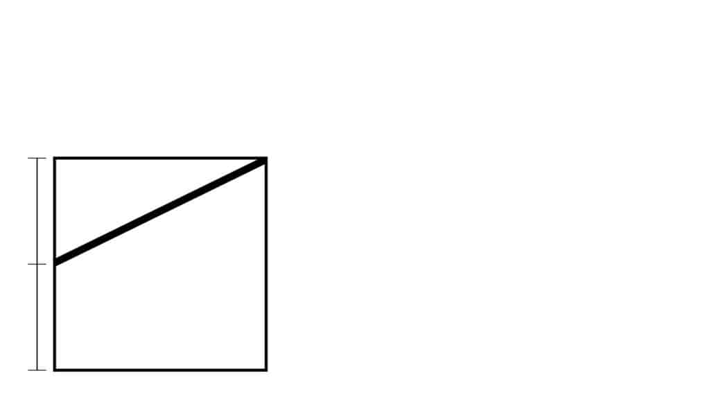
Bisect (cut in half) the left side of the square, and draw a line to its upper right corner:
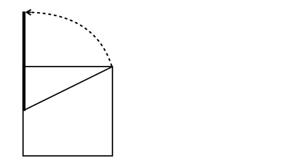
Using the halfway point of the left side of the square as the center point, rotate that diagonal line up and to the left until it’s parallel with the left side of the square:
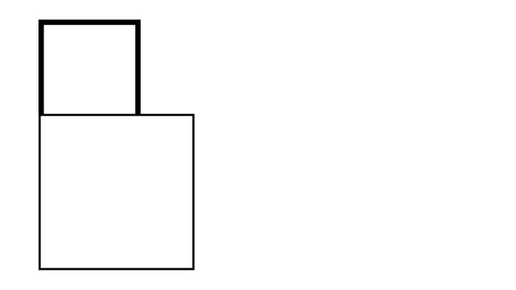
Make a square with the same length and width as the part of the line that’s above the bottom square:
Complete the rectangle by extending everything to the right hand side of the form:
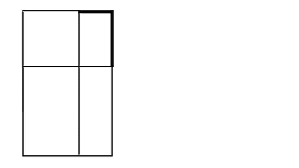
And that’s it! Now you’ve got a golden rectangle.
It has some interesting properties:
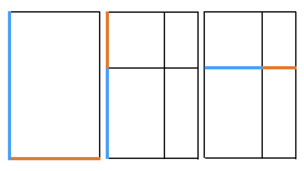
The ratio between every pair of blue and orange lines in the examples above is all the same; and it’s all the golden ratio. That’s not nothing, and perhaps noting that this is where recursion starts; similarity across scales.
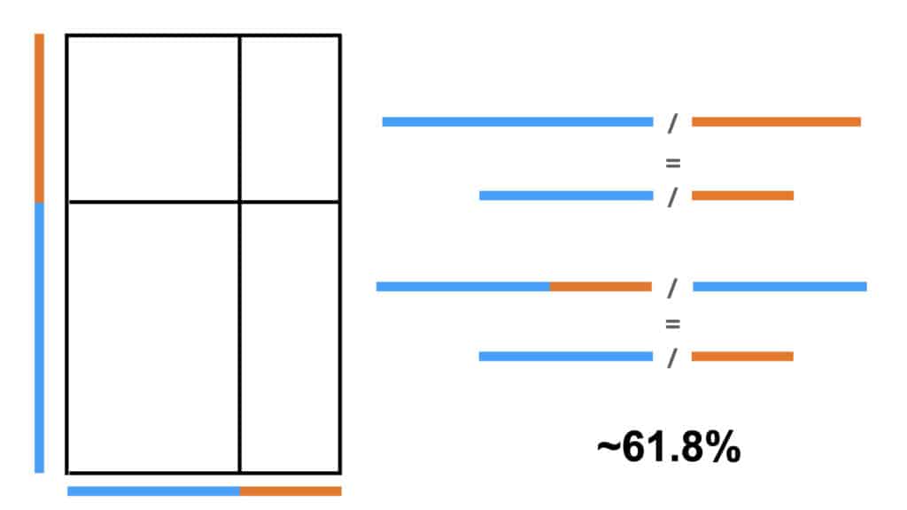
Where it starts to get interesting is across different relationships. The ratio of any line made of the combination of a blue & orange line is to the blue individual segment as the ratio of any blue to its corresponding orange segment. This ratio is called phi; in Greek it’s spelled Φ, and it’s about .618. Crucially, like its cousin pi, π , it’s irrational, it never resolves, and it goes on forever.
What does the golden ratio do?
For starters, there’s this: if you take the orange line, and rotate two blue lines from its ends so they touch, you have everything you need to construct a regular five-sided pentagon without any calculations. The orange line is the length of every face of the pentagon.
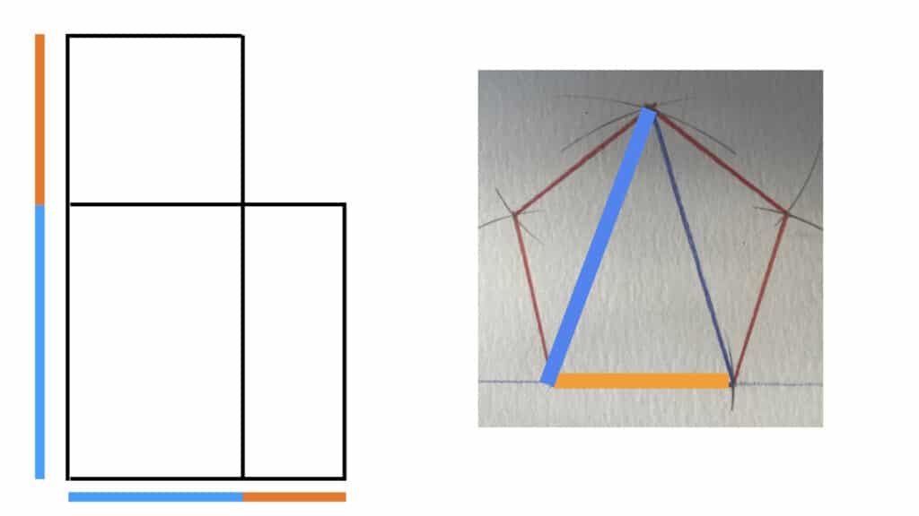
Then there’s this: if you have a golden ratio, you more or less already have a pentagon, and vice versa. They are inter-subscribed; they share a fundamental set of relationships by their very nature.
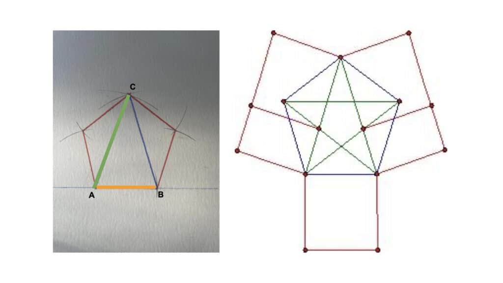
You can go pretty far with this stuff; there are multiple ways to construct pentagons without a ruler, interleavings between the various shapes, I may have to put together another post…for now it’s enough to say that there are kinds of geometric relationships that can be useful in getting regular linear constructions out of circles, and vice versa. And you don’t need to understand much math in order to get some interesting results:
What you can also start to do is to use this relationship to generate patterns that have useful properties, which will eventually come around to Charlie’s statement about sampling.
In the drawings as follows (which I started on paper), the blue line is the long side of the rectangle & the orange line is the short side. The new lines are always the thick lines.
Start by placing the blue line on the left and striking two parallel lines out to the right, from the top and bottom of the long side. This gives us a set of reference lines we can use. Then place an orange line to the right of the blue line, with its bottom along the lower parallel line. Put a mark at the top. This is our first grid marking.
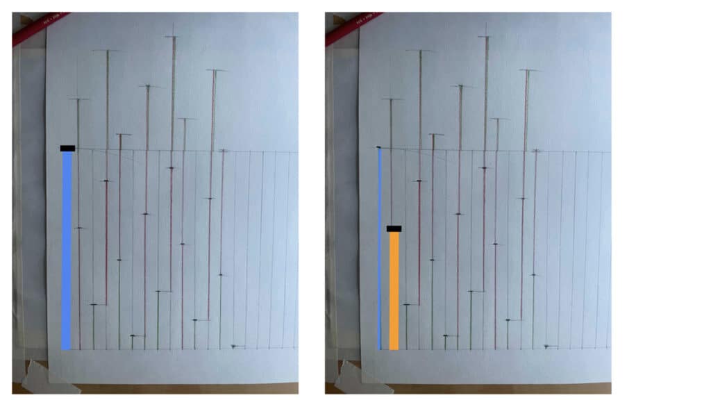
Next, we place another orange line at the mark we just made, so that it sticks up over the top parallel line. Take this extra length, which we’ll call the red line, & bring it down to the bottom of the bottom parallel line, one tick mark over.
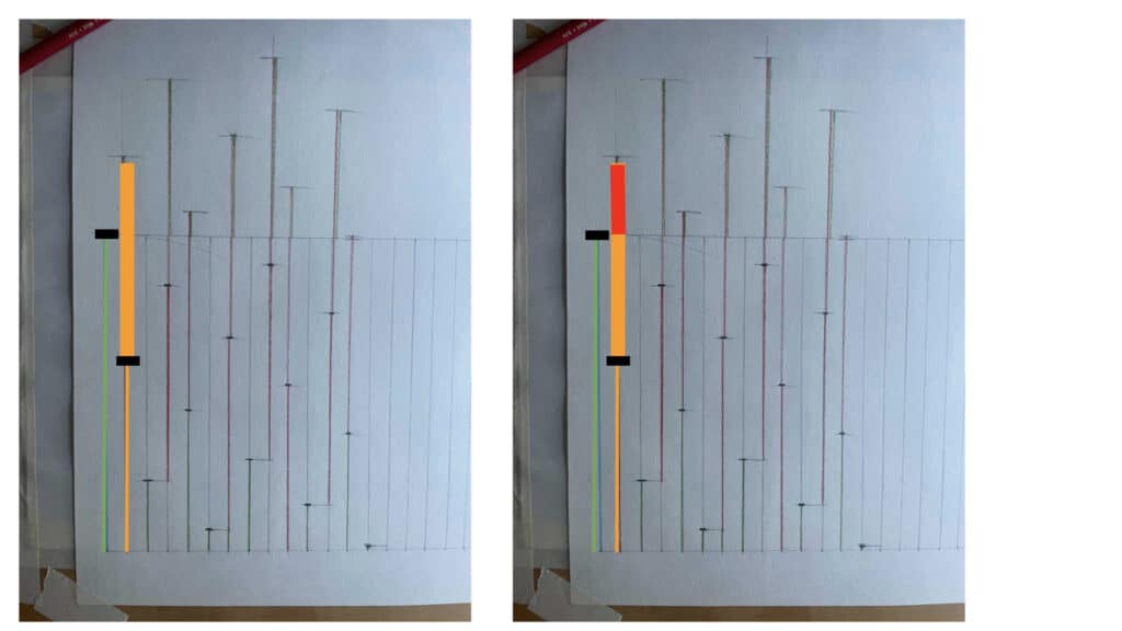
The top of our new red line becomes the next place for a marker. Then we put an orange line on top of that, and the top of that becomes our next marker.
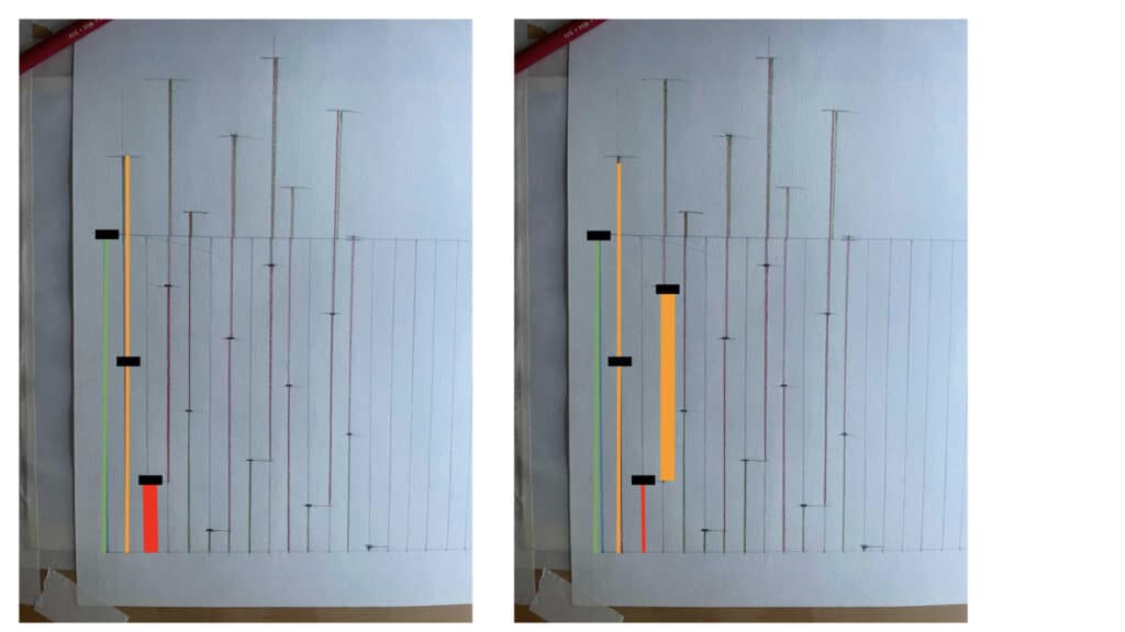
Then keep doing that, making marks every time the combination of red line and orange line lies within our range of parallel lines, and taking the lengths of each red line back down to the bottom parallel line. Eventually you get a pattern that looks like this: 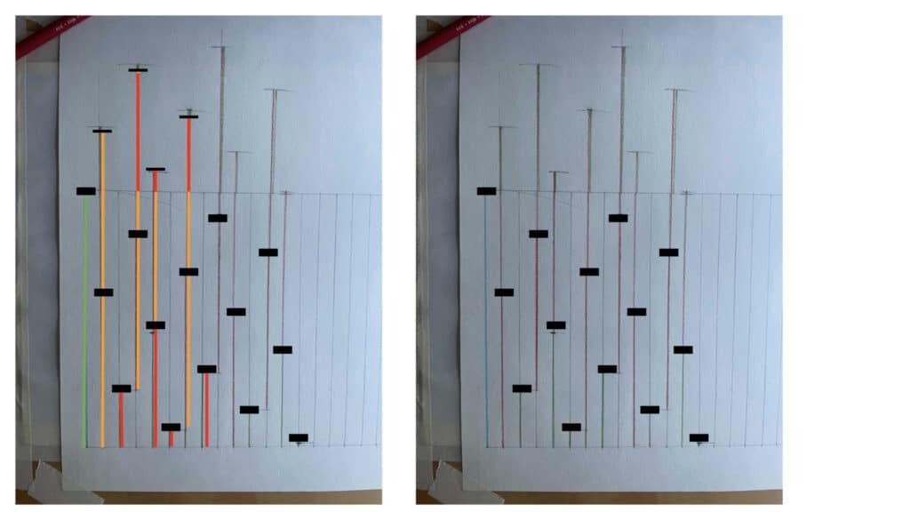
Which lets you do this:
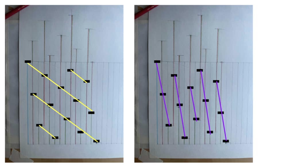
And also this:
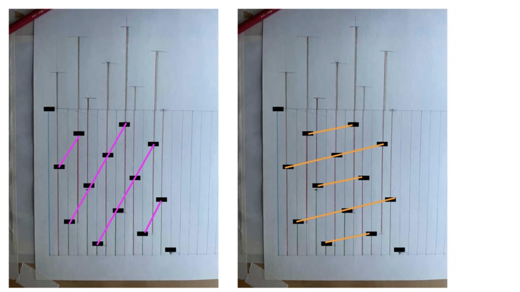
Which, when you combine them, looks like this: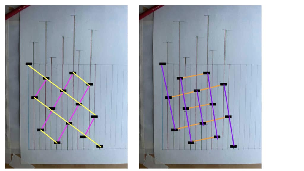
Which looks suspiciously like this:
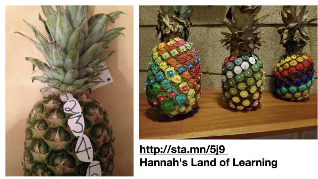
It’s hard to talk about this for very long without mentioning Vi Hart, whose amazing videos about the Fibonnaci sequence (and in general, Doodling in Math Class) comes at this from the number side of things but draws many of the same conclusions.
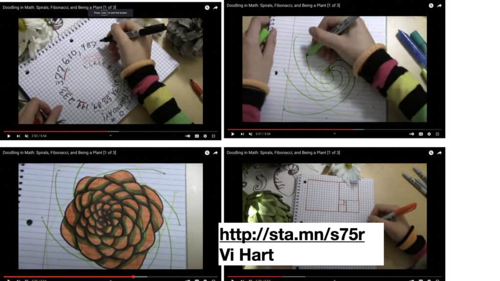
So, to summarize: we’ve got a) a fundamental irrational property of a simple geometric construction that leads to b) patterns in every direction and c) seems to be inscribed into the structure of a great many natural phenomena, as well as a mathematical sequence that results in very specific kinds of spirals.
How can the golden ratio be used in mapmaking?

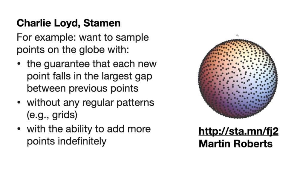
This is the heart of what’s fascinating to me about this method. It guarantees the most spread-out, and therefore most efficient, next step, no matter how many steps you’ve taken, or will take in the future. It lets you act, with confidence, in the moment, without a defined end in mind. It’s about being effective, without necessarily needing to be efficient. It’s about behaving abundantly, extravagantly, knowing that you’re doing the best thing in every moment, without having to worry about ending too quickly or spending too much time on what’s next.
Let’s take a look at how this works in action. We’ll be using three different sampling modes on the same map: grids, random, and the golden ratio. The thought experiment I’m going to ask of you is to imagine that you don’t know what’s in this image, and to imagine what conclusions you would draw. In each instance, we’re sampling this image, of downtown Chicago rendered as a watercolor painting. We’re going to pretend that we don’t know what it is:

The first thing we’ll try is to lay down a grid pattern. It looks like this:
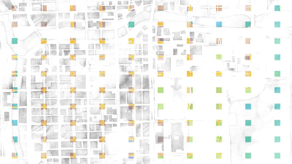
In this use case, we’ve had the bad misfortune of laying down the grid starting on one of the streets in the grid, and picking a grid size that basically matches the length of a city block in Chicago. So the west side of our sample looks like it’s only got streets in it, and no buildings at all. And we entirely miss some of the roads that are in the park on the east side.
If we move the starting point of the grid, we get something that looks like this:
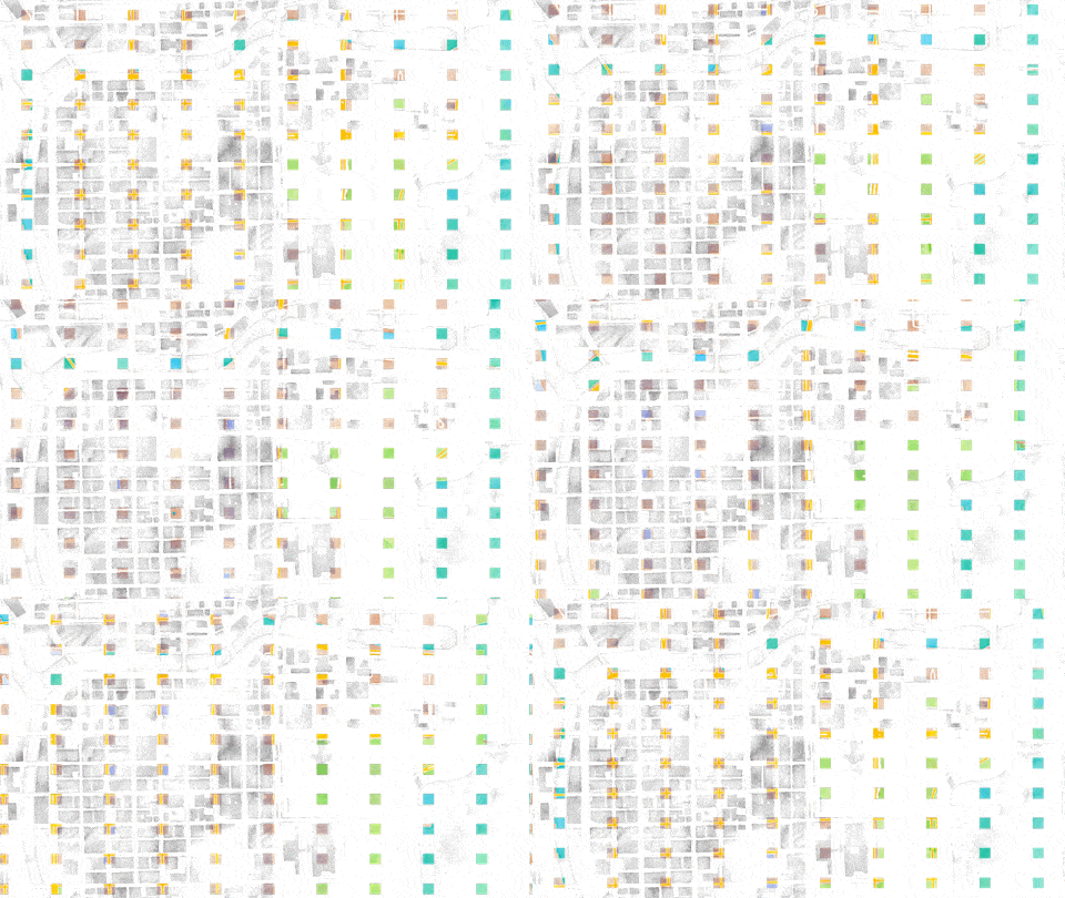
If you keep your eye on the easternmost grid, it looks like we’ve only got buildings (purple), or streets (yellow), but never both. The grid misreads regular patterns.
Random sampling isn’t much better. If we sample a bunch of random points, we get some places where the samples are very close together, and some places where there are hardly any samples at all. So we’re sampling more than we need to in some areas, and less than we need to in other areas:
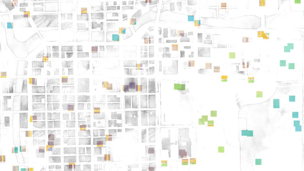
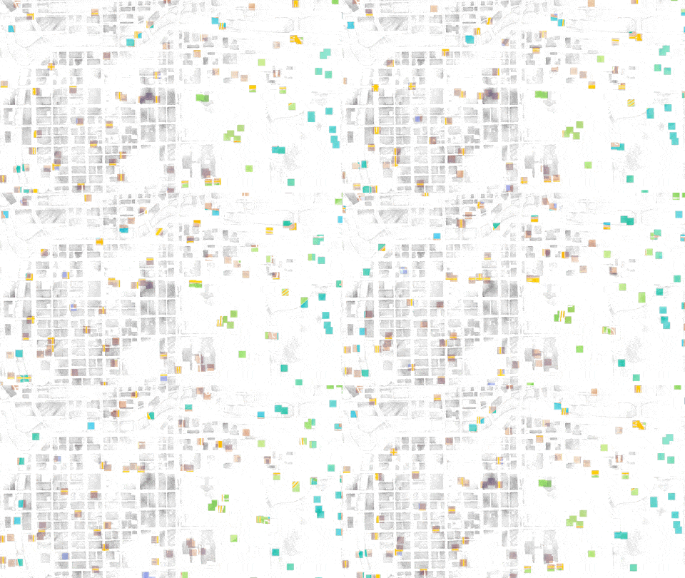
If we move the grid around, we get this. Basically the same thing; clumps & spreads:
However! If we sample according to the golden ratio, we get this:
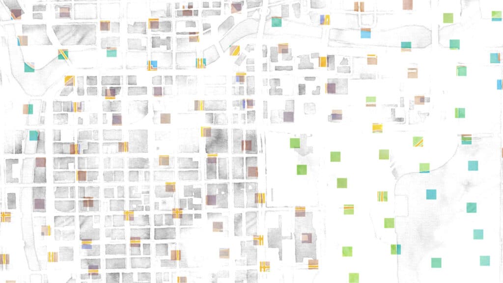
Nice and evenly distributed; and the key is again that every follow-on sample falls into the largest gap that’s left, no matter how far along in the sampling you go. We also get some lovely lines that demonstrate the “patterns” that emerge. Some are short:
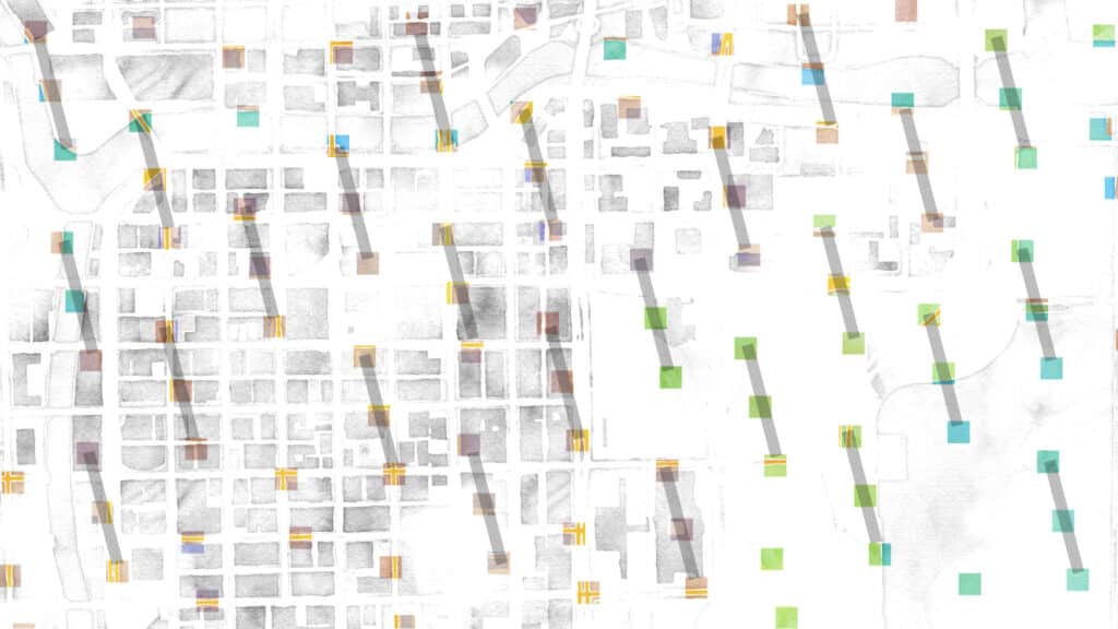
Some are pretty long:
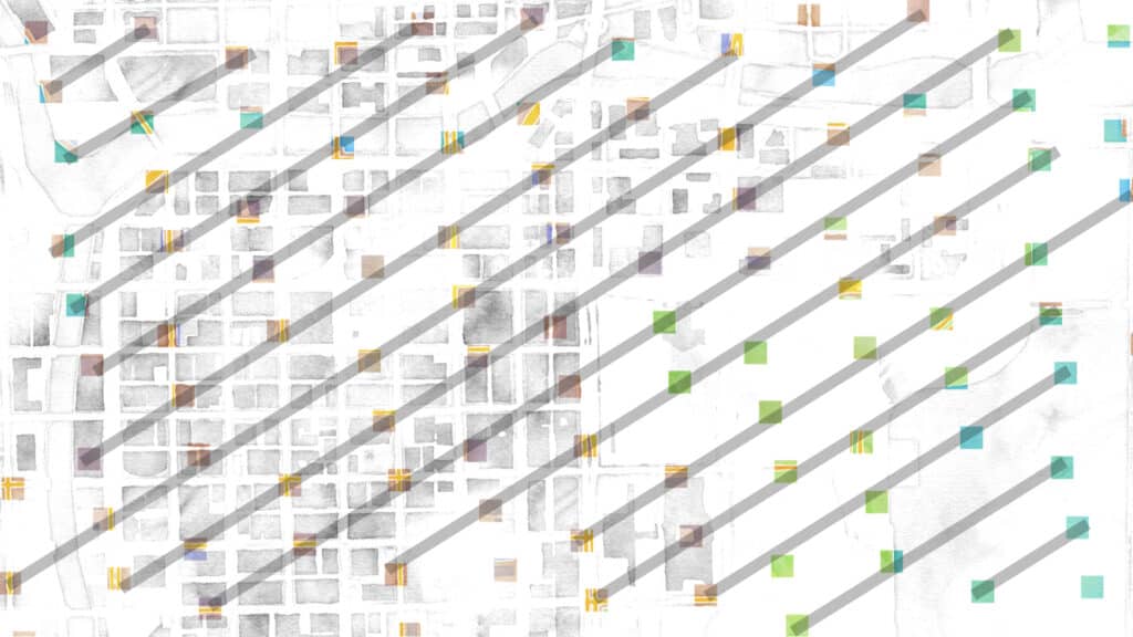
And some stretch almost the whole width of the sample area. When I showed these to Charlie, his response was “neat, but don’t forget to say that these aren’t straight lines, really; they’re ever so slightly curved, like they would be on a pineapple or sunflower.” Damn!
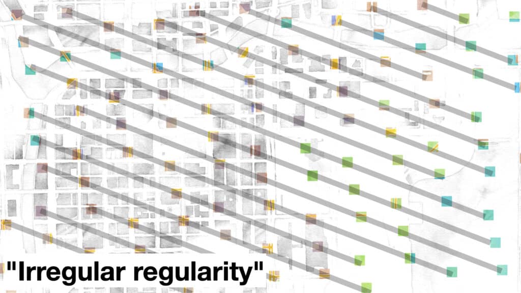
Moving, it looks like this:
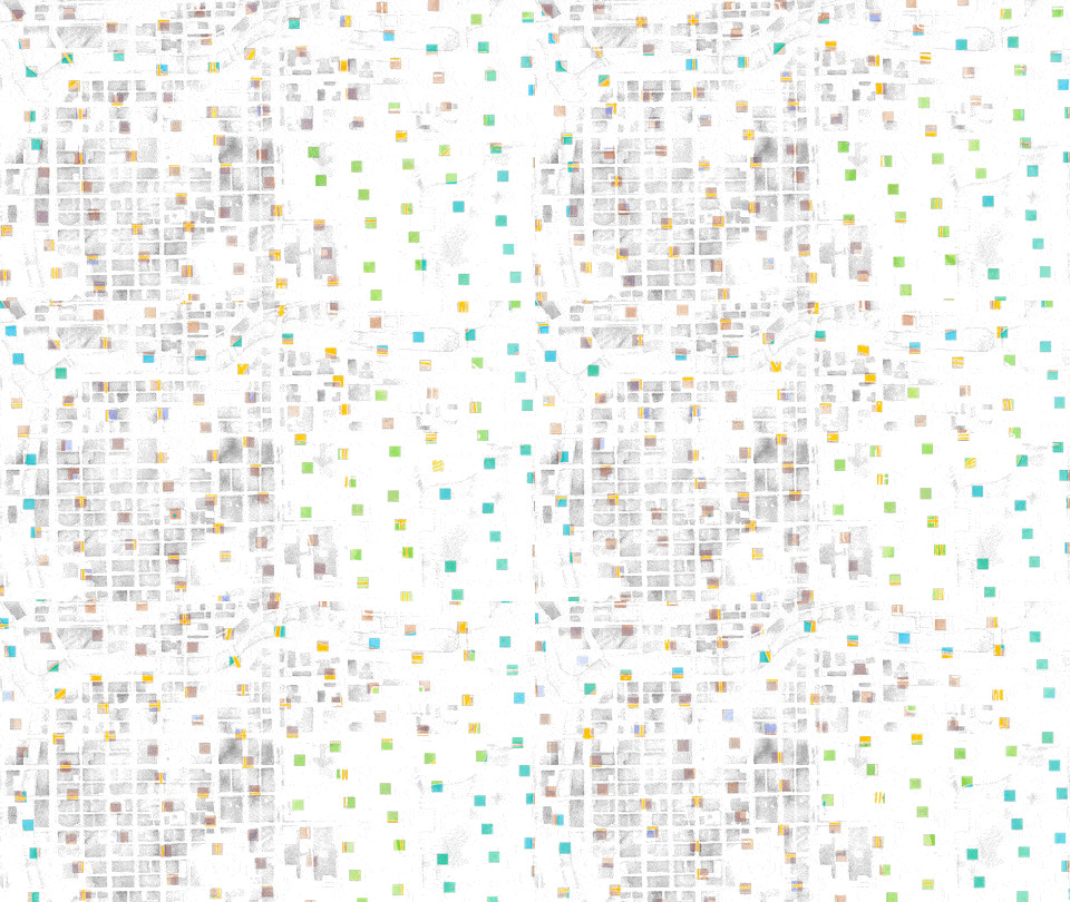
It’s this irregular regularity that’s the most beguiling to me here; a structured unstructuredness that comes from a simple, but entirely irrational, ratio between two sides of a rectangle, the construction of which requires simple geometry and minimal planning.
Charlie and I want to keep drawing from this particular well, so if any of this is of interest to you, watch this space or drop us a line. We’ve also posted the code that was used to generate the images above and can serve as a jumping off point for further experimentation, here. If you’re interested in using phi to pick colors, take a look here; this’ll be the subject of a follow on post.
