
A Dead-Simple Tool That Lets Anyone Create Interactive Maps
Wired Magazine
07.15.2014
DATA SURROUNDS US. It’s everywhere, in the most micro sense (small gadgets that track calories we’ve burned, or how much water our plants need) to the most macro (analytics companies that can monitor, for instance, the health of entire populations). But there are precious few companies actively working on helping us make sense of all that data. One of them is Tableau, a software company that turns heaps of data into visualizations for the common man: teachers, doctors, journalists, you name it. To make those tools clearer and cleaner, they recently partnered with Stamen Design, to release three new map templates, which anyone can play around with by downloading Tableau’s free software.
Stamen is something of a brand-name in this area, having created a wealth of data visualizations that have been endlessly lauded and studied by those in the field. And that’s for a simple reason: While there are myriad tools for creating static infographics, designing an interactive map requires far more development expertise, and the tools are hairier to use. Maps in particular get knotty: as Eric Rodenbeck, Stamen’s founder, points out, we’re likely most accustomed to Google Maps. It’s a great looking design, but it’s just used for wayfinding. Maps can can be useful for other kinds of storytelling, but adding a layer of data to a map creates a logistical problem: if graphics or content goes on top of a map, then the map is obscured.
The partnership with Tableau presented another hurdle: typically, when Stamen designs a map, they know how the client will use it. For instance, when Stamen created a map for Pinterest users, they knew right away that the users would be also be Pinterest users, who likely enjoy the scrapbook feel of the main site and are already using the red “pin” icon.
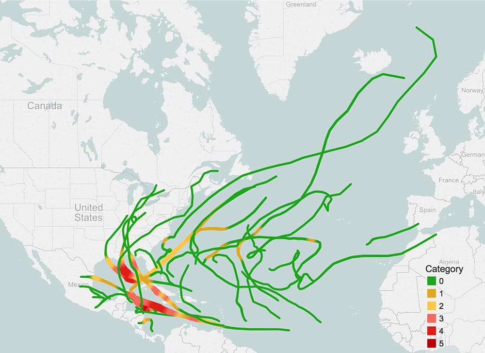
But the entire point of Tableau’s software update is to create a sophisticated cartography tool for anyone. Map-makers simply upload a .csv file of data into Tableau, and then get to select a template from Stamen’s canon of maps. This meant creating three map templates that are flexible enough to complement the color scheme and data density of an unknown user. “People put all kinds of stuff on Tableau,” Rodenbeck says. “It’s not just driving routes, or geographic information services.” Data could be about anything—voters, the weather, even patterns in birthday parties. One way Stamen makes this possible is with built-in contrasts between colors used for water, land, and road networks.
“Those guys are crazy,” Rodenbeck says of the Tableau team. “I’ve never had a client actually hold up a color meter and discuss whether it should be 9% more in one way or another.” That rigorous approach—so detailed that Tableau’s in-house color scientist, Maureen Stone, developed a new color palette that would allow for permutations in the map, without conflicting colors showing up—plus a partnership with Open Street Map’s detailed data, is how Tableau and Stamen plan to democratize good, interactive design.