Facebook COVID-19 Mobility Dashboard
Exploring movement trends across states and counties in the time of COVID-19
Background
The ultimate goal of this project — which took place over a very short timeframe as the pandemic began racing across the globe — was to help answer key questions related to COVID-19. How well have physical distancing interventions worked? Where do communities need the most support with their distancing efforts? How and when, and how quickly, should we reopen different cities, states and countries?
What We Built
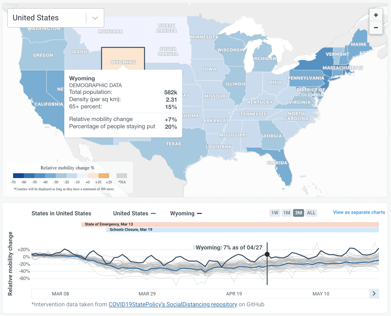
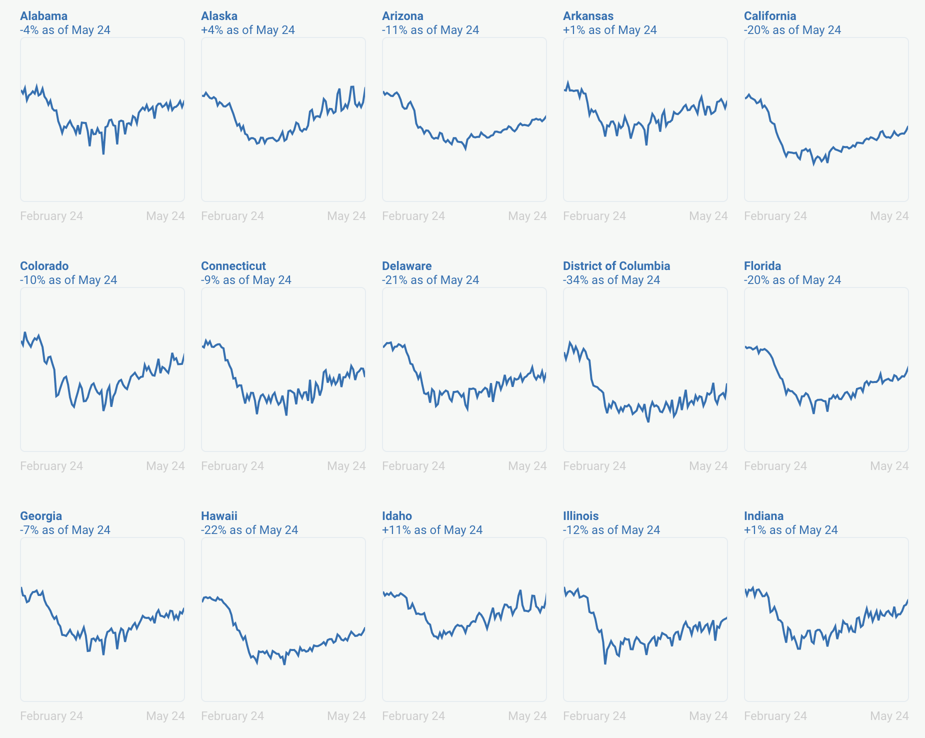
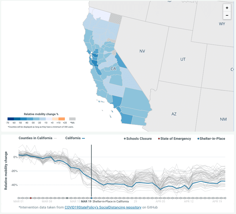
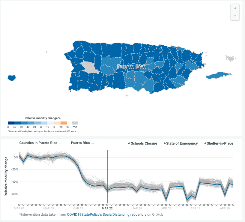
To build this dashboard, we started with de-personalized, aggregated county-level mobility data —which Facebook’s Data for Good program makes available for humanitarian purposes—and we paired it with census data that painted a fuller picture of the populations of the states and counties.
We visualized two different measures of mobility: how often people traveled relative to the day of the week, and the percentage of people who “stayed put” over a 24 hour period. We mapped these trends, county by county, allowing comparison of the trendlines over time, at the state and county level. We added points on those trend lines showing various state government interventions: school closures, emergency declarations, and shelter-in-place declarations – showing the impact of these interventions on mobility trends.