A collection of all blog posts by Alan McConchie.

blog/Alan McConchie

Stamen’s 12 Sunsets with the Getty Museum wins Webby Award!

Alan McConchie | 05.18.21

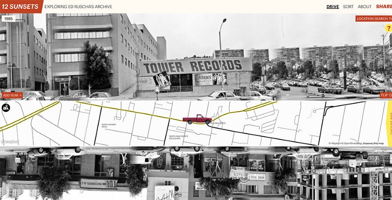
Stamen’s project 12 Sunsets: Exploring Ed Ruscha’s Archive, which we built in collaboration with The Getty Museum, is the 2021 Webby Award winner in the category of Architecture, Art & Design! The Webby Awards have honored the best websites on the internet every year since the inaugural awards in 1996. This year’s awards ceremony was...

Stamen’s Watercolor map tiles are now in the Smithsonian’s permanent collection!

Alan McConchie | 05.18.21

Stamen’s Watercolor map Today the Cooper Hewitt (the Smithsonian Design Museum) officially added Stamen’s OpenStreetMap-based Watercolor map to its collection, the first live website to ever become part of the Smithsonian. Learn more from the Cooper Hewitt press release and the announcement event recorded on YouTube: We are especially grateful to the hundreds of thousands...

Our Brilliant Friend: Stamen and OpenStreetMap through the years, part 1

Alan McConchie | 05.05.21

A personal history of OpenStreetMap, seen through the eyes of Stamen Design by Alan McConchie, Eric Rodenbeck, and the Stamen Design team Stamen and OpenStreetMap, growing up together on the mean streets of Napoli Last month, we were interviewed by Steven Feldman for The Geomob Podcast about Stamen’s history using OpenStreetMap (OSM). This stimulating conversation...

Stamen Design on the Geomob Podcast

Alan McConchie | 04.28.21

Recently Eric Rodenbeck and Alan McConchie had a fascinating conversation with Steven Feldman for the Geomob Podcast. Geomob is a great resource for the geospatial community, organizing a series of in-person meetups in Europe (and now hosting virtual presentations which are all recorded online and available on YouTube). In our audio interview with Steven we...

Corona-cartography: what we learned from a year of COVID-19 maps

Alan McConchie | 04.12.21

In our last post looking back at the data visualization trends of the coronavirus pandemic, we focused mainly on charts and diagrams, and less on maps and cartography. By and large, the maps of the pandemic were predictable and familiar choropleths and proportional dot maps that did their jobs well and didn’t call attention to...

Visualizing the pulse of a pandemic: A year of COVID line charts

Alan McConchie | 03.25.21

Visualizing the pulse of a pandemic: A year of COVID line charts You asked, we answered: The @FinancialTimes coronavirus death & case trajectory trackers are now 🔥 FREE TO READ 🔥 outside the paywall: https://t.co/JxVd2cG7KI In this morning’s update, the US has gone above 470 deaths, bringing it just behind where Iran was at the...

How we watched the election at Stamen: our favorite maps and charts of 2020

Alan McConchie | 11.11.20

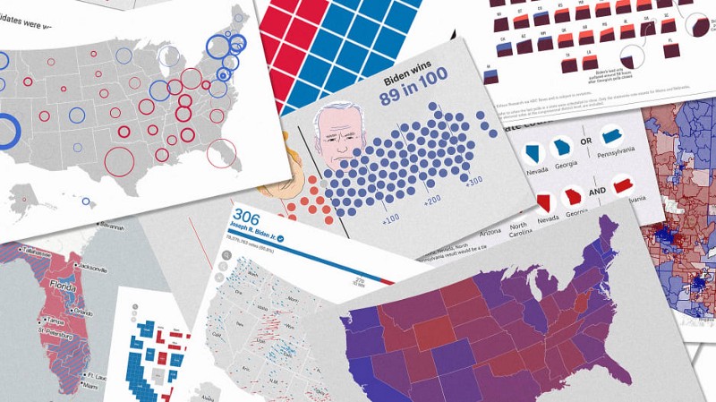
[Also posted on Fast Company as “We design maps for a living. Here’s who got the 2020 election right”] Every election season, maps and charts take center stage on major news outlets and across social media. The public is hungry for numbers and understanding, and data visualizers and cartographers race to produce their best work...

Getting Native Reservations on OpenStreetMap: Transcript

Alan McConchie | 12.18.19

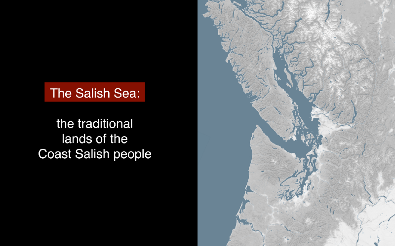
Today (January 22nd) is Treaty Day in the region where I live (the northwest part of Washington State). It marks the day in 1855 when the Point Elliott Treaty was signed between the United States government and the native nations living around the north part of Puget Sound (the central Salish Sea). I talked a...

Video: Getting Native Reservations on OpenStreetMap

Alan McConchie | 11.01.19

[crossposted from mappingmashups.net] Last month I gave a presentation at the North American Cartographic Information Society (NACIS) conference. NACIS is always one of my favorite conference, and you can now watch videos of most of the presentations on YouTube here. My talk was about getting Native Reservations to show up on OpenStreetMap. I blogged about...

Our next Data Visualization Foundations class will be this November!

Alan McConchie | 10.04.19

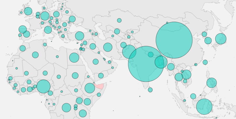
Visualizing population by country using circles on a map! Enrollment is now open for Stamen’s next Data Visualization Foundations class, scheduled for November of this year at Stamen Design. This hands-on class, which we developed with dataviz expert Curran Kelleher (author of the online platform for teaching & learning data visualization vizhub.com) will teach you...