In our last post looking back at the data visualization trends of the coronavirus pandemic, we focused mainly on charts and diagrams, and less on maps and cartography. By and large, the maps of the pandemic were predictable and familiar choropleths and proportional dot maps that did their jobs well and didn’t call attention to themselves. Inevitably, though, there were many examples of misleading maps that failed to follow the cartographic rules, or of maps that were widely misread by the public.
In this post we’ll look at a few of those maps gone wrong, and also look at some very well-done maps that pushed the limits of what we expect from pandemic cartography.
Dot Maps Misinterpreted
In our last post we discussed the popular Johns Hopkins coronavirus dashboard, which, despite being one of the most reliable sources of COVID data and charts, also had one of the most misinterpreted COVID maps. At times it felt like everyone on social media who works with maps found themselves at some point explaining to people how they were reading it wrong (we’re looking at you Lyzi Diamond and Alberto Cairo), ourselves included.
The main problem with the map was its inconsistent level of detail (showing counties in the US, but whole provinces in Canada) that gave many people an incorrect impression of the situation on either side of the border.
Pulitzer Prize winning journalist Laurie Garrett wrote:
“There is one place in the world where a map of #COVID19 cases & deaths reveals a straight line, with a huge amount of disease on one side, very little on the other. Where? The 3000+ mile border [between] US/Canada”.
While Garrett is correct that the spread of COVID was massively worse in the United States than in Canada, that’s not why the map looks like that. The following chart makes the case more persuasively and accurately:
So what’s happening in that map? What is it actually showing? The map uses proportional symbols (the red dots), and in the US it has cases broken out by county, so there are lots of tiny dots spread out through the US. But for Canada the cases are aggregated by province, so there is only one dot in the center of each province. This gives the impression that the COVID cases stop at the border, which they do not. In actuality most of the Canadian cases would be clustered right along the north side of the border too, if we had them mapped more precisely than the provincial level.
The Johns Hopkins map gives the impression that Canada has only a few COVID hotspots, and those are scattered far away from the border, but this is not true. The data on the map is not wrong, but it is very misleading. Imagine if the tables were turned: if Canada’s rate were twice the US, but it was still only mapped by province in Canada and by county in the US, you would still see more red on the map in the US and think things were worse here.
In some cases, it’s better to tell the story with a chart, not a map.
Update: I went into more detail about how different levels of aggregation lead to very different results in a twitter thread here:
Choropleth maps gone wrong
One widely shared map example came from Georgia, held up as an example of “lying with statistics” that deliberately manipulated the classifications on their choropleth maps to hide worsening numbers. (For more about choropleths, check out our recent post by Curran Kelleher, “Some thoughts on multivariate maps”).
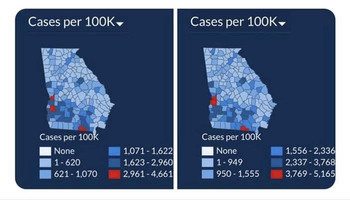
These Georgia maps were criticized in two ways: first, that the colors never changed, despite worsening numbers. However, this could just as easily have been the result of using the defaults in their GIS program. Even if the map maker had wanted to maintain the same class buckets, they would have needed to keep adding new colors to the map, pushing into different parts of the color spectrum as the number of cases skyrocketed beyond what anyone could have predicted at the start of the pandemic. Weather maps have the same problem, as climate change brings storms and heat waves that produce unprecedented temperatures and rainfall, requiring cartographers to add new colors to the end of their color scales.
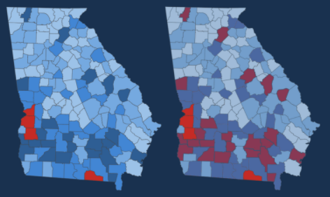
Others critiqued the choice of colors of the map (a more convincing argument) which used calming blue colors for every class break except for the top bucket, which used red. A more accurate color ramp should have used a more gradual gradient from blue to red, as illustrated in this remake:
While it’s true that Georgia Governor Kemp’s administration was caught manipulating their weekly case numbers to make the pandemic in the state seem less severe, it’s not clear if the decisions made on these maps were part of that agenda, or just very poor design choices. Finally, Adam Pearce noted that the map had a line chart right next to it, which somewhat undermines the argument that the visualization is trying to hide the data.
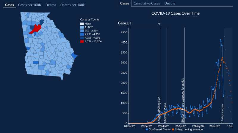
This observation should give all of us pause; at Stamen we frequently combine maps and charts, especially when we think just one without the other can’t tell the whole story. In fact, we pride ourselves on that being something we almost always do, and we feel good about the fact that we’re giving the viewer a more nuanced picture by presenting all those possible perspectives. But seeing this outrage by people who look at a map out of context without considering the entire interface should be a lesson to all of us who make data dashboards.
Now almost a year later, did Georgia’s map makers take this criticism to heart? Well, it seems they got the memo. The map now has a new legend, and today’s map of cases doesn’t even use any blue color and has, um, a lot more red.
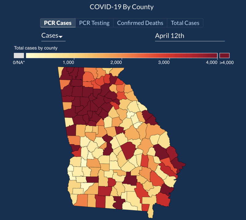
Mapping the progression of time
A lot of the controversy about the Georgia map can be traced back to the fundamental difficulty of showing time on a static map. Geographic maps are great at showing variation across two or three spatial dimensions, but with this strength comes a great weakness in representing the temporal dimension. This is why we devoted so much of our attention to time series charts during the pandemic, and not maps. Trying to understand change over time is especially problematic when we try to compare the legends on static maps created on two different days, as with the Georgia maps: these maps were simply not designed to be compared in that way!
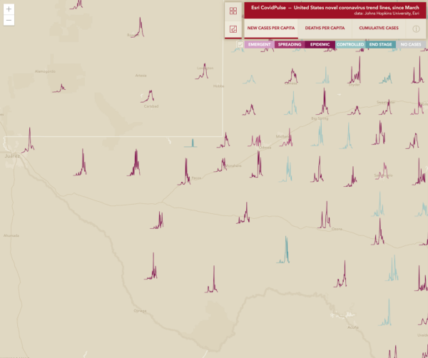
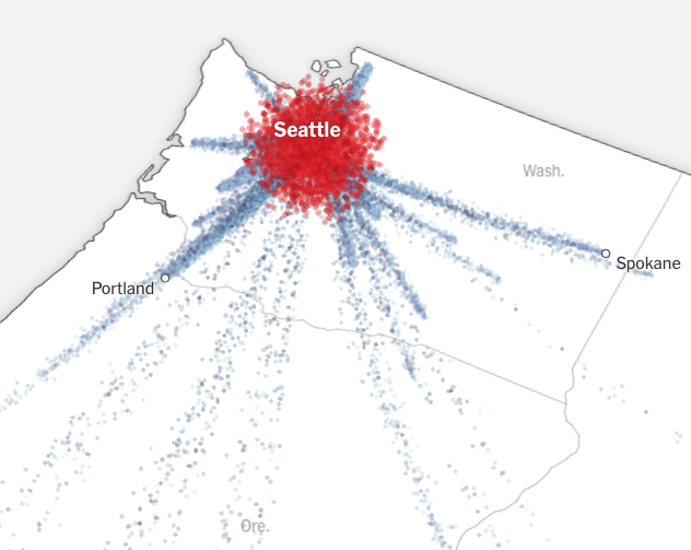
Despite the inherent challenges, we appreciated the few maps that went beyond simple choropleths and dots, and attempted to communicate temporal change on a map. Two very different examples we liked were the Esri CovidPulse map that packed in more information with tiny sparkline charts for each state or county, and the New York Times’s use of evocative bug-like map markers to tell a map-based narrative of the virus’s spread:
Sometimes, you just need to make a map into an animation. Our friends at Pitch Interactive built a striking time-lapse choropleth map for Big Local News with a fantastic dynamic legend that shows what happens if you wisely choose a color scheme that can work with the range of values for every day in your dataset, not just for a single day’s range. (Here’s a grainy gif; you should really click through to the source for the best experience:)
Another excellent example in the genre of animated maps was by a video by David Waldron, which combines several tricks to help aid comprehension of a fast-moving, complex phenomenon where lots of things are happening at once:
The first thing you notice is the glowing “firefly” effect of the highest-density areas, which is not just a flashy bit of bling, but also helps the eye notice patterns and new peaks across the whole map, even when you’re not looking directly at the spot where a peak occurs. The subtle annotations calling out the names of places on the map are also carefully chosen to serve both as geographic orientation, but again as indications where something important is happening on the map that you should look at. Finally, the use of the calendar in the upper right corner not only grounds the animation in a specific passage of time, but doesn’t require the reader to look directly at a rapidly-changing string of text to orient themselves temporally, as many less-refined animated maps often do. Very well done!
Understanding the scale of the tragedy with map metaphors
As we mentioned in our previous post, creating visualizations of a global pandemic can risk losing track of the lived experiences and tragedies of people who contracted COVID or who lost a loved one to the disease. Not only can we lose track of individual stories in the heaps of charts and statistics, as readers we can also become overwhelmed with numbers that are too large to comprehend. As the death toll in the US passed 100,000, then 200,000, then 500,000, cartographers and data visualizers attempted to communicate the scale of the loss in novel and somber ways.
In a way, maps have a unique advantage in visualizations of scale, especially when they can be connected to the places where the map reader lives, using distances and areas they are familiar with. By building on the direct experience we all have with our immediate surroundings (such as the town or city we live in, the distances we travel on a daily basis) maps can use spatial metaphors to make large numbers feel more understandable.
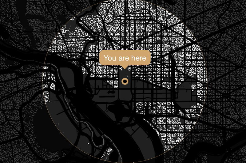
Some of the best examples of this type were made by the Washington Post, first in September to mark the passage through the threshold of 200,000 deaths in the US, and again at the 500,000 death mark in February 2021. The first visualization was an interactive map where the user would input their location and the map would draw a radius around their position that would encompass 200,000 people:
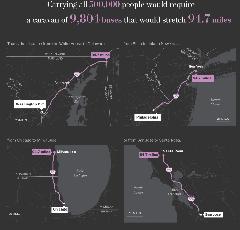
The later article used a series of static maps showing how many buses parked end to end would be necessary to carry 500,000 people, and how long that caravan would stretch:
Stamen’s maps of the pandemic
We’d be remiss if we didn’t mention our own COVID visualization projects, all of which involved maps in some way.
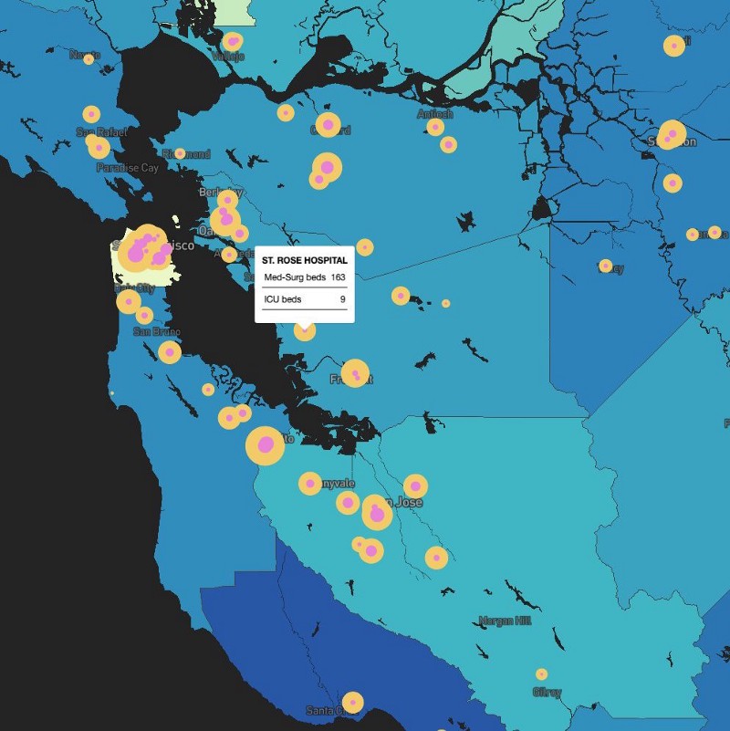
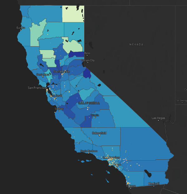
At the start of the lockdowns, we watched hospitals overflowing in places like Italy and in New York City, we searched for related hospital data closer to home in California. Stamen alum Logan Williams made a quick map of hospital capacity in California, finding that California has just 1.8 hospital beds per 1000 people, less than most US states and far less than most developed countries (South Korea has 12.3, for example). We shared the rough map in an attempt to answer “What parts of the state have less capacity than others? And where are all the facilities that take care of us?”
Of course, at the time others were working with the same data, and we particularly admire this work from ProPublica in a similar vein: Are Hospitals Near Me Ready for Coronavirus? Here Are Nine Different Scenarios.
Some of our projects already in flight needed to adapt to the new reality of the pandemic. Our project to build the California Health Atlas for UCSF had some new COVID datasets added right before its launch in April. You can read more about it on our blog here: “UCSF Health Atlas: COVID-19 health data viewed through a local lens”
Our biggest pandemic project was with the COVID-19 Mobility Data Network and the Data for Good team at Facebook, visualizing the effect of lockdowns across the United States. We worked extra hours to launch a project in weeks that normally would have taken us months, and we’re extremely proud of the results. In the following months we continued to expand on that work, making it international with the addition of 14 more countries and new datasets showing lockdowns around the world. You can view the live site at visualization.covid19mobility.org, and read more about it on our blog post “How we approached building Movement Trends with Facebook Data for Good and the Covid-19 Mobility Data Network”. For some behind-the-scenes details of the mapping tools we used, check out our presentation at the NACIS cartography conference.
What have we learned? What’s next?
Looking back, it’s heartening to see some inspiring examples of cartographic innovation, even while we wade through case after case of misused or misinterpreted maps. Most of those errors are sadly predictable, so much so that Kenneth Field was out ahead of the curve in February 2020 with “Mapping coronavirus, responsibly”, an overview of all the cartographic rules that were already being broken. We can hope that in times of crisis when the public demand for maps (good ones and bad ones) grows dramatically, that discussions like these will lead to a more curious and cartographically literate public in the future.
Going forward, we’re sure we’ll keep coming across the occasional surprising new COVID map or thought-provoking analysis, such as the New York Times’s recent rundown of the chaotic hodge-podge of colors used by states to communicate COVID restrictions. And of course we’re always looking for ways we can help people better understand and communicate with their data. If you’d like to work with us on your data visualization or mapping project, please get in touch!

