Every once in a while I like to write a blog post outlining what I’ve been up to over the previous few years here at Stamen Design. Last year (2023) I reached a bigger milestone with the studio, having been with the studio for an entire decade. Wow!
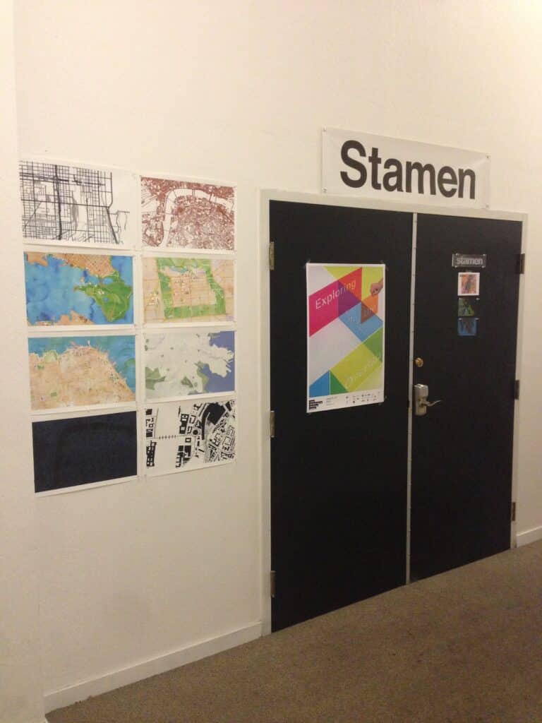
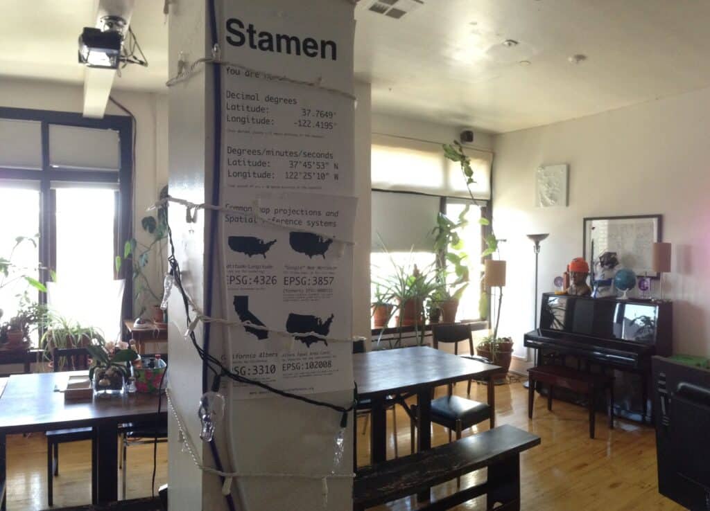
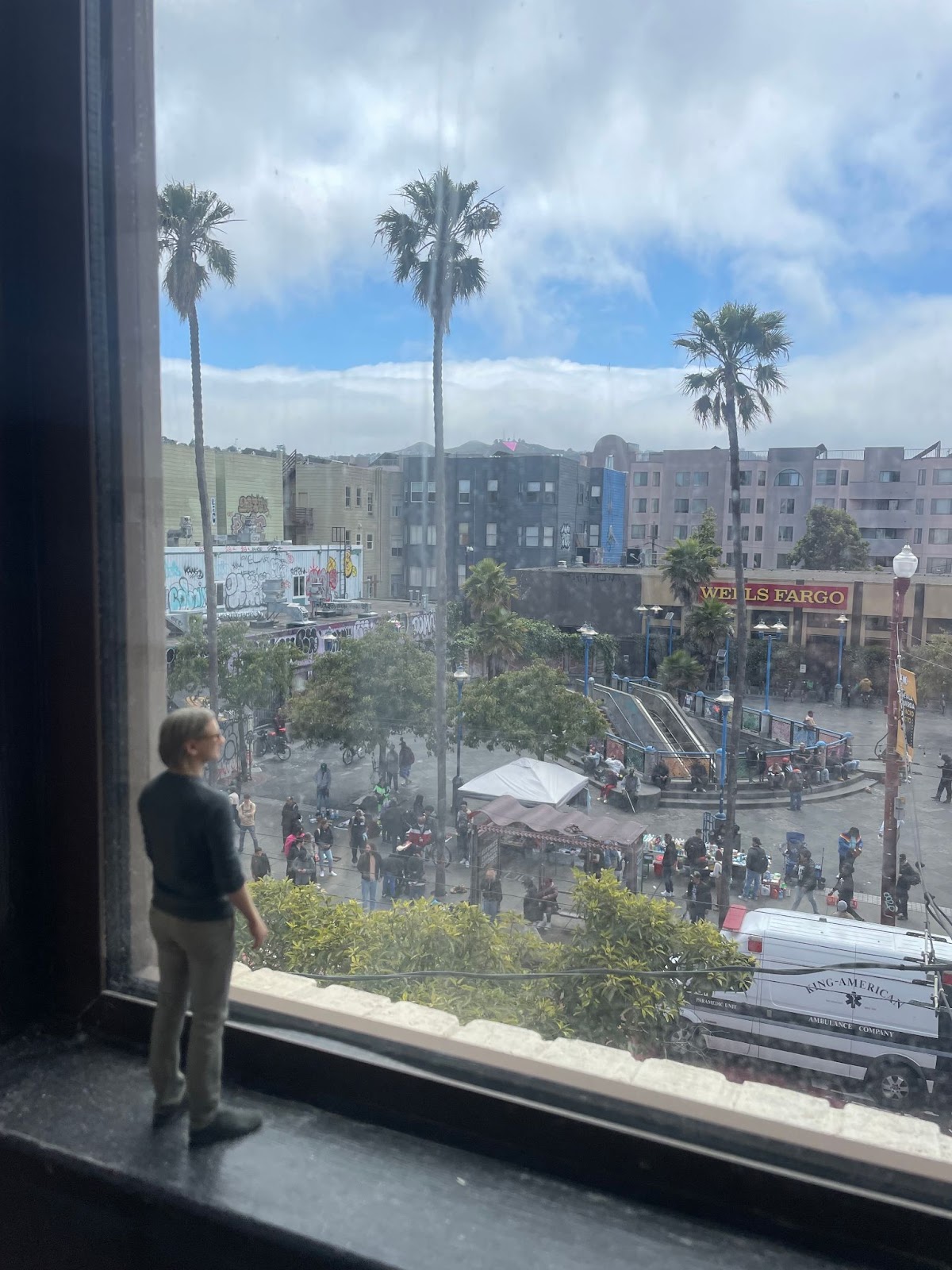
Most of the time, it feels like the years have flown past in a blink. I still vividly remember those days in 2013 when I first started at Stamen (a company I had admired for years earlier, and referenced in my grad school research on crowdsourced map making). I’d been lucky to start talking with people from Stamen even before I started working there, chatting with Rosy Schechter (later co-founder of Maptime) at the State of the Map conference in 2013, and attending the weekly “geobreakfast” gatherings hosted by Mike Migurski. When I finally landed a job at Stamen and started working in that beautiful, plant-filled, map-steeped studio overlooking the plaza at 16th and Mission, I felt like I was in some fantastical elite science lab at the epicenter of everything I was interested in.
I’m not trying to say “wow how cool it was that I was in the right place at the right time”, although I certainly feel lucky. Really I want to say that, even then, it felt like so much cool stuff had already happened. Many of the people whose work I admired–Migurski, Nathaniel Kelso, Sha Hwang, Rachel Binx, Aaron Cope, and others–had already moved on from Stamen (become “alumni” in our studio parlance). There was of course endless opportunity to work on exciting new things, but I also felt a not-quite-sacred responsibility to carry on the important things that had come before, sometimes in spirit, and sometimes quite literally in terms of never-ending maintenance of open source code projects.
Stamen is certainly a Ship of Theseus, a metaphor we often come back to as a studio. Stamen goes through ups and downs, and people come and go and leave their imprint on the place, but something special about what Stamen is carries on.
Now I am the old-timer, I guess. The oldest plank in the ship other than the original, Eric Rodenbeck the founder. And so far our ship has stayed afloat.
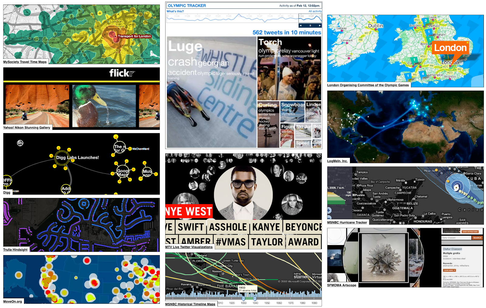
I’m not going to look back in detail over most of those previous ten years, since I’ve already written a few retrospectives like this one at earlier milestones. If you’re curious about all the work I’ve been involved with (even a tiny bit) over the years, please take a look at those earlier blog posts:
Project work
Since I last wrote a retrospective post two years ago, we wrapped up our long-running work with Meta to help them build their global map for Facebook based on OpenStreetMap (OSM). It’s great to see Meta continue to build on this work, and for them to continue supporting the open data ecosystem through their release of the Daylight data distribution. Our work with Meta started small (at first it was just me and one or two others from Stamen consulting on Facebook’s first explorations into how to use OSM to make a raster map), then grew into one of our biggest Stamen projects as the scale of the undertaking became apparent. Now we’ve delivered a beautiful map that is fully integrated into Meta’s infrastructure, which their own talented internal team can support and expand in the future.
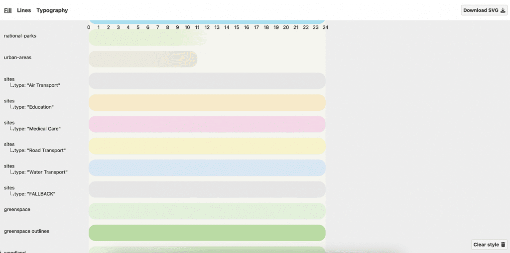
After that, we had another exciting opportunity to work with another major online platform, Amazon Web Services, release another suite of basemaps built on a fully open-data stack. We designed four map styles for Amazon Location Services, again using fully open data. These maps are available for anyone who is building applications on AWS who needs a map as part of their offering. There are two reference maps (in light and dark mode) and two cleaner, more minimal versions design for use underneath colorful dataviz overlays.
Through our experience with Meta, and then Amazon (and a few other clients along the way) we really started to realize what it was that was special that we were doing for these big organizations. The key way that Stamen provided value was by helping them understand the sheer complexity of the undertaking of creating their own basemaps, and guiding them through all the steps from database to data processing and on through cartographic styling and map rendering. Gradually the concept of “full stack cartography” started to form in our minds as a way to structure this process, and to explain to clients what we do and why they need our help. I feel lucky to have worked with my good friend Stephanie May during this period as we developed these thoughts with the help of the rest of our team. I’d known Stephanie since those early days before I even started at Stamen, where we were both web-mapping-adjacent academic cartographers attending those Friday “geobreakfasts” and rubbing shoulders with the techies who were actually building the stuff. Ten years later, after following parallel paths, we crossed paths again as colleagues at Stamen, and I owe a lot to her leadership and vision in making these big basemap projects come to fruition.
In the last couple of years, Stephanie and I both tried to put our “Full Stack Cartography” thoughts out into the world, through a mini-podcast interview with each other, an appearance on the Mapscaping podcast, a conference presentation, and a decision-making flow chart.
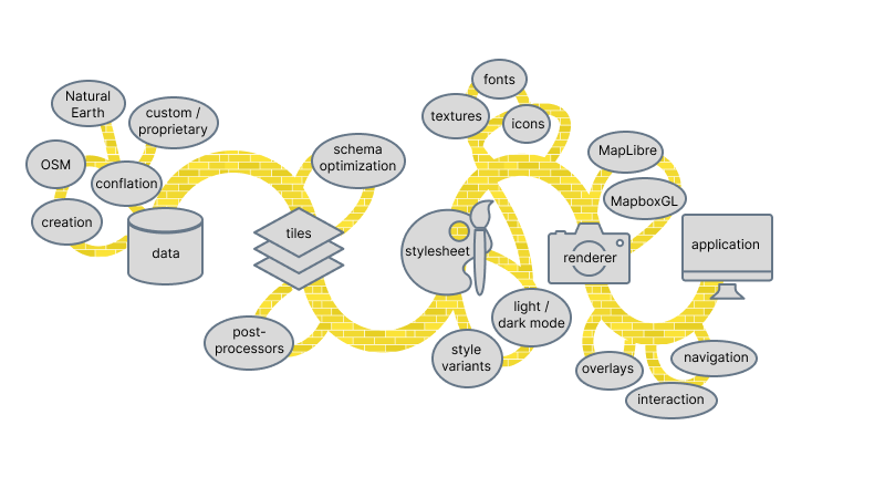
In conjunction with this focus on Full Stack Cartography, we’ve also been building out a lot of open source tools to help us be more efficient when designing and building open source maps from the ground up. Some of these tools like Maperture, Chartographer, Figmasset, we have talked about at various conferences and in blog posts already.
They say that naming things is one of the toughest parts of software development, but we are lucky that we’ve landed on pretty cool names for all these tools so far. While none of my suggestions ever get chosen as the winner, I’ve enjoyed running our internal Ranked Choice Voting polls among my teammates to pick the final names for these tools before we publish them. I guess my personal love of bizarre backronyms and recursive acronyms is not shared by my colleagues. 🙂 Nobody liked “FACE: Figma App for Cartographic Embeds” or “MAPTOOL: Maptool, A Program To Observe Overlay Layers” or “MONSTERA: Map Object Notation and Stylesheet Templates for Efficient Repeatable Assembly”!
While I’ve mostly been working on our big basemap design work, I’ve also contributed to the mapping on some other projects that I’m really pleased with. As a couple of examples that illustrate the breadth of things we get to work on at Stamen:
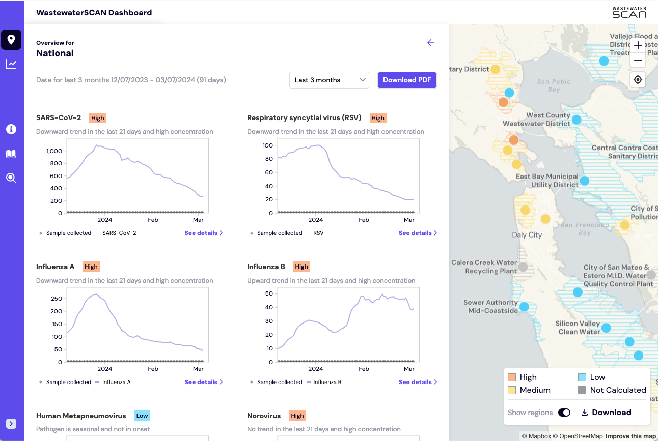
We built an interactive dashboard that visualizes traces of COVID and other pathogens in sewer wastewater at sites all across the country. This project with the WastewaterSCAN group shows that coronavirus remains a threat, even though it has receded from the daily headlines and most people are back to living their lives as though we are all back to normal. With decreasing rates of people testing for COVID, and more and more people having asymptomatic infections, it has become extremely hard for public health workers to get an accurate picture of how prevalent COVID still is. That’s where wastewater testing comes in, as the only really reliable and objective metric we have to monitor the spread of the COVID virus through our communities. And now WastewaterSCAN is expanding their approach to test for even more kinds of pathogens. This is not our first project mapping COVID and the impact of the pandemic (and I’ve also written a roundup analyzing a lot of other people’s covid maps too) and it’s so interesting to see how the data analysis needs (and hence the data visualization needs) have changed so dramatically over just a few years.
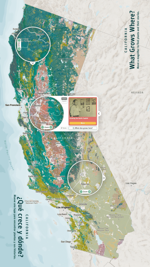
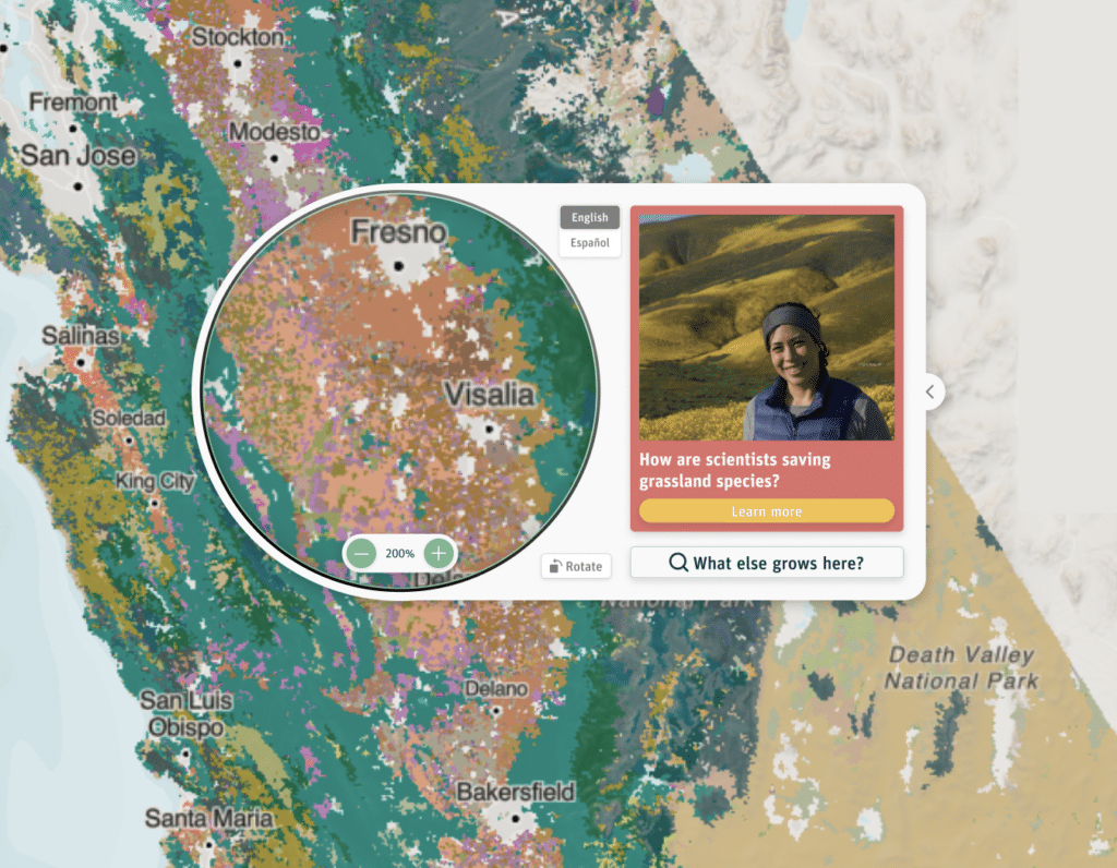
We also designed a very cool interactive map exhibit for the Exploratorium museum in San Francisco, all about the complex plant ecosystems in California. We had to design a map for a 65 inch touchscreen, which required us to totally re-evaluate most of our assumptions about labels, sizes, and the level of detail we could show, given that people would be interacting with the map at a completely different scale than the phones and laptop screens we’re normally used to. Also, because multiple people might be interacting with the map at the same time, we couldn’t let anyone zoom in on the whole map like we normally allow on a web-based map. Instead the map has a virtual magnifying glass effect that people can use to inspect the map in detail without distracting other museum guests who might be examining another part of the map at the other end of the table.
I especially want to credit my fellow cartographer Kelsey Taylor for doing a lot of the mapping on those projects (and many others). After most of my early years at Stamen as the only official “cartographer”, it’s been very fun and satisfying to have more mapping colleagues like Kelsey and Ross Thorn who I can directly collaborate with on cartographic styling.
As always there were quite a few really big and exciting projects we worked on that were for our clients’ internal use and sadly I can’t share any details about them. Such is the nature of our work sometimes. There have also been a lot of other excellent public projects we launched in the last few years, but if I didn’t work on them directly, I haven’t mentioned them here. You can check out the Stamen blog to learn more about the great things my colleagues have been working on.
Blogs, podcasts, and more
Speaking of the blog, we tried to keep it thought provoking and also fun over there, with occasional silly content like our first (and probably only) annual OpenStreetMap Oscars which I organized with Ross Thorn.
We also collected our favorite maps that people made using our basemaps as part of the 30 Day Map Challenge, which you can peruse here. (I’m very jealous of those people who managed to make a brand new map every day.)
Even more exciting along those lines, is that we launched our own Stamen podcast at the end of 2021. Ross was the one doing all the work holding the podcast together, but I got to be involved as one of the early interviewees, where Ross and I had a fun conversation about the concept of what actually is a basemap, leading to some cool realizations like the fact that when you’re designing a global basemap you’re effectively creating maps of places that you’ve never even looked at. Read more about that interview and either listen to the episode or read the transcript here: “Alan McConchie & the Maps Underneath“
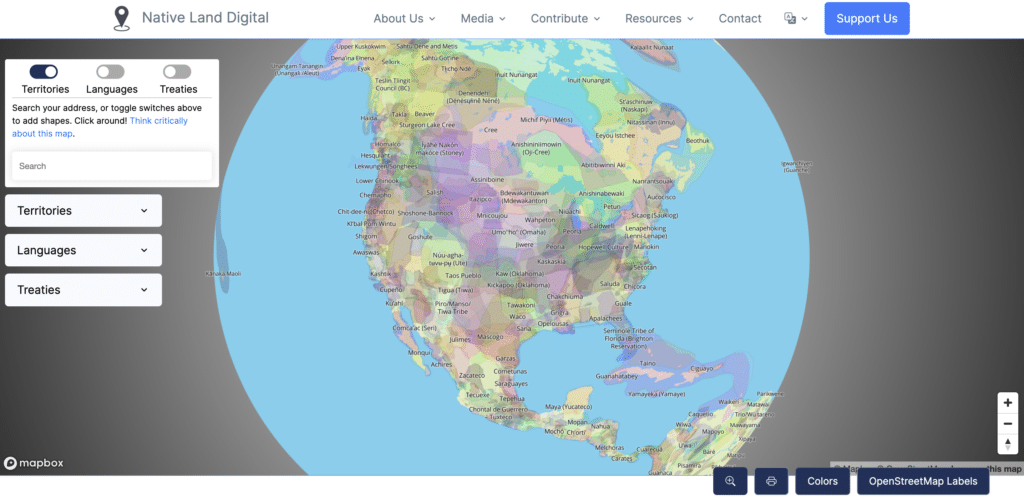
Later on in the second season of our podcast, I was the interviewer on an episode with Tanya Ruka, the Executive Director of Native Land Digital. I’ve been a huge fan of the native-land.ca website for years, and it was great to talk with Tanya about the fascinating challenges and opportunities in making a global map of indigenous territories and languages all using open source tools. The episode along with its transcript is here: “Tanya Ruka & Mapping Native Lands“
On the topic of podcasts, I also got to be a guest on the Mapscaping podcast hosted by Daniel O’Donohue. We talked about “full stack cartography” (which I talked more about above) and in particular this conversation ended up being structured in a really practical, easy to understand way where we walked through the step-by-step process of all the design decisions that need to be made from start to finish in the process of building a map. Listen to the episode here: “Full Stack Cartography – Think Like a Designer for Better Maps”
Another blog post I wrote that had nothing to do with client work was an obsessive deep-dive into a recent cartography trend of adding gigantic dramatic shadows to maps using high-resolution digital terrain models. While that may sound boring at first, just take a look at some of these beautiful, delicious maps that people have been making with this new technique.
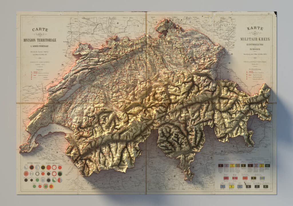
When you first see a map like this, it’s stunning, but after you’ve seen a thousand of them, well, they’re still pretty stunning, but you start to wonder why these maps have become so ubiquitous in just a few years. In my post, I try to explain the confluence of data and software that makes these maps (relatively) easy to make these days, and I offer a few thoughts on where we could take this trend next. You can read the whole thing here: “Shadows on maps are getting a lot more exciting, and here’s why”.
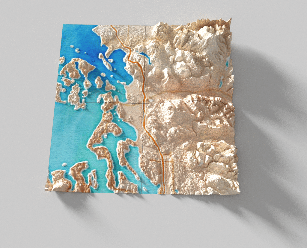
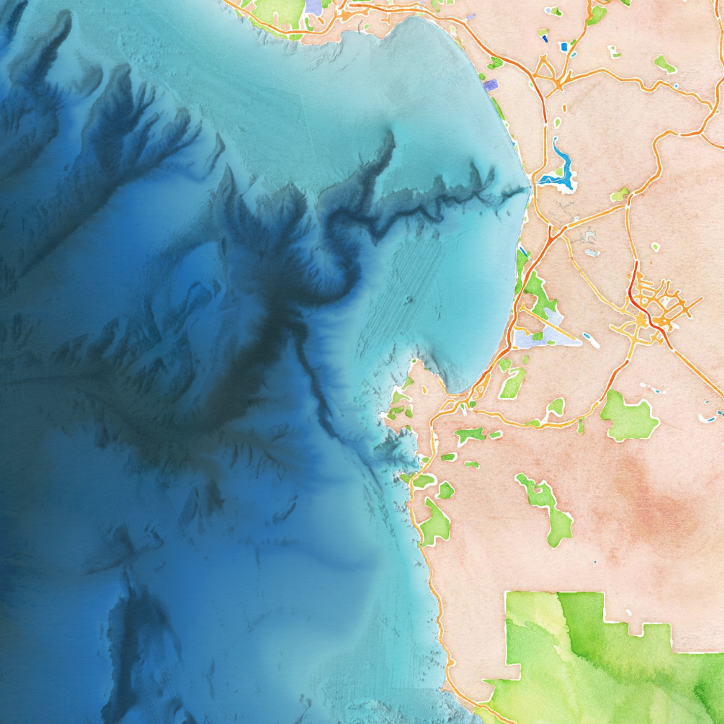
I’ve only had the chance to use these “Blender maps” in one public Stamen project so far, a bathymetric map of the coastline off of Santa Cruz. Read more about that project in “Mapping the endangered California coast”.
And as always, one of the great pleasures of working at Stamen is having extremely talented colleagues, and especially, prompting them to make fun quick projects that would take me too long to implement myself. For example, in my last roundup post I mentioned how I prompted Eric Brelsford to make the “scale-o-tron” tool, and this last year it seems that Damon Burgett was my go-to partner in crime for instantly turning a simple ridiculous idea into reality. He built an app that lets you carve a jack-o-lantern out of a globe, and after a brief afternoon conversation about a recent post by ESRI’s John Nelson, Damon quickly whipped up a demo about how we could do the same thing using Mapbox, leading to another blog post about “More ways to make your maps go Dark Mode”.
Stamen transitions
The last two years have seen some very big transitions for Stamen as a whole. As a team it was time for us to say goodbye to some very fundamental aspects of how we work and how we presented ourselves to the world.
After several years working remotely as a team, we finally decided we were never going back to in-person office life and it was time to shut down our physical space at 16th and Mission for good. Eric wrote a little about that transition here. We had one last gathering in San Francisco, and when we were done we packed up the books, pulled the maps from the walls, and distributed the plants to everybody’s homes. The end of an era.

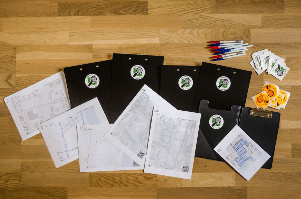
We also found new virtual homes for some very long-running software projects that we had been hosting for many years. Supporting free software is an exhausting effort over the long run, especially when it involves online services that need to be kept running. One of these was Field Papers, a website that lets you create printed maps designed for offline data collection for OpenStreetMap. It was a satisfying moment to finally flip the switch and hand off the Field Papers system to the OpenStreetMap US organization, who are much better suited to take care of it for the next generation of volunteer mappers. Long live Field Papers!
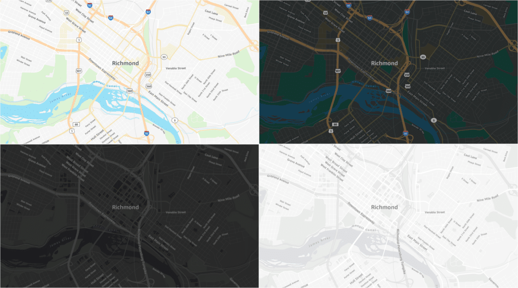
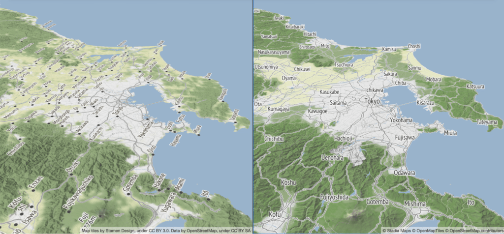
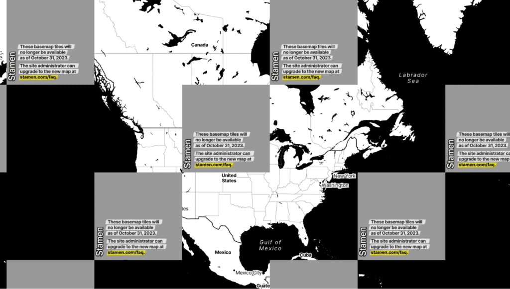
We also had a similar issue with our beloved OpenStreetMap-based basemaps, known as Toner, Terrain, and Watercolor. We were providing those maps as a free service for the public for over a decade, and while we were proud of all the innovative ways people used them, and the important websites we helped support with that service, the map tiles themselves were showing their age. The servers that rendered those tiles were becoming increasingly obsolete and harder to maintain, and the costs of supporting the service always weighed heavily on our small design studio of just a dozen staff. Luckily, we found a partnership with the team at Stadia Maps and worked with them over the course of 2023 to rebuild our maps from scratch on their modern infrastructure. We transitioned the responsibility of hosting those tiles to Stadia, allowing them to do what they do best, and letting Stamen focus on our strengths of designing and building new maps for our clients.
This transition was a huge lift, and it’s a relief to have it done (although stay tuned for more collaborations with Stadia in the future)! You can tell how much work it was by how many blog posts we wrote about the Stadia transition:
- Here comes the future of Stamen Maps
- What’s next for Stamen Maps
- The end of the road for Stamen’s legacy map tiles
- Familiar maps, brand new data
- Harnessing modern vector cartography
- Terrain behind the scenes
- And finally: Helvetica is more than a font, it’s a state of mind
Random side projects along the way
Also always, there’s a bit of stuff that doesn’t fit anywhere else.
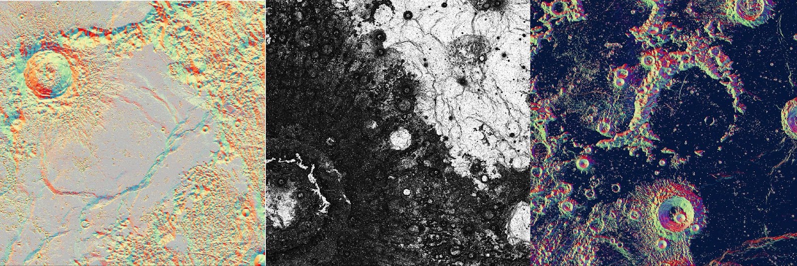
I made some maps of lunar terrain, but I can no longer remember why:
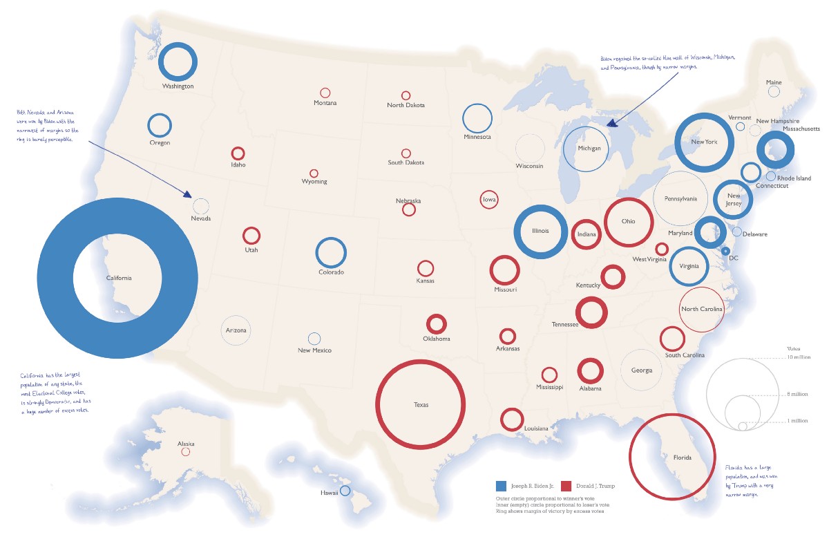
My “election ring map” concept, which I talked about in my year eight post, ended up in Ken Field’s book “101 Inspiring Ways to Visualise Empirical Data”. Read more at “The Election Ring Map sneaks into Ken Field’s new “Thematic Mapping” textbook”.
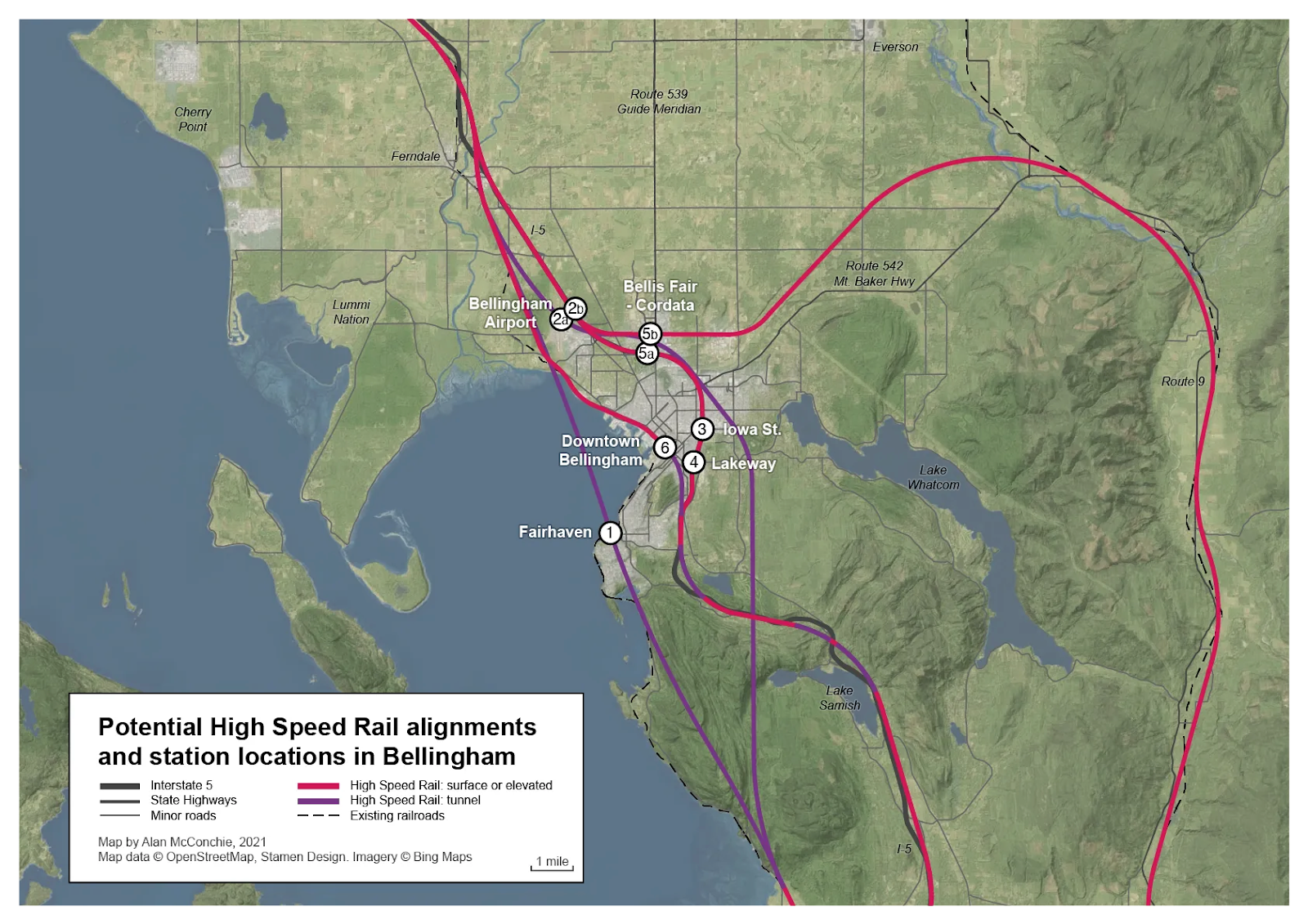
I spent far too long on one of my personal obsessions, planning for High Speed Rail in the Cascadia corridor. In particular, I wanted to figure out how and where a potential HSR line could navigate the tricky terrain around my hometown: “Cascadia High Speed Rail in Bellingham: thoughts on station locations”. If I ever retire, I’d probably spend most of my time making more maps like these.
Where to keep up with what’s next…
That’s all for now. I look forward to having more interesting maps to share with you in the coming months and years.
You may also notice in this post that I’ve linked to Mastodon a few times where I previously would have linked to Twitter. While I used to be an avid Twitter user (the personal networks I developed there were a significant contributor to landing my current job!) the site is a shadow of its former self, and has been falling apart under the new ownership… but that’s a discussion for another time. For now I’m happy on Mastodon (my account is subdued.social/@alan) which is like a decentralized, non-commercial version of Twitter, and I’ve also got Stamen set up with a Mastodon account too, at vis.social/@stamen. Give us a follow over there for more updates, or you can still find us on most of the other usual places, including some of the other new platforms like Bluesky or Threads. Keep in touch!