
Remote dataviz & maps in the cloud
2022 was our first full year at Stamen being really remote. We’ve been out of our beautiful San Francisco office since the beginning of the COVID-19 pandemic, which I’ve reflected on before, but for the first year or two, we all assumed being remote was temporary. 2021 saw people use the studio space intermittently and presented new challenges to a hybrid approach to being remote. 2022 was the first year that together as a team, we fully embraced the idea that we were likely never going to have or need a physical space again for our operations. We leaned into the idea that we’re a 99% remote company in this new era, that remote is not in-person-lite but its own unique way of working, and that we wanted and needed to get really really good at it.
I think a full explication of how our work and relationships have had to change in this new virtual world deserves it’s own post, but here are a couple of things that’ve changed in how we show up for work at Stamen:
- Using tools like Figma for just about everything: meeting notes, project boards, brainstorming, collaboration. It’s got lots of different tools for this: timers, background music, emojis. Everything’s editable by everyone all at once in Figma, and this style of working, where everybody just piles on and adds & modifies others’ work suits our collaborative style.
- Finding ways to make sure that we’ve got alignment on important issues & things we want to change. Where before we’d just get into conversation around the lunch table, now we’ve got to be a bit more formal about it, and we’ve started forming task forces to address various issues. Remote Life, Stamen is a Ship of Theseus, Brass Tacks are some of the ones we’ve deployed over the last year or two, and these groups are empowered to conduct experiments and measure the results to help us work better together.
- Be honest, be up front, don’t be afraid to say what’s really going on. Here’s an example: I have a hard time standing still sometimes, especially when I’m in back to back zoom meetings; I just need to move around a bit and start to feel trapped into needing to present as a captive talking head on Zoom. So I’ve asked a couple of times during meetings: “Is it OK if I walk around? I can’t sit still. Or I can turn my video off.” It sounds a little silly, but it’s an important principle we’ve learned: if you need something, ask for it. It’s OK to walk around. It’s OK if kids/dogs/contractors/partners make noise when you’re on your call. Ask for what you need.
Despite the shifting nature of how we met as a team daily, we still showed up and delivered on an incredible scale for our clients in this new season of Stamen.
The breadth and depth of our work, and client roster, continues to impress me. Our team has grown, expanding with it the programs we are able to offer to clients. As is the nature of client services, we’re not able to share much of the exciting work we did in 2022, but what we have summarized exemplifies the high quality of design, innovation, function, and purpose that is at the heart of every project, whether for a client or internal to Stamen.
Here’s some of what we got up to last year:
Advancing data-driven decision making in emergencies with CrisisReady

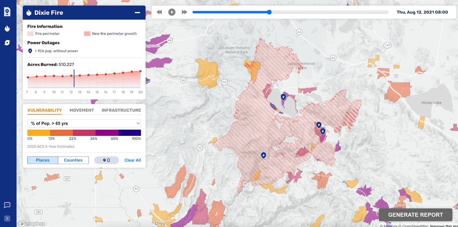
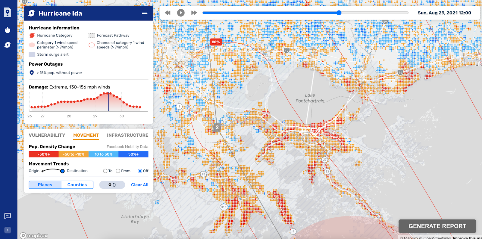
CrisisReady is a consortium of doctors who work with Stanford and Harvard Universities. Their work supports and sustains the practical engagement of academic researchers in response to disasters and public health emergencies. We worked with them to develop interfaces for on-the-ground responders to use during emergencies like last season’s California wildfires, which are unfortunately increasing in frequency and intensity.
The specific use case CrisisReady asked us to solve was at the intersection of fast-moving fires on the one hand, and the locations and densities of vulnerable populations who would be impacted by the fires. Populations especially vulnerable to fires are those who have medical conditions that require power to run things like dialysis machines and other life-saving equipment; first responders typically prioritize those populations over those that have more ability to move independently, even when they don’t have power. Questions the first responders need answers to are: will the fire block the road we need to use to get to a specific area? How many people are there, and what percentage of them are vulnerable?
CrisisReady’s parent organization is Direct Relief, who Stamen worked with at the beginning of the COVID-19 pandemic visualizing the movement of humans around the world relative to the baseline of movement in March 2020.
Exploring the use of a matrix view in wildlife ecology and land management
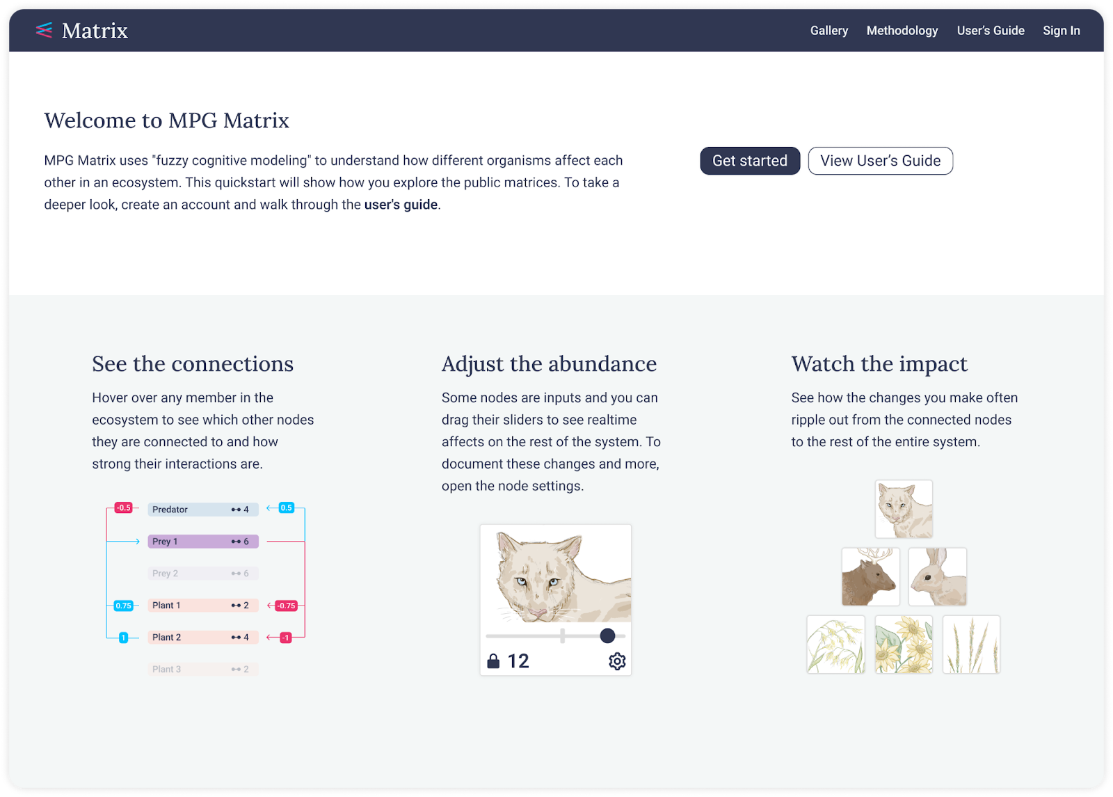
We’ve been working with the scientists at MPG Ranch since 2016, helping them build and define tools for use in their work restoring this 10,000 acre ranch in western Montana. Our latest project explores the use of a matrix view in wildlife ecology and land management. This project is part of our ongoing partnership with Dr. Dean Pearson, and it builds on our previous work to create tools that help researchers and practitioners better understand the complex interrelationships between different elements of an ecosystem.
The idea behind the matrix view is simple: to provide a comprehensive view of the inputs and outputs for a given ecosystem. By examining these relationships, scientists and practitioners can make more informed decisions about how to manage the land and its wildlife, from culling excess populations of certain species to restoring areas that have been damaged by overgrazing.
In addition to its use by scientists, we also developed an educational view of the matrix, tailored specifically for middle-schoolers! This makes it easy for students to understand the complex relationships between different elements of an ecosystem, helping to build a deeper appreciation for the environment and the importance of conservation efforts.
Building a better future: SCAN’s wastewater treatment plant tracking tool
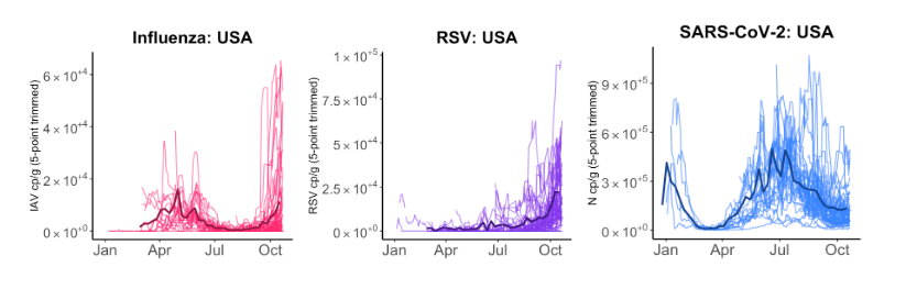
In January, we helped to launch a new tool on behalf of the Stanford-led SCAN Wastewater Consortium of Stanford University and Google engineers. This project came about in response to changing responses to the COVID-19 pandemic. Public health officials are increasingly reliant on samples from wastewater treatment plants, as these facilities provide a more reliable indicator of public health than hospital data. No one’s getting tested anymore, but everybody poops. You can’t make this shit up!
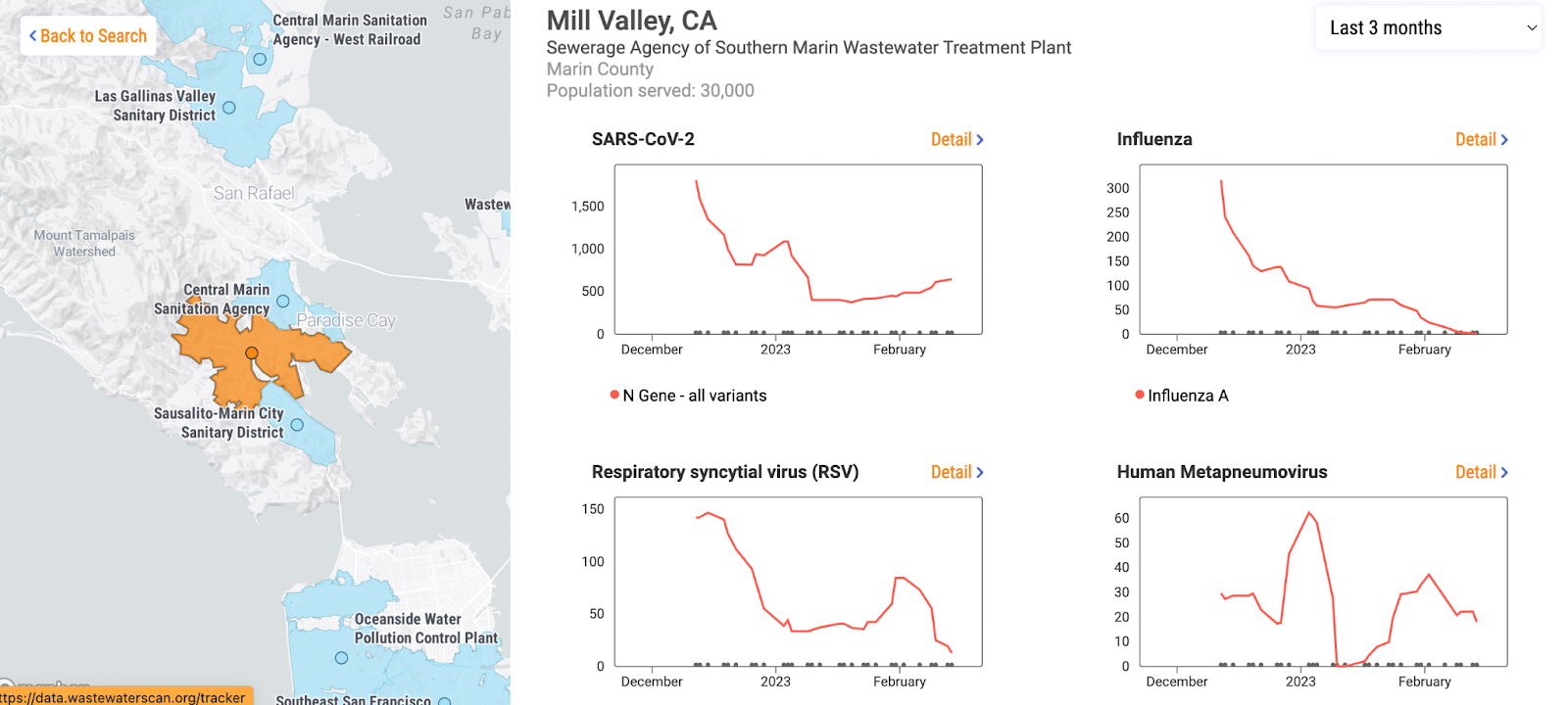
The Consortium’s tool initially tracked the spread of the coronavirus in the San Francisco Bay Area, but it has since expanded to include more than 130 additional sites and sewer shed polygons, as well as RSV, and other pathogens. This allows everyone to access the same type of telemetry and charting, making it easier for public health departments to monitor trends and take action when necessary.
In addition, the tool is designed to be flexible and scalable, so that new districts and health departments can be added as they come online. This aligns with the federal initiative to have each wastewater treatment system represented on the tool, and we’re working to ensure that it will continue to grow and evolve over time. Fundamentally it’s enabling conversations like this one:
Bringing data to life: partnership with True Ventures
I’m always looking for ways to help our clients tell compelling stories with data. That’s why I’m excited to have gotten to work with Jeff Veen from True Ventures, a VC firm that advises and funds startups on who and how to hire. The firm runs regular surveys of its membership, which includes over 200 startups, to gather data on health benefits, remote culture, and other topics.
It’s a double pleasure to work with Jeff, whom I’ve known from the early days of the web when we were both hopeful that the internet would be a force for good in the world. His Measure Map project, acquired by Google in 2005(!) was one of the first times I’d seen super high quality interaction and graphic design applied to web analytics, and it blew me away when I first saw it.
Jeff wanted a set of storytelling tools that would allow him to showcase the trends he was seeing in the survey data. Our team created a set of interactive visualizations that allow the firm’s internal stakeholders to explore the data in new and meaningful ways. For example, a COO of one of the startups in the firm’s portfolio can look at the data and see what other peers are doing at other companies when it comes to paid time off, company size, and other policies.
While the application is currently designed for internal use, the firm has plans to make it more public in the future. They see this as an opportunity to understand how the companies in their portfolio are changing over time, and to provide valuable insights to their members.
Partnering with Data for Good: a case study in emphasizing data utility
The fires that ravaged California were right at some of our doorsteps at Stamen. Having done a fair amount of disaster work over the years, one common theme we hear is that first responders are often hampered by a lack of access to data that they can use on the ground.
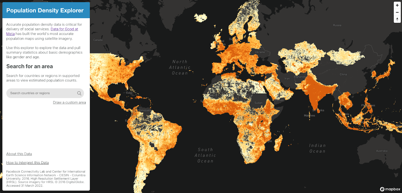
That’s one reason why we were particularly excited to have the opportunity to work with Data for Good, a non-profit organization dedicated to using data science to tackle pressing social issues. Our partnership with them goes back several years and they know us as a trusted partner in visualizing data, especially in the data for good landscape. Our work with health communications and nonprofit communications is also well-known to them.
Recently, we had the chance to work with Data for Good to use machine learning and satellite imagery to calculate more detailed population statistics, which is especially important in regions where it can be difficult to find accurate data. The data was available online through AWS and another humanitarian data exchange program, but for most people, it was not easily accessible.
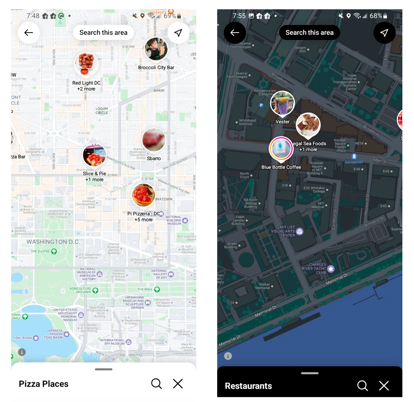
Data for Good wanted us to create a web portal that would allow people to easily visualize this data on the fly, not just at the regional and country level, but also generating custom polygons, an endeavor that can be tricky with raster data.
The data was complicated raster data that was difficult to process, and we needed to find a way to make it easily viewable on smartphones, as most people accessing this data would not have access to wifi. One of the biggest challenges we faced was data processing. We were excited to try out flatgeobuf to store the data, which allowed for quick computation to happen on the fly.
Meta: reflecting the purpose of a social map
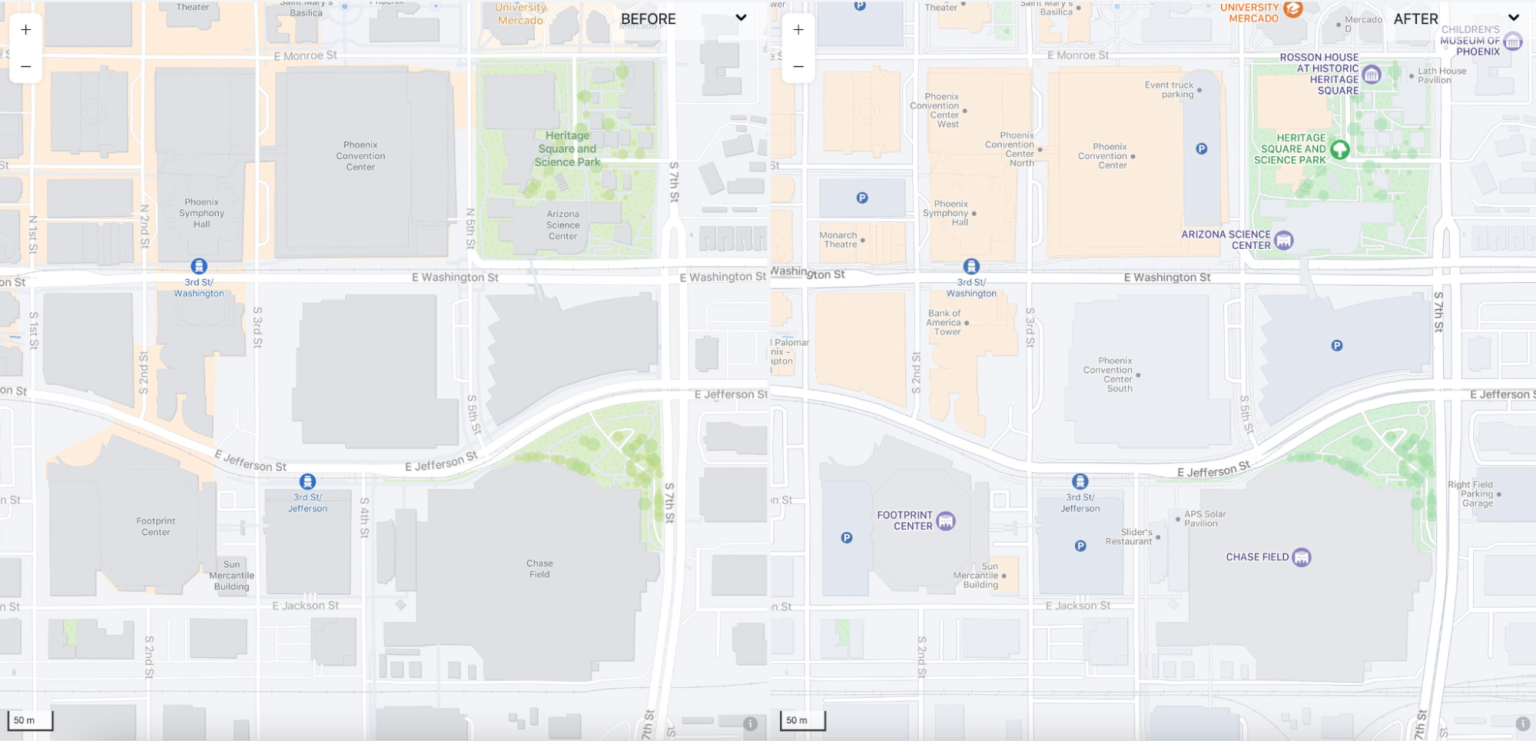
By design, we’re always looking to push the boundaries of what’s possible with maps at Stamen. This year, we were proud to continue our work on a unique project that challenged us to think about what a map can be when it’s not solely for navigation. Our team was tasked with designing a map for Facebook that would serve a different purpose: to facilitate social connections and reflect the priorities of a social media platform.
One of the key milestones of our project this year was a full color refresh. Our team reevaluated the colors used in the map and applied a muted palette to lighten the look and help address legibility issues with labels. We also changed the road colors, not for navigation but for a social media map, prioritizing what was important in a map meant for sharing on platforms like Facebook.
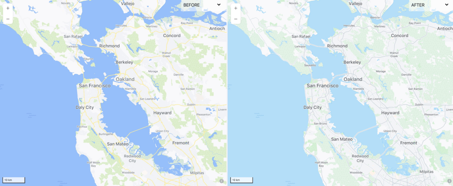
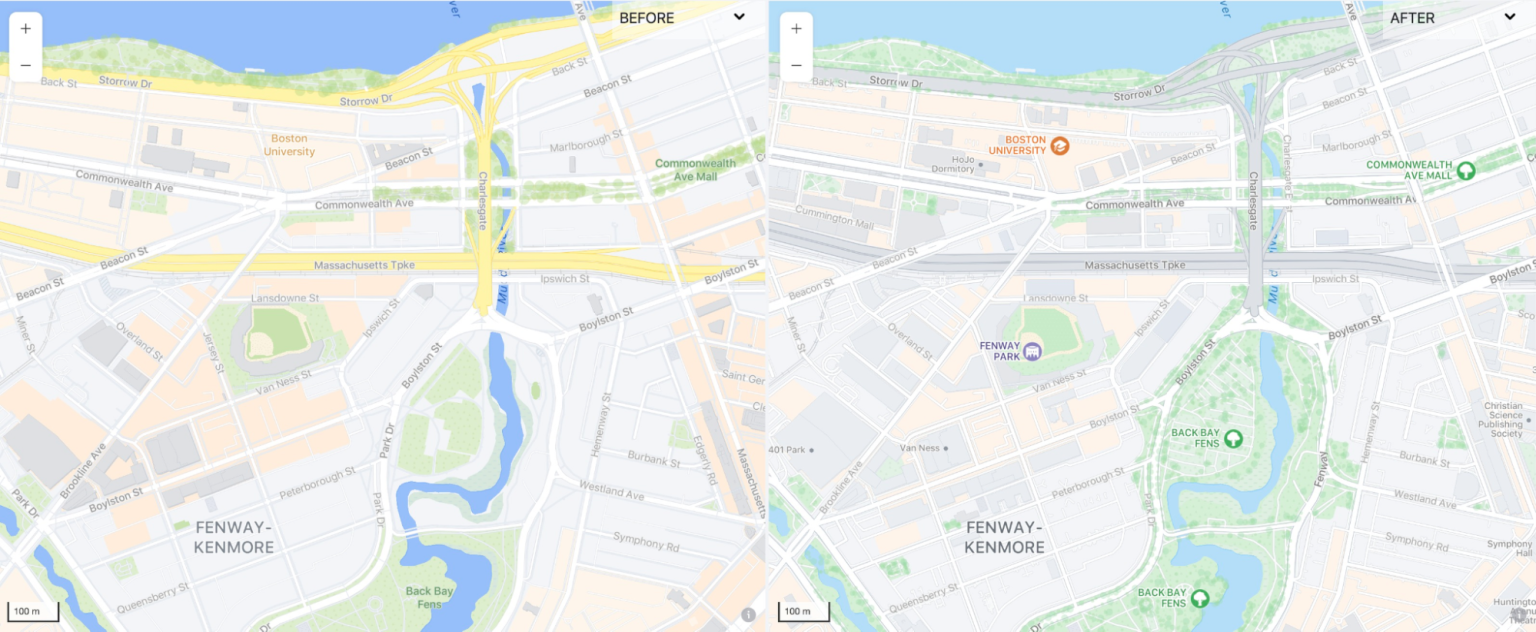
What can a map be when it isn’t focused on navigation? Instead, we designed it to be focused on the people using it. We made the roads gentler and lighter in color, opting for gray instead of bright yellow highways. This change helped to clear up the color space, making room for colorful icons from the places team to be integrated into the map.
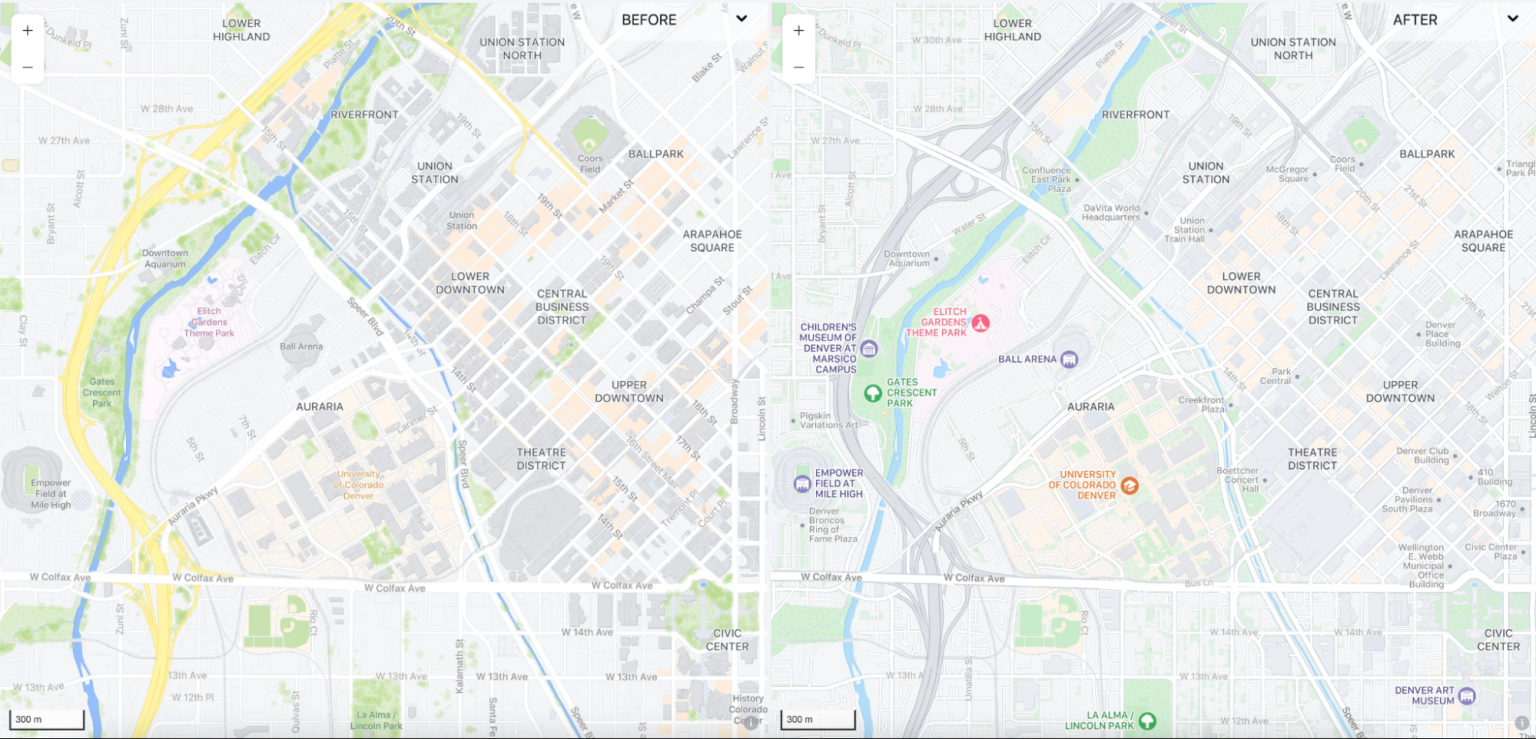
Facebook also depicts high traffic areas to highlight spots users might want to frequent. Previously, this was done with an orange background, but now at higher zooms where buildings often obscured these areas, the buildings themselves highlight popular areas for Facebook users.
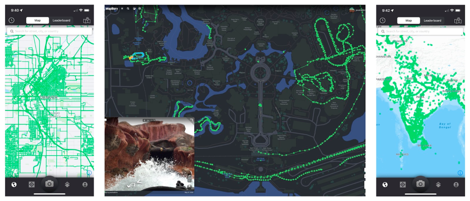
Our cartographic handiwork graces other surfaces apart from the typical Facebook timeline, such as the locator maps for Facebook’s Crisis Response which aid users in telling friends and family that they’re safe in times of trouble. The map also exists outside of Facebook in apps such as Mapillary, an open street-level imagery platform, and Instagram for Android. We kept these other contexts in mind while designing without compromising our commitment to the core Facebook application.
Checking in and connecting with businesses are important features of the map, and we tried to make this visually appealing by incorporating brighter colors and playful elements into the design. Our goal was to create a map that was lighthearted and reflective of the social connections enabled by the platform. Let us know if you think it works!
Carto tools: maps in the cloud
At Stamen we’re proud of our long history of developing our own tools for use across different projects, doing this out in the open, and making these tools free for others to use. Some examples include:
- Modest Maps, which got people up and running with maps on web pages
- Maps from Scratch, a workshop teaching people how to deploy a full rendering stack
- PolyMaps, a framework to break out of the ubiquity of the Web Mercator projection and other conventions (did you know that Mike Bostock, who went on to write the d3 rendering language now ubiquitous in the #dataviz community, spent a summer as a Stamen intern developing open source tools with us? Polymaps was the result)
- maps.stamen.com, free open source web maps based on OpenStreetMap, in three styles used in thousands of websites around the world, recently acquired by the Smithsonian
- Field Papers, a tool for creating printed maps of OpenStreetMap data for hand-drawn data collection in the field
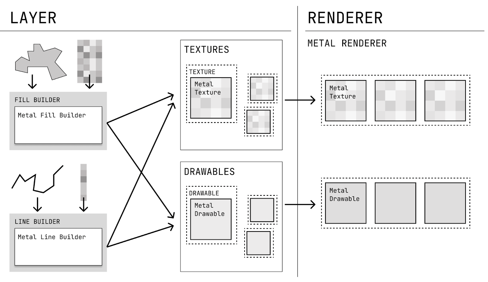
2022 was the year we got back to it, this time focusing on enabling distributed workflows through tooling so we can get underneath the mapping libraries, platforms and services we pioneered a decade ago. Hence: Carto Tools, our internal name for a growing set of best practices and tools that we’ve started using across the landscape of different clients to manage workflows that rely on cloud storage, real time rendering, loosely coupled APIs, and tightly aligned data standards.
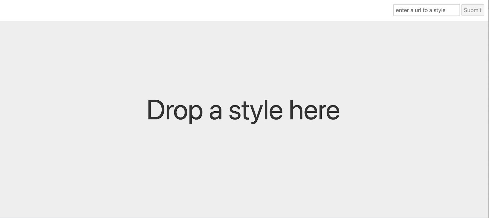
Chartographer is the first of these we’ve released publicly. It’s a way to visualize the way that different mapping elements in a design—roads, rivers, titles, fills, transitions—behave at different map scales, without having to look at the map at all those scales. It’s the kind of tool that we found ourselves often wanting when we designed maps in the cloud for custom tile stacks, but we couldn’t find one anywhere. Necessity being the mother of invention, we built it ourselves! Follow along on GitHub if you’re interested in what else we’re building.
Other tools in the Carto Tools family are Figmasset, which we talked about at the NACIS conference (more on that later in this post), and Maperture, which we haven’t blogged about yet, but which is already receiving code contributions and feature improvements from an enthusiastic open-source developer community. More to come.
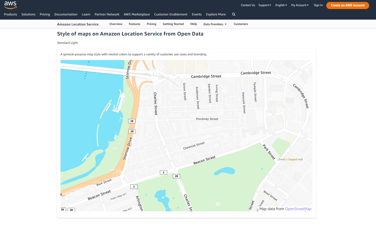
Amazon Location Service: Stamen style
Amazon Web Services does more than host data. In recent years, Amazon Location Service is increasingly providing APIs for customers to address common geospatial business cases like: geofencing, geocoding, managing business operations, or tracking where things are. It stands to reason that a company that knows exactly where your recent order is located can provide these services to others, and that’s exactly what they’re doing.
Stamen was brought in to design custom map styles to serve those business needs. The data largely comes from the Overture Maps Foundation, largely based on OpenStreetMap (OSM), and as we’ve been working with OSM data for some time now, we feel right at home. We love supporting the creation of more open data map stacks, delivering map styles custom designed with Amazon Location Service users in mind, and also teaching our clients to do it for themselves as we go.
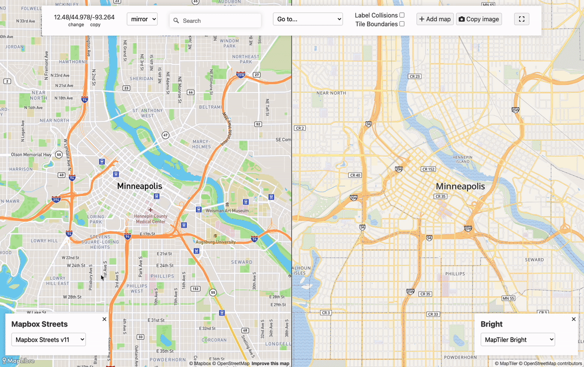
MapLibre: maps for all, for free, forever
MapLibre is an open-source community that develops, maintains, and promotes free software to serve and render maps on mobile and web platforms. It started as an open source fork of the popular Mapbox rendering libraries after their switch to a proprietary license in December 2020. It’s supported by Meta, Amazon Web Services, and others.
Stamen was brought into this effort to bootstrap community efforts to update the mobile rendering libraries. We partnered with Steve Gifford of Wet Dog Weather, a veteran consultant on rendering for mobile, to produce software design documents describing how best to restructure the code so it’s easier to work with in an open source environment and efficiently migrate to Metal, the currently supported rendering library for iOS. While Steve did the heavy lifting, we flexed the product management and design savvy we’ve developed from years of client services work to pull it all together and bring the community along.
Meet Texturecat: because we couldn’t resist developing an icon along the way.

Work on Maplibre is happening out in the open on GitHub, and the titles of some of the various PRs strike me as taking a page from Iain M Banks’ science fiction spaceship names: Blazing fast and lightweight PostGIS vector tiles server, Angular binding of maplibre-gl, An mbtiles server in Rust, and so on. Follow along! Get involved!
Podcast: PLN8/pollinate / don’t be too obscure or weird
2022 saw our podcast get its legs underneath itself and stand tall! Initially called PLN8 and now changed to the easier-to-discover Pollinate (hey, it’s not called Stamen for nothing!), the podcast focuses on data visualizations and the people who make them. Helmed by Ross Thorn, and interviewed by a rotating cast of Stamens, we had great conversations with people like RJ Andrews, whose new book series on data visualization pioneers is achingly beautiful and super relevant, Christina Conklin, whose Atlas of Disappearing Places chronicles places lost to and threatened by Climate Change, and many others. We also gave ourselves permission to put our own Stamens under the glass, in interviews with Stephanie May, Amira Hankin, Alan McConchie & others. Check it out wherever you get your podcasts: Apple, Spotify, and others. We’ve already started on Season 2, and there are still seats open, so if you know someone we should interview on the podcast, I hope you’ll let us know.
We’re often asked, at the start of a conversation with clients about a project, “what was the impact of your work?” It’s often hard to answer that question, since most of what we do ultimately lives on our clients’ infrastructure, and we typically don’t have a window into things like page views, links and so on. But in this case, since it’s our podcast, we do! So I thought I’d share some goals & data about the podcast, in the hope it will be useful to people who want to think about how to do podcasts about dataviz.
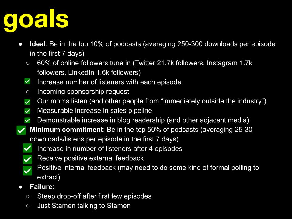
We’ve started, when initiating projects, to explicitly document what ideal success looks like, what a minimum commitment looks like, and what failure looks like. This way, when we’re done, we can measure our successes and failures, which’ll be useful the next time we decide to do something (or not). I feel so grown up! Stamen is turning 22 this year, so it’s about time.
So here were our goals. A green box with a check mark means that the thing happened:
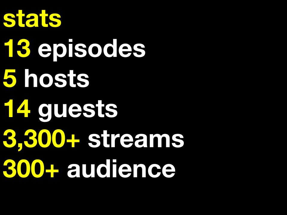
Pretty good! Here are some stats for 2022. The podcast continues to grow::
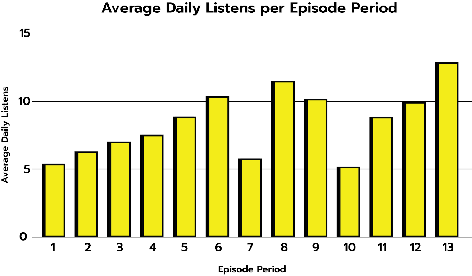
One common thread we saw when researching how to define our success was that consistency is key; if you set a schedule and stick to it, you’re more likely to build an audience that’ll help you grow. And it’s working! We’re seeing modest, but overall consistent, growth in daily listens per episode. Ross put together a really terrific talk about how he does it here on the NACIS YouTube channel; more about this in a minute. Consistency is key! Watch it!
There are ups and downs in listenership throughout the year, but we’re also seeing growth in average daily listens per episode, which is also encouraging. And each year we’ll have more data to compare with to better understand how we’re growing and what our listeners want to hear.
It may seem small, but consider this: my son’s basketball team is the worst in their league. They started off regularly losing games with scores like 4 to 60. Super discouraging, they’d just get demolished. But we kept with it, and little by little, their scores started going up, and their opponents’ started going down. Last weekend they lost 10 to 28. We are directionally correct, as they say, and excited to be moving in the right direction. Give a listen! And let us know if you’d like to hear someone interviewed or a project discussed. We’re doing it for you.
NACIS
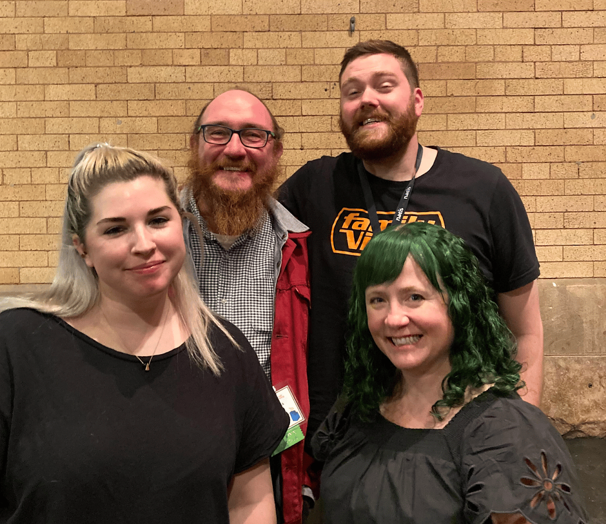
We sent five(!) people from Stamen to 2022’s meeting of the North American Cartographic Information Society in Minneapolis. It was my first NACIS; hoping it won’t be my last. What a terrific group of people, and it’s so nice to have my West Coast-centric bubble just popped, and hard. There are people doing amazing work all over North America.
I gave a talk on the Golden Ratio & Cartography of which I’m particularly proud (and wrote a blog post about it), Stephanie gave a talk on Vector Tile Cartography, Kate talked about “I Want to be a Cartographer When I Grow Up,”, Ross hilariously spoofed himself with “So You Wanna Start a Mapping Podcast,” and a good time was had by all!
Kim Stanley Robinson Interview
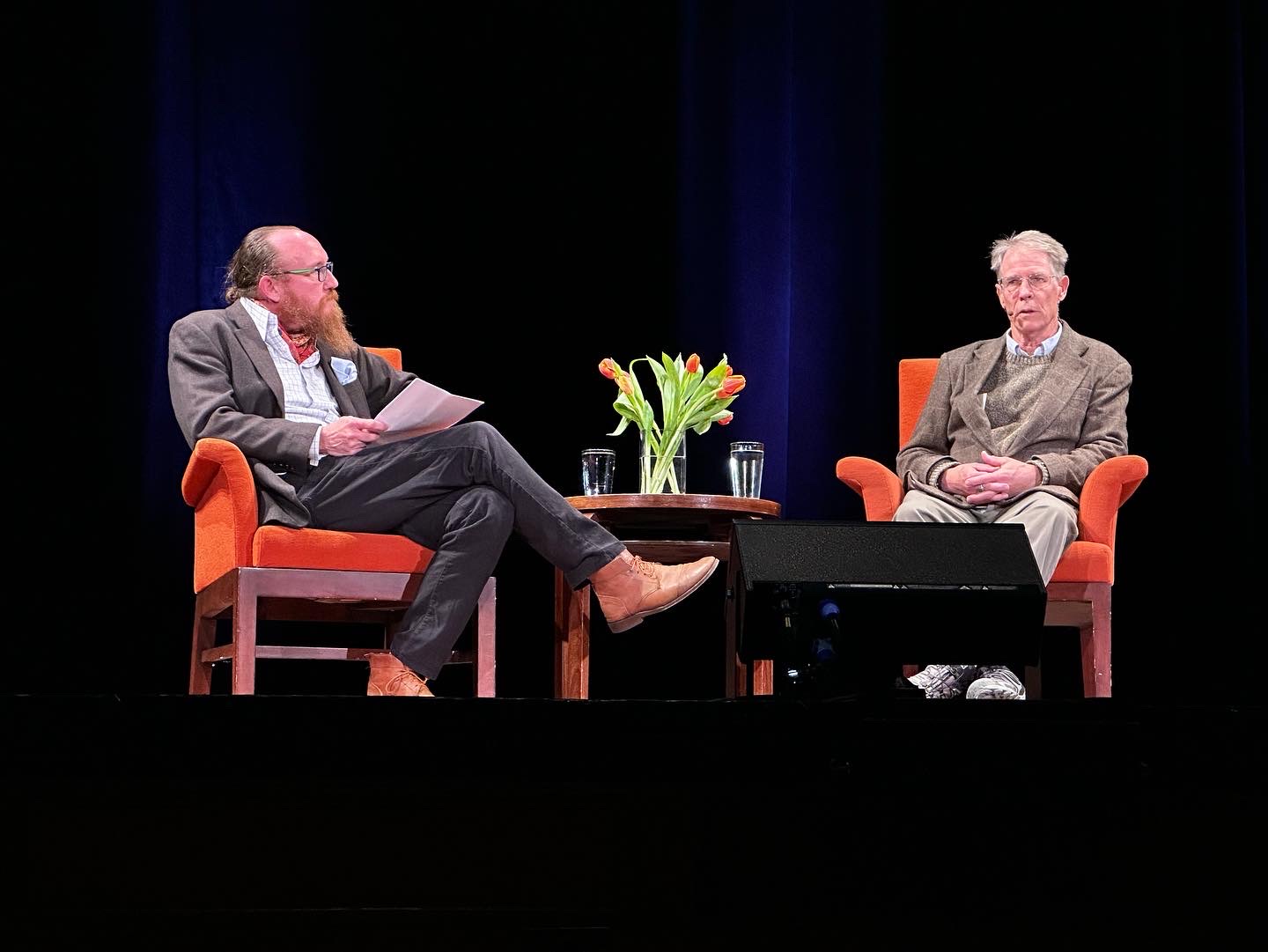
Sometimes you get to interview your heroes. Sometimes you even get to buy them a drink afterwards! I was lucky enough to get to do both last year, and for City Arts and Lectures in San Francisco no less! Kim Stanley Robinson is one of my absolute favorite authors writing in any genre, and being asked to interview him, on stage, in front of 400 people no less (and NPR audiences around the country), was a real thrill. We talked about science fiction, narrative techniques, maps, a whole range of things that fascinate us both. When he was writing the Mars Trilogy, he had to imagine where the new oceans on Mars were going to be (read the books!), so he bought a bunch of squishy Mars globes and squeezed them in various ways to see where the dents were. One thing in particular I wanted to discuss with him is this idea, explored to stunning effect in his Ministry for the Future, that people who suffer the devastation of climate change aren’t just going to make people upset; they’re going to want revenge on those of us who had an outsized role in causing it. It’s quite a thrill to hear someone say about you “you know, that reminds me of a conversation I was having in a similar circumstance with Iain Banks.” I’m beyond grateful to my friends Caterina Fake and Jyri Ingstrom for recommending me for this opportunity. You can listen to the interview here.
And so.
A big year! We kicked our blog into high gear, fully committed to remote work with all its charms & pitfalls, did a whole stack of richly varied mapping & data visualization projects that I’m incredibly proud of, as well as the team.
As always, the variety of the projects we do is the thing I take the most pride in here at Stamen. We’ve come through a challenging and difficult year with a renewed sense of purpose and commitment to the work, and I’m beyond grateful to our team and our clients for their contributions to our success in this extraordinary moment.
If and when you find yourself wanting to take your data communications efforts to the next level, please do get in touch!