
We live in a world awash with data. And, from every corner of that world, there continues to be a rallying cry demanding more accurate and complete data sets. Yet, even in well-designed and controlled studies, missing data occurs in almost all research and gathering.
We’ve been primarily conditioned to see such data gaps as problems. A quick search engine query with nearly any phrase containing “data gap” returns articles touting headlines like, “How to Identify and Fix Your Data Gaps” and “Five Ways to Overcome Data Gap Challenges in Your Charts.”
However, consider this: What would change if we viewed data gaps as opportunities and strengths instead of challenges and weaknesses in the data stories we tell?
While seemingly incomplete at first glance, data gaps can actually lead you to a more comprehensive understanding of the data context. Quite often, you’ll find something interesting (and useful) if you stare into the void.
The Myth of “Perfect Data” Limits Possibility
The idea that there is a right way to correctly collect, prepare, and visualize data is an unfortunate notion we’ve observed all too often. This belief that if you structure your data properly it will transform into an accessible visualization that inspires people to draw precise conclusions when interacting with it is one worth challenging.
There’s no such thing as perfect or clean data; it always contains biases, assumptions, power structures and flaws. Data can go missing in many ways. In fact, if you’re not collecting data, don’t have access to some kinds of data, or can’t use existing data for a specific data analysis process, that data is missing from your analysis process.
However, that doesn’t mean that your data isn’t useful. There’s an emphasis on useful in this conversation versus correct. A dataset might be flawed, but it’s more useful to come to the conversation with a curiosity about what the flaw reveals instead of just critiquing how that flaw is a problem.
Data Gaps Invite Investigation
Our team worked on a project with the University of Richmond to visualize US census records organized by county into an interactive map. The objective of the data visualization sought to illustrate the foreign-born populations as reported by the US census from 1850 to 2020. As we rendered the dataset into a map, we noticed a strange data gap. When looking at the Population Over Time map, it suddenly seemed that there were no foreign-born Chinese residents in the country from 1910 to 1950.
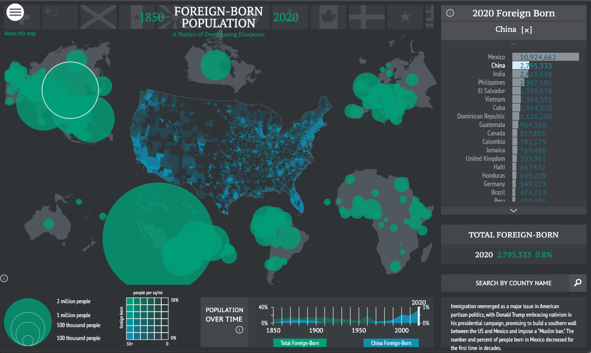
Of course, we knew this couldn’t be true. After all, in San Francisco, California, alone, the origin of Chinatown predated this data anomaly. Where had all of the US Chinese immigrants in the first half of the 19th century gone?
We thought there must be a problem with our data or our code. It turns out the code was just fine. It was the data. It was missing. Its absence invited more investigation.
As we dug into the data gap with our partners at Richmond University, we asked a question; What was happening in the world when this data would have, should have, been collected?
And, there was the answer.
The Chinese Exclusion Act of 1882 banned all Chinese immigration to the United States for ten years. Renewed in 1892 under the Geary Act and upheld by the Supreme Court in 1902, these laws made Chinese immigration permanently illegal. Chinese immigrants and their American-born families were also forbidden from being counted in the US census and remained ineligible for US citizenship until 1943.
The data gap held an entire history of decades of racist American immigration policy…policies that spurred later movements for immigration restriction against other populations and continue to have divisive and lasting effects on the subject of immigration today.
The discovery of this data gap and its reason enhanced the insight the Richmond University project offered. Highlighting the data gap in the annotations and interactivity of the Foreign-Born Population: A Nation of Overlapping Diasporas map created new conversation and consideration, offering an invitation to rethink American history in a global age.
Raise Awareness of Your Data Gaps
First, you must become aware of data gaps to make sense of them. Such awareness isn’t always easy for people responsible for collecting data inside a system. It’s easy to either ignore your data gaps, throw your imperfect data out, or only focus on the data you have and how to use it.
There is power in data and storytelling, but dismissing those powerful data gaps skews your data interpretation and biases your judgment. Focusing only on the data you have or attempting to fill data gaps with fake or simulated data can lead you to draw the wrong conclusion about what your information is telling you. You may miss critical insights when you only consider what is immediately in front of you.
Addressing Data Gaps Reduces Data Analysis Bias
One of the most famous examples of such bias comes from the mathematician who helped win WWII.
During WWII, the US military asked the Statistical Research Group at Columbia University to examine the damage done to planes returning from missions. The research group focused on the bullet holes that caused extreme damage to the planes to determine where additional armor should be added. Statistician Abraham Wald challenged this conclusion. He encouraged the team to not just focus on what was in front of them but on something conspicuous in its absence — the planes that did not make it back. Wald argued that because the only planes being examined were the ones that survived, the study ignored the most critical data — the bullet holes they could not see in the missing planes. Rather than needing more reinforcement, the bullet holes the military examined in the surviving planes showed areas of the aircraft that were much stronger and didn’t need additional support.
In data analysis, what’s most critical is not just the interpretation and analysis of the given data, but also (and sometimes most importantly) the data that we cannot immediately see.
Visualizing Data Gaps
We should consider data visualization not as a discipline based on strict rules and complete data sets. Instead, data visualization is a crucial piece of data analysis. Visualizing your data in numerous experimental ways empowers you to explore what your data is telling you, with its presence and absence.
Identifying data gaps helps you identify possible biases in your decisions, interpretations, data collection, or data analysis processes. And once you recognize these gaps as invitations rather than limitations, you can begin to tell more complete data stories.