
Last week I gave a couple of presentations around the Bay Area about Stamen Design’s recent project American Panorama.
American Panorama is the result of more than a year of work with the Digital Scholarship Lab at the University of Richmond, and it’s extremely satisfying to finally get to share it with the world at talks like these. If you haven’t yet explored American Panorama, it’s a collection of interactive maps (backed by an open-source data visualization toolkit we developed) that illustrate aspects of American history from the forced migration of enslaved people to the overland migration across the American West and the immigration of people from all over the world up to the present day.
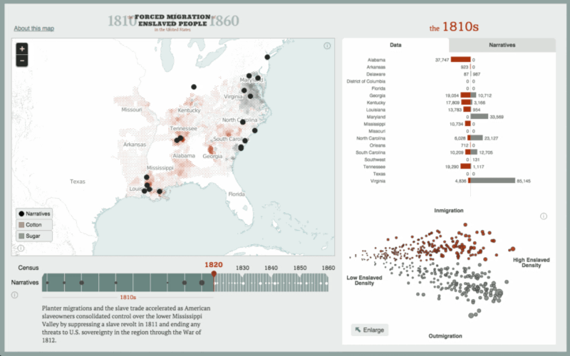
The first talk on Monday was for San José State University’s Department of Geography & Global Studies. Many of the students and faculty who attended were part of a course called “Inventing the Modern World: The History of Technology.” The audience at this talk had some insightful questions about the ways that American Panorama could be used to explore other subjects like genealogy, and insightful comments about the omissions and assumptions built into US Census data that is the source for many of the maps.
The second talk on Wednesday was for the University of San Francisco’s Data Visualization Speaker Series:
This audience was made up of data visualization students and practitioners, who were much more familiar with the mapping tools and techniques we used for the Panorama, and had many more questions about the design process and technical decisions we made during development.
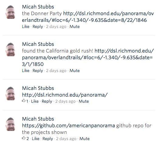
It was exciting to see the comments that occurred during and afterward on social media. For example, one member of the audience at USF was enjoying playing with apps during the talk and posting to the meetup page. Here’s where he discovers the Donner Party in the Overland Trails map:
In the presentation I talked a lot about the importance, as data visualization designers, to learn as much as you can about your topic from domain experts. In our case, it was the historians at the University of Richmond who were the real drivers of the maps we made for the Panorama. Our job at Stamen was to use our visualization skills to translate their knowledge into inviting, elegant displays that still respect the complexity of their ideas.
We hope that public presentations like these will help further the evolution of open source tools like American Panorama. We’re open to comments and collaboration on github, or you can contact us at @stamen and @americanpano on twitter.
UPDATE: the video for the talk is now on YouTube.
The slide deck for my presentation can be found on Speaker Deck, and my notes and links can be found here.