Visualizing the pulse of a pandemic: A year of COVID line charts
You asked, we answered:
The @FinancialTimes coronavirus death & case trajectory trackers are now 🔥 FREE TO READ 🔥 outside the paywall: https://t.co/JxVd2cG7KI
In this morning’s update, the US has gone above 470 deaths, bringing it just behind where Iran was at the same stage. pic.twitter.com/NBA7FMYlmC
— John Burn-Murdoch (@jburnmurdoch) March 23, 2020
Just over a year ago, Stamen HQ officially closed its doors and we all started working from home. Being who we are (Stamen is a design studio specializing in data visualization) we did what we always do during dramatic news events: try to understand what’s happening through the language of charts and graphs. Only this time we weren’t alone: everyone in the world was trying to use data to understand a crisis that was in many ways invisible and (for most of us) looming some unknown length of time in the very near future.
The start of the pandemic brought an onslaught of new data visualizations at a rate we’d never seen before. On March 18, our own Eric Rodenbeck joined other visualization experts in sharing their recommended coronavirus charts for Co.Design, trying to explain to a confused public which visualizations they could trust, and how to read them. In particular, these experts called out the iconic “Flattening the Curve” simulation, which told us what needed to happen, and others pointed to diagrams that showed us what might happen: the ominous charts of spikes in other countries, suggesting our own potential futures.
Within our own Slack channels, we had a similar flood of COVID19 dataviz discussion. Sharing links with each other was one of the ways we coped with the lockdown and the initial shock of the pandemic. Since the start of March 2020, we posted 1,324 messages about COVID-19 in our Slack group, and shared 425 unique links.

The links we shared ran the gamut of dataviz types, including stacked-area streamgraphs, bar chart races, and of course maps, maps, and more maps (all of which may warrant their own retrospective posts). But above all, the signature visualization of the pandemic was undeniably the humble time-series line graph. These simple (and sometimes not-so-simple) squiggly curves were the primary focus of our hopes and fears, our uncertainty and our anxiety.
Line charts everywhere
Especially in the early days, it seemed everyone was inevitably making variations of the same kinds of time series chart, tracking time along the X axis and counts of cases or deaths along the Y axis. But beyond those broad similarities, there was a lot of variation, in particular relating to how to arrange the data on each of these axes.
In many of these charts, the time axis wasn’t showing raw calendar dates, but instead transformed each region’s data to align each line to a common outbreak-centric start point such as the number of days since the 100th case or the 10th confirmed death. Because the pandemic began in each country and region on different days, adjusting the start date of these charts helps make better comparisons between the trajectories of each chart, but it’s a bit of a subjective decision on how much to adjust the dates.
The vertical axis also saw quite a bit of variety in these charts, with lots of important discussions around whether a linear scale or a logarithmic scale was better, and whether to show cumulative cases or rolling averages. See this video summary from Vox of the pros and cons of each:
Most interactive charts made this a configurable option, but it remains an ongoing anxiety among data visualizers how much the general public really understands how to read a logarithmic chart. Not surprisingly, even Google searches for “logarithmic scale” spiked during March 2020, coinciding with the surging popularity of this chart type:
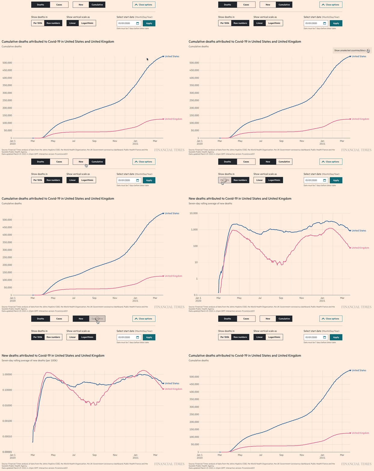
Among our favorites of this genre of line charts were the “Coronavirus tracker” visualizations produced by John Burn-Murdoch and the team at the Financial Times. (These were the same charts called out as a favorite by Ben Fry in the earlier Co.Design article). It was fascinating to watch the FT refine their charts in real time, adding new data and new features as the pandemic progressed, and as they had time to build new features. The unrelenting pace of the pandemic really pushed data visualizers to rethink how to launch a minimum viable product (even if it’s just static charts updated manually each day) and add features like interactivity and a more efficient workflow later.

We can also be grateful for the medium of Twitter for making data visualizers like Burn-Murdoch take screenshots of these interactive charts, forcing them to pick what they considered the best set of axes to show as the defaults. “As the story shifts, the charts shift,” wrote Burn-Murdoch at the end of March, explaining why he changed the default charts to show the number of new cases per week, rather than cumulative totals.
Before and after:
Now that we’re marking one-year anniversaries of many of these initial charts, we can see how dramatically different these charts have become:
One of the downsides of an exponential axis is that it can hide the severity of a new spike. The dark humor of this post by Alex White — “When we said ‘flatten the curve’ we should probably have specified ‘along the X axis’” — would be lost if we looked at this chart on with an exponential scale:
Bending time:
Other charts attempted to add more information by removing the time axis entirely. As long as the X axis includes a cumulative metric (total cases or cases per capita) then each line progresses across the chart from left to right in a way that is still somewhat familiar. You can read the the progression of events from left to right, even though time “speeds up” or “slows down” depending on how fast those total numbers accumulate. The other benefit is that we don’t needing to worry about adjusting the origin of the time axis to make the charts for different regions “line up” because they all start from the same cumulative zero point. We called these kinds of charts “a bit of a mindbending combo to get your head around”, and probably not suitable for the average reader, but for someone who has the time to really sit with the chart, you can glean some very detailed insights about what’s going on.
This type of chart is introduced in great detail in this early YouTube video from Minute Physics: “How To Tell If We’re Beating COVID-19”
We appreciated this early New York Times article which compared a few different charts using more complex axes such as these, and including a little fine print at the bottom of each one explaining the pros and cons of that particular way of visualizing:
Predicting the future:
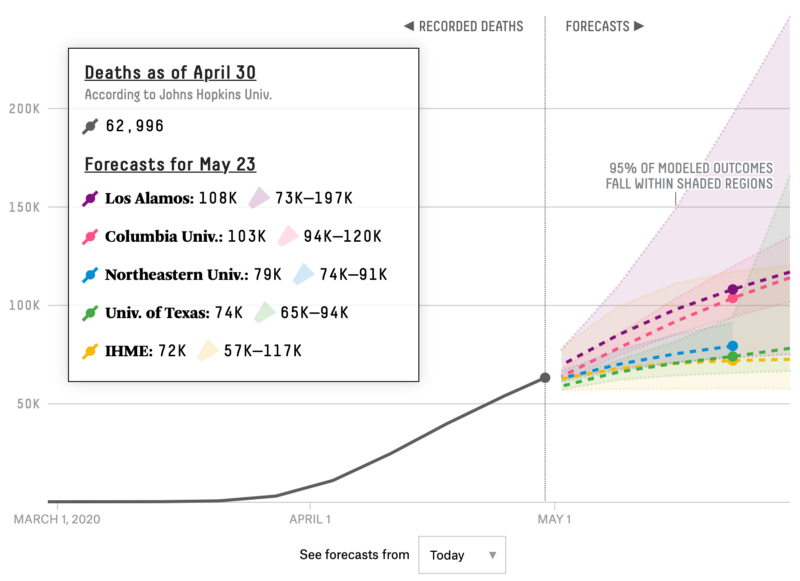
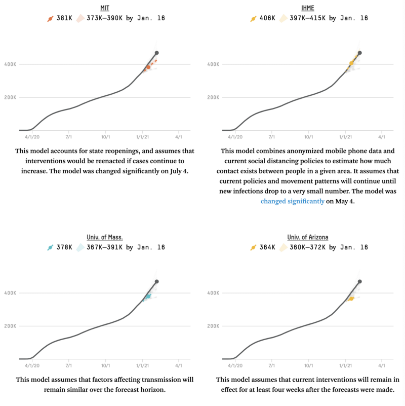
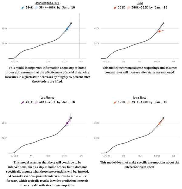
The main reason to go to such lengths to adjust the time axes of these line charts is to glean the future of the virus in your area by studying what happened in places where the pandemic hit earlier. Would Italy follow the same trajectory as China? Would Texas follow the same path as New York? We also followed the scientific models that tried to predict what the next few weeks would hold, especially the FiveThirtyEight aggregator that compared all the models against each other, only to find that most of the models consistently underestimated the eventual case count.


One of the fundamental challenges to making predictions like these is that extrapolating from the near-exponential growth at the start of a pandemic is extremely difficult, especially if you don’t know what the saturation level will eventually be (that concept of “herd immunity” that is thankfully no longer top-of-mind now that vaccines have been developed far quicker than expected). We really liked this animation from Constance Crozier showing how difficult it is to predict an s-curve until you’re near the end:
And we enjoyed our friend Charlie Loyd’s recollection of a Neal Stephenson quote on the topic of exponential growth and the singularity, if not directly on the topic of COVID 19:
On March 25 in our Slack we shared this link from covidactnow.org, which at the time had the unfurl text “This model predicts the last day each state can act before the point of no return. The only thing that matters right now is the speed of your response.” We don’t know how they defined the “point of no return”, but we’re pretty sure every state went past the point of no return after that.
One frustrating aspect of most of these projections is that they couldn’t predict the multiple waves of COVID spread that we eventually experienced. One model that did try to take into account the results of cyclical patterns of lockdown and re-opening was published in Science in May 2020. We imagined “this would end up like cycles of 2–3 months of lockdown and then a couple weeks of Bacchanalia where we try to try to maintain the economy by squeezing in all the sports events, all the travel, all the three month’s worth of going to bars in just a few days…..” [quote from Stamen Slack] In some ways we weren’t too far from the truth.
Grappling with scale
As the pandemic continued to push our data beyond it’s previous bounds, breaking records and crashing through staggering new milestone after milestone, we all struggled with how to communicate the immensities of scale in our visualizations. We particularly admired how the New York Times rose to the challenge by foregrounding data visualizations on their front page, and allowing them to burst out of the conventional layouts of the printed page, both in their handling of the millions of unemployment claims, and of coronavirus deaths themselves.
Eric Rodenbeck discussed these in much more detail in his earlier post “Some thoughts about dataviz in the age of COVID-19”.
In other cases, comparing current overall deaths (regardless of cause) to other historical tragedies or past death rates helps counter the coronavirus deniers who claim that covid rates are inflated or no worse than the flu (although, some recent MIT research has some discouraging findings about the ability of a clear dataviz to sway the thinking of anti-mask believers). This visualization of monthly deaths in New York City shows the impact of the pandemic far outpacing the impacts of the 9/11 attack:
In another chart from just last week, we can see that within the US, deaths as a percentage of population is above 1.0 for first time in 70+ years. https://twitter.com/foxjust/status/1369433721594646532 (although note how this chart doesn’t start the Y axis at zero, a data visualization no-no that exaggerates the appearance of the 2020 spike). As an aside, you can also see that even before the COVID-19 related spike, US death rates were gradually increasing over the past decade. This ominous trend in US health, driven largely by a dysfunctional health care system and increasing income inequality, perhaps gives some context about why the United States was particularly hard hit by the current pandemic.
Looking back, taking stock
Are we at the end? As we saw in the chart at the start of this post, the chatter in our internal Slack channels tapered off after the first couple of months, as pandemic life became routine and it was clear that COVID would be with us for a while. But there are still many things to visualize, and the potential light at the end of the tunnel means new visualizations are needed, on topics such as visualizing the vaccine rollout, monitoring when or if the economy will get back to normal, or tracking the spread of the new variants.
But there does seem to be a shift occurring, even if it’s nothing more than a transition away from reliance on rushed but essential visualizations created by volunteers or jury-rigged by news organizations when nothing more official existed. Even the stalwart COVID Tracking Project stopped collecting data on March 7, 2021. In The Atlantic, Robinson Meyer and Alexis Madrigal looked back on their year the COVID Tracking Project with some grim observations about how we still haven’t come to terms with the deeply flawed and incomplete data that we’re relying on to guide the pandemic response.
At this point, one year in we have no time to be complacent, with new COVID variants causing dramatic new spikes in Europe, which may only be starting here in the US:
Throughout this year, as a data visualization community we’ve learned a lot about what we’re capable of during a crisis, and with any luck our readers have developed new fluency with data and data literacy. But we have also learned how much we don’t know, and still have yet to learn about our tools, our data, and our practice. We also hope that this experience of living through this pandemic year and in our own small or large ways being part of the crisis that is the subject of our charts — of being both the visualizer and the visualized — will give us more sensitivity the next time we find ourselves making visualizations of some crisis or disaster. Dataviz can be humanizing, and dehumanizing, and hopefully this year we’ve used it not as a distraction from feeling, but as a way to cope through more connection, sensitivity, and understanding.
