National Audubon Society Climate Maps
Looking at bird habitats over the next several decades
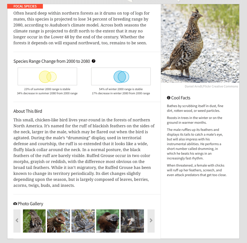
Background
Climate change, though we know it’s there, is a hard thing to see: it’s slow, it’s invisible, and if you don’t know what you’re looking for, then you might not even miss it once its gone. Birds, however, are often hard to miss: they can be loud, bright, beautiful, strange. It turns out that by watching where their flight ranges are shifting now, we can get some idea about where they are going, which points to some likely patterns of climate change and how it will affect an ecosystem in the not-so-distant future. This is precisely the kind of data that the Audubon Society has been collecting extensively about North American bird flight range changes, and in this project we have helped them to visualize it.
What we made
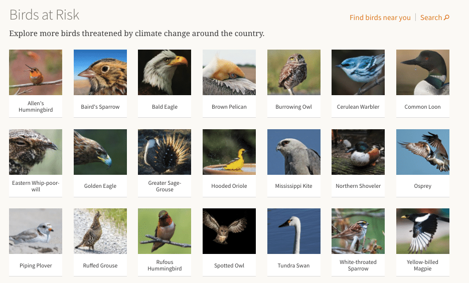
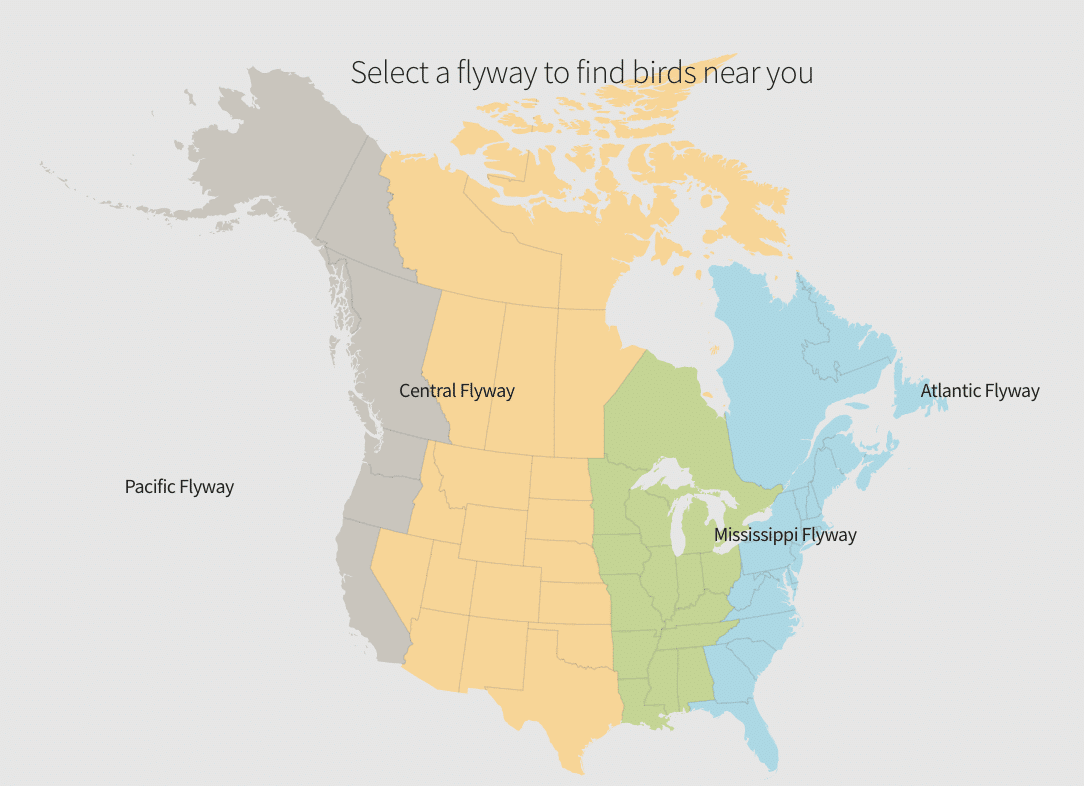
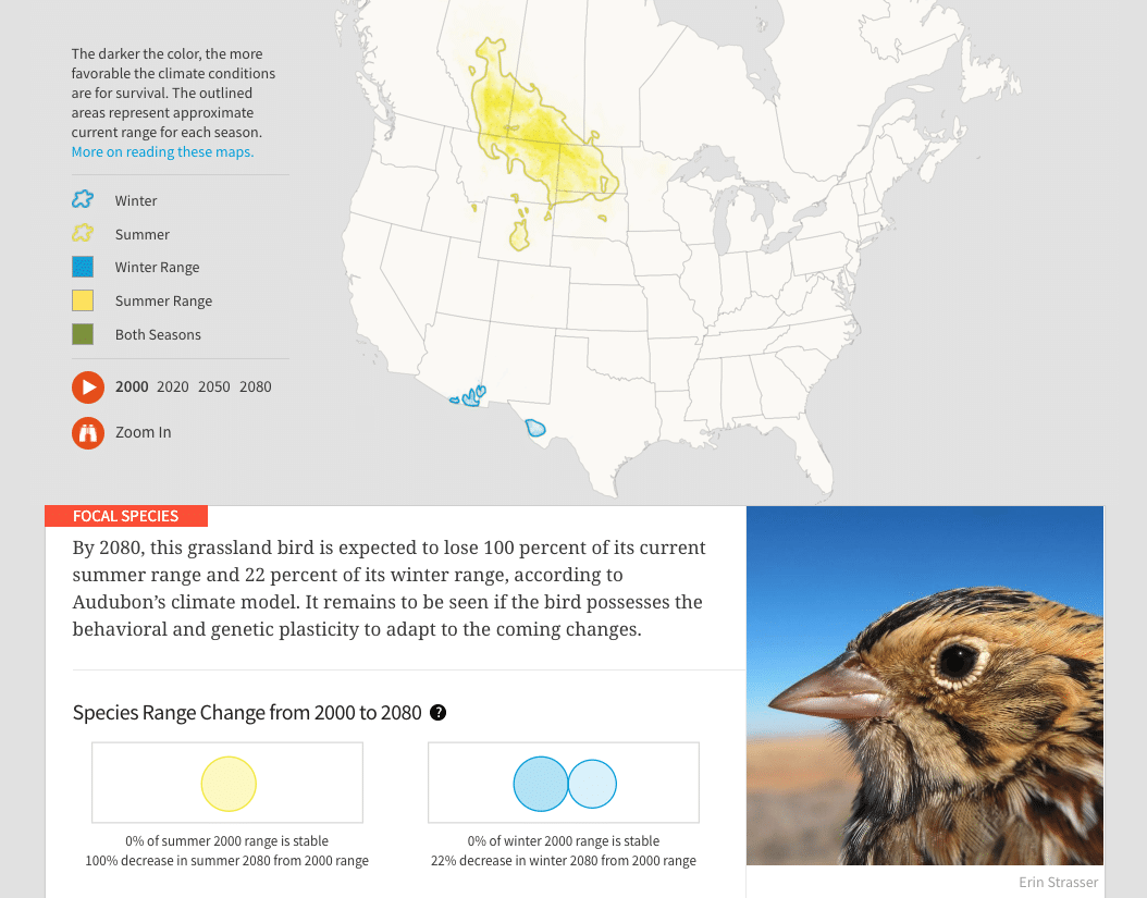
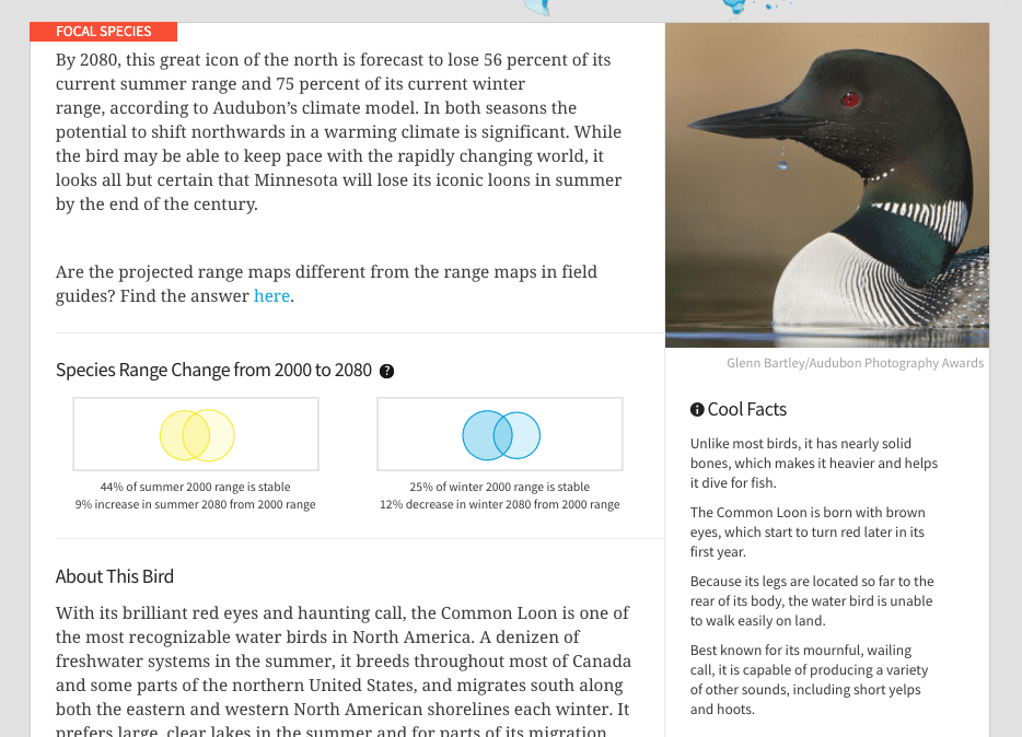
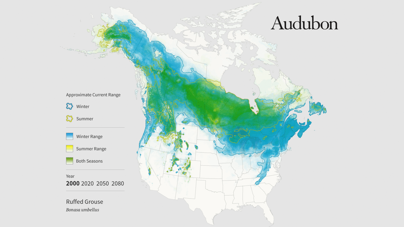
Working with data from “the broadest and most detailed study of its kind,” the visualizations we’ve made together, with a lovely site designed by our friends at Mule, collectively comprise “the closest thing we have to a field guide to the future of North American birds.” Hundreds of thousands of observations (drawn from the long-running citizen science projects the North American Breeding Bird Survey and the Christmas Bird Count) combined with sophisticated climate modeling create these predictions of where certain birds will be, when. Suddenly we have a clearer idea of where each specific bird will go, not just that they will all travel north. The dataset for all 314 birds contained both summer and winter range predictions. Our main challenge was to make this data engaging for the public. For us, this meant making the visualizations easy to understand, as well as easy to share.