Stamen spent much of 2015 building and designing American Panorama, a wide-ranging historical atlas for the 21st century. Funded by the Mellon Foundation, the atlas is a project of the Digital Scholarship Lab at the University of Richmond. In addition to the maps, the project also involved creating a set of open source tools for digital scholarship that the scholars at the Lab could use to make maps of their own. The DSL recently launched a new project built using these tools, called Mapping Inequality: Redlining in New Deal America. The project shows, in graphic and exhaustive detail, the degree to which neighborhoods where people of color lived were systematically excluded from the government investment that helped lift the United States out of the Depression. I sat down with Rob Nelson, Director of the DSL, during a conference on Creating Spatial Historical Knowledge at the German Historical Institute in DC, to talk about the project.
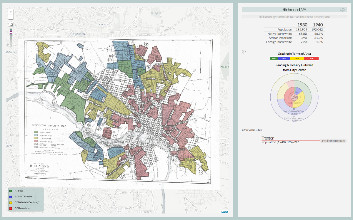
Eric Rodenbeck: So I’m here with Rob Nelson from the Digital Scholarship Lab. You’ve had quite a week with your launching of the HOLC maps. Seems like there’s been some really interesting attention and some good press: National Geographic, CityLab, NextCity, Forbes, and others..
Robert Nelson: Absolutely.
ER And You’ve also had a lot of interesting emails.
RN It’s been really gratifying. We do work for the public often, and I’ve learned that people will make use of the materials you put out into the world, through the Web, in ways that you never would have anticipated. So I’ve stopped fooling myself into thinking that I actually know the great variety of creative and idiosyncratic ways that people will be using the materials we put out. With this project I tried to keep my expectations within reasonable bounds.
But we really think these are really provocative and important materials that deal with the history of inequality, and particularly the history of racial inequality in the United States, and particularly in American cities. And I felt very passionate about these materials. This is amongst the closest thing to a passion project that we’ve done in the DSL.
And I was hoping that it would be not only advantageous to historians, the economists, scholars, but that it would interesting to activists, and I’m really happy to see that it has been. We’re getting people that worked for fair housing writing us. And then the surprising thing is some of the other materials I never would have guessed, or some of the other responses I never would have anticipated.
For instance, a medical researcher wrote, and she was interested in seeing if there’s correlations between redlining and incidents of asthma amongst black children, which is not something on my radar and I am just grateful. I mean it’s really satisfying to see that. And then I got a few emails from people sharing their stories about growing up in communities and they locate themselves and they talk about their mothers’ response to segregation. I got just a charming email from a woman that just began to go into her story, and she ends it by saying, “If you want to know more, it would be useful to know more from an 80-year-old woman, let me know.” I think we will follow up with that because I would love to hear that. This has succeeded more than I would have dared to hope already, inasmuch as it seems to not only have been of great interest to the scholar community but to the activist community, and just people, in general, are using this. Thinking about grappling with the issues that I was hoping they would effect.
Racism in black and white
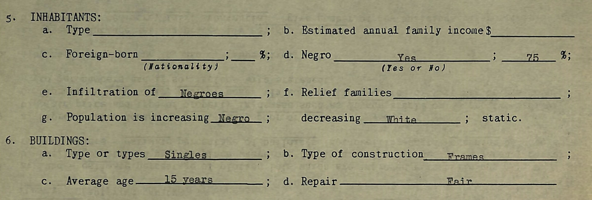
ER Well, I think it touches a nerve to see, in literally black and white, that black people in the United States were systematically excluded from the recovery effort that the government was extending to white people. Can you talk about that? Just give us a couple sentences of background on the project.
RN Sure. So these are maps that were made by and at the behest of a New Deal agency, called the Home Owner’s Loan Corporation in the latter half of the Depression between 1935 and 1940. This part of their work centered on creating security maps, which categorized neighborhoods on a scale of A to D, in terms of the mortgage risk, and that classification is exactly what you think. They’ve deemed D neighborhoods to be really hazardous risks. Or for banks and for other lenders, and essentially in making this the norm, the best practices amongst the real estate industry, they did considerable damage to already struggling neighborhoods and cut African American families off of some of the financial instruments that help people build wealth in the US.
ER So the basic idea is that HOLC recommended that bankers rescue underwater mortgages in some neighborhoods and not in others?
RN Well that’s a complicated questions because actually HOLC, they did bail out and bought up mortgages.
ER Specifically HOLC did, right?
RN Yeah, they did that. They did that before they launched this mapping surveys. That was the early first three years of their existence. And the evidence is they actually didn’t practice at least a pronounced version of redlining. The evidence is is that a lot of neighborhoods that would come to get a C and D neighborhood did actually receive mortgage financing from Hulk. So HOLC —
ER Before the maps?
RN Before the maps. But then the maps, in the process of building them, became a lesson in redlining that happens in cities large and small. They’re all over the country: Baltimore, in all the boroughs in New York, in San Francisco, but also in Spokane, and Warren, Ohio, and Battle Creek, and Akron, and Birmingham. So this was a really wide spread program that touched a lot of places — most American cities large and small. And it’s not solely responsible for this, but helped to create a national real estate market with really explicitly racist practices baked into it.
ER The claim is not that this is the one specific reason why these neighborhoods went down in value, but that it certainly played a significant part.
RN And there are definitely other reasons. As much as it is partly a cause, it’s arguably more of a symptom, and even in that regard, it’s a window onto practices within the private marketplace of lenders. That’s really shocking and can be shocking to see and confront some thoughts about how the histories of inequality in American cities has played out. Some of the reasons for that that these make so explicit that this is — I often say when I’m talking about these as a little joke that when I started working on this project, I kind of expected the intellectual work to be harder, right? That I’d have to read in the racism as subtext. But you don’t have to, because the racism is just text in these things. They’re very clear that the “infiltration” of African Americans, infiltration of Jews, the infiltrations of Polish immigrants and Italians are reasons to downgrade or to view neighborhoods as riskier investments.
ER And so the maps were intended as a guideline for bankers? Or who would use them?
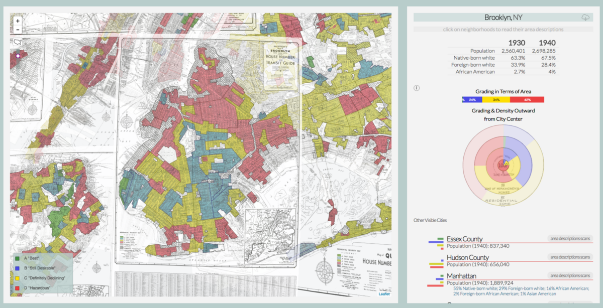
RN That’s a great question and a hard one. Some of the evidence is that not that many people used them. That they ended up in the files at HOLC. Then they end up caught up in the National Archives eventually, and that they themselves don’t have a wide enough circulation that they impact the real estate industry and red line practices bridling the U.S. But one argument is that it’s really less the maps themselves than the schema behind the maps, this classificatory mission of rating neighborhoods, of viewing neighborhoods with people of color and immigrants as risky investment. That becomes the norm. That becomes common sense.
ER I see. So it’s less an enforcement mechanism, and it’s more of an establishing of a social norm within an industry. It’s not like you’re required to follow these guidelines officially, but bankers, for example, would know those kinds of things?
RN Exactly, yeah.
ER Okay, that makes sense.
RN Some of the bankers were making these maps. HOLC didn’t send out their own employees to do this. They worked with local bankers and lenders. They essentially gave them, “Here’s a template. Here are the best practices in our view. Grade your neighborhoods.”
What’s missing is as important as what’s included
ER It’s a statement of the fact that certain neighborhoods are more worthy of investment. I think the shocking part for me, when I read it — I mean aside from it making clear that we’ve had systematic institutional racism in the housing markets since the ’30s, at least — was that it wasn’t so much in the comments that, although there are certainly very racist comments, but there are sort of baked into the structure of the forms that the bankers were asked to fill out. I think there’s one that says, “Percentage of Negro infiltration,” and you have to fill out a number from 0–100. It’s not something that the individuals who are filling these forms out decided to put in there. It was something the people filling out the forms were explicitly required to indicate, right up there alongside with average lot size. It was considered just another a fact to measure about a neighborhood that you’d go in on.

RN Absolutely. In some ways, some of the racism and the racialism within these documents is evident in what’s not filled out as what’s filled out. In many cases you’ll find explicitly racist comments in this kind of free-form qualitative section, where usually it’s called “clarifying remarks.” But on many maps, particularly on the South, what they’ll do is they’ll just leave that blank entirely for African American neighborhoods. The fact that they’ve identified an African American neighborhood —
ER That’s enough, and you don’t need to know anything more.
RN Exactly. I’m thinking particularly of Richmond, which is the city I’m most familiar with. And there’s a particular question on every form that’s about the description of the terrain. And for all A neighborhoods, that’s filled out. For most B and C neighborhoods, it’s filled out. And all those are all white. But for D neighborhoods, there might be one or two.
ER So it’s not even worth describing!
RN It’s not even worth describing, because you’re done. You just filled out African American. You said this was a Negro neighborhood. And the work is done because you already know what the grade’s going to be, right? This is kind of baked in that it doesn’t matter what the houses are, it doesn’t matter much about occupation. In fact, Richmond’s interesting in that regard, too. The fifth element is type is about occupation, and for B and C neighborhoods, they’re often pretty specific about this. They’ll say, “Railroad men” or “This is clerical workers.” For A neighborhoods sometimes they’ll say that, they’ll say “Professional executives.” Often they’ll just say “Best,” as if best is an occupation, but it’s this kind of old South notion that those at the top, it doesn’t matter what their work is because they’re old wealth. They’re not nouveau riche, where they need to work. For the African American inputs, all of them, with one exception, just says “Negro.”
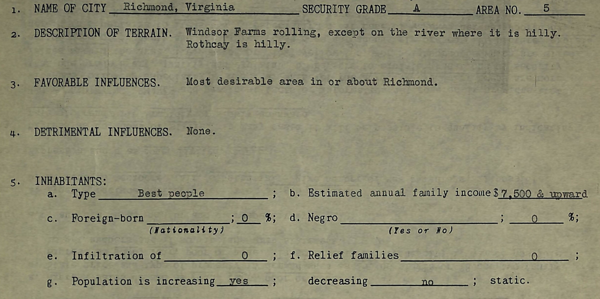
ER “Negro” is what they put down for people’s occupation?!
RN For occupation, for type of inhabitant. I often say that this seems to me to be a continued remnant, a legacy of a long history in the American South, where whites appropriated the labor of African Americans, whether that be the slave holder and slave, or that be land owner and sharecropper. The fact that these people are African Americans, in some ways weirdly is kind of, in a perverse way, makes sense as an occupation because — what the white elitists filling these things out can think is that their role is to have their labor appropriated or exploited by us because of their race. That’s an indication of a subservient exploitative relationship that they have in terms of work in the economy.
ER I mean it’s shocking to see it —
RN It’s shocking to see it in black and white. Yeah.
Scanning thousands of maps
ER One of the things that I’m happiest about is that it’s now been gathered into one place and can be explored spatially, right? I mean, it existed in the archives I suppose? Did you have to digitize it or was it digitized? Can you tell us a little bit about the process by which you spatialize all this information?
RN It’s definitely a collaboration, one that’s ongoing. I have three other institutions with three leads. So I’m working with a team at the University of Maryland that’s being lead by Richard Marciano, who’s an information scientist. LaDale Winling, who’s at Virginia Tech, who’s in the history department and has a group of grad students who’ve worked on this. And Nathan Connolly at Johns Hopkins. Yeah, a lot of work. It is a Herculean task. If I had known how difficult and how much work this would have been…I am happy it’s done but I’m grateful I didn’t appreciate it because I don’t think we would have done it. So some of these have been digitized. There was a cache that had been done by, I think, a university in Ohio.
ER Some of the maps?
RN Actually those are the area descriptions. And then some of the maps you could find, and there were a few projects that my collaborators that had worked to georeference and georectify them. So Richard had done California cities and North Carolina cities. I’ve done Richmond. There’s another project I did, St. Louis. I know there’s a digitized version and georeferenced and georectified version for Hartford. But those were few and far between for sure. And we’re talking about 150 of these. So no one had done — far as know — Warren, Ohio. No one had done Haverhill or even looked at Haverhill, Massachusetts or Manchester, New Hampshire. So it was a huge task.
ER And the maps existed in a digital form, though?
RN No.
ER You had to scan them?
RN We had to scan them. We did that there at the National Archive and we — mostly Richard — would work with folks there. He had some colleagues there and we’d kind of work bit by bit and get five here, ten there.
ER And you had to scan the reports?
RN Yep. And that is a Herculean task that was taken on by Richard’s students, as there are thousands and thousands of those. Some of them are easier to do than others but some of them are very thin, like onion paper, very old and very fragile. And they’re clipped, so you have to handle them very carefully. It’s not a simple tasks, where you’ve gotten really well-organized and pristine sheets. It would be hard enough to do those one by one. These are in various kinds of states that make it difficult. You have to unpin them or work with the archivist to take the shots as best you can so it is no small task to do that.
ER You’re crazy!
RN Yeah, [laughter] It kind of feels that way. Well, that’s why you’ve got to do this in a collaboration and it helped that they were — the University of Maryland is right down the road from the National Archives so that made it damn easier for them to do that.
ER Okay, so then it all gets scanned and then it all gets loaded up into CARTO?
RN Well, there are some intermediate steps there. So we take the scan. We use some ESRI tools, Arc to georeference them onto maps. The rasters, for the most part, all we have in CARTO is metadata about them. So we wrote some scripts to tile these things, just some simple Python scripts. We tile them. It ends up being hundreds of thousands of individual tiles that we put on Amazon S3 to serve them up. We do the same thing with the area descriptions: write some scripts, move through the area descriptions. We had like 350,000 tiles or something like that, all told. I realized later that we actually needed retina tiles for these things to rewrite the player. So we had to write another script to undo or partially undo the tile pyramid to make higher resolution tiles for retina screens, but it really does look a lot better. So there’s tons of tiles that need to be done.
Once we have the georectified maps, we create the polygons using Esri again. Output those as shape files. The shape files are then uploaded into Carto Now we have that portion of the geographic data we extract from. It outputs a XML file with the bounding box. We use that in CARTO to be as our geometry. So we need that for the application to kind of know where these maps are and ask for the right tiles when it needs them.
ER It sounds like it was a tremendous amount of work, but it also sounds like you’re using a really wide variety of tools.
RN Yeah, we just use whatever gets the job done the most efficiently and effectively. So some of that is commercial software off the shelf from ESRI. We use Carto obviously as our data store back-ends. We do scripts in Python, old scripts in Python that I’ve used and adapted, and now I’ve been writing more and using Node since that’s the react and I’ve gotten much more familiar to me with the development of the map themselves. I’m starting to use that to do diagnostic things. I’m working on, and haven’t quite finished, something that pings Amazon to look for tiles that might be missing. Because I know when you’re dealing with hundreds of thousands of tiles, something went funky with the script that generated them, or the upload died at a certain point, and I know there’s going to be some missing things that we need to —
ER So you’re writing a crawler for your own material?
RN Yes [laughter].
ER That’s classic.
RN But it’s much better than paying students to go through these and look at every zoom level. That’s stupid.
The toolkit
ER When we started working on the Atlas together I guess a year and a half ago now, the hope was that together we would build a set of tools that would allow you to make more of these atlases easier. Can you talk about that?
RN Yeah. As we developed this, we started off using a number of the toolset that’s built into the panoramic toolkit to build this. So that would include things like the hash manager, which is in there in the final version. The legend works really well, and we continued to build that out. There’s certain things that I wanted to do in terms of styling that. That it was easy to just adjust the component. But we’re familiar enough with it that I felt comfortable messing with the code. I was originally thinking we’d use — what is it? The pull down selector that we’ve used for — what was which one it used it for? Which map used that?
ER It’s Canals.
RN Canals, yeah. And so I did that for a long time, and then I eventually realized that it was the wrong scale level for this, because I just had far more cities than we had Canals, so it just was too much trouble.
So we still have a lot of time, and some things kind of work out and some things don’t. We didn’t use as many of the components as I’d originally anticipated, but where the components were really useful and where the previous maps were useful is models to use. I use sublime text as my development environment, and I created a project that had all the maps in it because I’d often find myself referencing or looking something up to see how a particular component was built in Canals or Forced Migration or whatever as I was building out and mapping inequality.
So it’s as much the code as it is something that can be emulated, used as a model, adapted in some cases as the toolkit themselves, that we found useful. I think that will become less and less the case as we move forward. We’ll build out components more and more. We’ll eventually exhaust even our own creativity about the different components and visualizations that we think about employing, and we’ll continue to refine them, the components. Like everything, they’re not perfect and the simplicity of them is one of their virtues. So I don’t want to make them so complicated, like so many props or options that you could pass in that they just get unwieldy at the same time. I think we can make them a little bit more flexible. And there’s a certain point where that becomes — you make too complicated, too flexible.
ER That’s the nature of it. But, for me, the fact that it’s all intended for digital scholarship kind of limits it, in a way. Not limits it in a bad way, but sort of constrains it in the sense that you’re not going to be doing satellite positions or anything like that here, you’re going to be working on things moving through space and time in the United States.
RN Yeah, and I think there’s a time element that’s really useful. There’s not a lot of components out there, actually, that deal with historical time. That’s partly a product of the fact that it’s used as react, that time just becomes another state that you represent.
ER I think that when we first started talking to you, we sort of had time as a separate thing on its own that we thought was going to cut across all these other categories that were delineated, whereas as it turns out, in React, time is just another data point, like latitude, longitude, or whatever.
RN Yeah, so there’s really kind of four dimensions here that we were dealing with. That’s been really helpful because this piece of history did unfold over the course of five years, but there’s no timeline in there. It’s not really necessary. Most cities, just with a handful of exceptions, only have to have one. So there’s not a diachronic element there. So you can treat this almost as a kind of synchronic, of the moment.
ER Yeah. Although that is how it’s presented, as of the moment, right? But there is a little bit of a timeline there.
RN There is a little bit, but not enough to warrant. Most people I think are going to be interested in particular cities, and it’s going to be beside the point whether this happened in ’37 or ’38. They just deal with the data that they get.
More gaps in the data
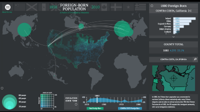
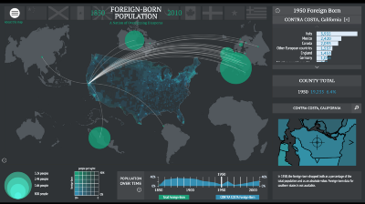
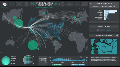
ER I keep coming back to this idea of data gaps in the data are really interesting. When we talk about Foreign Born, I think I mentioned this earlier, the Asian Exclusion Act of 1924. On the map, It’s like a reverse meteor through the sky of the political landscape right where the Chinese people just disappear from California.
RN Yeah. Well, one thing I love about the map and something I haven’t really spoken very much about is these HOLC maps are just a great example of the constructiveness of place and space. I’m thinking particularly of Richmond. I was showing the project to a group of police officers that were doing a class on leadership. One of them pointed out to me that there’s this neighborhood in Richmond on the map, Oregon Hill that’s listed in the HOLC maps as 95% African American. It’s actually always historically been a white working class neighborhood, and my best guess is that this was a kind of projection about what was going to happen in the neighborhood or what maybe should happen in the neighborhood that they saw protecting forward about where this would be a myth.
ER So “Blacks are moving in” is what they’re saying.
RN Yeah. Yeah and then that’s like inevitably going to happen. I don’t think it really did.
It’s not like they went around and actually did racial surveys. Some of this is just complete fiction. I mean some of this obviously reflects knowledge, local knowledge about it and some of it’s no doubt accurate, but some of it is I think stereotype. So in that regard, it’s not necessarily bald-faced lies, but they reflect I think in many cases the common sense of the agents who put these things together more than they do the realities on the ground.
That’s what I like about these maps. Often maps are thought about as these objective views on reality. These things reveal maps as these instruments of ideology and politics and racism, right? They help to make a reality that they’re ostensibly describing. In as much as this gets calcified in policy and contributes to an environment where red-lining happens, where red-lining practices are deemed to be just good business. That they help to make the realities of “slum” and “blight”. These were two terms they would have used. Defining the place as a slum, as a D neighborhood, as a hazardous neighborhood, is not a recipe or remotely a route to not make that a slum. But it deepens this impression. It makes the situation that we continue to wrestle with today.
There’s lots of different routes and different paths of these D neighborhoods in the interior cities take during the course of 20 and ends of the 21st Century. But one of those is gentrification, that these are starved and deemed to be dying, and that process of essentially passing judgment on them as dying neighborhoods contributes to their death in some odd way. Contributes to the point where they lack resources, lack infrastructure, that you then get a kind of turnover that happens through gentrification. We struggle with these issues today. I think you can look back — sometimes I go and look and some of these maps, even if I don’t know the city, or if I know a tiny bit about the city and its amenities, I can pinpoint, look at D neighborhoods. Go, “That one, I bet that’s gentrified.”
RN I had this experience talking to a reporter in Tacoma, and I knew where the glass museum was, so I said, “I bet this is a gentrified neighborhood,” and he goes, “Yep.”
Learning by looking
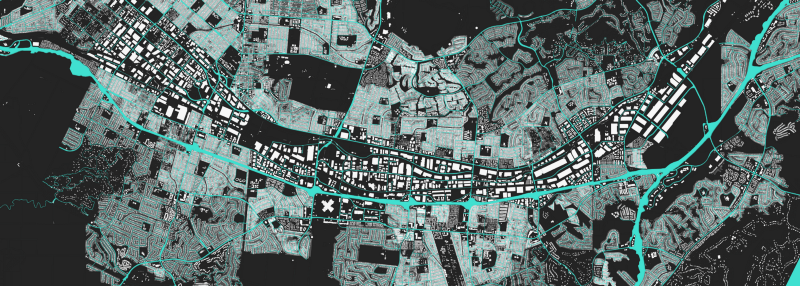
ER Okay. We just did a project about Los Angeles and I want to just show it to you. It shows the building sizes and the lot sizes of Los Angeles. So the bigger a building is the lighter it is, and the bigger the parcel is the darker it is. So these are huge parcels owned by one organization with just tiny little buildings on them. And then these are huge lots with gigantic buildings on them. And here are these middle sized lots with middle sized buildings on them. This is some kind of — this is along the river. You start to see these kind of demarcations where, I think, this is a big housing project, these are kind of modest sized lots — it’s almost like there’s a gradient of wealth as you go that way. And when you get into it — yeah, look at that. This area in here where they’re kind of medium sized lots and medium sized houses with tiny little sheds in the back. So that denotes a particular kind of neighborhood, right? And I just love the idea that you can tell something about a place from the way in which it looks, from space.
RN That’s great.
ER Thanks! I love this idea — and I’ve been talking with this with my friend Paul Ekman and we’re going to talk a bit more about this with design and sciences — that he’s a psychologist and he’s a very interesting guy. He developed the science of how facial expressions relate to emotions. He said to me once that he represents a dying breed of science which is observational and just looking, rather than crunching numbers. Just sitting, and looking at what you’re studying. And I love this idea, that you can just look at a map and without any other context, just because of how it looks, you know that it’s a rich or a poor neighborhood.
RN That’s amazing.
ER Thank you. Seizing on something you said earlier, that you could — that you were talking with a reporter and you were looking at a city that you didn’t know very well that she was interested in and you could point to a neighborhood on the HOLC map and say, “I bet that’s where gentrification is happening now.”
RN This was Tacoma, Washington. And I knew there was some revitalization that was happening downtown. They have a Chihuly glass museum down there now. And I more or less knew where that was, and could look at the map, and just knowing that particular areas had been marked as D and kind of reading through the area description of them that described blight and slum situation, but then knowing that having that one nugget of information, I could say, “I bet that’s a gentrifying neighborhood,” and I asked and she confirmed, “Yeah, this place is being turned into lofts for hipsters.”

ER So in some ways — let’s just test this out — you could use the HOLC maps — and with a little bit of local knowledge identify, from space as it were, where the gentrification is likely to be happening?
RN Yeah, and I mean there’s other roads, right? One other road is we know that alot of these D neighborhoods later became targets for urban renewal, so you could compare that spatially to more modern apps to satellite imagery and you could probably do something similar to this, where you could pinpoint overlaying D neighborhoods and — what do they call that when you aerially interpolate information — what is that called?
ER Machine learning for satellite images.
RN Exactly. I mean, this is what scientists do with forests, right? Because they can use color density to kind of know something about the composition of forestland, and I think you could probably do the same thing combining HOLC with views of cities to see which areas have been razed through urban renewal. And obviously, one example of this is a lot of these cities, or these D neighborhoods — became targeted and razed by highway construction. Interstates goes through a lot of these neighborhoods so a lot of these neighborhoods don’t exist in the same way that they did 80 years ago because they’ve been cut in half or totally obliterated by highways.
RN This is something I had in my head as you were talking about that but also thinking about this map, I was thinking about that map that’s — I forget who did this — the map of trees in New York?
ER Yeah, I’m not sure. There’re so many now.
RN Yeah. But it’s an amazing project and I bet you can tell something — this correlation between the trees in New York and racial lines and economic segregation. I think the particularly of where I live. There’s a street — Brooklyn Parkway — and the main street divides a primarily African American neighborhood from a primarily white neighborhood is Chamberlain Avenue. And beyond the complexion of the people on either side of that, the thing I’m most struck by is if I come from the Highland Parks, which is primarily African American neighborhood, into the Ginter Park neighborhood is that you see a ton more trees. In fact, it’s so much more wooded on the west side which is mostly white than it is on the east side which is mostly African American. I don’t know why that is but it is just visually striking.
ER I was going to say I love that — I don’t love that [laughter]. I don’t love that those people don’t have trees, I guess. But I do love this idea that by observing, you can learn by how things look. I’m decided not to become an academic because, even though I found alot to read about when it came to my field, the history and philosophy of technology and science fiction, there weren’t enough pictures in the academic journals that I was reading, and I was really fascinated by all this visual stuff. I got really involved in World War I and the battlefield and the technology as a way of talking about battle and war. But when I published these papers there’d be maybe one picture in it whereas I’m talking about something that’s quite visual. So that’s kind of how I got on this path. And this idea that’s it’s not just by looking at a map but that by looking at a certain kind of map in a certain kind of way, you can make inferences about things that it was never intended to describe to you is — I mean, that’s the good stuff as far as I’m concerned. That’s what I chase anyway.
Rings as a metaphor for urban development
Could tell me one or two other stories about something that you found interesting in HOLC?
RN Well, one element that we took inspiration from the work that we did with you for sure was we fell in love with some of the visualizations that were tied to but not intrinsically spatial that ended up in the first few maps that we did with you. So I’m thinking of the bubble plots that’s in the forced migration map which for me was the most revelatory thing of anything that we did. I’m thinking of the punch cards for commodities traveling across canals, of simple icons on the overland trails that show relative traffic from year to year. So I didn’t know exactly what that should be for HOLC but then but then I remembered I was familiar with this great and shocking graphic that was produced by an early 20th-century urban sociologist, Ernest Burgess. At first, it started off as an experiment with visualizing these materials. As I spent more and more time with the maps, I’d often noticed a kind of bulls-eye pattern where you had more D, red neighborhoods towards the center, and as you went outwards to the periphery — the emerging suburbs and cities — you had more A and B neighborhoods. His diagram was an effort to visually represent that.
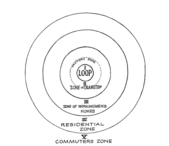
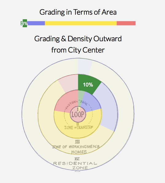
So we created this visualization that interacts with the map that tries to gauge the relative amount of each grade as you get further and further out from the center of the city, which is both its governmental and commercial heart. And it led to not just an interesting visualization, but one that I found that gave me an interesting idea that I’m continue to be intrigued by. How these spatial theories from early urban studies — scholars, sociologists primarily — how they get, in some ways, applied through the HOLC maps. How these theories become, not just descriptive, but prescriptive. How, when they’re translated into these maps and thus translated into the norms of the real estate industry, they become self-fulfilling prophecies. This is an idea that I’d love to think about it more depth and really dig deeper in terms of a more involved research project in the spatial theories of early 20th-century American cities and if and how they were adopted by and used by HOLC.
ER So the idea there being that, if the theory holds water, is that you should see is lots of bad in here in the inside of the loop and lots of — well, it should get better the further you get out. You should have more red in the middle.
RN And which is generally, but not entirely, the case if you look at these as a whole. I have combined all of these into a visualization that shows the relative percentage as it averages out across all the cities. And in some ways not surprising. There is a lot more D, red neighborhoods in the interior and more A and B on the exterior. C is actually interesting because it was 42% of the second ring, the third ring, and the fourth ring — also 42%. And I don’t exactly know ter if that means anything but I found it remarkable that it was entirely consistent in terms of its spatial distribution in these cities.
ER And there’re different kinds of cities too, right? Like here you’ve got the center of San Francisco right in the downtown which makes sense. I guess San Francisco, when I look at it, has a lot of bad neighborhoods way on the outside of town.
RN Yeah, but it’s 47% in the first circle and decreases significantly as you move out. All the closest neighborhoods to the downtown are red, right? But if you look at the yellow, it’s about the second ring, for the most part. This does fit the pattern fairly well, right? 8% and 8%, but there’s 3%, and obviously, this does, but 55% of it is B on the exterior ring and that drops by about half in the next ring, at the third ring, and it’s just a small fraction of that in the second ring.
It’s not a theory that we’re — our interest is not in suggesting that this is a correct theory. That’s actually decidedly not the point. And I actually worry that people are going to think that. The point is to see how academic theories in some ways impacted this program and once they’re translated into policy you can have some pretty lamentable policies.
ER But I think also it’s how what you’re doing is visually testing the spatial theories of this way of thinking about cities, right?
RN Yeah. I’m trying to think about whether these maps in some ways are informed by these theories. That’s the other way of looking at it. And the other thing we’re doing is that there’s a certain kind of play to this, right? This is a way of letting people experiment with the map to see things they might not otherwise see by highlighting certain features, whether that be the entirety of a grade or a particular grade that’s on the periphery of a city.
So we will relay our rings just to give an indication. But those rings were on the original map, right? And as I said, there’s 2,000 of these, and they weren’t making these maps from scratch. So they’re not putting this on or they’re using existing commercial maps and then augmenting them with these color codes.
ER So the inference, or it’s not even like you’re doing science here, but the point is people thought about cities in this way when they were making these maps. It was part of a common frame of references.
RN Exactly. The distance from the center of the city says something — conveys some useful information and arguably that information, if you take Burgess as an example, and even today. We think of suburbs, and suburbs are defined in part by the fact that they’re distanced from the urban center. The fact that they’re distant, we call that suburbs, but that also does indicate something about who lives there, what the norms and the values are, what the cultural perspective of…
ER So let me complete that. We obviously live in a very different world now than this world. It seems pretty clear that the centers of cities are experiencing a pretty significant rejuvenation, and the suburbs, in many ways, are really suffering. And the kind of values have changed, people’s attitude towards land has really changed, to good and to bad. What if we wanted to measure this now? The project exposes and illuminates and argues about a way of thinking about American cities as reflected through official documents and practices. And I wonder whether there’s something to say about that now? Would we would do it differently now?
RN What I’m often struck by is this. For sure there is change. And it’s not that hard to look at some of these policies and connect them with, say, gentrification that’s happening in lots of cities. But I’m also struck by how little it’s changed. That you can underlay a lot of these maps with other maps that show racial distribution in American cities, and they often match up directly.
We put in current-day poverty data, and what I was struck by was how much overlap there was between the neighborhoods that were marked as D continued to have the highest concentration of poverty. It’s striking how much that matches. In another example, someone contacted me from Mobile, Alabama who was working on something related to segregation and gave me a map of racial segregation in the city, and it was remarkable how much it matched up and was recognizable visually, compared to the whole map of Mobile, and I don’t know anything particularly about Mobile.
I think the legacy of these these red-lining practices — is these segregationist and segregationist policies and these policies that contributed to wealth inequalities continue to have a major impact. And it’s — perhaps shouldn’t be surprising — but it’s still shocking that you can see the persistence of poverty and concentrations of poverty in particular areas over a better part of 100 years. I think that should be shocking, how little has changed.
ER Shocking. That’s the sentence I want to end with. Cool, thank you.
RN All right, cool. Thanks. That was fun.
