
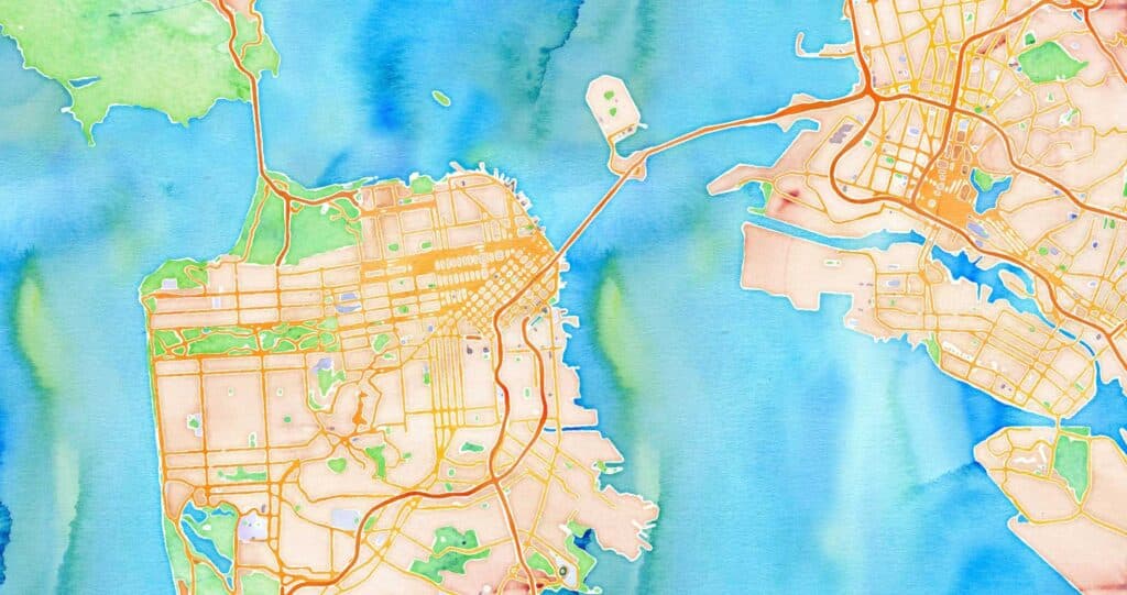
The Stamen map tiles have long been one of our most iconic offerings, but only recently have we engaged with how to sustainably move them into the future. In June’s episode of Pollinate we dig into how some of the headier challenges of performative materiality apply to preserving the Watercolor style in the Cooper Hewitt permanent collection, and in this conversation Stephanie May and Nicolette Hayes chat about the practical challenges of preserving, updating and maintaining this seminal offering.
Transcript:
Stephanie May (SM): Hi, everybody. I’m Stephanie May, Director of Geospatial at Stamen.
We’re following up on the most recent episode of the podcast where we talked to Andrea Lipps of the Smithsonian about curating digital artifacts and her role in getting the Watercolor map styles acquired into the permanent collection.
That episode and that conversation between Eric Rodenbeck and Andrea Lipps was a lot about the legacy of Stamen maps. I’m here now to talk with Nicolette Hayes, the Director of Design and Marketing at Stamen about the present state of these map styles and what the future holds.
We made a big announcement this week, which is that we’re getting out of the business of hosting tiles to refocus our efforts on creating beautiful map styles, and we’re kicking that off by recreating Toner, Terrain, and Watercolor for use with vector tiles.

We have a great partnership with a company called Stadia Maps, who’s hosting these tiles going forward, that allows us to focus on something that wasn’t possible 10 years ago when these styles were created, which is to separate out the styles and focus on the cartographic aspects of those in ways that are more portable, useful and relevant to the client work that we’re doing now.
Hi, Nicolette.
Nicolette Hayes (NH): Hi, so glad to be here with you! It’s a really exciting moment to be engaging with these map tiles at Stamen. So much work has been done just in the recent months to actually move this thing forward in a way that—at least in my eight years at Stamen—just has not been the case. In fact, full disclosure, my personal relationship to Watercolor, Toner and Terrain generally has been one of a little bit of cognitive dissonance, because there’s the work that we do at Stamen and that I’ve spent every day doing, which is client services (it’s solving communication problems, it’s design, it’s so many things) but the form that hosting these map tiles has taken mostly has been confused people emailing us and asking when we’re going to make updates and why there’s so many broken tiles and all kinds of things… and I was like, wait, where’s our customer service team? We don’t have one of those. Where’s the team that’s making these—Oh, we, we don’t have one of those either. It’s just been sad because I know that it is such a beautiful and important piece of our company’s legacy and yet it has been sitting so far on the outside for so long that it makes it really challenging.
SM: It’s totally true. In my mind, these map styles were already a museum piece before Smithsonian collected Watercolor. And it’s been true for a long time that the way that we’ve handled it has been to sort of landmark them, just keep preserving them as-is through a preservation society which really just consists of heroic volunteer efforts on the part of staff to keep things running and to keep things working out of love for the legacy and the beauty and the pride that we have in what these tiles represent.
So it’s felt really incredible to be able to recreate these styles and do it in way that allows us to bring them back towards the client work that we do.
NH: There’s something nice in the way you’ve gone about doing this effort too—I’m thinking back to what Andrea referred to when she was talking about the needs of digital artifacts in terms of curation: it’s not just what it looks like, it’s what it does…that you can’t just take a screenshot and say “this is what it looks like, yay, done”—there’s the entire technical stack that had to move into the future along with the actual designs.
And then of course, as design director where I really get to engage with this process is in watching you all—our whole team actually—think about what is the visual aesthetic of these styles that obviously people thought about when they were first created, but since they haven’t been updated for so long, they’ve become iconic in all of these ways that I don’t think we necessarily spent a lot of time thinking about until we had this really cool new design constraint, which was analyze, understand really think about what the styles are. How they work, but also, what they look like and what parts of that do we want to bring forward and what parts do we want to leave behind? What parts do we absolutely have to leave behind because it’s super outdated and impossible to recreate in the current moment. And we have so much rhetoric internally around Helvetica—what fonts are we going to use? What is the Stamen font that’s going to live on in these maps that will be flexible and durable and representative? What pieces of the design process are actually central and which are on the table to be cut.
SM: Yeah, it’s interesting that you mentioned font since one of the hilarious early discoveries we made is that for all these years, Toner has been using Arial not Helvetica, they render these super simple, crisp labels. I am a complete font nerd and could riff all day on cartographic fonts and what makes them useful and exciting. Really, I think what you’re getting at with that example is that there’s a lot of big questions in here once you move past curation and, and history and legacy and start looking towards the future, it opens up a lot of really big questions and really the way that I managed it was by making sure that we didn’t open them too fast: initially, we’re just taking one little baby step, which is that we’re moving from this mindset of curation (or legacy or landmark or preservation) to just ensuring that we’re recreating something that’s backwards compatible, right? So it’s gotta look like almost the same thing which kind of pushes out a lot of the bigger aspects of the questions that you’re asking about what’s important to keep and what’s important to leave behind and where do we riff and how do we keep the spirit of the thing?
But it’s still really enough of a challenge. I think you’re exactly right in calling that a useful design constraint.
It was a useful way to help the current generation of Stamens really feel like we can take ownership of these styles and use our core competencies as cartographers to recreate some things—it’s kind of like redesigning the work of masters; going to a museum and recreating it maybe as you do in art school—but it’s also something different: it’s also an engineering exercise, it’s also a technical exercise, it’s also a data curation exercise that gets at all of the skills and competencies that we have to do regularly.
But yeah, I can definitely say that designing this process was really hard. It took a lot of work getting everyone to regularly step back with the right level of focus to decide collaboratively: Are we there yet? Are we focusing on the right things? Are we going deep enough without going too deep? Are we using our time wisely? All of that is actual work. It required a lot of cartographic insights, the kinds that really only come to you in the middle of the night after pounding your head against thousands of lines of style sheet code to really understand where are the artifacts and what are you really ultimately trying to do and going back and forth between the big picture and the minutia. And even then there’s a lot of judgment calls in this type of work. As one example, it wasn’t (it still isn’t) clear to us really what’s a render effect in these styles versus what’s intentional: those chunky halos in Toner and Terrain are something some of us love to hate on—are those something we preserve? Or are those something that we can riff on and improve.
Similarly, there’s a very interesting blur effect that comes through in Terrain that’s cool on the one hand, but in other points, it’s a little bit too extreme to the point where one of our team members commented “when I look at this map, I feel like I need glasses.” But ultimately, this team succeeded brilliantly—once we were able to identify the issues and name the tasks and prioritize them, there’s nothing that cartographically we couldn’t solve for.
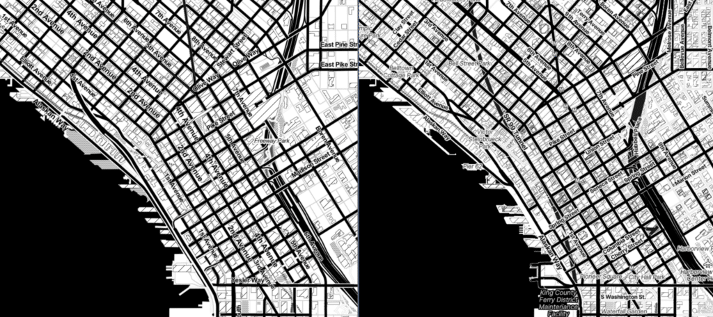
And it was a herculean task, taking these old styles, deconstructing them and then rebuilding them with all modern tools. But, you know, check out the screenshots from our latest blog post, the results really speak for themselves. What they accomplished is quite remarkable.
NH: I love that we finally have had this opportunity to bring that cartographic mindset and ability to make these updates into a larger system that you have had so much influence over designing to just make sure that we’re not just looking myopically at what the maps look like and preserving that for all times, but actually incorporating it in a sustainable way into our business model and into what Stamen is right now and what we hope to be in the future.
So we’re so excited to have this partnership starting up with Stadia and to have the culmination of all of the strategic effort be something that we can really start to leverage.
So, thank you, thank you for making all that happen, Stephanie. Really appreciate it.
SM: Well, thanks for that Nicolette, thanks for that recognition. That’s really kind of you.
And I think it is really exciting to anticipate these maps going out in the world. And in terms of that original goal of backwards compatibility, I worry that maybe, maybe we’ve done it too well and people won’t notice when we quietly slip the new tiles in where the old tiles were.
And the risk of that is that people won’t be clued into the fact that there’s a few lines of code they need to change in order to continue on with Stadia and there’s an account set up step that’s needed as well.
So we’re, we’re extending the life of these tile services just a little bit longer until the end of October to give everyone time to see that. And we’re thinking about creative ways of getting people’s attention, which is a fun exercise in and of itself how to maybe swap in some cute creator tiles here and there that people may notice who aren’t subscribed to our blog or listening to this podcast.
And really, what success will look like beyond that is: just as we’ve loved over all these years seeing the Stamen map tiles out in the wild, in our lives and all over the place—those of us who can tell the difference—if we start to see these new styles out in the wild, we’ll know that we’ve fully succeeded.