
We help our clients find and tell the stories in their data for the audience they need to communicate with. This can take the shape of data journalism, a report, an interactive experience with a strong narrative arc, or even real time visualizations of data in the MTV music awards.
We’ve been designing custom data visualizations and interactive experiences for over two decades. We believe better data communication empowers people to have more informed conversations about everything – from climate change and the environment to education, healthcare, and gun control. Data visualization is a rich source of sympathetic magic for ourselves and the world.
Our aim is to help our clients solve the most challenging communication problems by making their data insightful and actionable. We dig deep to find the stories in the numbers, the hidden fascination in the banal. We actively pursue strategies to display, understand and navigate through rich and varied flows of information, and deliver uncommon creative experiences borne out of data insights.
We continue to find inspiration and delight in every project that we do. The following are some of our favorite data storytelling projects from over the years.

The Atlas of Emotions for the Dalai Lama and Paul Ekman
Visualizing the continents, states, and actions of emotion
In 2014, the Dalai Lama asked his friend, scientist Dr. Paul Ekman, to design him an Atlas of Human Emotion, and Paul asked us to help him. Over time, the idea grew into a collection of maps, each representing a different aspect of the science of emotion.
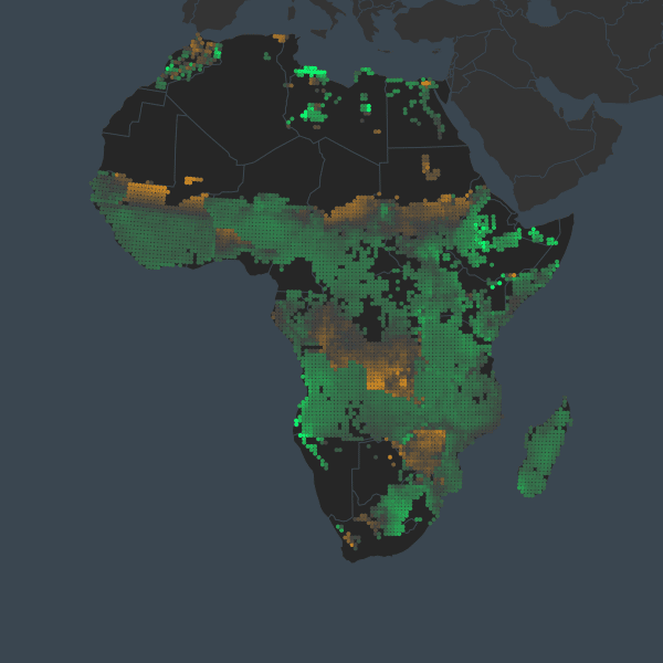
Vision for Adapted Crops and Soils with Earth Genome
Mapping crop potential and the future of agriculture in the face of climate change
In collaboration with Earth Genome, we created a data-driven product showcasing an interactive map and supporting data visualizations to demonstrate the nuance of food investment given climate change and nutritional needs.
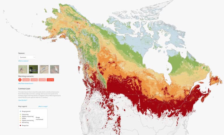
Survival by Degrees with the National Audubon Society
Exploring the impact of global warming on North America’s bird populations
A climate report by the National Audubon Society reveals that nearly two-thirds of bird species are imperiled by current climate change projections. Audubon asked Stamen to use our data visualization expertise to illuminate this grim — but sometimes hopeful — story, creating visualizations of Audubon’s projections of the impact of global warming on species across the U.S., Canada and Mexico.
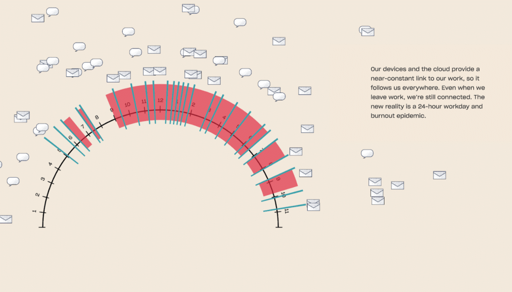
Showing How Work Became a Mess with Dropbox
We used illustrations and data to tell the story of the modern workplace and its pitfalls
Dropbox wanted to to answer a key question about the modern workplace: How did so much of the new technology that is supposed to make work more efficient actually end up making us less productive. Using publicly available data, the idea was to start a conversation — one that would lead to better tools and ways of working.
Looking for a more analytical or open-ended method for exploring your data? Find some of our favorite interactive data experiences here. You can also view additional projects on our work page.
Ready to make some data viz magic happen?