
This episode of Pollinate introduces some of our recent client work with Columbia University’s Center for Spatial Research. A conversation between three members of the project team provides a deep dive into the ins and outs of using modern technology to create a historical experience centered around 100+ year old data. Dan Miller worked with Stamen’s Nicolette Hayes and Eric Brelsford to turn New York City census data from 1850, 1880 and 1910 into a fully explorable interface with enough curation and guidance to tell some meaningful stories.
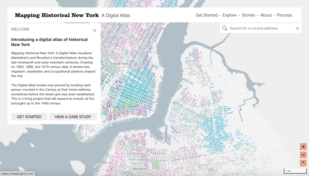
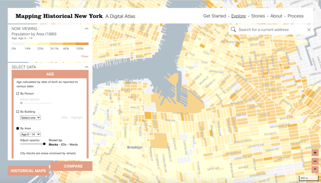
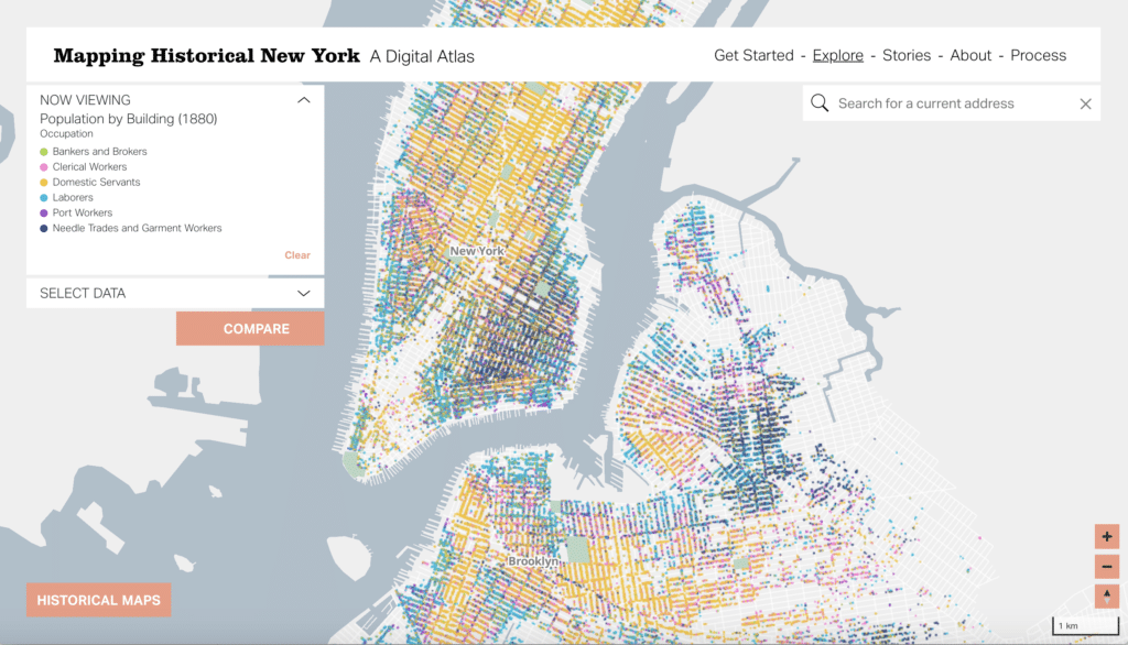
The interface currently displays census data in both Manhattan and Brooklyn (with more boroughs coming soon!), which means you can explore some common demographic categories: population, race, gender, age, birthplace and occupation. For each category you have the opportunity to see this data at varying levels of aggregation. The most general is a choropleth summarizing the percentage of people making up any one of the choices within a category (for example, anyone under 14 at the block level).
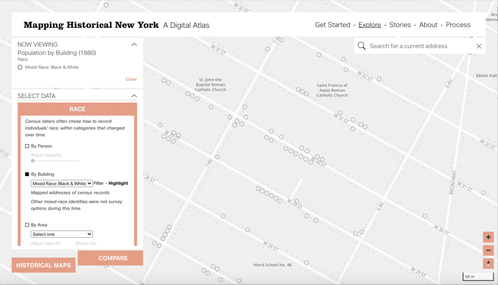
Diving deeper, you can see how the data is distributed at the building level, allowing you to see a point representing any place someone from that demographic lived (for example, highlighting just the buildings that housed mixed race individuals).
And finally, the map allows for granular exploration of a curated set of demographics within a category at the person level, showing a dot for every person clustered nearest to that individual’s building (representing, for example, all the bankers & brokers, clerical workers, domestic servants, etc. responding to the 1880 census each in a unique color).
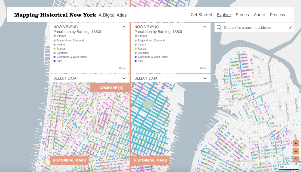
Viewing these supposedly simple demographic trends reveals transformative shifts in the demographic landscape, such as the formation of German enclaves in the Lower East Side between 1850 and 1880.
As with all census data, however, the story is further complicated by the politics of inclusion and exclusion inherent in collection methods and policies. Not to mention, surprise data quirks like address systems changing over time, or not being collected at all!
Explore the interface for yourself at mappinghny.com and check back in for even more information about building the site coming soon to our blog.
Transcript — +
You’re listening to Pollinate, a podcast on data, design, and the people that bring them to life, brought to you by Stamen Design.
Nicolette Hayes (NH): Recognizing bias in historical data, showing 60,000 different jobs as colorful dots on a map, and what you can and can’t learn from zooming in and out of New York City. These are some of the topics we’ll dig into during this episode. My name is Nicolette Hayes, and I’m the design director at Stamen. Today, I’ll be introducing you, not only to some of my interesting Stamen collaborators but to a project we just launched that shows how walking through a city 150 years ago, knocking on doors, can be turned into a map that gives us fresh insights today. With that, I’d like to welcome my guests.
Dan Miller (DM): I’m Dan Miller. I am a researcher at the Center for Spatial Research, where I work on the Mapping Historical New York project.
Eric Brelsford (EB): And I’m Eric Brelsford. I’m a design technologist at Stamen Design.
NH: Let’s start by talking about the Center for Spatial Research since it’s kind of a unique workplace. It definitely is a little bit outside of the kinds of places that we have worked with as Stamen. So if you could tell us a little bit about the way you guys work internally and what you do there, that would be really great.
DM: Yeah. So the CSR, or the Center for Spatial Research, is a hub that brings together research in architecture, urbanism with methods in data science. So we work across a number of different disciplines. We have a team of researchers, research scholars like myself, who work with the director of the Center for Spatial Research, Laura Kurgan, and the assistant director, Dare Brawley to come together on projects like this one that we’re going to talk about today, the Mapping Historical New York project, which is a collaboration between our office, or our research center, and the history Department at Columbia in faculty and history.
NH: So yeah, I think a really important word that you just said several times was collaboration. It seems like this is a nested doll of collaboration. You’ve already got a lot going on within your organization. Then you guys are collaborating with Stamen Design. But that also just brings me to your specific role at the center, since it seems like you are often sitting at sort of the nexus of communicating between different parties, if you would tell us a little bit about that.
DM: I come to this work at the CSR from an academic background in geography and in historical GIS or geographic information systems. I’m thinking really critically about how to apply GIS methods in the humanities. Before I started at Columbia on this project, and that’s what I mostly work on as a researcher in the CSR, I got to work on a number of different collaborations between historical demographers and people putting together textbooks. I got to work on collaborations inside of an architecture studio with architects and designers who were interested in using mapping to assist human rights defense and advocacy work. I also am a collaborator in the Holocaust Geographies Collaborative on the Holocaust Ghettos project, which is trying to look at the history of the Holocaust from a spatial perspective and incorporate a lot of visualization and mapping into that work driven by the methods of GIS.
DM: And so there in all of those projects and I think this project, the Mapping Historical New York project at the CSR, really brings a lot of those themes together where my role is to sit in between people speaking different disciplinary vocabularies and trying to work with methods of mapping and visualization to create a project that helps kind of rethink a historical event. For this work, I think a lot of the challenges– and this work being the work of the Mapping Historical New York project, a lot of the challenges come from dealing with massive amounts of information, identifying an opportunity to map historical census records of which there are many millions of microdata records that we can work with, and then thinking about how to visualize them and support faculty research in and towards developing kind of new approaches to the history of New York City.
NH: I will also just say from experience, having worked with you on this project, that skill set that you’re describing, you brought to bear in a pretty useful way for actually just getting this map made internally for us as well. It’s often really difficult when you have a lot of stakeholders that are really, really invested in the final product that are coming at it from different perspectives and have different needs that they all are sort of weighing against the work that you’re trying to also have feel cohesive and complete and as simple as possible. And so having you on your side to sort of wrangle all of those very, very important perspectives and then communicate them back to us was incredibly helpful. And I wish we had a Dan Miller on every project at Stamen, frankly. But before we sort of jump into the project itself, I want to give my colleague Eric Brelsford a chance to introduce himself as well, since he was another very, very important and integral member of this project team.
EB: Thanks. I work on data visualization with a focus on maps and GIS. As a design technologist, I’ll work on everything from helping to analyze and clean data to prototyping to front-end and back-end development to make the site that you need with that data. I’m based in Brooklyn, and I’ve been making maps of New York for about as long as I’ve lived here. So that’s part of what is really exciting about this project to me.
NH: And I will say that I also contributed to this work. I was the interface designer that contributed to the final product. I’m not going to talk too much about what that exactly looks like, though, because I want to hear how Eric describes it, especially since he did so much of the prototyping and sort of thinking about how all of this would fit together. And my role as designer, in a lot of ways, was to sort of come in after the data had been all accumulated and cleaned and curated in all of these meaningful ways, Eric prototyping it so that I could see exactly what we were looking at and then sort of applying some finishing touches. So we’ll let Eric describe what this project actually was from his perspective as sort of somebody coming in right at the beginning there.
EB: So this project takes a unique number of data sets about historical New York, and it makes those data sets visible on a map of New York. If you loaded the project right now at mappinghny.com, it is focused on Manhattan and Brooklyn, and it gives you the option to look at data for 1850, 1880, and 1910. And within each of those years, we give you ways to look at the data sliced up in a number of different ways. It’s all coming from the census, so it’s the kind of variables that you might expect from census data, occupation, race, birthplace, that sort of thing. But within each of those categories, we give you a couple of different ways to look at that data. One way is kind of a simple choropleth of what the percentage of people identified that way is. Say, you’re looking at people who are bankers, you might see the percentage of people who are bankers in a block or a ward as defined by the project. Going deeper, you can actually look at this by building, so you can see which buildings had people identified that way on the census.
EB: Part of what’s really exciting about this project is, beyond the building, you can actually see individual people. So within each building, you can see people in something resembling a dot-density map, which we’ll talk about later. So you can see at a high level kind of the patterns of– I’ll stick with occupation since I was talking about occupation. You can see the patterns of where people of various occupations lived in the city at that time. But you can also zoom in and see, in a particular building, what occupations were represented in that building. There are a bunch of other things you can do with the map. So you can add a compare mode, so you can compare two maps with different settings and swipe back and forth between them to see the differences, say, between 1850 and 1880. And the team at Columbia wrote some really impressive data stories using the data to give you an idea of how you can use this site.
NH: One of the last things that you were sort of alluding to was the fact that you can see all the way down to the person level on this map. And we will talk about the visual manifestation of that a little bit more in a minute. But I wanted to give Dan a moment to tell us about where that data came from. What does it mean that we’re able to see person-level data? Talk to us about the census.
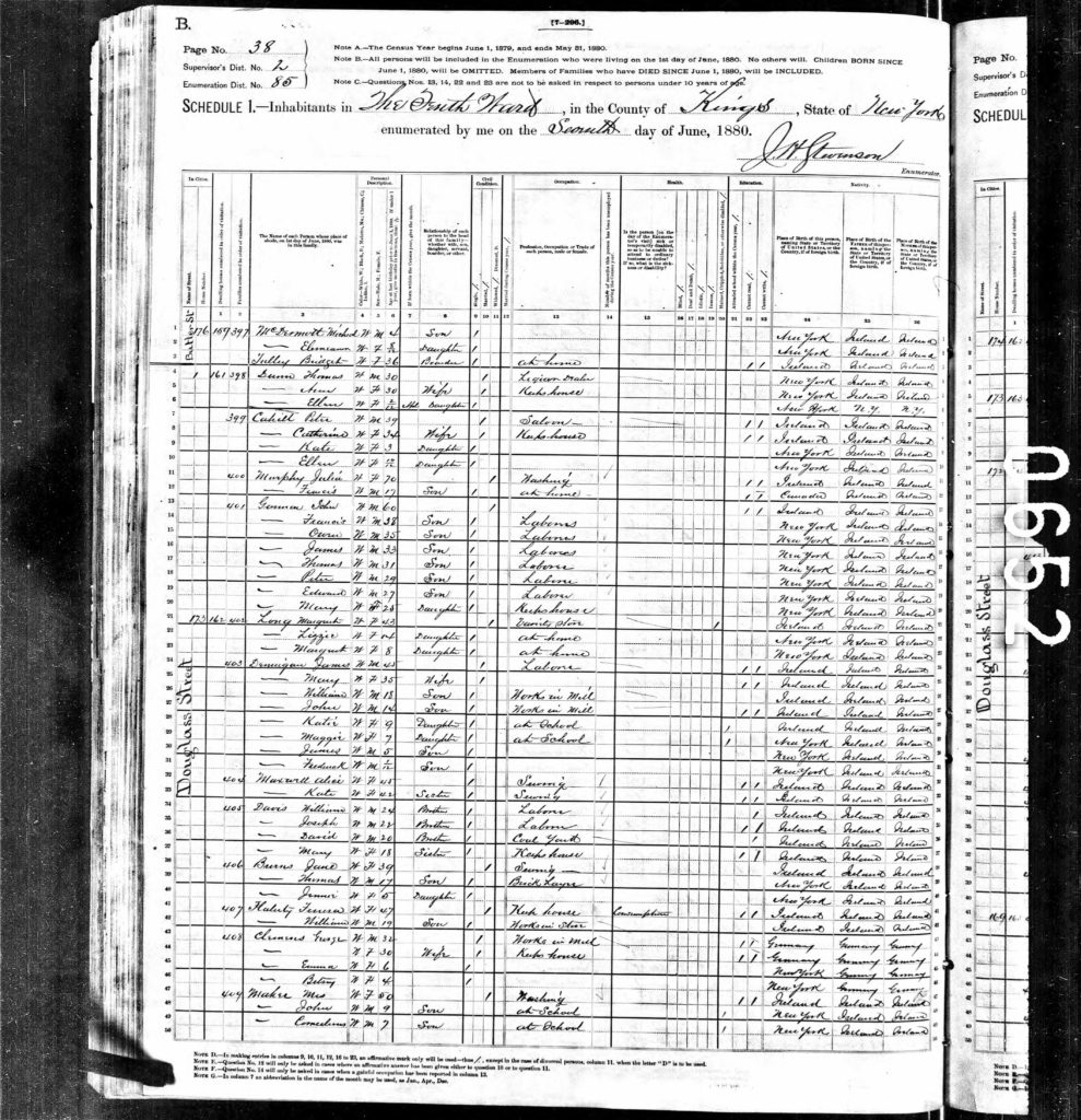
DM: So here’s one of the really interesting opportunities and one of the largest challenges of this particular project, I think, having worked with a lot of census data going back to 1790 before starting to work on– working on this project. We have this opportunity here to work with historical microdata which are the individual records Eric mentioned. And usually, when you work with historical-census data outside of this kind of project and you’re interested in making a map, you have the opportunity to map it at the county level. Or sometimes you could make a map of it at the ward level. If you’re mapping in New York City, wards are these administrative areas that are really significant. But here we actually are going back to transcribed versions of the census manuscripts. So we have the 1850 census, 1880 census, and 1910 censuses available to us from the IPUMS project, which is at the Minnesota Population Center at the University of Minnesota. And they get these data from a number of different sources. So they’ve been working with and formulating census data for projects like ours to work with for a while now. And there are amazing opportunities and challenges wrapped up in working with these person-level records.
DM: So one is that we don’t always have an address associated with these records. So if you were to look within an archive of some of these images and look at the census manuscripts that census takers were walking door to door and filling out throughout the city in 1850, you would notice that there was a long list of names. Race was marked down, occupation was marked down, some of those categories that Eric was mentioning, but then you would also notice that there’s some information missing that would be key to kind of mapping things with granularity, such as an address. A complete lack of an address in the 1850 census was something we realized pretty early on in the project was going to be a challenge if we wanted to map with specificity to the building level. In 1880, there are addresses, but this is where the history of the city and the development of the street grid kind of comes into play. So we’d learned a lot about that.
DM: The address system was changing. It was really in flux throughout this time period specifically. And then moving forward to 1910, you have the integration of Brooklyn into the overall city of New York as a borough. Before, Brooklyn and New York or Manhattan were two different cities. They kind of bring together their urban planning approach, their approach to address systems. So we have to represent that and reconstruct that even to get to the point where we can place an address on the map. So we spent two years as a project working really intensively with the census data, and then the underlying spatial data needed to map the census records. So in some cases, it was back to 1850, reconstructing an address where there wasn’t an address. We used record-linkage methods to do that, linking to other records from the time that had addresses.
DM: And then moving forward to 1880, the census records required a lot of intervention to clean up the addresses, to standardize them so that we could map or geocode them onto a historical street grid. And these are all things that end up kind of embedded within the site, or they’re ways of working with census data that are expressed in the site that maybe hide some of the intensive work over two years when you see the final or near-final product represented as a dot on a map. But there was a lot of work, especially work and contributions from students in urban studies and history and planning who helped us achieve that granularity. The census takers were doing their work in 1850, 1880, 1910 over a number of months, walking the city, knocking on doors, filling out these census enumeration forms as they went. And those are really the kind of core documents that we focused on as a project. We’ve learned a lot about how the census was taken, and we even can trace some of those enumerators from door to door through our work with the census.
NH: So I guess, at this point, we should take a little step back to sort of a visual description, again, of what it really means to take that kind of granularity and make it something that people can understand. I know that this is something that as an interaction designer, I spend a lot of time thinking about is just how much you want to aggregate data so that people can observe trends versus– sort of the magic of this data set was in just how much specific person-level stories you could begin to really feel and understand based off of having access to that data set. But again, as an interaction designer, I worked with Eric to actually be able to put that information on a map in a meaningful way. So tell us, Eric, tell us about the dot-density map.
EB: One way that we tried to show the person-level data originally was by doing kind of a typical dot-density map, which would kind of uniformly spread dots throughout an area. So for example, if you have data at the block level, kind of randomly dispersed the dots within that block. And we had some prototypes that did things that way. But because we had such detailed data as Dan was describing, we didn’t want to just fling these dots around the block, basically. If we could show more detailed views of the data, it seemed to make a lot of sense to do that, and this was in conversation with another one of our colleagues, Alan McConchie. He was saying, “Well, it would be really nice to see these points clustered around the dwellings.” And so we had a couple of prototypes where the points were clustered around the buildings.
EB: And eventually, what we ended up doing was clustering the points around the buildings, but also making those clusters tighter if there were fewer people in the dwellings. And I think that’s a really important part of this because, as you zoom out, you can actually see the population density change. So if you’re comparing, say, 1850 and 1880, you can really see how a place like the Lower East Side really fills in with people in that 30-year span. You can also zoom in and see why this must have been a huge building because it looks like there are 100 people living in it. So it was a really unique challenge to try to show all of the people-level data. If you look at a more typical dot-density map, as I was saying earlier, often it’s at the census-tract level, and you kind of just see, if you zoom in far enough, everybody is just randomly dispersed within that area.
NH: Yeah. You’re reminding me of some of the confusion that I experienced at the beginning stages of the project, which is I knew we had the address level. I knew that we actually knew exactly where individual people could be placed on the map. And when I was looking at those sort of randomly distributed ones, I think I innately assumed that the placement was meaningful even though I know that that’s not how those kinds of maps work because I work within this field. But it gave me good insight into what possibly somebody who isn’t making maps all day, every day might experience having misconceptions about what data means when they’re reading it, if they’re thinking about it that deeply, which I always wonder. Another thing that, while you were talking about the clustering, I remembered was it ended up looking like a fire drill map. It got really fun to see all the people in the streets.
EB: It’s true. It does kind of look like that. I should say, another option that you’ll sometimes see people do is what’s called a dasymetric dot-density map, where you kind of pull out the parts of the area that you’re looking at where people are unlikely to live. So if you knew where the buildings were, you might pull out the empty spaces and only put people in the buildings. That was also on the table while we were working on this. But I think, for the reason I mentioned earlier where you can better see the population density, I think this was the right call, ultimately.
NH: Well, that actually seems like– it reminds me of something that you introduced us to Dan, which was– actually, throughout this project, you did a really, really nice job of pulling together some precedents and just historical mapping in general, how an interface can look, how it should look, how different people felt about how all of those different maps and interfaces looked. And I know that there was some really interesting precedents within the field of dot-density mapping, even, that you brought to the table.
DM: Yeah. The historians that we work with on this team, they’re urban historians, Gergely Baics and historians of immigration, Mae Ngai and Rebecca Kobrin. They’re really used to working with census data in some format, and especially for Mae and Rebecca, I think, working with census manuscripts, so those enumeration forms I was talking about. And they were quick to point out the history of urban social reform movements and during the same time period of our project, so that’s within roughly the late 19th century to early 20th, who were working in really innovative ways with census data and data that they were collecting themselves through intensive surveys. And some of them were producing maps like the Hull-House Maps or like the New York City Tenement Commission maps that were so detailed and were a big inspiration for us, but they’re of small areas. So the Hull-House and the Tenement Commission maps are– in the New York City case, the Tenement Commission maps are really diving deeply into the Lower East Side neighborhood and what became Chinatown, the area between the Manhattan and Brooklyn bridges, and describing and surveying the people who lived in those tenement buildings.
DM: If you look at those Hull-House Maps, they map at the building level, demographic responses through different census categories, the responses to different questions with a lot of granularity. And again, they’re just showing or describing visually one neighborhood. And we were immediately wondering if we could do that with the data that we had on hand for the entire city or in this case, Manhattan and Brooklyn. And then just to have that breadth and depth, the relationship between the granular mapping and then the fact that you get to zoom out and see how patterns that might affect one particular block, or even within a building in some cases, manifest across the entire city. So far, it’s been really fascinating for all of us on the team to kind of interpret the data that we’ve created through these dot-density maps that you all helped us realize. They’ve just been incredible entry points, and I think that’s why we’ve foreground them so much on the site.
NH: All right. Well, that begs the question, entry point into what? I feel like that was something I got really excited working on this project in general was when the interface had come together enough, and we had enough of the data displayed that we started to be able to really see patterns and stories and start to wonder about why these dots over here were like this, in this color. And of course, we had very naive questions that we were asking, whereas the people that you are in conversation with all the time have the opportunity to ask really well-informed and contextualized questions around these things. So I’m curious if you have any favorite stories that either you have come across or people that you work with have unearthed that you could tell us about.
DM: Eric described the parts of the site that are geared towards helping us tell stories with the massive amounts of information that we have, which I think we realized would be really overwhelming without providing, as we were saying, an entry point into all of it. So we have these case studies under the story section of the site. Right now, there are four of them, but we’re really hoping– and I think one nice thing about how this project was built is that we can expand them. So we’re hoping that we will expand them in collaboration with other people, students, other historians. Those case studies right now, present four different approaches to the history of Manhattan and Brooklyn during this time period that you’d be able to introduce from the perspective of the census. So, so much of this, again, is just coming from the census and what it could show.
DM: The case studies or the stories that we have up right now, look at the history of immigration and neighborhood formation. So there’s one on German enclaves, which is really a fascinating look, mostly drawing from those dot-density maps that we were describing of where German-born people settled, and German-speaking people settled in New York when they came here from Germany, which at the time looked a little bit different from contemporary Germany. But they all coalesced in these enclave neighborhoods, which kind of just differentiates them from other immigrant groups in the city. So Lower East Side, if you look at the 1850 dot-density map of birthplace on the site, you can see, in these bright blue dots, those dots indicate the people who were born in Germany or that were listed as being born in Germany on the census, the beginnings of a neighborhood forming in the Lower East Side. By 1880, it becomes what historians refer to as Kleindeutschland, which is Little Germany. What’s really interesting, too – which was surprising to a lot of people on the team, and I think has been really interesting for people to see in the map of Brooklyn – is how much Bushwick and East Williamsburg and then other parts of Brooklyn, or what became Brooklyn, were also home to these German enclave neighborhoods.
DM: If you move ahead in time and show the 1910 dot-density map, you can see a different pattern for people born in Italy. And this is something that people on our team are really excited about digging into as well. So it’s kind of a new way of looking at immigrant neighborhoods where the Italian neighborhoods in Brooklyn at the time, as you can see from the map, are smaller and more scattered, but still pretty condensed in certain parts of Central and Southern Brooklyn. I kind of live close to one of those neighborhoods in Brooklyn, and it’s been interesting kind of going and kind of rethinking my own relationship to those few blocks where our map in 1910 shows a lot of Italian-born people were living really close to each other.
DM: And then with these maps, too, as Eric mentioned earlier, because you can zoom into the building level, you can see how these patterns of immigrant-neighborhood formation kind of play out between buildings and sometimes even splitting blocks. So thinking about dynamics of segregation that were characterizing the city at the time, you can definitely explore those dynamics on the map where in some blocks in the Lower East Side in 1910, kind of this zone between what became Lower East Side populated mostly by Russian Jewish immigrants and Little Italy, which is still Little Italy today. You see some blocks where there’s a lot of kind of mix of Italian-born people and Russian-born people, but then they’re really segregated by building, which I think tells you something more about where people lived, what kinds of conditions they were living in, who they were living with in the same building versus on the same block. It’s the basis for more exploration, I think, for students and researchers.
NH: It’s funny. I’ve spent so much time thinking about this project from a zooming-in-and-out perspective, in terms of thinking about how we aggregate the data, whether it’s at the person all the way up to the enumeration district, the ward, etc., and now I’m thinking about levels of experiencing the map almost as like a zooming experience, too. So you already alluded to the fact that we have sort of an open-ended exploratory mode that you can use versus a more curated data-stories mode where you can be walked through something and see it sort of explained to you and spelled out. But the third one that I hadn’t really considered was my own experience of exploring this map and the kinds of insights that I came across. In my very first one, having lived in New York– which I think everybody does this. I’m just going to go out on a limb and say that everybody does this. If you’ve lived someplace and you look at a map, you look for your house. I think our founder has sort of staked his reputation on that being a basic premise of mapmaking, so.
NH: So the first thing I did was, I went to East Fifth Street in the East Village not too far from where you’re describing, actually. And I think we only had 1850 loaded at that time, and my street just wasn’t there. It turns out the block that I lived on just straight up didn’t exist, which was so disappointing. And so that was my first level of sort of experience for the map was just feeling excluded. We’ll put it that way. I felt like maybe this wasn’t a place that I actually recognized. And then from there, once we actually did get data loaded, and I started looking around and seeing the makeup of the rest of the neighborhood around the exact spot where maybe my house was, and I stopped imagining it from a current-day perspective and realized that what I was looking at actually was historical. That’s sort of the second layer, right, where you’re not looking for yourself and your reality. You’re looking at what the map is actually showing you and thinking about what that means. But now my third layer that I want to add to that is the fact that data isn’t perfect. And it is collected by people and collected using policies and that even just looking at that data as it was – and it’s very authoritative the way it existed and in its authoritative state because it was from the census – even that is innately problematic. And I know that we had some good conversations about that.
DM: I really appreciated how much we discussed that while we were putting the site together as a team. And I think that’s really important, and it’s really core to the work that we do at the Center for Spatial Research is to constantly be interrogating the means of producing a data set, and especially if you’re going to be using that data set in a project like this, think about how representing the data, what kinds of documentation needs to be produced around it. I think your points about the missing data are really interesting for your former apartment on East Fifth Street. That might have existed. There might have been people living there in 1850. If the census didn’t count them there, they’re not on our map right now. And I think there’s a long history, unfortunately, of undercounting and census misrepresentation in the history of the census as this really important American survey that aims to, in some ways, count everybody who lives here. But as we saw in the 2020 census as we were putting this project together, it’s so often, and it has been in the history of this survey, politicized.
DM: And I think two of the most incredible categories that we are working with and that form these really interesting dot-density maps that we are talking about are subject to these political motivations. So an example is the birthplace category. It’s interesting to be able to map where people who are counted in the census in 1880 in New York said that they were born. They were born in Germany, as we talked about the German enclave’s example, or born in Italy. Or either people self-reported or the enumerator filled in– the census taker or the enumerator filled in their interpretation of it in some cases. That question was motivated by anti-immigrant sentiment, trying to understand how immigrants, and at the time, the rapid influx of immigrants that were shaping cities like New York and they were changing the demographic landscape of the US, were doing so and trying to understand and differentiate them on a survey. So that is important to keep in mind while we have access to it as a category on the historical census, and we’re able to make really interesting maps and, hopefully, some reparative maps of immigrant neighborhoods. There’s a motivation there that I think is important for us to understand and to document. That also is true for missing information, undercounted records in the city. And I think, as a project, we’re trying to do a better job of grappling with that, showing that to users, documenting it, and the documentation that we’ll eventually release and publish alongside the data that we’ll share out in the open source.
DM: For some of the categories like occupation, we have upwards of 60,000 individual responses, just people saying, with a lot of variation and diversity, what they were doing for work. And that’s not something that we could show with fidelity on a map like this. But that’s another thing that we’re trying to integrate more, thinking about how to show– or how to, wherever possible, return and learn from the initial moment where the census was taken, that interaction between the person who was home that day at the address being enumerated and the census taker, and then to think up from there how that information was taken, represented, used in different ways and then how it gets to our project many, many decades later.
NH: I know we went to a lot of effort to both give people the opportunity to see as much as possible in terms of the richness of the individuality of the data, but then also, of course, having to make some choices so that you could actually understand what you’re looking at, at a glance, if that was the route that you wanted to take. I’m still trying to whittle down, which was, I have to say, having your team doing that work was really, really useful for us because we didn’t have to necessarily be the ones to say, “These are the six occupations out of this incredible 60,000 that are really worth talking about.” That, as a data visualizer, is always a real challenge to pull out with any sort of confidence if you’re not working with experts who can really help to guide you in that fairly arbitrary exercise, but hopefully, making it slightly less arbitrary.
NH: But I will say that one parallel that I did experience in working with that data set was at the point that we were actually starting to see that data in the dot-density map so that each occupation, like the few that we had highlighted for the sake of storytelling, we were able to apply colors to it. And job number one, as a visual and interface designer, make it pretty, make it something that people want to look at– okay, maybe that’s job number two. And job number one is actually make the colors different from each other. Make it so that it’s something that you can differentiate the banker from the dock worker. But then immediately thereafter, we started to realize that there are such different distributions and densities of these specific data sets. And because we were working with finite data and not trying to just apply it to the entire data set, we would be able to make some really specific choices about how that color was applied.
NH: So one of the first things I did was trying to apply a single color to something that was going to occur quite a bit, just made the entire experience really overpowering. And so having the opportunity to go in there and fine-tune and say, “You know what? There was a lot of white people living in the city at this time. If we make them all really, really bright-colored, it’s going to drown out all of the diversity that we’re actually trying to sort of bring out in showing this map.” So having the opportunity to customize and go back in and say, “These are the six occupations or six races or birthplaces, and these are the colors and how we want to apply them,” it was a really enriching experience in terms of feeling like we don’t want to just take the first path or the completely naive path of just randomly assigning a color and assuming that that’s it, that that’s the end of the communication. There is no sort of further inference that the viewer is going to make based off of these decisions, that whether or not we did it intentionally or not are decisions that we’re making. There’s a couple of other things that I wanted to talk about in terms of the visual experience of putting the map together. And I’m going to open this back up to Eric. Because actually what I was describing earlier about not totally understanding that I was looking at historical data until we were a little ways into the experience, I feel like a lot of the work that you did on the actual customization of the maps and the base maps and how we showed the data was when that really came to life.
EB: Yeah. So we started originally with kind of– the typical way you might make a web map nowadays is using kind of a standard vector tile set, and those are of present-day data. So we had, for example, the coastline for current-day New York, and we had some current-day parks and things like that for context. And slowly in conversation with Dan and the team, we started to chip away at that. So we ended up having a custom coastline created for each year shown on the map. So this was a process of tracing a variety of historic maps that I did not do, that thankfully, Dan was able to get done with your team at Columbia. And I think an accurate coastline, if you’re familiar with the geography of New York, makes it really clear that you’re looking at something that is not the present day. You see things like Governors Island and Coney Island changed really significantly in the area around Jamaica Bay. A lot of the area around New York’s coastline has been filled in from a variety of tunneling projects like subways.
EB: And it’s really interesting to see that happen over time, especially if you’re comparing, say, 1880 and 1910. You can really see a big difference. You can also see in 1880– using the custom street network that the team at Columbia made, you can see that the East River bridges don’t exist yet. So I think that also is a big help. And in a lot of cases, if you see that you’re outside the existing road network at the time, it makes a lot more sense why you’re not seeing data for that area yet. It’s not developed yet. So I think all of those custom layers– there are other things that were created for the project, like parks, over time; points of interest, over time; place names. So as Dan said earlier, Brooklyn wasn’t a part of New York for a lot of the time that we’re looking at on this map, not part of New York City. It was a separate city. So you can see the label move around a little bit. You can see it where it was when it was a separate city. And then once it became a borough, you can also see the other towns that made up Brooklyn at the time. But I think all of that custom data adds up to such an immersive experience in comparison to what you were describing earlier, Nicolette, where you’re kind of just expecting this to be data overlaid on top of a present-day map.
DM: I can add something to that, or I’d like to build off of Eric’s– what he’s saying. I just think that the customization of the base map was another really key moment in our collaboration between the two teams of going back and forth, thinking about what the possibilities were, noticing things. I really like how Eric put it. Noticing that using the contemporary and open-street map, base map really doesn’t feel right once you start to overlay some of our census data onto the map. And then we have, on our team at Columbia, students who are really interested– who are interested in learning GIS and working on this project, took on the coastlines as an example. And so you can zoom in and see all of the changes in the wharfs and things based on their work.
EB: It was really exciting to work with a team that was able to get the resources to do that kind of work. It is the kind of thing that I think I kind of maybe mentioned as something I would love to be able to do, and then you were actually able to do it, and that was really gratifying.
NH: This is also reminding me of an early point in the project before I started thinking about how we could actually make it feel historical. And I was assuming that we would just leverage the look and feel of the actual raster maps that we had in place because we did have these very beautiful rasters that we were able to overlay– or underlay, I guess, for the entire city that had their own very historic feel to them. And that that was actually sort of innately terrifying too because there’s so many colors already baked into that base map. And trying to imagine how you then overlay a dot-density map and a choropleth and all of these other really exciting data layers that we were exploring was a little bit terrifying. But I think we got there. We ended up making it something that you can both toggle on and toggle off. You can adjust the opacity of some of our data layers. We gave the user a lot of opportunities to sort of customize their view so that they’re not stuck looking at it in any one specific way. But I think we also leaned into– even though it doesn’t– even though we’re looking at historical data, we’re not shying too far away from sort of a contemporary-feeling map. It makes the entire thing still feel fresh and relevant. And speaking of that, I guess we should talk about what’s next for this project.
DM: Back when we first started to collaborate with Stamen, we were thinking about where we wanted to go with the project. So we just currently have Manhattan and Brooklyn census data for this time period we’ve been talking about, 1850 to 1920. And that’s an important time period in the history of the city and the history of our project’s interest in immigration and how it shaped the city. 1924 is when the immigration exclusion act was passed, and that really changes the dynamics that our project, at this moment, kind of represents in the census. But when we were first starting to work with Stamen, we were already thinking about wanting to move forward in time to 1940 and then also add the Bronx, Staten Island and Queens, and kind of round out the entirety of the city. And then if we were moving to 1940, we were thinking of how interesting it would be to show Nassau and Suffolk County in Long Island and then to think about early suburbanization. That all relates to, I think, the way that you all worked with us on designing the interface, designing the stack– or selecting the stack for the site. And even the esthetic, like you were talking about, Nicolette, should feel slightly historical or at least open to a historical interpretation in overlays, but should then, for straddling over 100 years of New York City’s history, be able to be updated and to speak to different moments in that history esthetically. I think it would be so interesting to draw from the maps, but those maps change a lot over the project’s time period.
DM: So moving ahead, 1940 is our next goal. We have another three years to work on this project, luckily. And we’re going to go back to the construction and digitization of the street networks for the other boroughs that I mentioned, and then we’re going to move forward in time to 1940 for all five boroughs, which will help us represent the Great Migration, which is the next large demographic transformation of New York City that we’re really excited to be able to show on these maps.
NH: And then how about for you, Eric? From a technical perspective, what is next for this map, slash, what did you already do to future-proof this project so that it can go to these magical places that Dan is describing?
EB: It’s another fun aspect of this project that we came into it, both Columbia and Stamen, looking for ways to make this project, as much as possible, independent of external dependencies, so if a web service we were depending on shuts down for whatever reason or the version that we were using gets deprecated, for example. Those are two reasons why everyone on this call and a variety of our projects have run into in the past where you have a project that works one day and then doesn’t work the next day, no fault of your own. So we spent a lot of time thinking about how we could get away from that as much as possible. So the stack is entirely self-hosted by Columbia using pretty simple back-ends that are mostly just serving vector tiles that are generated [and] loaded. So we’re not using complicated servers that are also generally expensive in comparison to just serving these static files.
EB: But we also took a bit of time thinking about what it looks like to add a case study or add other kinds of content to the map. And we came to a solution that so far seems to be working well for the team, which involves editing some Markdown files, editing some JSON files in order to define the steps in a story, for example. So it’s not too flashy, but it’s something that is pretty accessible for people who are moderately technical. That’s a lot of what we tried to make happen in addition to the work of visualizing the data on the map.
NH: In conclusion, what advice do you have, Dan, for other people who might be trying to take on a similar sort of exploit? We are not the only people who have made a historical map. And what did we learn from this experience, and what would you offer to others who were trying to tread a similar path?
DM: I would start with sustainability of the project. In some ways, I think that’s always useful to envision. A lot of our– like what Eric was just saying about the goals of the stack and the long-term sustainability of the site came from previous experience of sites failing and that being really challenging, especially with all of the complexity that we wanted to achieve with the different types of information we are drawing into this site, the different kinds of mapping assets, raster tiles, vector tiles, census data. We had a sense that this would be a challenge, and so we centered it in our process, and we found really great collaborators in you all in centering it. That would be some– that would be advice that I would start with, I think. Because then it also informs and is inflected in all the decisions that you make about how you’re working with the data, and these data are not unique for American cities anyway. You could do this in a number of different cities and others are working on other projects and North American cities. There’s a really fascinating one in Montreal, Historical GIS of Montreal.
DM: But to achieve the web map and sort of try to find a home for it in the public, some public engagement, and to represent the data in these ways that we’ve achieved on the digital Atlas, I think starting from a place of thinking about sustainability and long-term goals really helped us. And then I think the grappling with the history of the data set and the history of the representation of the data set is another place to find really great inspiration, kind of critical guidance for the work, a lot of our methods that get the data to the map, what’s interesting about the conversation we’re having now, a lot of the esthetic choices, the pairing out of complexity, the centering of the dot-density maps in the site are also somewhat guided by the historical context and historical information that we have integrated. So I would also start with the creation of the source. Go back to thinking about how the data set you’re working with is made and to start from there too.
NH: Well, in a nutshell, [music] that sounds like why this was a project that we wanted to do at Stamen. We love working from data. So thank you so much for the opportunity to work with you on it. I’m very excited about where it’s gone. Thank you both so much for being here with me today. It was lovely talking to you.
DM: Thank you. Thanks, Nicolette. Thanks, Eric.
EB: Thanks you two.
NH: Thank you for listening to Pollinate. Many, many thanks to Dan Miller and Eric Brelsford for joining me today and to Ross Thorn for producing this episode. Music for Pollinate was created by Julian Russell. You can explore the Historical New York map at mappinghny.com and also read more at stamen.com/blog.