As Nicolette Hayes described in Embracing the Abstract in Data Viz, the Atlas of Emotions required us to think and act creatively to visually describe human emotions. Zan narrated the path to our depiction of emotional states in The Shapes of Emotions, and that leads us to the site’s coda, Calm.
There was a significant amount of back and forth on Calm, not just on its form but on its inclusion. Calm, in the context of the Atlas, is almost a negative space — the state in between and around the emotions. A person at calm is a person aware of their emotions, one who does not deny their emotions’ existence, but rather who navigates among them and balances between them. Paul was uncertain about depicting calm in the Atlas, as it is a term with less scientific rigor than the emotions and their states. But the Dalai Lama stressed its importance as a productive outcome of the knowledge behind Paul’s research and the atlas. It also works well as a conclusion to the loose narrative of the site, so we set out on a quest to evoke it as accurately and beautifully as possible.

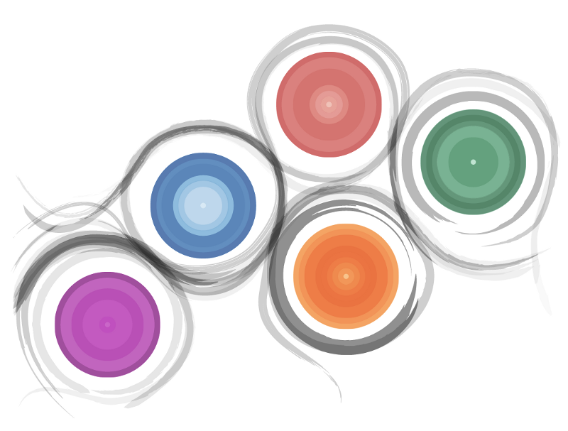
The search for Calm was an elusive one. We began with painterly design sketches, inspired by ensō:

The design intention was for the brush strokes to flow around the continents, as if being painted by an invisible hand. While unsure about the brush stroke texture, I knew the motion was possible, so I started there.
Snakes!
The first task was to define the motion paths. Nicolette Hayes was working primarily in Illustrator on this project, and Zan and I built out the rest of the site using SVG. This workflow, as described more in The Shapes of Emotions, afforded fluid translation from static mocks to animated interactives. To derive the motion paths, I simplified and saved the paths in the Illustrator file to an .svg file, and copy-pasta’d the raw SVG text into an array of strings.
Then, I set up a basic particle system to launch strokes along each path at semi-random. To animate the strokes, I turned to — where else? — a Bostock block. The basic concept is to interpolate an SVG stroke-dasharray attribute from a complete ‘gap’ to a complete ‘dash’. (Pro tip: use your browser’s developer tools to inspect the “Live sample” on that page for a handy stroke-dasharray sandbox.) There were plenty more details, but that was enough to get us here:

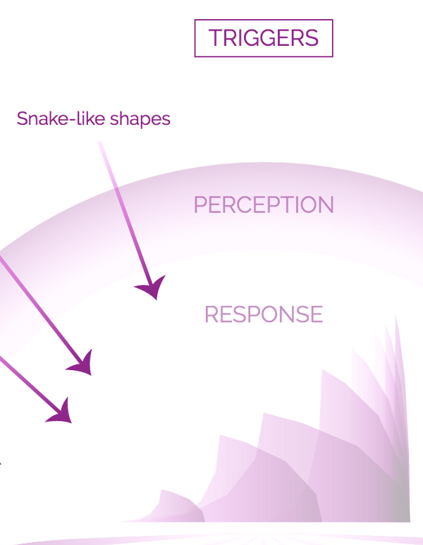
Happy with the direction things were moving, we took this build to some Friends of Paul for testing and feedback. And were shot down almost unanimously. As deep into the design and implementation as we were, we failed to see these shapes as others did: Snakes. Worms. Creepy-crawlies.
Anything but Calm.
In fact, our very own site warns us about things like these (see screenshot ←).
We hadn’t even gotten to the brush stroke texture yet, and already we were in trouble. So, we reassessed, and backtracked. In fact, we came at it from the other direction — the motion wasn’t working, so let’s try the brush strokes.
I tagged in my partner Zan to try her hand at the next iteration. She started experimenting with static brush strokes that were true to the initial ensō-inspired mocks. This route led us here:
We felt like we were hitting a wall. Animated paths ended up feeling reptilian, and classy brush stroke textures felt flat and dead without motion inferring the presence of the hand that drew them. In fact, we realized we had reached a double-impasse: technically, we were unable to unite the textural and the animated, and even if we could we were increasingly uncertain that animating the initial mocks would lead us to a convincing representation of Calm.
Back to the drawing board, we tried to drop the strokes altogether, and renew focus on the softly-pulsing colored continents. After much discussion with Nicolette Hayes about our visual metaphors, Zan moved on to a simpler prototype that saw the emotion continents entering and fading gently, representing the persistence of Calm through the periodic ebb and flow of emotional episodes.
Simple, minimal. Something of the spirit of ensō, without the ensō. But…not quite there. It felt a little too hollow, too empty. I stared at it for a while, while my mind’s eye revisited fields of color and texture I’d known in the past. And then I realized that some very simple tweaks would bring us where we needed to be, to move away from the continents as representative icons and instead to depict the emotions as textures, filling our field of vision.
In the end, the solution was simply to reframe what we’d already built, rather than building more. And this became the lesson learned: generative systems can offer more solutions than you design into them. The initial design of the emotion continents comprises particle systems that grow concentric circles at a constrained range of colors, opacities, sizes, and speeds. In addition to the element of time Zan added above, the final solution was, essentially, just to add a multiplier to the sizes. Granted, it took us a lot of iteration and communication to come to that conclusion. But the flexibility offered to us by building the site’s sections as generative systems held the answer right under our noses — Calm was just waiting there for us to find it.
