By Eric Brelsford and Alan McConchie
It’s hard to believe that it was only one a month ago when the Ever Given container ship got stuck in the Suez Canal. As cartographers, one of our favorite memes from the Ever Given era was the Ever Given Ever Ywhere tool built by Garrett Dash Nelson, that lets you stick the Ever Given on a satellite map anywhere in the world. Our own Ross Thorn quickly whipped up a Godzilla vs Kong version of the app, but we couldn’t help thinking how cool this tool would be if it could be generalized: what if you could draw a shape on a map and extract the satellite imagery from that shape and paste it somewhere else?
Well, now you can! Introducing: Scale-a-Tron!
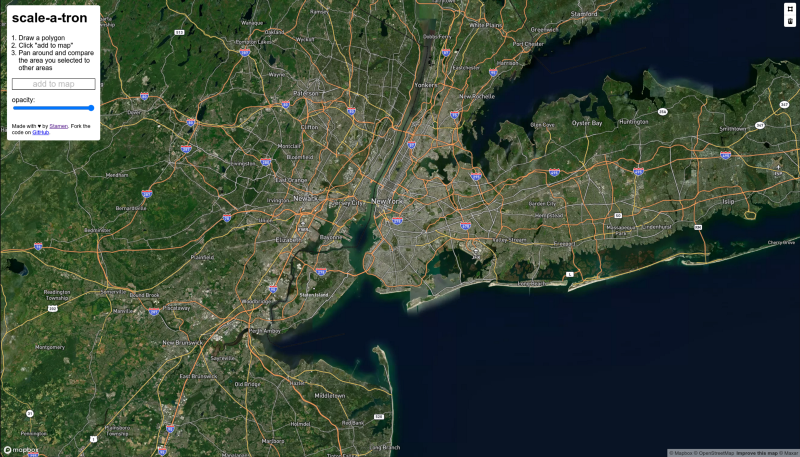
Unlike Ever Given Ever Ywhere, we don’t let you adjust the scale of the area you’re looking at. The clipped image will always* be accurate in terms of area.
Comparing map areas like this isn’t a new idea. In addition to the Ever Given Ever Ywhere app, we take inspiration from other interactive apps like The True Size Of… and MapFrappe (RIP), static maps like The True Size of Africa, Bill Rankin’s floating Manhattan maps, the map of the Apollo 11 moonwalk superimposed on a baseball diamond, BERG London’s HowBigReally work for the BBC, and various articles comparing relative areas on maps.
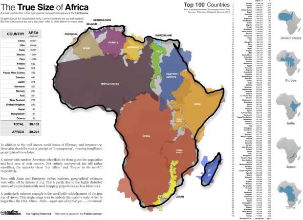
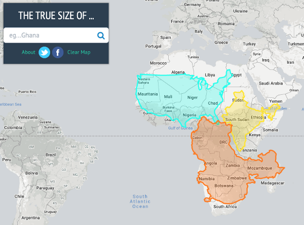
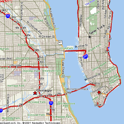
Scale-a-Tron is inspired by these maps and tools, but as far as we can tell, there’s no easy-to-use app that does the same thing but for satellite imagery. If you wanted to make an accurate satellite comparison map, you had to do a bit of work in a GIS program or some careful screen measurements and complicated math with Photoshop.
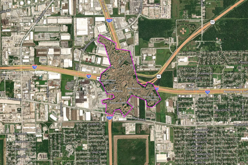
Now that we have Scale-a-Tron we can easily recreate some twitter memes like Siena, Italy inside a freeway interchange in Houston, Texas.
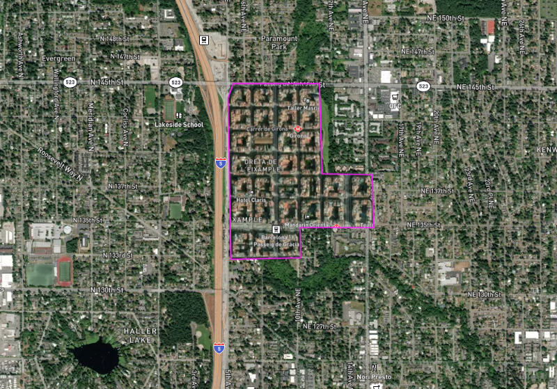
Or see how much of the Eixample neighborhood in Barcelona you can fit in a golf course in Seattle:
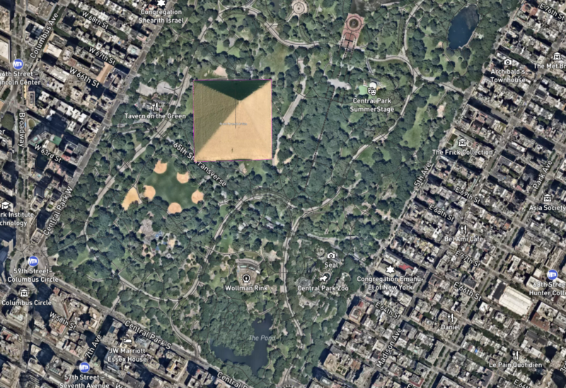
…or you can plop one of the pyramids in Central Park:
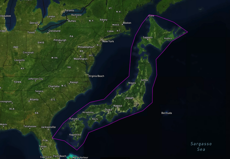
…or compare Japan to the East Coast of the US:
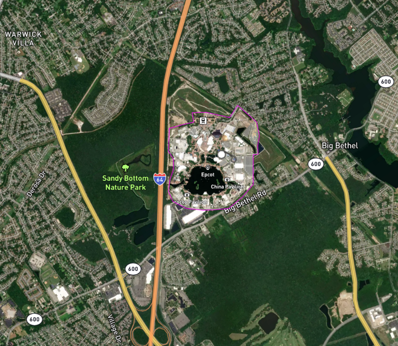
…or see how Epcot compares to your local landfill:
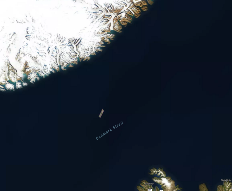
…or drop Manhattan in the Denmark Strait, near where an iceberg the size of same broke off some time ago.
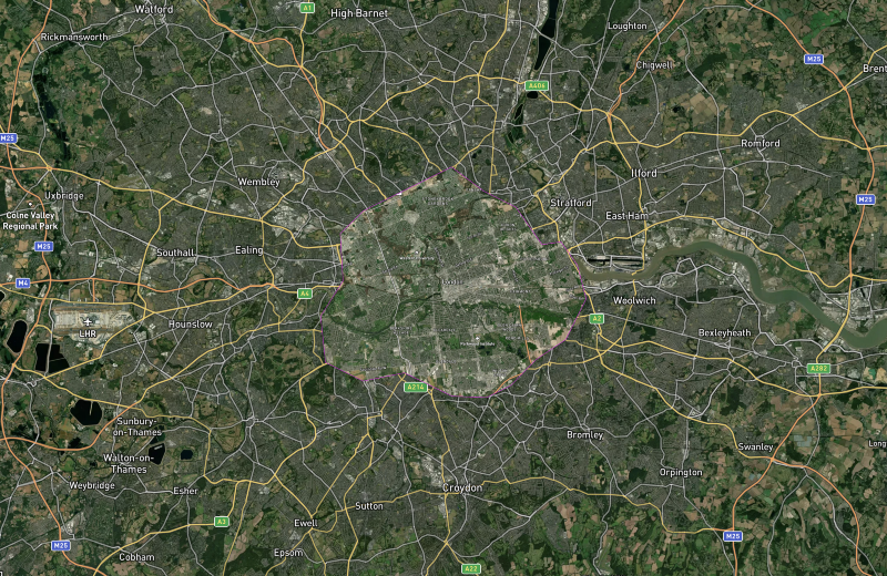
…or put London, Ontario on top of London, England:
…or something else — send us screenshots of your favorites or use the hashtag #scaleatron on social media!
The code is on GitHub if you have suggestions or improvements. We have some ideas about improving this but are interested to hear what others would find useful.
Enjoy!
Postscript:
*Well, ok, our app compensates for the area distortion of the Mercator Projection, but it doesn’t compensate for shape distortion over large areas. It works fine for small areas (like cities or buildings) but if you cut out something big like Greenland and move it to Antarctica the area will be correct, but the shape will not.
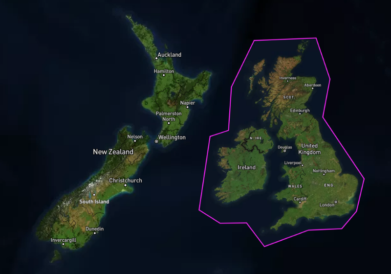
Observe if we move Great Britain to the southern hemisphere, next to New Zealand. Because the Mercator’s distortion in the southern hemisphere is the opposite of the northern hemisphere, England should look larger than we are used to, and Scotland should look smaller. But in our app it looks the same.
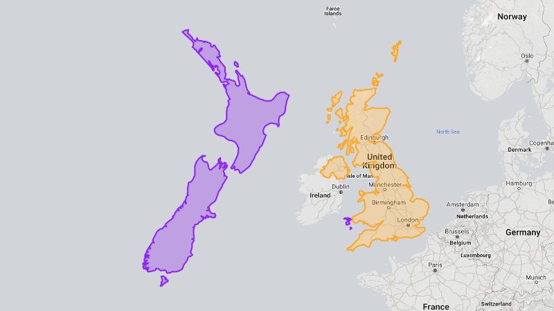
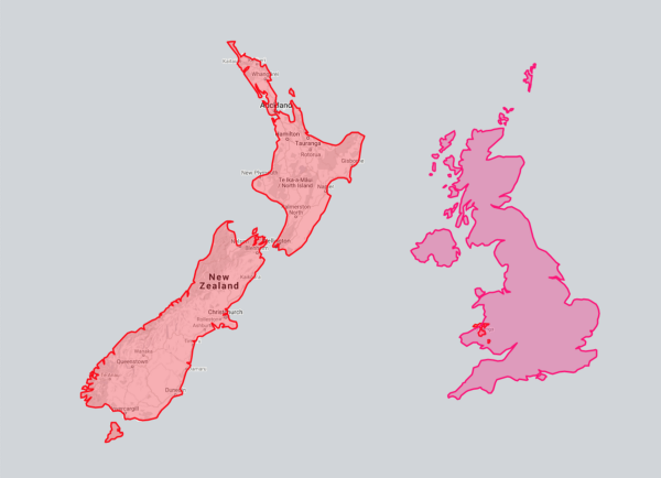
Compare with The True Size Of… which does modify shapes correctly. Notice how the shapes of Great Britain and New Zealand look different when we move them to the opposite hemisphere:
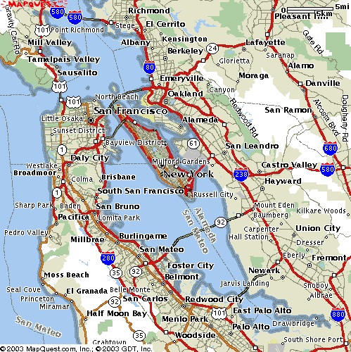
Oh, and just because you see someone made a size comparison map… doesn’t mean it’s correct:
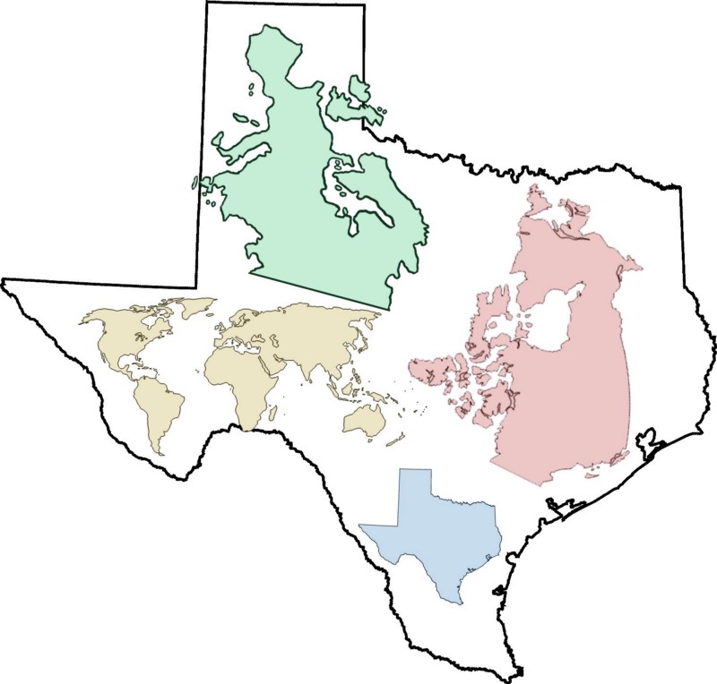
…and as we all know, tokyo is in japan, not england.
