In recent years, San Francisco has become one of the most expensive cities in the world, putting extreme pressure on the arts and culture community that has been an essential part of SF’s unique character. Arts organizations have found it increasingly difficult to find affordable long-term spaces. Thankfully, SF is also home to the Community Arts Stabilization Trust (CAST), an innovative philanthropic organization whose mission is to raise money and purchase buildings to serve as permanent homes for arts and cultural organizations. At Stamen we are big fans of CAST’s work, and we were excited to work with them to build Culture Compass, a map visualization of San Francisco’s arts landscape. You can read CAST’s announcement of the project here.
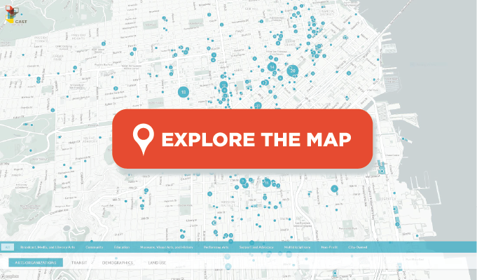
You can now explore Culture Compass at culturecompass.org! The site is partly an arts directory, and partly a real estate search tool, all rolled into an interactive map that lets users see how SF’s arts organizations are intimately embedded in San Francisco’s neighborhoods and infrastructure. Our goal was to create a tool to help CAST’s decision makers see where and how to intervene and support SF’s arts landscape, both now and in the future.
The application is organized around a map of San Francisco as the central interface. On top of this map we can layer various datasets and see how they interact and overlap with each other. The primary layer is the database of arts spaces, which are visualized as collections of blue dots.
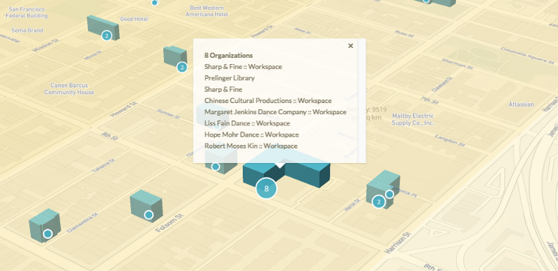
The data for these arts spaces comes primarily from DataArts, combined with data on city-owned spaces from official City & County of San Francisco sources, all with a bit of hand-curating from the CAST staff. This database (of thousands of arts organizations and their associated locations) is rarely seen on a map all at the same time.
We found it quite challenging and fascinating to untangle the complicated relationships that arts orgs have with their physical buildings and offices, and with each other. In some cases, the official legal address for an arts organization is in someone’s house. In other cases, several organizations might share the same building and address, making it challenging to show them as distinct dots on the map. In even more tricky situations, an organization might have their administrative office in one place, but undertake their programming in other organizations’ venues, or even in public spaces that have no addresses. We did our best to make all these things make sense on the map, but if you see anything that looks weird, please let us know and we’ll try to fix it!
While the arts organizations layer is the star of the show, the real value in the application comes from the supplemental layers which can be used to add more context. Along the bottom of the interface, you’ll see some tabs that you can use to toggle these context layers on and off. Let’s look at each of these in turn.
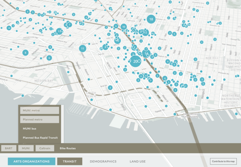
Transportation
First we see a layer that shows public transportation networks. Most arts orgs need good access to buses, rail transport, and bike infrastructure. Each of these layers can be added one at a time, or all at once to show all transportation possibilities simultaneously. Because purchasing a building for an arts organization is a multi-decade investment, CAST and its funders also wanted to see the location of planned future transit infrastructure. To that end, we also added an extra toggle to show the Central Subway currently under construction, as well as the planned extension to Caltrain and the Bus Rapid Transit lines along Van Ness and Geary.
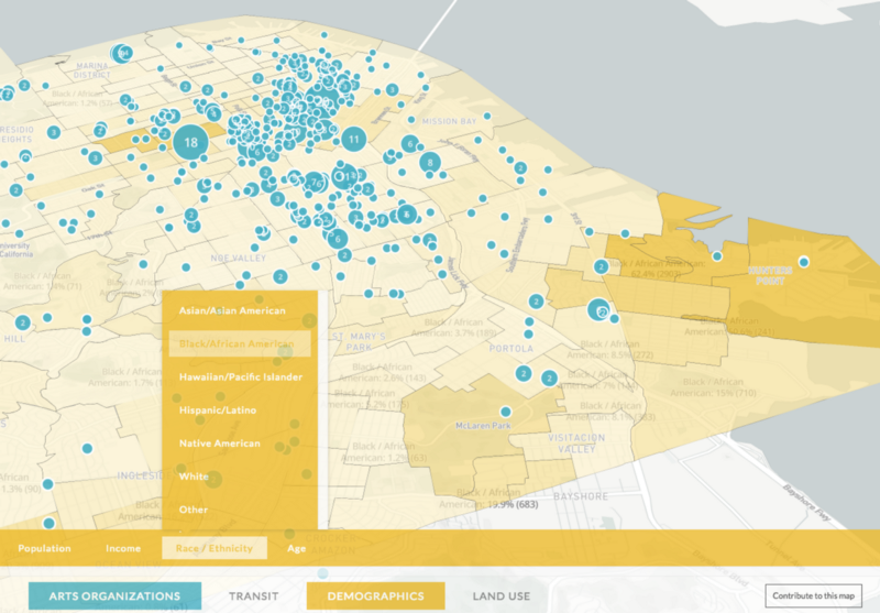
Demographics
Next we see the demographics layer. Inside this tab, we can view a variety of demographic indicators at the census tract level. At a high-level, we can use this to explore the overall relationship between the location of arts organizations and different demographic groups, perhaps to locate underserved areas. From the point of view of a specific arts organization looking for a new location, they could use these census layers to find which neighborhoods have the right mix of age, income levels, or ethnic composition that matches their programming and their existing audience.
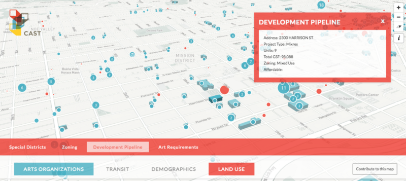
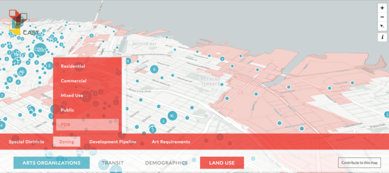
Land use
The last tab combines several land use and planning layers. Here we can add an overlay to show different zoning districts, with particular emphasis on parcels that are potential locations for art venues or studios. For example, we have a specific call-out for parts of the city where zoning requires new construction to invest 1 or 2% of construction costs to arts funding.
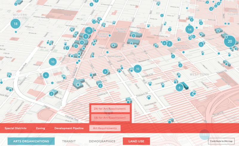
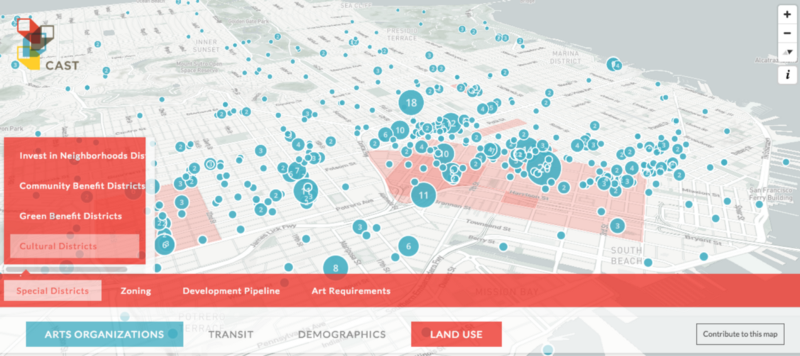
Within this group of layers, we can also overlay some specific cultural districts that often have their own cultural initiatives. Tracking down the data for these districts was a bit of a challenge, because there aren’t always official maps of their boundaries. And to add even more complexity, some of these districts overlap!
Finally on the land use tab, we can turn on a point layer showing the city’s Development Pipeline. This data is published quarterly on SF’s open data site at it shows upcoming and in-progress new construction.
Across many of these land use layers, we also call special attention to “PDR” zones, which are the Production, Distribution, and Repair areas specifically protected under Proposition X. Protecting the city’s blue-collar manufacturing areas is just as important as protecting our arts community, and in many ways these effects can go hand-in-hand to maintain San Francisco as a thriving, diverse city for everyone.
Whew, that was a lot of data layers! Throughout the design of this map, we had to strike a careful balance between adding too much and too little information.
- We tried to controlled the possible combinations that a user could activate on the map. We didn’t want to create the kind of overwhelming experience where the user sees a list of dozens of checkboxes and is tempted to turn them all on, making the map into an unreadable mess. Instead we limit you to just a few layers at a time, focused specifically on the types of questions you might want to ask when planning future real estate investments in the arts.
- We dramatically simplified the colors, so that each tab of related information shares the same general palette. We especially wanted to avoid using the familiar color schemes for map layers that are normally represented as a riot of colors, such as the kaleidoscopic effect of a typical zoning map or the rainbow lines of the BART system diagram. The typical color schemes work well when those kinds of maps are viewed in isolation, but they wouldn’t work when combined with multiple other layers as in Culture Compass.
We think of this map as only the first step. We’re already thinking about what features we’d like to see in a Version 2 of this application. If you have ideas about what you think this map needs, or if you’d like to help us bring a version of this map to your city, please get in touch!
And like all great projects, we couldn’t have done it without the extensive help of CAST’s partner organizations: San Francisco’s Office of Economic & Workforce Development (Ofc. of Ecom & Wkfc Dev.), SF Grants for the Arts, SF Arts Commission, and the National Endowment for the Arts: