Showing multiple variables on a map is an age old challenge in data visualization and cartography. Here we review this design space. This investigation began as a personal curiosity, and expanded to a quest to find the solution to what appears to be an unsolved problem in data visualization — how to calculate the color that one perceives when looking at a particular region of a dot density map. Dot density maps, small multiples, multivariate choropleths, oh my!
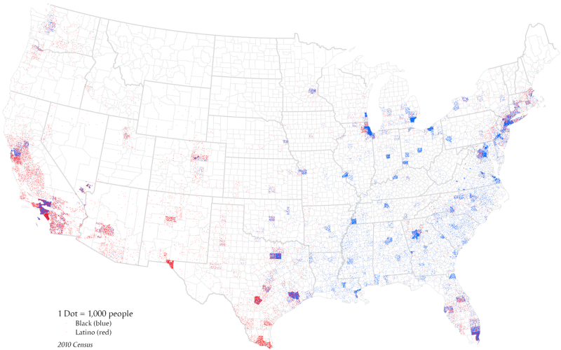
Dot density maps (sometimes called dot distribution maps) show little dots that are randomly distributed within polygons on a map. One dot generally corresponds to a fixed number of things. If its representing demographic data, for example, one dot might correspond to a certain number of people. In the map below from Wikipedia, one dot corresponds to 1,000 people from the 2010 Census. Color here represents Black vs. Latino.

Dot density maps have a long history in cartography, especially in the early days of mass-produced print maps when it was difficult or expensive to print with nuanced shades of color. Varying densities of dots can successfully communicate subtle variations in the data, when a bucketed choropleth map could not (we will talk more about choropleths below). Here is an example of a univariate dot density map printed using only black ink from a World Geography textbook in 1948, with a bit of humorous commentary from Tumblr:
Given the limitations of printing technology and of early computers, until quite recently nearly all dot maps used some aggregation and rounding, where one dot equals 100 or 1000 people, for example. But with greater computing power and better display capabilities, some newer dot maps use a 1 person = 1 dot ratio which is so much richer and visually compelling. Perhaps the most impressive of these 1 to 1 dot maps is The Racial Dot Map by the University of Virginia (which uses Stamen Toner for their labels). The screenshot below shows census blocks in New York city where color represent ethnic distributions. This data comes from the US Census American Community Survey. You can see here very clear grouping patterns in various parts of the city.
Here is another dot density map of similar data, on the scale of the entire US. You can see clear grouping patterns at this scale as well. This was made with a Python library called DataShader that has many examples of dot density maps of Census data.
Here’s the same map zoomed to New York City. Although there are no color legends with these maps, one can infer by comparing this to the The Racial Dot Map by University of Virginia that pink = Hispanic, green = black, blue = white, red = asian.
If you zoom way in, you can see that it’s just a bunch of dots positioned randomly within polygons. When zoomed out, the colors from these tiny dots blend together in such a way that your eye can perceive the mix of these various colors, and then by comparing these colors with a color legend you can grok these complex geospatial patterns.
Here’s another example dot density map that shows religious identity in greater London. You can again see very clear clustering patterns. I had no idea there was such an enormous Sikh community in the West of London!
These maps of race and religion use a lot of different colors which can be difficult to distinguish if there is a lot of overlap between similar colors. If the blended regions are essential for understanding the map, we may need to limit the number of variables (as in the first map we looked at, which only includes black and latino demographic groups) and we have to carefully choose colors where the blended result is itself a separate color distinguishable from the others.
Here’s an example dot map using elaborate color blending that Stamen created in 2012: Trees, Cabs & Crime. This map shows trees vs. crimes vs. cabs in San Francisco. (Note, this is technically not a true dot density map because these dots represent the actual locations of things, and are not randomly distributed within existing polygons).
Another way of presenting multidimensional data on maps is using a technique called “small multiples”. With small multiples, there are multiple separate maps that each show a single dimension.

When you place those univariate dot maps on top of each other, you get a multivariate dot density map. What strikes me about this is the way that the colors are blended together. This particular piece uses Subtractive Blending, which is the same kind of color blending that occurs in the CMYK printing process.

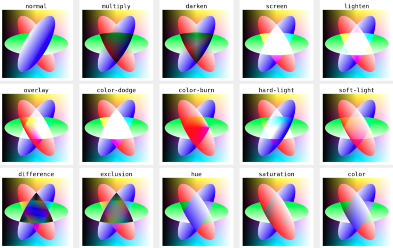
It turns out that there are many options when it comes to blending colors together where the dots overlap. These are called “blending modes”. Blending modes are described in detail in MDN: mix-blend-mode. That article describes how one can implement various blending modes using CSS.

It’s unclear what the “best” blending mode is for dot density maps. It appears that folks making dot density maps have experimented with various options and chose what “felt right”. I would be curious to know, based on first principles of perception, what the “best” blending mode is for the case of dot density maps to optimize clarity of perception of the data.
I began to wonder, what color does one perceive when one looks at a dot density map? Wouldn’t it make sense to just fill in the polygons with the color that one would perceive, rather than going through all the trouble of making so many tiny little dots and blending them together? This line of inquiry cracks opens up the wonderful world of multivariate choropleth maps.
A choropleth map (from Greek χῶρος choros ‘area/region’ and πλῆθος plethos ‘multitude’) is a type of thematic map in which a set of pre-defined areas is colored or patterned in proportion to a statistical variable that represents an aggregate summary of a geographic characteristic within each area, such as population density or per-capita income. — Wikipedia
A Choropleth Map has polygons that are filled in with a single color. The Extremely Detailed Map of the 2020 Election by the New York Times is a nice example of a choropleth map. While it does have two colors, it is in fact only showing a single variable, the leader margin. This is not a multivariate choropleth map. It is a univariate choropleth map that uses a diverging color scheme, where there is single sequence of colors that diverge in hue in the middle.
Below we see a bivariate chorpleth map that shows metrics for both Smoking and Obesity across US counties. Light blue means lots of smoking and low obesity. Pink means little smoking and high obesity. Dark blue means high obesity and high smoking.
The color legend for a bivariate choropleth map can be constructed by first creating two independent color legends going in different directions, then overlaying them on top of one another. Here again arises the question of blending modes — how to overlay them? In the below example by Joshua Stevens, the darken blending mode is used. Why? Not sure. That article even says “Experiment with other blending modes. ‘Multiply’ also works well.”
The below bivariate choropleth shows Income diversity vs. Ethnic diversity in Vancouver. This is work Stamen has done in collaboration with the Max Planck Institute for the Study of Religious and Ethnic Diversity. The Superdiversity project investigates complex relationships of demographic groups in urban environments in particular. The bivariate choropleth map has proven a useful tool for revealing spatial structure in the study of superdiversity.
In Stamen’s work in the UCSF Health Atlas, the bivariate choropleth technique takes center stage as a means to compare any two metrics. But what happens if you want to compare more than two metrics at a time on a map?
The Pop vs. Soda map by Stamen’s own Alan McConchie shows three metrics at once on a map. This example is particularly striking because everyone can relate to the topic — what word to people generally use to refer to carbonated beverages? Because there are strong geospatial clusters with this data, the trivariate choropleth technique is totally readable.
In this CMYK Vice Map, we see metrics on drinking, smoking, and obesity. This montage is interesting in that it shows each pair as an independent bivariate choropleth as well. I personally find this trivariate choropleth difficult to interpret, probably because the underlying phenomenon does not adhere to clear clustering patterns as the pop vs. soda phenomenon does.
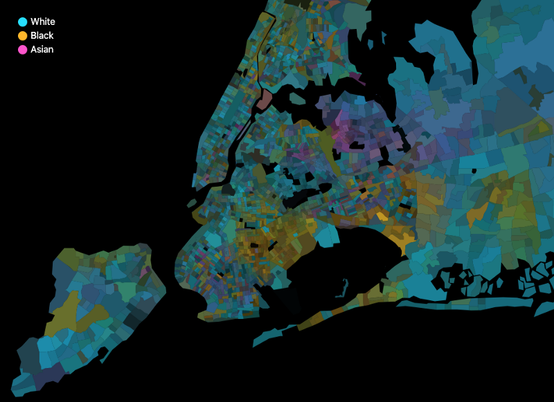
So how would one implement a multivariate choropleth map in code? I tried my hand at this and came up with this trivariate choropleth map of New York census blocks, using American Community Survey data. In this implementation, three separate color ramps are constructed using D3. For each polygon, each color ramp is evaluated and the resulting colors are blended together using the color-blend library, with the “multiply” blending mode.

While this does work, I’m still not sure if it’s really “correct”. What started this little investigation was a pondering: What is the color that one perceives when one looks at a dot density map? With the right theoretical underpinnings, we should be able to derive from first principles the color that is perceived for a given polygon of a dot density maps, directly from the data, and without going through the trouble of rendering hundreds of tiny points, blending them together, and taking the average color. The ultimately “correct” logic, however, still feels slightly beyond reach.
This predicament is reminiscent of the following quote:
Be patient toward all that is unsolved in your heart and try to love the questions themselves, like locked rooms and like books that are now written in a very foreign tongue. — Rainer Maria Rilke
Thanks for coming all this way with me into the wonderful world of multidimensional choropleths! If you have any questions, or examples of a dataviz topic you’d like to see covered on this blog, please drop us a line.
