A personal history of OpenStreetMap, seen through the eyes of Stamen Design
by Alan McConchie, Eric Rodenbeck, and the Stamen Design team
Recap
In part one of this series, we covered the early years of the friendship between Stamen Design and OpenStreetMap. Like Bert and Ernie, Romy and Michele, or Turner and Hooch, these two friends from different backgrounds soon learned they had a lot in common, and quickly these BFFs became inseparable.

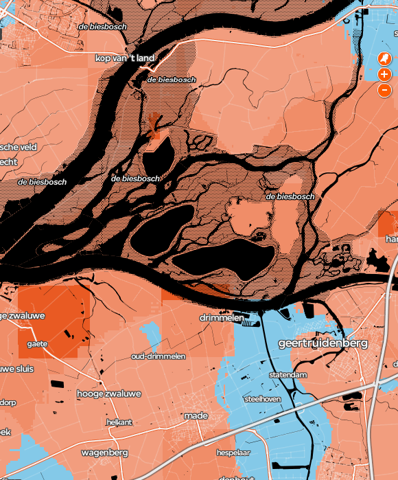
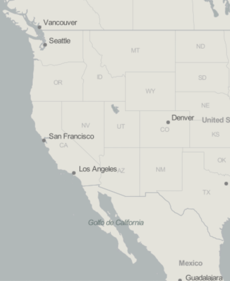
In the previous post, we started from OSM’s creation in 2004, to Stamen’s first maps using OSM in 2009, and building up to a heady pace of non-stop experimentation in 2010 and ‘11. In chronicling the feverish haze of 2011, there were even a few OSM-based Stamen maps that we overlooked in our last post, such as our cyberpsychedelic basemaps of “Netherlands from Above” for Dutch broadcaster VPRO, our subtle dataviz-focused gray basemap “Acetate” we designed with FortiusOne for their GeoIQ platform, and even a bit of a mobile OSM map for a little company called TripAdvisor.
The golden age, 2012–2016

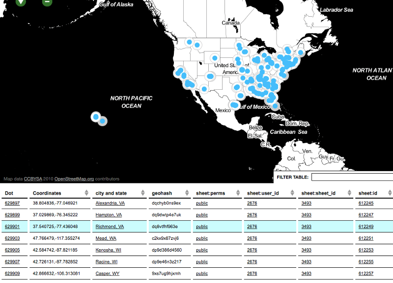
As we mentioned in Part 1, from 2010 to 2012 Stamen was working on a Knight News Challenge Grant, on a mission to build tools to help people tell stories about cities. We built tools like Dotspotting to make it dead simple to geocode some points and put them on a clean, minimalist map, ready for inclusion in a journalist’s news article in a tight deadline.
But something very interesting happened along the way. Sure, creating publishing tools for journalists was important, but when we asked them, what people really wanted and needed were more good (and free) basemaps. So we focused our remaining work on the Knight grant on creating a family of new, well-designed basemaps that we could make available for anyone to use. To Knight’s strong credit, they continued to support our work even though we made a mid-project pivot; they believed us when we told them the needs in the marketplace were more important than the grant we’d originally written.
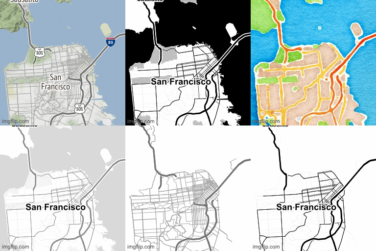
Watercolor, Toner, Terrain
So, in June of 2011 we made the source code for Toner public, and then in March 2012 we launched maps.stamen.com, a one stop shop for developers to preview our map styles and learn how to use them in their own applications. Along with Toner we now offered Watercolor and Terrain styles, all with documentation and source code in a nice developer-friendly package. This was the culmination of all our basemap experiments, reaching an audience wider than we could have hoped for and supporting more use cases than we could have imagined.
This work was a team effort, carried in particular on the shoulders of Nathaniel Kelso, Geraldine Sarmiento, Mike Migurski, George Oates and the late Zach Watson. Each contributor wrote a blog post about their part of the process, which are all fascinating reads even today: “Watercolor Process”, “Watercolor Textures”, “Terrain Process”, and “Log Maps”.
These tilesets were also critical in our own dataviz work, and we designed them in such a way that we could easily mix them into highly customized cartographic visualizations. We made the Toner and Terrain styles available in stackable stripped-down variant styles, such as a background-only tileset, or a tileset with nothing but labels, or borders. Using these separate tilesets makes it possible to insert your visualizations (like a choropleth, for example) as layers in map sandwiches, to avoid obscuring the map labels with your data overlays.
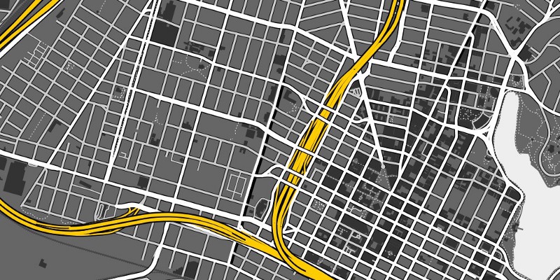
We created open source tools for processing OSM data, such as High Road a set of queries for grouping OpenStreetMap roads into a clear three-level styling hierarchy, and Skeletron, a tool for de-duplicating parallel roads (such as the “dual carriageways” — in the UK-speak that defines the OSM data model — or divided freeways common in the US) to avoid the “MarketMarket DoloresDolores GuerreroGuerrero” doubling of road labels that had annoyed us in previous maps.
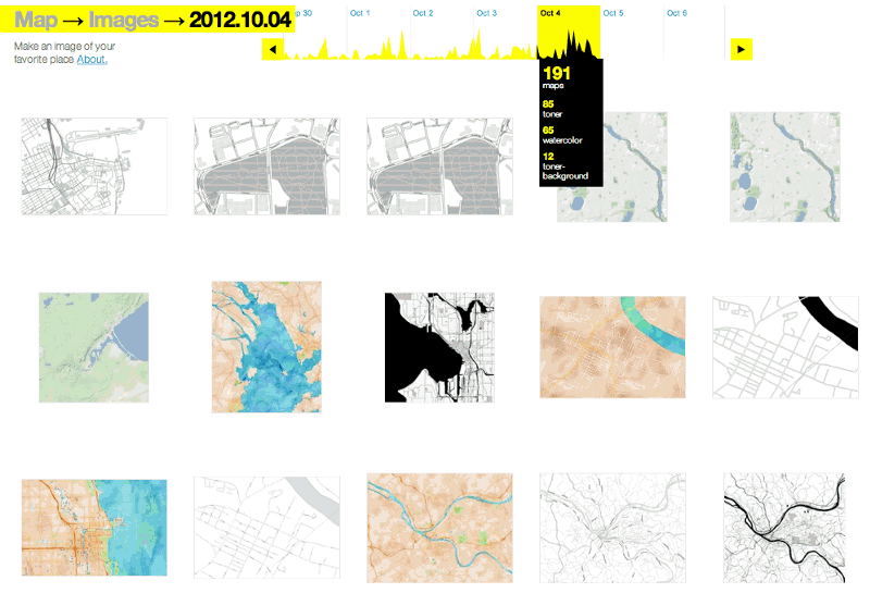
We created a map2image tool that lets users easily make larger snapshots of the map, and means we can also enjoy watching the feed (which still works! …for a little while longer) of where people are interested in.
People loved Watercolor. They loooooooved it. “A new Creative Commons tile set adds a human, organic touch to cold digital maps,” wrote Fast Company. “Now if only there were more projects like this.”
An anonymous fan paid to put a giant billboard of a Watercolor map in The Mission in San Francisco.
Our goal with Watercolor was not just to create a thing of beauty, also to make technical provocation to show what kinds of maps might be possible when you have access to the raw underlying data, as we did with OpenStreetMap. A map like Watercolor would have been impossible to make with the limited customization offered by a more mainstream map provider like Google Maps.
Watercolor was also meant to invite people to think about the nature of maps and their inevitable subjectivity (no matter how technical and objective they sometimes seem).
“I wanted to make a kind of gesture in mapping that I hadn’t seen done before. Map making is always an expression of power as well as aesthetics. I wanted to show, not just say, that the choices mapmakers make are just that: choices, informed by ideology and agenda and all kinds of other factors. Maps occupy a special place in our information systems; they relate most closely to the physical world, so they’re a great conversation piece for issues of representation, power dynamics, technology, history. Everything gets wrapped up in maps if you look closely enough. There’s no such thing as a ‘neutral’ or ‘objective’ map; maps always leave something out for everything that they include.” — Eric Rodenbeck in conversation with the Cooper Hewitt Museum
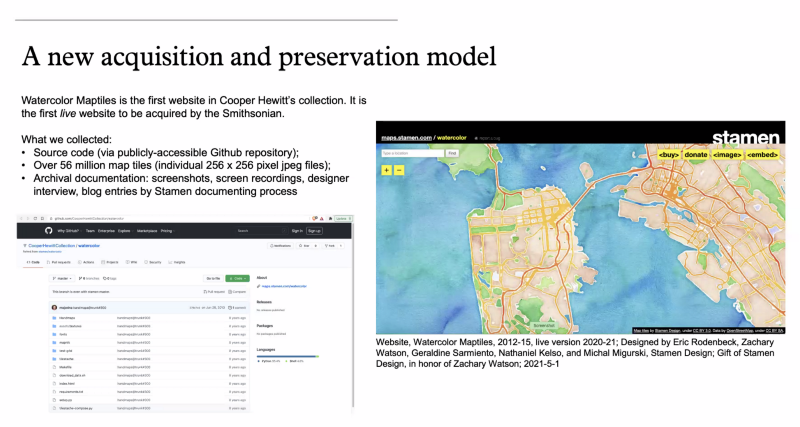
Watercolor has shown enduring appeal, and just this week it achieved a level of recognition that has us feeling incredibly flattered and deeply pleased: on May 18, 2021 the Cooper Hewitt (the Smithsonian’s design museum) added the Watercolor map tiles and source code to their permanent collection!
This is the first time the Smithsonian has acquired a live website, and the process forced the Cooper Hewitt curators and conservators to invent new models and processes for handling digital artifacts such as this.
“Interactive digital works by their very nature subvert traditional museum collecting practices,” said Andrea Lipps, associate curator of contemporary design at Cooper Hewitt. “Watercolor Maptiles is itself a dynamic, living web-based map that is placeless; it exists on a browser and its assets are distributed across servers. By creating a duplicate version of the Watercolor Maptiles site and hosting it on Smithsonian Institution servers and domain, Cooper Hewitt has established a new acquisition model for the museum sector.”
Burning Map
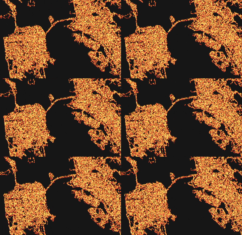
Watercolor wasn’t the only map we used to push the technical boundaries of cartographic rendering. We also used the black and white OpenStreetMap linework layer from Toner as the input to more experimental maps, such as the early WebGL prototype “Burning Map” (largely the handiwork of Stamen alum rachel binx):
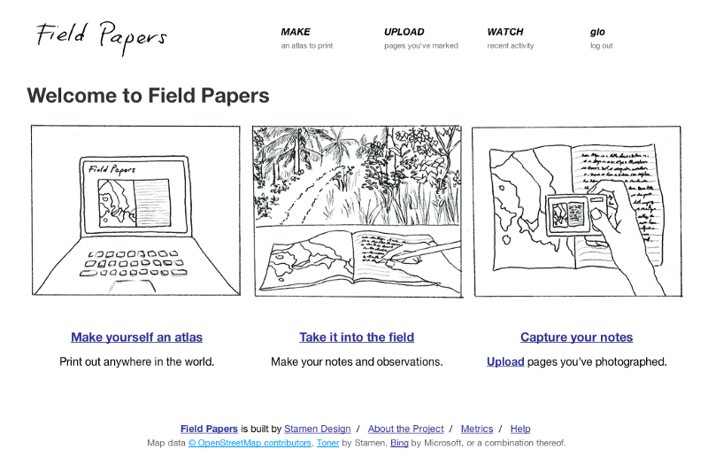
Walking Papers becomes Field Papers
Also in 2012, we launched Field Papers as an improved & extended version of Walking Papers (which we talked about in the previous post). We added some performance enhancements in 2013, followed by a full rebuild of the codebase in 2015 that we’ll discuss a bit later.
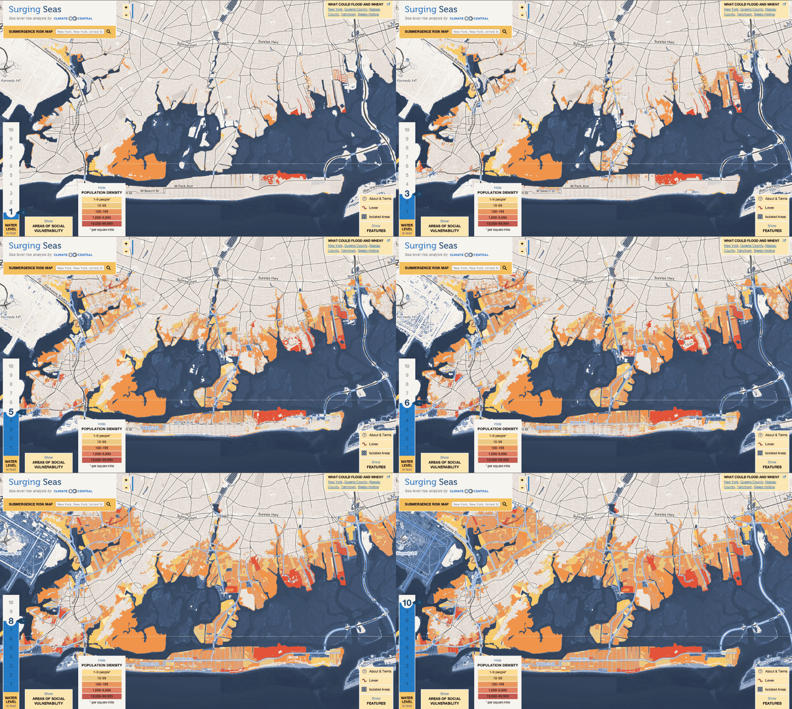
Surging Seas
Working with Climate Central, in 2012 we launched the first iteration of Surging Seas, using our Toner tiles combined with a bunch of really cool client-side pixel manipulations to show the effects of rising sea levels, foot by foot and meter by meter. The site was on the top of the list of Atlantic Cities’ top 10 maps of 2012.
“[T]he most frightening, important maps of the year come from Climate Central’s Surging Seas project, which offers an interactive map of all coastal areas of the Lower 48. In the discussion of potential sea level rise, these maps are the most alarming images out there.” — Atlantic Cities

We went on to do several iterations of this project with Climate Central in subsequent years, adding demographic data and the ability to choose from different warming scenarios (taking into account that some amount of future temperature rise is already locked in)
2013: a new generation of open source tools
Around this time Mike Migurski left to join Code for America, and new director of technology Seth Fitzsimmons stepped into his shoes without missing a beat. Our OSM projects continued at a breakneck pace. You can see more about Seth’s philosophy of mapping infrastructure in a talk he gave at the 2014 FOSS4G conference.
Map Stack
In early 2013 we poured more energy into squeezing out all the possibilities of mixing-and-matching raster tiles with our launch of Map Stack:
Once geographic data has been rendered into a map tile, that tile is fundamentally just a raster image, not unlike a photograph. So, if we take inspiration from photo compositing concepts like “overlay”, “multiply”, and “screen” blend-modes, throw in some knobs to adjust opacity, brightness, and saturation, and include the ability to use the features in one tileset to mask off areas in another tileset, we can create an incredibly powerful cartography styling tool! With all of these lovely filter effects that become possible, you might call it an “Instagram for Maps”.
Map Stack became a popular plugin for the GEOlayers component of After Effects, so often whenever you see an OpenStreetMap-based map on TV or in a video somewhere, it’s quite likely it uses Stamen tiles via Map Stack.
Mapping the Golden Gate
We went way down the rabbit hole making the most painstakingly curated cartography for the Golden Gate Parks Conservancy, combining OSM with many other local datasets and hand-tweaked symbology. This map showcases some of the obscure yet impressive detail in the OSM tagging scheme, such as the “direction” tag that allowed us to create specific icons for each scenic viewpoint, oriented in just the right direction. (OpenTopoMap also makes use of this information). You can see Kate Watkins, Seth Fitzsimmons, and Alan McConchie talk about some of the special details in the map in their State of the Map presentation “Advanced CartoCSS Tricks”.
Pinterest maps
Also in 2013 we were among the first to sink our teeth into the new tools and OpenStreetMap tilesets provided by Mapbox’s first moves to vector tiles. In 2013 we designed basemaps for Pinterest using the new “Mapbox Studio” (at the time still called “TileMill 2”). There’s a lot of detail about the Pinterest map in “Advanced CartoCSS Tricks” too.

In 2014 we really got into the basemap-making groove, with two more full-fledged worldwide OSM basemaps for two big clients, Tableau and CartoDB.
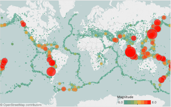
Tableau maps
in 2014 we designed basemaps for Tableau, again using OpenStreetMap. Wired called these “a dead-simple tool that lets anyone create interactive maps.”
“This is the stuff that’s happening in computer labs at Stanford, and now it’s consumer grade level. It’s happening industry wide, maps are moving out of the hands of experts and into the range of everybody,” Rodenbeck says. “The idea is that maps can be super accessible to everybody.” — Wired
CartoDB maps
For our good friends CartoDB (now renamed as “CARTO”) we designed two more worldwide OSM-basemaps in a light and a dark style called Positron and Dark Matter. Much like the Acetate and Toner styles that came before them, these tilesets were designed with dataviz overlays in mind. Shoutout to Brandon Liu for his contributions to this project.
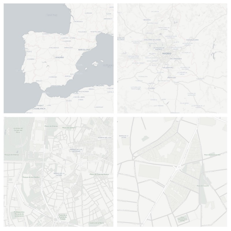
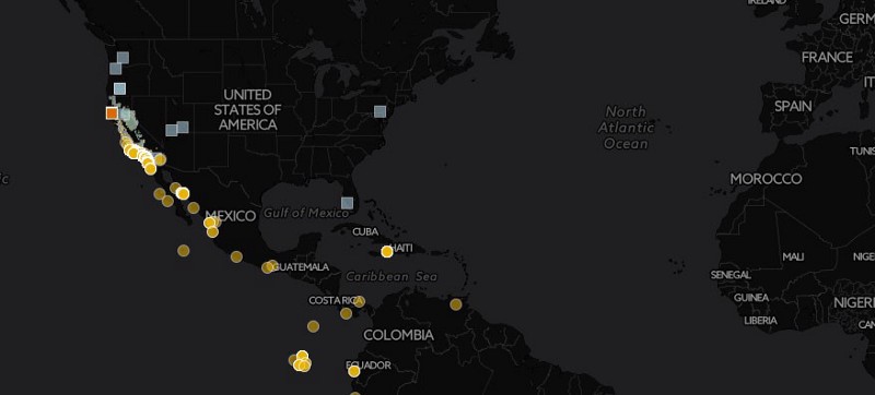
And just like with our own Toner and Terrain styles, you can float your labels on top of your data layer in a delicious map sandwich:
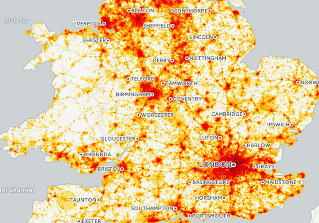
In 2015 and 2016, the recurring theme was “open open open”! It was a period of doubling-down on the success of OpenStreetMap’s data model and on related projects and open datasets.

OpenTerrain
In 2015 we started a new Knight Foundation project to build on our previous basemaps, and add a little something new: collecting a global terrain dataset made up of all of the disparate local and national topographic datasets scattered around the world. Elevation data is largely absent from OpenStreetMap, and it is difficult for amateurs to collect it reliably. However there are plenty of publicly-available terrain datasets provided by governments and universities, some collected by satellites or the Space Shuttle, others collected from aircraft using LIDAR, and all provided at different scales and resolutions.
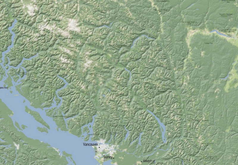
Proprietary web maps like Google Maps and ESRI’s basemaps had done some of the work to stitch these datasets together into a seamless world-wide layer, but the results of their synthesis remained proprietary. As far as we could tell, no one had done this work for the benefit of the public before. Similar work was happening with the OpenTopography project to catalog sources, but not synthesize them.
We were well on our way with the first few global datasets, and made enough progress to create a terrain-enabled version of the OSM Humanitarian map style (which we called Humaniterrain), which was used in relief efforts after the 2015 Nepal earthquake… but before we finished our overall project, our friends at Mapzen came along and created something similar and even more extensive!
What can we say, great minds think alike! And due to Mapzen’s position as a research arm of the well-funded Samsung corporation, they were able to get the job done quicker than we could have. (A year and a half later, Mapzen shut down operations, although most of their open source contributions live on with other organizations, including their elevation data tiles which are now hosted by the AWS Open Data Registry) Turns out it’s not easy keeping a business open for the long haul.
We got on with what we did best, designing maps! We created several experimental terrain styles, such as this dark-mode hillshade designed to be layered on top of a map with a fully-black background such as CARTO’s Dark Matter:
And played with enhancing our existing styles with hillshades:
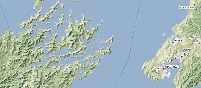
In 2016 we also released a global version of our Terrain basemap (which had been US-only when first released) and we ended up using Mapzen’s excellent open source terrain tiles as the underlying data for the hillshades (along with, of course, OpenStreetMap for everything else). Big thanks to Chris Henrick for his work on the Terrain reboot.
This was also a period of rebuilding and refining our some other previous work (not just our map tiles), making them more stable and easier to maintain for the long haul. Most of this work can be credited to the vision of Seth Fitzsimmons and his desire to save our small studio of a dozen staff from spending all of our time on tech support.
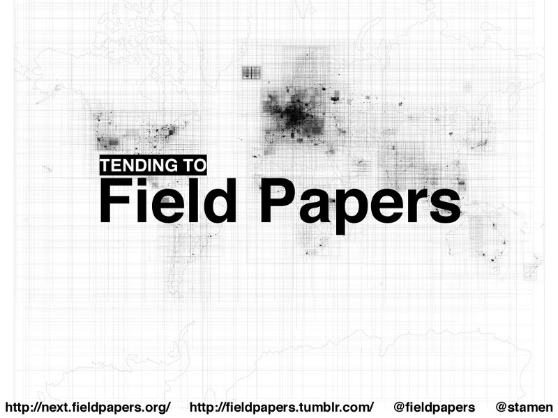
In 2015 we rebuilt Field Papers to make it more stable and to support more internationalization, and we created a Field Papers Tumblr (because 2015) to chronicle our improvements. Sean Connelley did the bulk of this work, and presented some impressive maps of all the Field Papers atlases every created at the Humanitarian OpenStreetMap Team Summit in 2015.
In 2016, in collaboration with SpatialDev, we built Portable OpenStreetMap (POSM), a way for humanitarian mappers to take a copy of OSM into the field where internet connectivity is unreliable, and intelligently sync their offline changes back to the main OSM database when they return to home base.

But something was changing in the industry… Our updated Stamen Terrain announcement came right around when other platforms like MapQuest and Google were shutting down their free services and requiring API keys. Many map-based sites across the internet stopped working.
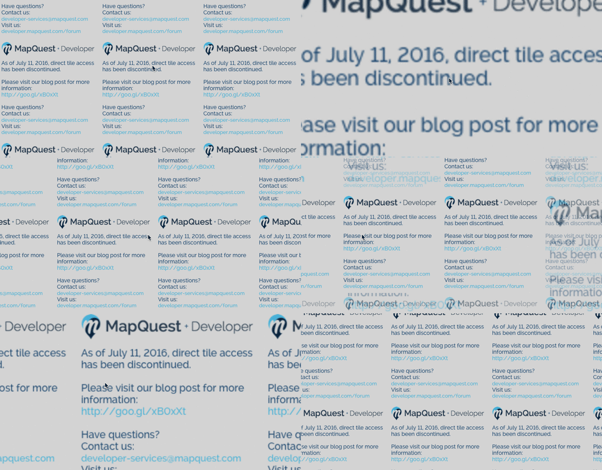
Developers rushed to find alternatives. “Luckily for them,” wrote Aaron Reiss for Slate, “new tile sets arrive where old ones disappear. On July 13, two days after direct access to MapQuest’s tiles ended, the internet got a new free map of the world, built and designed by Stamen, a small map-centric design firm based out of San Francisco.”
These changes were perhaps inevitable, a sign of the further maturity of the industry at that point. Hosting map tiles for the entire world is expensive. We should know! Were we naive to think we could continue providing them for free, when much bigger companies decided they couldn’t?

Join us next time for part three, and we will — perhaps — answer that question!
