blog/Data Visualization

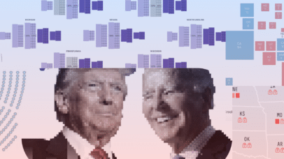
Maps and visualizations we’re keeping an eye on for Election Day, Part 3: Down-ballot races and electoral math

| 11.01.24

Welcome to the third and final part of our series on maps and data visualizations in advance of the 2024 U.S. General Election (if you’re just catching up, here are parts one and two). Today, we’ll close with discussion of Congressional races and the electoral college. I’m just a bill We’ve mostly discussed the presidential...

Maps and visualizations we’re keeping an eye on for Election Day, Part 2: Indicators

| 10.31.24

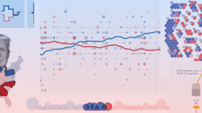
Welcome to part two of our series on maps and data visualizations in advance of the 2024 U.S. General Election (if you missed it, here’s part one on polling). Today, we’re discussing other indicators of political outcomes, including money in politics, changing demographics, key issues, and previous elections. Here comes the money Politics is all...

Maps and visualizations we’re keeping an eye on for Election Day, Part 1: Polling

| 10.30.24

This is a perfect encapsulation of how we’re all feeling: unsettled. The presidential race has been neck-and-neck for months, even before President Biden decided to step off the ticket back in July. As the 2024 general election approaches, we thought we’d dig into some maps and visualizations of election data from across the media landscape...

Telling the Story of Changing Populations With Mapping Historical New York: A Digital Atlas

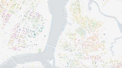
Content in this post comes from our presentation at the North American Cartographic Information Society (NACIS) 2024 Annual Meeting last week in Tacoma, WA. Mapping Historical New York: A Digital Atlas visualizes New York City’s transformations during the late-nineteenth and early-twentieth centuries both in terms of population and landscape. Drawing on 1850, 1880, 1910, and...

Visualizing ecosystems with MPG Matrix: A new approach to land management

| 06.27.24

Has anything like this ever happened to you? It might not seem like it, but these stories are likely the impacts of a poor resource management decision. Ecosystems are composed of an extremely complicated web of plants, animals, microscopic organisms, fungi, people, precipitation, and so much more. When the abundance of one component changes, the...

Why use interactivity in data design?

| 06.20.24

Show don’t tell. It’s what we are taught from a very young age and continue to employ everyday, be it at school, work, or even in conversations with our friends. This phrase has stood the test of time as being the most powerful way to convey information. Actions, words, thoughts, senses, feelings, and even data...

What if you could track public health like the weather?

| 04.03.24

Imagine you’re going out of town this weekend. You check the weather forecast where you’re headed and see clear, sunny days, so you make sure you pack your sunglasses in your bag. Next, you check the public health trends where you’re going and see COVID-19 is high. So, you tuck away your face mask next...

Pulling back the curtain on economic disparity with the Distressed Communities Index

| 03.26.24

In August 2023, Stamen started working with the Economic Innovation Group (EIG), a bipartisan public policy organization dedicated to forging a more dynamic and inclusive American economy. The focus of our work was their keystone product, the Distressed Communities Index (DCI) interactive dashboard.  The DCI highlights economic disparities in U.S. communities at several geographic levels,...

Year ten at Stamen

| 03.11.24

Every once in a while I like to write a blog post outlining what I’ve been up to over the previous few years here at Stamen Design. Last year (2023) I reached a bigger milestone with the studio, having been with the studio for an entire decade. Wow! Most of the time, it feels like...

Manzanar UpClose In-Depth

| 02.08.24

As we mentioned recently, Stamen worked with Densho in 2023 to create Manzanar CloseUp, a map of the Manzanar concentration camp in California where Japanese Americans were incarcerated during WWII. Where our previous work on Sites of Shame visualizes all of the camps that existed and the aggregated movement of individuals to and from camps,...