We spend a lot of time making maps and data visualizations here at Stamen, and we’re pretty public about that. What we’ve been less public about is the time we spend reading maps and data visualizations. Research is a core part of our practice here, so in the spirit of a new decade (when data visualization has apparently gone mainstream) I thought I’d try my hand at sharing some of what goes on behind the scenes here at the studio.
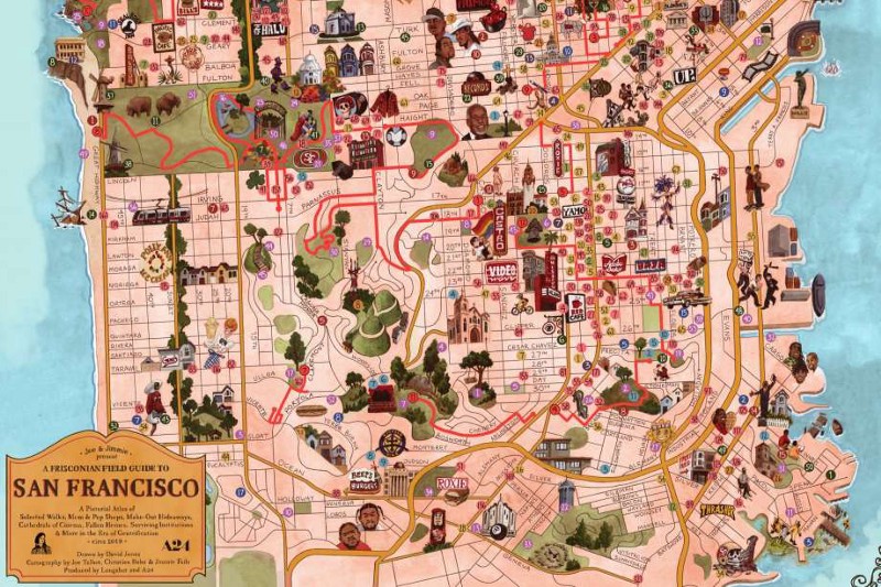
The Last Black Man in San Francisco’ director creates map of the city featuring things he loves