
by Eric Rodenbeck and Alan McConchie
OpenStreetMap’s Los Angeles County building import is well under way, having imported over 1.5 million buildings so far, and with another 1.5 million to go! We were proud to help get the project off the ground, and it’s now taken on a life of its own, as you can see in this video about the project. It’ll be harder for me to find an example of the good things that can happen when companies, governments and volunteers coming together to get open data on to the internet than this.
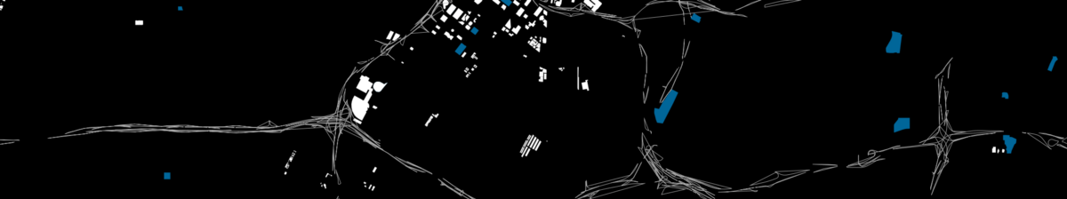
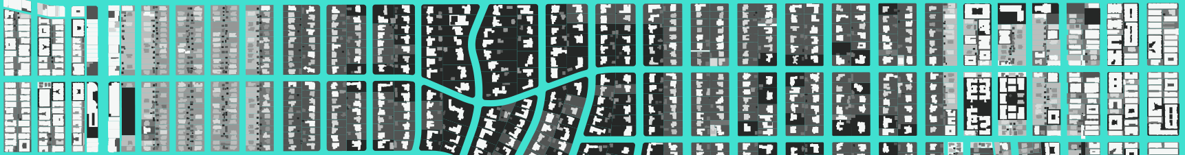
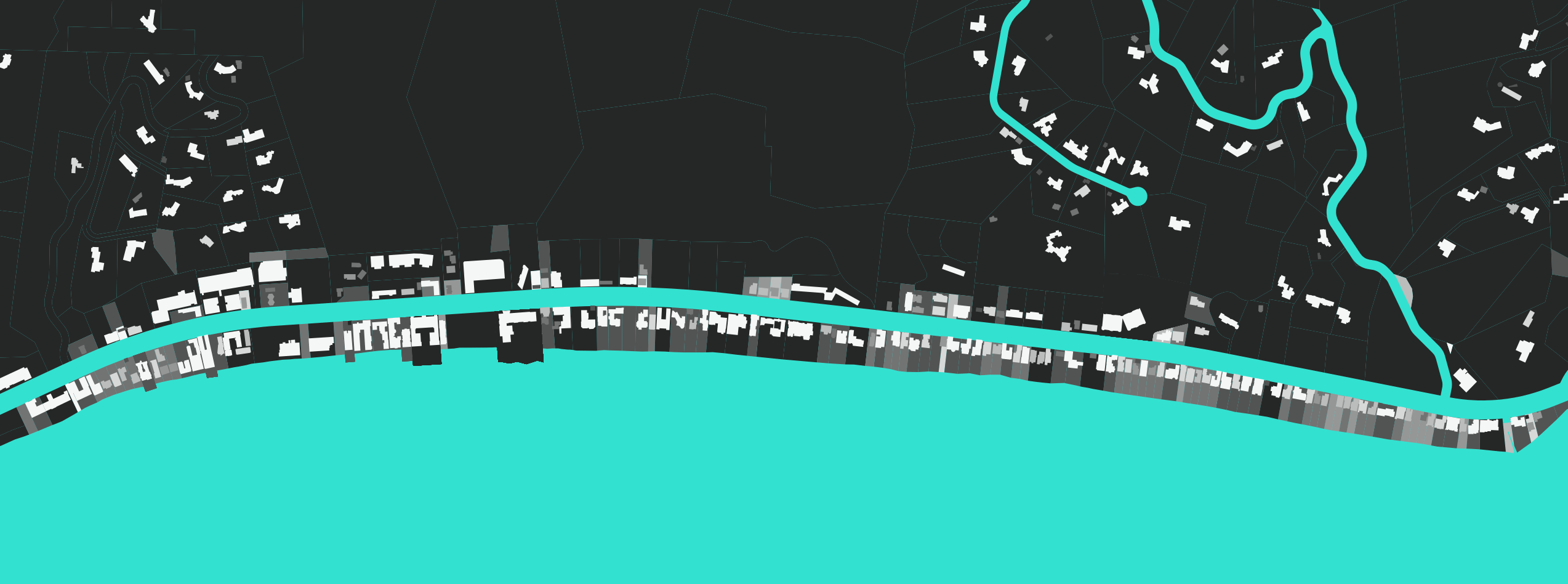
The first thing to note is the sheer scale of what’s been added. Check this out, from a project we did to visualize buildings in cities like LA in 2011. Here’s downtown LA back then, with very few buildings in OpenStreetMap:
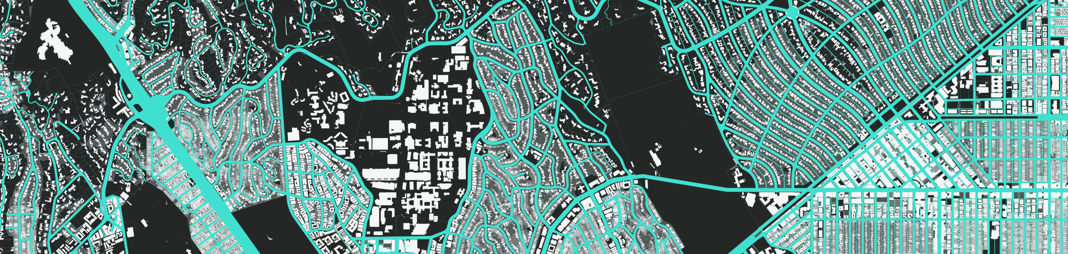
Here’s the exact same part of town, now:
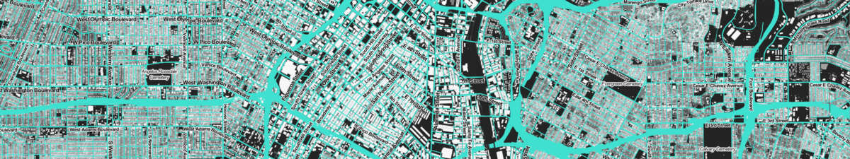
It’s not even close. Over a million buildings have been added to the map, a painstaking process led by volunteers and with a ton of support from the data team at Mapbox. You can read more about the process by which this amazing work happened on the OpenStreetMap blog.
We’re extremely grateful to LA City and the County of Los Angeles for publishing all of this great public data online. data.lacity.org and data.lacounty.gov are full of delicious #opendata goodness. Specifically the OpenStreetMap LA Buildings import uses three public datasets: building footprints, addresses, and the Assessor Parcels Data which lets us determine what type of structure each building is: houses, apartments, schools, shopping malls, factories, etc.
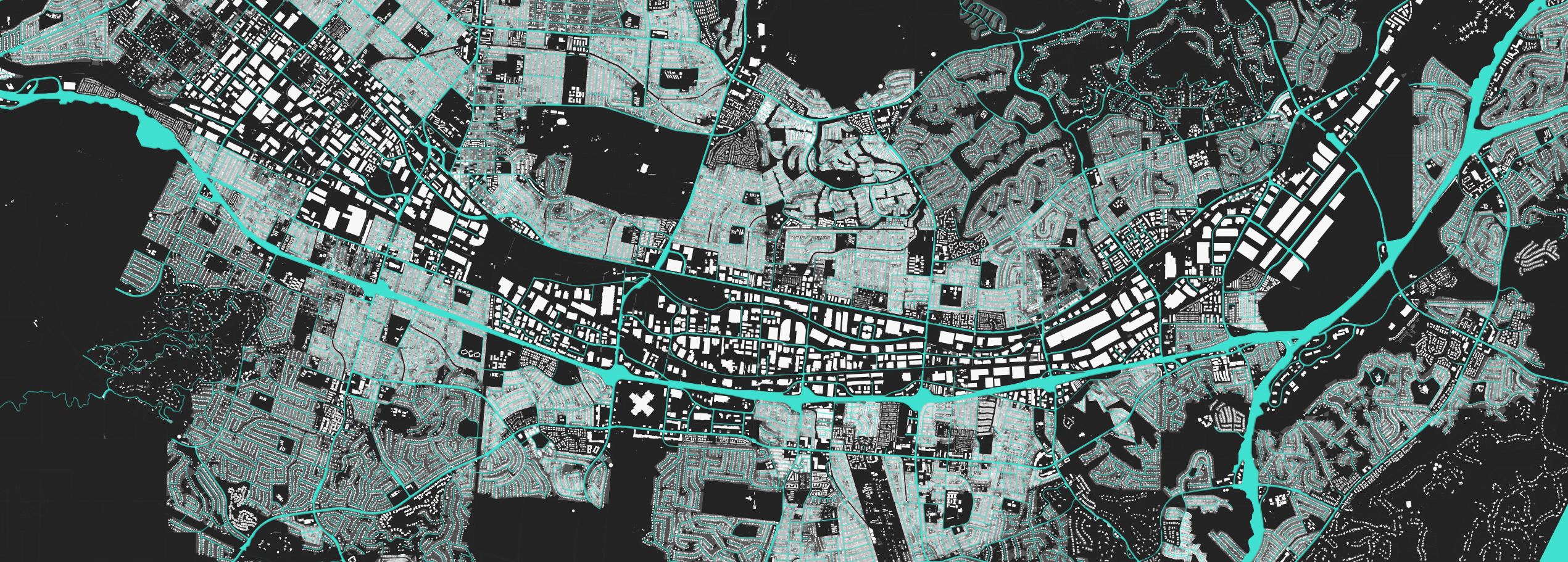
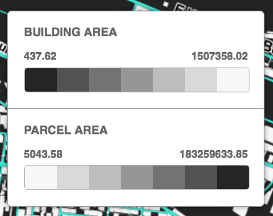
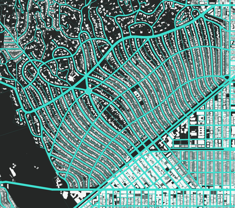
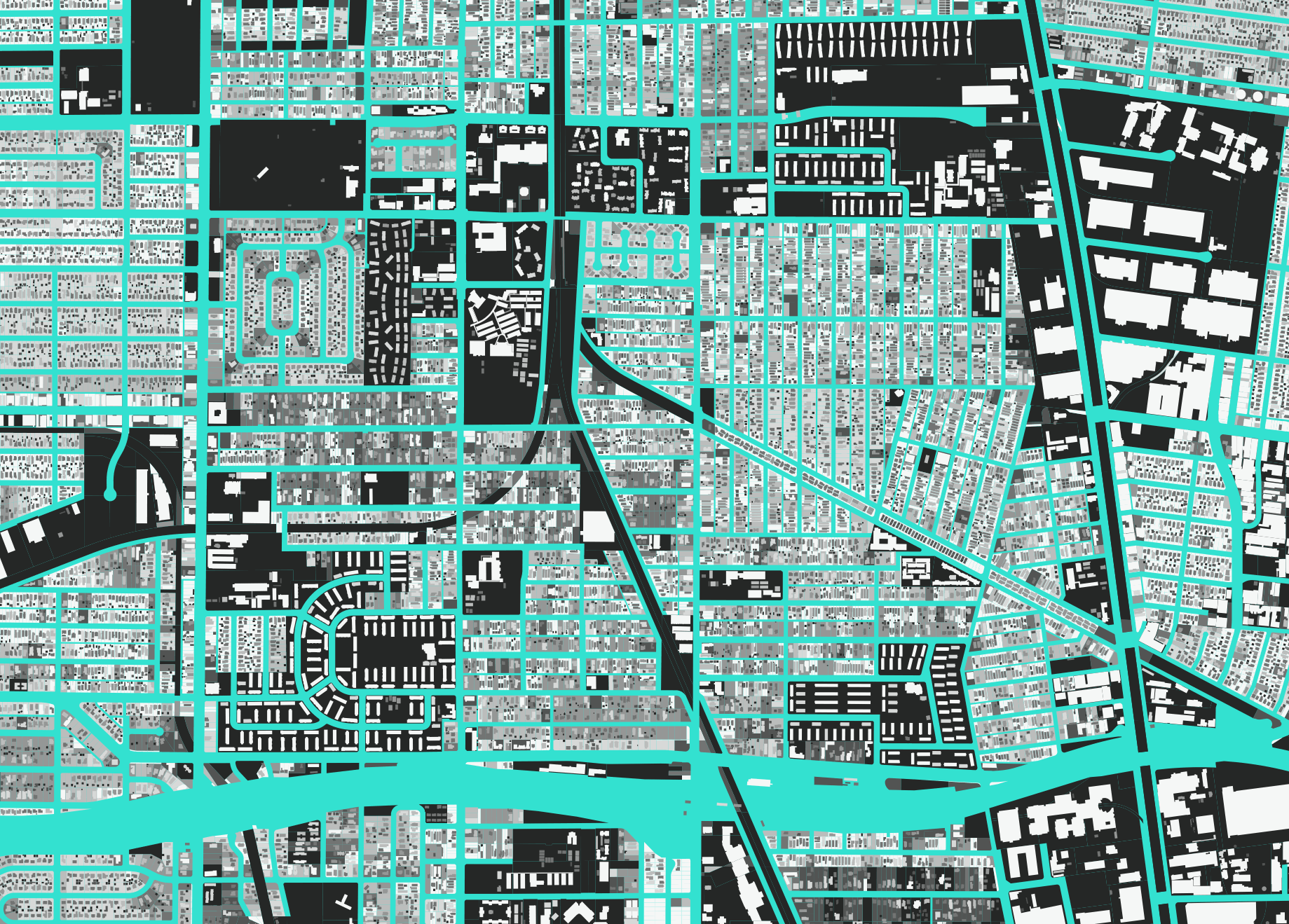
Here at Stamen we’ve taken a look at two of these datasets that, taken together, can show us some interesting things about how planning and building in cities affects the urban tapestry. The first is building size (from the building outline data), and the second is lot size (from the parcel data). We color buildings from small (dark) to large (light), and lots from small (light) to large (dark):
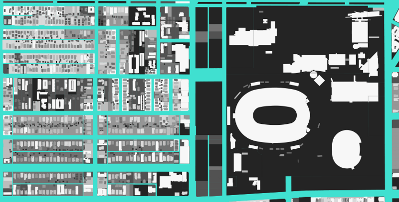
So in this image below, we’ve got the LA Memorial Coliseum, a very large (light) building on a very large (dark) lot, and then right next to it are a number of pretty small (dark) buildings on pretty small (light) lots, with some scattered differences in between.
A benefit of this work is that we can start to make pictures of LA that tell us something about conditions on the ground, without necessarily knowing what’s there. At Stamen we’re invested in this idea that you can use your eyes to learn, and that the data can have a lot to tell you if you take a moment to sit back and just look.
The visualization becomes especially powerful and beautiful as you zoom out, and the tiny specks of buildings and lots start to blend together into complex continuous gradients. To get this effect, we use the power of CARTO’s server-side raster rendering to draw all 3,110,802 buildings and 2,384,040 parcels at the same time. It sometimes takes a bit longer to load the map tiles, but we think the added detail is worth it.
It’s possible to make these maps for any city (assuming the city provides their buildings and parcels data online for free, which is not often the case), but we think this visualization is particularly appropriate for Los Angeles and its dizzying array of landscapes and environments. The county of LA is one of the largest counties in the country by area, and by far the largest by population, with more than ten million residents. It is a microcosm of the whole world, within the boundaries of a single county.
These maps are an example of something that happens quite often in the studio: while we’re working on a project, we happen to come across new ways of looking at data that don’t necessarily solve the problem at hand, but still teach us something interesting and perhaps help us solve different problems and answer new questions. Sometimes these “side effects” end up on the cutting room floor, but this one we thought was too beautiful not to share.
You can browse an interactive map at la.stamen.com, and please let us know if you discover anything interesting! We encourage you to get in touch if any of this has struck a chord. Onwards!