


Eric Rodenbeck: I’m here with Kai Chang and Alec Burch. We’re here talking about our most recent work with the World Health Organization. We’ve worked with them before.
Kai Chang: We did the 2015 immunization report which was last year’s. The immunization report always comes out one year after the data is all collected. So in 2016, we did the 2015 report and this is 2017, for the 2016 immunization report. You can find it online here.
ER: It’s tracking the immunization rates of children worldwide.
KC: Across a couple different vaccines, like DTP3 which is Diphtheria, Tetanus, and Pertussis and is a three-dose vaccine.
ER: So let’s talk about this first chart here, global coverage and number of unvaccinated infants per region.
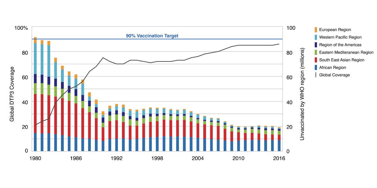
Alec Burch: We’re using a dual-axis graph with a stacked bar chart showing unvaccinated children in each WHO region and a line showing global vaccination percentage. There is also an indicator at 90% which is the vaccination target percentage outlined by WHO. So if we look at this, you can see that there’s been really good progress toward the 90% vaccination goal until about 2010, if you’re looking at the global trend line, but since about 2010 it’s been stagnating. And then if you look at each region you can see some interesting things. For example progress in Africa has pretty much stayed the same since the ’80s, whereas of all the other regions have made a lot of progress.
ER: Well look at the other regions, Southeast Asia saw huge, huge improvement. And then, Western Pacific too. But Africa stays about the same. Interesting. Anything else we can learn from this, aside that Africa remains stubbornly at the same levels as it was in the ‘80s?
KC: It’s a handful of countries too that are problematic, which comes up later in the report.
ER: Okay. So let’s look at those. Moving on to the number of unreached children by country.
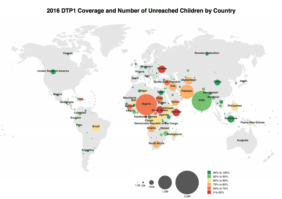
KC: We plugged in new data into last year’s visualization, and changed it from DTP3 to DTP1. There’s a big difference between DTP1 and DTP3. DTP1 is the first step in the three-part vaccination for Diphtheria, Tetanus, and Pertussis, and its’ presence suggests that the population has some contact with World Health Organization, but not very much. The presence of DTP3 means they’ve completed the vaccination schedule, which means they had this repeated contact. So last year we did DTP3. Since this year’s numbers for that vaccine would be almost identical to last year, they decided to switch to DTP1, just to see where there is a lower level of engagement.
ER: So there’s huge numbers of unreached children in Nigeria. It’s not just a percentage either. It’s a huge number of them.
KC: Circles here represent the unvaccinated population.
ER: Right. And then their color is the percentage of them that have been vaccinated. So you get a sense of the overall numbers as well as how many other children there are in those countries.
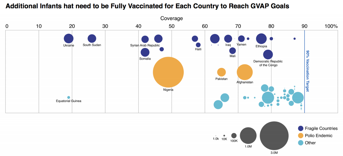
AB: In this year’s report we talk about these 10 million children that will need to be vaccinated if we want to reach the 90% global vaccination goal. This visualization shows where those children are. We’ve broken the countries into three categories. The dark blue countries are fragile countries and we’ve labeled the top nine of those. The goldenrod countries are countries that are dealing with polio right now, and the light blue are some others that fall into neither of fragile or polio endemic.
ER: So then you can see again Nigeria has so many.
AB: One interesting outlier here that Kai noticed and we asked the client about is Equatorial Guinea. They’re not listed as a fragile country, and they also aren’t dealing with polio right now, but they’re below 20% vaccination coverage. We thought maybe there was an error in the data and that they’re actually a fragile country. But it turns out as a country, they’re pretty wealthy. And given that they’re wealthy, WHO doesn’t categorize them as a fragile country.
ER: So simply by virtue of where it’s placed on the graph, you can start to ask questions about whether it’s a country that’s in crisis or whether it’s a country that has chosen not to do this kind of vaccination.
AB: Yeah. We at Stamen obviously don’t know the political state of every country, but the WHO are really knowledgable about that, and they filled in the gaps for us when we thought there was a possible error in the data.
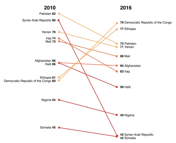
ER: Moving on to trends in DTP3 coverage since 2010. This is a graph showing that change. My God, the Syrian-Arab Republic is just almost off the chart.
KC: This is mostly a detailed view of fragile countries, from the previous slide. It starts with 2010. The Arab spring was in 2011, and basically the collapse of Syria overlaps with this time frame.
ER: I keep coming back to this aspect of these charts, you can always see the impact of war on the immunization rates of children in a place. It’s one of the most obvious and appalling things that happens to a country when it’s torn apart like that. Haiti has gone down pretty dramatically as well. Iraq also, and Mali.
KC: Some people had some design feedback that it was confusing why some things are colored the way they were. Like why the Democratic Republic of Congo was colored orange even though it’s improved quite a bit in the time period.
AB: They’re colored based on their 2016 vaccinations percentage, not on change.
When we started a year ago there was a lot of room for improvement with this report. We made it a lot better in the first year, and we’re making it even better in the second year. And our hope is just to continue to make it better each year. So we’re going to use similar types of visualizations every time we update these, but continue to improve them.
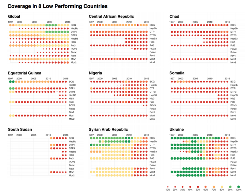
KC: These punch cards doubly encode coverage, as opposed to the radius and the color of these. We have vaccines on the Y axis, and years on the X axis.
Here we can see a variety of vaccines, get a report card of individual countries, and how they’re doing. Green is good, red is bad. So you see Syria, which we were looking at in the slope chart, falling off, and exactly which vaccines have fallen off.
This is a tool we’ve used on several projects, also to assess data quality issues where we don’t have vaccines. Sometimes we’ll see gaps in this data, where vaccines appear for a couple of years and drop off. Not in any of these cases. So it’s also a way for us to assess data quality issues, and also potentially for WHO, the World Health Organization, to address data quality issues, which is usually not as big an issue on the country scale, but they also collect some national data, and regional data, for countries where data quality can be a major issue.
ER:Look at Ukraine. It’s gone down across the board, but there was a brief time in 2005 when their hepatitis B went up, and then it went down again.
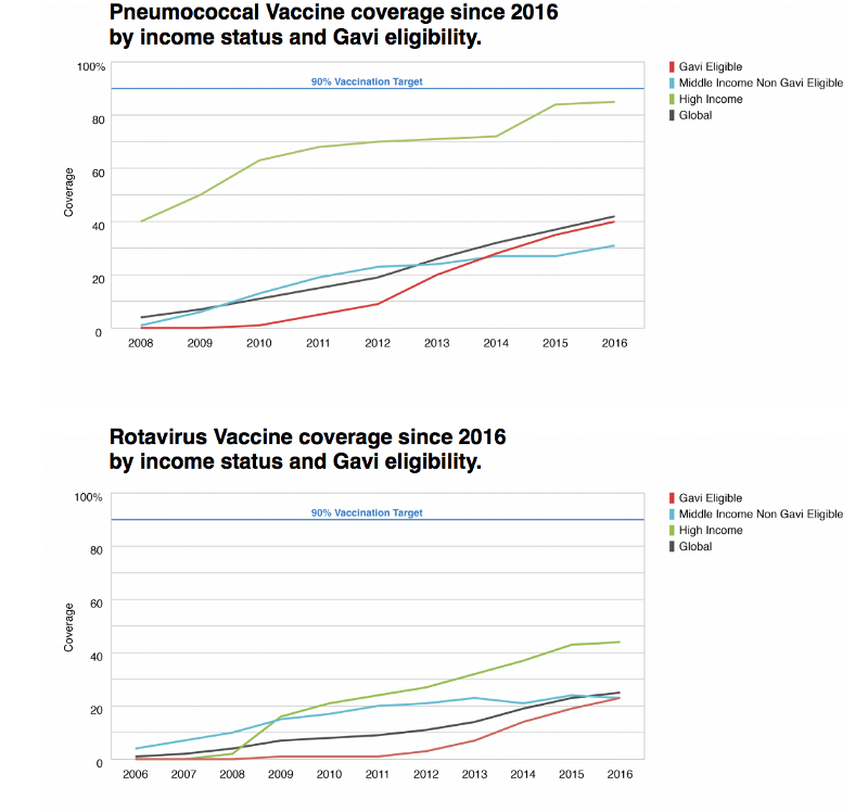
AB: Pneumococcal and Rotavirus are two newer vaccines. In these two visualizations we’ve split these up into countries based on income. So high, middle (non gavi eligible), and low-income (gavi eligible) countries, and then there’s another line just showing the global trend. But what’s interesting here is that high-income countries are doing really well because they have the resources to do really well on their own. And low-income countries are, all things considered, are also doing pretty well because a lot of resources are put into those countries to help aid in immunization. But the middle-income countries are the forgotten middle child. They don’t have the resources to deal with these things on their own, but they’re also aren’t getting a ton of resources from else where. So they’re actually the worst performers with regards to the new vaccines. It’s not the low-income countries.
ER: Interesting. Right, so it’s like being middle class in the United States and trying to get financial aid.
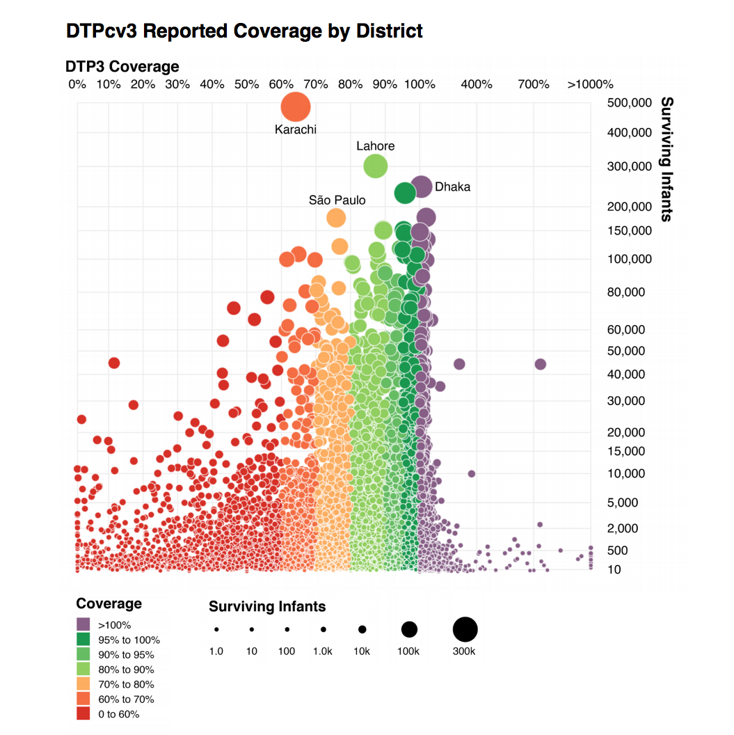
KC: This is the new data that we got from WHO this year. We got roughly 70,000 data points, where every data point was an administrative region broken down in two levels, even down to within cities. Buenos Aires, for example, was broken into several administrative regions. And, actually, several of these dots on the right hand side of the chart we have immunization rates, over 1000% were all in Buenos Aires.
ER: So the horizontal axis is the percentage of infants that were immunized, relative to the population of those areas. Some of them are over 100% — there are more immunizations reported in that district than there are children who live in that district.
KC: Initially we thought it was a data quality issue, but WHO went in back and confirmed that this data was correct and should be represented in this way. As best as we can figure, this it is a migration of people coming to the cities to get immunized.
ER: So, again, we have this issue like we had with American Panorama, our project with the University of Richmond, where at first you think it’s a data issue or it might be a code issue, but it actually turns out to tell you something really interesting about the way the world is. That people come into — assuming that this is accurate, it shows you that there are many places in the world where people go into cities to get immunized and then go back home. Which could be true of any of these other places too.
KC: Right. So for the low performers, it could be that their population ended up being immunized, it just wasn’t in those districts that they were immunized. So the idea is that a lot of these outliers, once you average them out to broader administrative regions and especially to the country level, you get numbers that are more inline with 60, 70, 80 — hopefully 90% being the target at the country level. In the case of districts, the target is 80%. So we use a slightly different color scale here where 80% is green and considered success. And we added this purple color, which is the over 100%.
ER: In Karachi, my god, there’s huge numbers of surviving infants but very low immunization rates. Is that what this is showing? Right?
AB: Relatively low.
KC: It is.
ER: Yeah. If it were red that would be one thing. But it’s orange, so it’s not.
KC: And the placement of the circles, for the placement the two quantitative scales, neither of those are linear as well. So in order to distribute the dots in an aesthetically pleasing way, because we have just a small handful of districts, especially in Buenos Aires, that went over 1,000% or in these 400,000 surviving infants. But the vast majority of districts do fall within 0 to 130% or so. And so we just wanted to provide more space for those regions. Especially small districts, districts with 2,000 to 20,000 surviving infants is where many districts fall. So we just wanted to provide more area so that all the circles weren’t cramped into one corner of the chart.
KC: We’re starting on a new phase next month, with all the work focused on exploring this data. So there’s more to come very soon. A lot of it may end up being internal tools that World Health Organization uses because some of this data is not necessarily fit to be published.
ER: So not just tools for the public consumption, but also tools for WHO to do their work?
KC: It’s both. That’s right. One of the big issues WHO has is that they have this idea that every district needs to get to 90% or 100% and that’s a pretty thin band. But when you really look at the districts, one of the things that they told us was “Well look, most districts really don’t fall within these bands, even in countries which have excellent immunization rates,” and it’s because of these migration issues and data quality issues.
ER: So just because a lot of people in a particular district have not been immunized in that district doesn’t mean that they haven’t been immunized.
KC: Right. It means that they may just simply not have facilities for immunization but the residents do travel nearby to get immunized.
ER: That seems like a useful data point to know, and data visualization seems like a great starting point to have those questions make sense.
Thanks guys!
