
Thanks to Kelly Morrison for her help co-writing this post.
Stamen was asked to create six maps using XYZ Studio, a new web app from HERE that allows users to create custom maps from large datasets. We sat down to talk about the process and the product (viewable at https://explore.xyz.here.com/gallery) with the map makers: Alan McConchie, Stephanie May, and Sarah Fortune.
Eric Rodenbeck: Let’s start with your roles. What did you do on this project?
Stephanie May: I was developing unique visualizations using the HERE platform and other JavaScript libraries and data science tools.
Sarah Fortune: I was working on the visualizations as well, using HERE and their APIs.
Alan McConchie: I also made a few maps for our collection of demos, a couple using big public data sets. Also, I had made a few demos for our previous work with HERE, some of the very first xyz sample maps that we made.
Kelly Morrison: And I helped out with project management and content creation. Let’s talk first about this map of car break-ins in San Francisco.
SM: What HERE asked of us was that we use their tools and freely available open data to make some visualizations that would demonstrate the value of their platform. This was the first one I found and chose. It’s an analysis of a well-known data set that’s available from DataSF. It’s a subset of all of all the police report data published for the city online.
This map represents all car break ins since January of 2018. I downloaded the data from DataSF, and then I took it into Studio and did a bunch of processing on it. The most significant thing I did was to aggregate all of the data by intersection because, in my explorations of the data, I found that that was the best and most responsible way to visualize the break-ins. Then I used the HERE platform — first to upload and tag the data, and then to visualize it in HERE Studio by using their rule-based styling abilities to create a graduated-dot map, which is a very classic style of data-driven map.
KM: And I think you mentioned in your description that this was inspired by an existing SF Chronicle map?
SM: The Chronicle has been covering the issues around car break ins in San Francisco for a couple of years, and it’s great that they’re highlighting that issue. In a recent article they published some months ago, they did a visualization that was just the bare minimum. They were pulling the data live, and then they were slapping all the points on the map and using the Leaflet clustering algorithm to show clusters that tell you absolutely no information.
ER: With Crimespotting, which was a project we did some time ago, we felt like our work was a response to the closed and shoddy nature of the way the data was being presented in the official City of Oakland’s tools. Things like: you couldn’t bookmark anything. There was no way to share it. It didn’t feel like something that belonged on the web.
SM: What was good about this map, which was made in Studio, is that Studio is so easy to use. There’s a very short learning curve, so it’s easy for non-developers and non-engineers to work with. And HERE has a CLI [command line interface] that allows you to upload data. So it has the potential to replace the tools that city governments use to publish their data. And if cities were to adopt it, HERE could build out a lot of the ability that outside users have to copy the data into their own space and do their own transformations on it
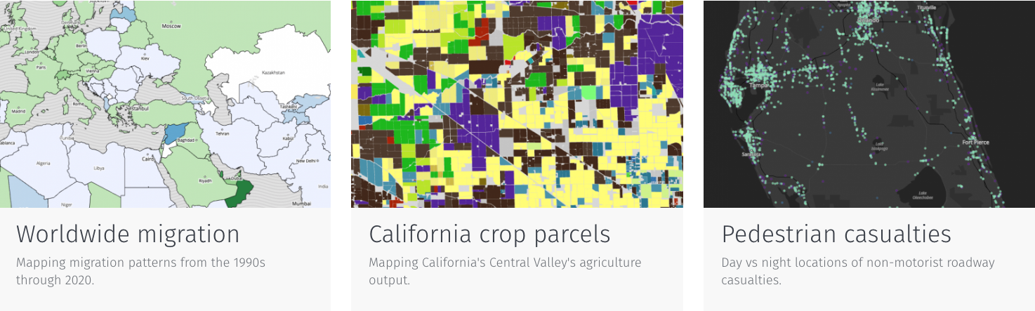
KM: Okay, let’s talk about California crop parcels.
AM: This is a data set that I saw someone else here at Stamen playing with. Logan Williams was playing with this over Christmas break, I think, and I was curious to see whether I could easily re-implement what he was working on.
So this is a GeoJSON file provided by a California State government agency showing every farm parcel in the entire state of California, and showing what types of crops are grown there. This data set was created from a combination of sources, like satellite imagery, some on-the-ground truthing, probably linking it with other types of data — maybe tax receipts. We used the high-resolution satellite basemap provided by HERE for the background.
A lot of people don’t know that California is the largest agricultural state in the U.S. It produces more crops than any other state for sure. And a lot of that is in California’s central valley, but there are other agricultural regions scattered throughout the state as well.
ER: They grow a lot of rice, right?
AM: They grow a lot of everything.
ER: They’re growing rice in the desert. Woohoo!
AM: What we can do with this map is view color-coded polygons on the map showing the different crops and where they are, on top of a satellite map. Where there are no crops, then you see through the satellite map onto the real background. So you can see various cities in the farming area. You can see where farmlands end as you get into the hills.
A legend on the left shows you the total of each crop type within your view frame, and it also indicates the colors of the things that you’re seeing on the map. So as you pan around and zoom in on smaller regions that might be growing only one or two things, the legend on the left will adjust and only show you the colors of things that are being grown in your view. And it will tell you what the total area is of what you’re seeing in your view frame.
ER: Right. So there’s a nice kind of back and forth between a visualization that’s non-geographic and one that is geographic.
AM: Yeah. And if you zoom in far enough, then we actually start to put the names of the crops showing up on the map.
ER: Oh, because they’re color-coded, but they might be different kinds of things?
AM: Yeah. Because there are probably close to 100 different crop categories here, you’re not necessarily going to be able to distinguish all the colors just by looking at the legend.
ER: Right. There’s so much here. It’s amazing!
AM: We were also kind of curious to see what types of interactions we could do to filter the view to emphasize specific types of subsets of the crops. One of the things we were really curious about was what time of year various crops are harvested. This data didn’t come from the original source data — I had to source it from various other places online. The idea is, given a particular category of crops — say, alfalfa, which is what you’re looking at right now — when is alfalfa usually harvested in California? We can’t deinitively say that any one of these specific polygons will be harvesting alfalfa in a particular month. We don’t have that data, but we can give you a rough sense of harvest time frames for individual crops.
KM: It’s pretty amazing to me that harvest time is really happening year round.
AM: And some crops can be harvested pretty much year round, and some of them have multiple harvest times within the year. But then there are others that peak in a very specific season or a very specific month. One of the strengths of California as a powerful crop-growing region is that we have a very long growing season, so we are able to grow crops at multiple times a year, perhaps have multiple harvests for some crops.
ER: So you took data from a variety of sources and combined them in the new platform.
AM: Yes. There’s one primary data set, which is the geometries of where the crops are grown. That’s a big dataset — it was a close to gigabyte once I had unzipped it. And when you just think about how you can zoom in on somebody’s farm, we’ve got that for the entire state of California. Then adding the time slider was pretty simple. That’s more of just front-end filtering in the javascript code.
We’re able to use the tags on the XYZ spaces to filter based on the kind of crops of the category. That’s a tag on the features in the XYZ space. So we can really quickly say, “I want to request from the XYZ server only crop polygons that are alfalfa or cherries.” Using the tag filtering is very powerful.
I think this is a really cool visualization. You can imagine a lot of ways that you could incorporate even more datasets and upload more into the XYZ space with tagging. Let’s say you were interested in following up on recent developments in bee colony collapse disorder. If you had some attribution that you could assign to these geometries, you could build on top of this existing functionality. And I think that it would be tremendous for journalists or other people that are interested in having access to this data in a way that they wouldn’t otherwise.
KM: Let’s move on to mapping Climate projections using Köppen-Geiger classifications.
SM: This is a visualization that I did of some model outputs, based on scientific studies that were done by the Intergovernmental Panel on Climate Change.
ER: Ah, the old Köppen-Geiger classification!
SM: Yes, the Köppen-Geiger classification is actually quite old. It dates back to the 19th century, back in the age when scientists loved to classify everything. I would say this is when data visualization began, because there was this belief that you could come up with systems for classifying the world. All sorts of taxonomies originated in that time, and this is just one among the many.
ER: I talk about Alexander von Humboldt a lot, as one of the founders of data visualization in the 1840s. This work is much older than computers!
SM: Yes. So Köppen also started his classification back in that time. His intellectual enterprise was to try and go around and group the different climates of the world based on a few discrete characteristics, so that you could make comparisons between climate types. One of the climate types we think of here in California is the Mediterranean CSB type climate in green, which covers the various Mediterranean climates. That’s a really specific climate type, which covers the west coasts of continents at about 30 degrees plus or minus north and south latitude, and happens in those really specific cases because of ocean currents flowing from pools and the fact that there are atmospheric high pressure zones that are blocking rain from hitting the continents in the summertime. So those are the main characteristics that create Mediterranean climates, and they exist in these very narrow bands in about five different continents around the world.
But that’s just one example of many. This visualization is specifically comparing the Köppen classifications based on observed data from the last century to model data for the next century, and showing how these climate zones as Köppen envisioned them back in the 19th century are shifting under our feet — literally. One of the most interesting examples is the huge shrinking of all of the cold climate types. They’re all being replaced by hotter climate types, and this is particularly pronounced at the high height latitudes. And the other one is the increase in desertification. You can see the expansion of all the very arid climate types into other areas of the world.
ER: I hope you’ve enjoyed living in your Mediterranean climate.
SM: Yeah, it’s not just that San Francisco’s going to become more like L.A.; it’s predicting that northern Canada is going to become more like L.A., huge swathes of it. And that’s largely because it’s just going to become hotter and drier.
I used the tagging functionality of the HERE platform pretty extensively in this visualization. I think it becomes the most useful when you need a super-attribution that you can access in Javascript to toggle between visualizations. Each shape has a classification, but then each of them also has a classification of current or future as well, that I added when I uploaded the data.
KM: I could play with this map all day. It’s hard to stop.
SM: It is. I could have spent at least a week on every single one of these maps, and we could have spent a great deal more time building up the functionality and all of the visualization. And there’s so many different directions it could go. There’s so much more you could add.
KM: All right, let’s talk about New York versus Los Angeles, parcel by parcel — the coast-to-coast smackdown.
AM: This is one that both Sarah and I worked on. We started from each coast and kind of worked together converging into a single project. Sarah started exploring the open data from the city of New York, which includes every parcel and the zoning for that parcel along with buildings and the square footage of buildings on each parcel.
I was working from the direction of LA. I had done a similar map using Carto a few years ago, just of LA. Both LA and New York have a ton of really interesting variation in terms of the parcel sizes, the way that land use has changed over time, and the way that that shapes how both cities have been laid out in terms of how blocks are shaped. And also distribution of facilities and commercial areas with residential areas — you can really see the changes from the center of each city out into the periphery. In the LA map, it goes really far out into desert in the northern part of the county. So there are tons of variations.
We wanted to do one view that was more practical, showing how you might use a real-world land use map. This is the colorized view that you first land on. These mostly use the standard color scheme that most zoning maps use, though it varies by city. And this is exactly the type of thing that a city planner or community group would use to see what the plans are for different neighborhoods.
The other view is a much more abstract and intriguing view. It’s not showing a colorized zoning; it’s merely showing how building sizes correlate, or sometimes don’t correlate, with parcel size. In a place like Manhattan, for sure, most parcels have a building that is out to the property lines on all sides. There are very few places where you’d be walking on the sidewalk and there’s not a building right up to the sidewalk. You might have a little bit of a land in the back yard in some medium-rise residential areas. Definitely in midtown there are gigantic buildings on gigantic lots, with maybe a little bit of non-built-up land around the skyscraper, but it’s very uncommon.
ER: Looking at Hell’s Kitchen, it’s kind of amazing. Broadway in the ‘40s — I used to live there, and Hell’s Kitchen was a tenement neighborhood with lots of rooming houses. You can just see it right away on this map. From 8th Avenue to 10th Avenue and from 42nd Street up to 49th Street, that’s Hell’s Kitchen.
AM: I also love looking at L.A, where there are these neighborhoods that have tiny garden sheds in the back, and you can see those pop right off the map. It’s harder to see them with the zoning, but it’s super easy to see them when you’re just looking at lot size and building size.
For the scatterplot in the bottom right, we’re getting the data from the zoning polygons, from the parcels. That provides us with not only the area of each parcel, but also the square footage of the building that is on that parcel. So often, we’ll see that, depending on whether we’re looking at a downtown area with gigantic skyscrapers or an older residential neighborhood where the houses or apartments are built to the property lines, there are square footages very similar to the square footage of the lot. But then in the more postwar kind of car-oriented suburban areas of Los Angeles, you’ll see houses on much larger lots where the lot itself is not filled with the building all the way. And so the scatterplot is meant to show that relationship. Obviously, the bigger the lot, the bigger the building you can build on it; but depending on what neighborhood you’re in, you’ll see a totally different distribution of that correlation or lack of correlation.
You’ll also see some really interesting stripes — vertical stripes that happen when you zoom in on neighborhoods where every single parcel is exactly the same dimensions because they surveyed and plotted out a whole neighborhood all at once with identical size lots. And you will sometimes see even identical size buildings where maybe everything is designed to very specific zoning requirements, or they were all a bunch of kit houses that were all built in the same era. So, sometimes just seeing vertical or horizontal stripes in the scatterplot will tell you something about a surprising homogeneity in the data, which is also very fascinating.
ER: It’s really interesting to see how this visualization really shows that the built environment is a historic record of zoning, of successive changes to zoning over decades and years and trends in buildings. But also all the places where there’s a lot of heterogeneity really speak to how the built environment becomes our on-the-ground record of all of the different philosophies that have existed.
AM: With this map in particular there are so many ways we wanted to take it further. So many more features to add. I’d love to be able to filter by property value. I think we have that in the dataset for both L.A. and New York. What is the correlation? Normally, it’s going to be pretty obvious between property size and house size and then the assessed value of each lot. What colors would we want to use for that? Or we would just use that for colors on the scatter plot. Those are all things we would love to do more with.
All of this is in a single XYZ space, and we’re distinguishing whether we want to pull out parcels or buildings or L.A. or New York with tags. So instead of thinking about each XYZ space as its own shapefile, instead we’re thinking of the XYZ space as a database that may contain multiple shapefiles or multiple types of things, and you just use tags to pull out what type of feature you want to pull out.
ER: Any issues getting the data into this format?
AM: This was an even bigger data set than the crops. Sometimes we tried to optimize. There’s the full-resolution copy of the polygons, and then there’s a simplified one that we uploaded, also with different tags on it, in the same space, so that when you’re zoom out a little bit and you’re seeing more of the city, you’re getting smaller geometries because they don’t have quite as many points and attributes on them. So a lot of that was just loading multiple copies for different viewing conditions or knowing in advance how we’re going to need to view it and what performance we’re going to need for loading all this stuff in the browser. We did all that by cleaning up the data and pushing it up into different tags.
That’s something that the XYZ API might support automatically in the future, because if you’re requesting data at a certain zoom, it should know that certain features at a certain resolution are not going to be visible. Definitely, their performance is right at the limit of what is possible.
ER: Mike Migurski and I used to talk about simulated annealing, which was a way to be able to overlap labels and things on zoom. The question is, if you’ve got two cities that are going to be overlapping one another at various zoom levels, which one do you show? At what point precisely do you only show San Francisco, and when do you show both San Francisco and Berkeley, for example?
SM: Yeah, this is a classic problem in cartography — how do you ever show Baltimore, given Washington, DC?
KM: All right. Stephanie, let’s talk about the map you made of Florida pedestrian roadway casualties. It’s a heavy one.
SM: This data set is very important and definitely a great example of data that’s available, but not necessarily accessible. It came from FARS, which is the National Highway Traffic Safety Administration’s database for police records that are collected after any car collision. It’s aggregated from police departments all around the country, in some cases from pen and paper reports, which inevitably introduces heterogenaety within classifications and bias. By bias, I don’t mean police bias. I mean reporting biases and all the different problems that happen when you’re transforming something from a text narrative to tabulated data. It’s a problem in FARS, and so that’s something that I was aware of and exerted an abundance of caution when trying to explain the visualization.
This data is made available as a bunch of CSVs on an FTP server. It’s a classic case of the unsolved problem of making open data actually accessible by pulling it into a database that people can then play around with. We want to enable people to engage with this much easier than they can with publicly available data set on any platforms that exist right now.
This visualization allows you to toggle between night and day and what time of day incidents occur. And then it also provides a sort of natural language narrative based on gluing the records together of what happened on that day and time.
KM: It’s a shockingly large number of people.
SM: And it’s a dramatic undercount of what is actually occurring on the roads.
What I really like about visualizations like this is that they’re living memorials to something that is not visible. It reminds me of the white bikes all around San Francisco that are visual reminders on the street that a cyclist was killed here. I think that those sorts of visual reminders that tie a specific event to a place are really powerful and compelling. These are the kinds of things that can really start to create the impetus for change and show the importance of taking these things into account as we develop our transportation networks. We need help to understand that we, actual people, are the externalities that urban planners got to create.
ER: Yeah. There are thousands of dead people on this map. This is an extraordinary litany of death.
SM: Yeah. Humans who are just crossing the street. And this is a growing problem, because we have spent so much time since the 70s thinking about how to make cars safer for people in cars. And we have been successful! Which is really bittersweet. Because it shows that number one, it’s possible through regulation and research and design and development to protect human lives. But number two, that we were making choices about which lives we’re protecting. It’s particularly relevant in this time of self-driving cars, where we’re getting all of these flat assurances that self-driving cars will have safeguards against human health. That won’t happen unless there’s focus of attention on pedestrian safety.
There are organizations around the country and around the world — part of the Vision Zero Movement and others — who are thinking about all of the factors that play into pedestrian safety. They’re analyzing traffic patterns and trying to pull out meaningful action items.
The city of San Francisco health department has been doing a great job of shining a light on this issue and collaborating with other cities and creating a Vision Zero local to San Francisco. They’re working with the police department to improve how they are keeping their records, and then getting the data directly from the hospital and directly from the police department. So they’re going off their own data rather than from the National Highway Traffic Safety Administration.
KM: You highlighted Florida specifically because it is among the most deadly in terms of pedestrian fatalities?
SM: I highlighted Florida because there’ve been a couple of highly publicized reports on pedestrian and bike collisions that have ranked metropolitan areas in terms of number of pedestrian killed per capita or something similar. And when you look at that list, it is dominated by metropolitan areas in Florida.
KM: Sarah, let’s talk about our last map in the set, worldwide migration patterns, which shows immigration and emigration patterns from the 1990s through 2020.
ER: I like this one.
SF: I picked this subject because migration is a really hot topic right now in the media, and there’s a lot of misinformation. So I thought it would be good if people get all their data from a neutral source. The UN data came in an Excel spreadsheet, so I turned it into a CSV file. I did some scripting with Python to make it into a reusable format. Then I had to join it with the country polygons from Natural Earth.
ER: Anything surprising from this one?
SF: It was somewhat difficult to get the country polygons into HERE. And there were some issues with countries that cross the date line…
SM: Yeah, which is often a problem with any maps that need to be global. Often, people just sort of handwave and say, “Don’t look at what’s going on with things across the international date line.” Once you need to join data to these shapes and have them nice and clean…
SF: Yeah, actually I was using a different dataset before for the country polygons, and it had a ton of problems. And then I got the Natural Earth dataset, and it uploaded much more easily.
View the rest of the maps in the project at https://explore.xyz.here.com/gallery.
Check out some more of the best damn maps on the web at https://stamen.com/maps/