
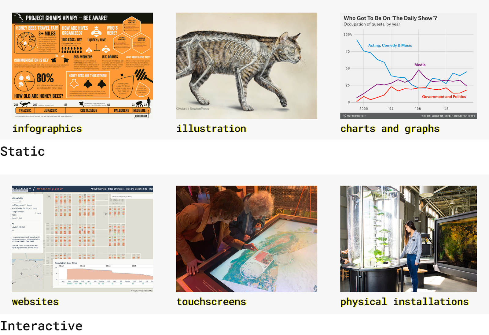
Show don’t tell. It’s what we are taught from a very young age and continue to employ everyday, be it at school, work, or even in conversations with our friends. This phrase has stood the test of time as being the most powerful way to convey information. Actions, words, thoughts, senses, feelings, and even data are more powerful ways of telling a story rather than through one’s summarization or description. When it comes to data, visualization is the most powerful tool we have in our toolkit to tell a story. These types of visualizations can be static (or animated), like infographics, illustrations, and charts and graphs. Or, they can be interactive, like websites, touchscreens, and physical installations, which often employ static forms.
Creating the framework
Most of our work here at Stamen involves creating interactive websites. We do, however, on occasion create physical installations, and nevertheless can appreciate how interactive websites are only a subset of the world of interactivity. The Design of Data class at the Stanford d.school wanted to understand why interactivity is such a powerful tool in data visualization. To answer this, we developed a framework for why you’d be wise to make a visualization interactive. The framework is meant to transcend interactive websites and apply to all forms of interactivity, as you should not need the technical chops that we have at our disposal here at Stamen to communicate the story behind your data:
- See yourself in the data
- Get a feel for the data
- Reduce overwhelm
- Interaction is fun!
1. See yourself in the data
Interactivity allows the user to enter the data themselves and relate to the story. This can take several forms, with the most common being that users will be compelled to find their house when given a map. It’s most natural when you arrive at a map to want to search for and zoom in on where you live. It’s familiar to you and can help orient yourself in what is going on the data. It’s best to capitalize on this most natural behavior as once a user finds themselves in the data, be it by searching for their house on a map or maybe searching for a demographic filter that applies to them in a chart, they might wonder how they compare to others. More broadly, it can help them understand why they should care about the story in the data.
Case study: WastewaterSCAN Dashboard
In the dashboard we built for WastewaterSCAN tracking current and historic pathogens levels using wastewater data, we built the map feature to accommodate people searching for their house. In fact, we very much intend for people to search for themselves in the data. Some of our largest use cases can be summarized by a user thinking along these lines:
- I’m sick, I wonder what is going around in my neighborhood?
- I’m traveling to Atlanta for the weekend, should I be concerned about getting sick?
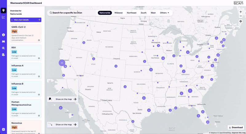
We added the ability to locate yourself in the map in a few different ways to accommodate these use cases. Users can search for a location such as their address, select a specific region, pan and zoom around the map, and even select the “locate me” button to find themselves immediately. Once they’ve found an area they’re searching for, the pathogen levels update to reflect the area and they can understand the associated health risks. For some users, this may be the entire reason they loaded the page, but for those that are still curious, they can continue to engage with the data in new ways such as using the chart builder or searching for unrelated places.
2. Get a feel for the data
Interaction allows us to chart our own path in the data. Sometimes data lends itself into becoming an interactive model that lets users run their own experiments. Users can create simulations, manipulate what’s being shown, and answer whatever follow up questions they may have. Complicated interactive data models are meant to allow you to answer all the “what if?” questions you may have. Even simpler charts with different variables that can interact to change the displayed result can offer a multitude of different paths a user can take to get a feel for the data.
Case study: AR watershed sandbox
For this example, let’s step away from the screen and consider how one might interact with data away from their laptop or phone. One more famous interactive experience you may be familiar with is the sandbox that uses augmented reality to display watersheds built by UC Davis. It is designed around the questions a user might have when approaching the sandbox:
- What happens if I dam this river or erode the riverbank?
- What happens if suddenly there’s significantly more rain here?
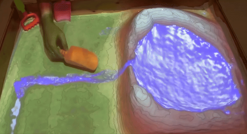
Users can answer these questions by moving the sand to form new features, trigger rainstorms, and see how the water would react in the mini-cross section of land. Instead of making users look at various different examples of how a watershed would work, the designers have taken away the guard rails and allowed for limitless possibilities for users to test their own questions. While doing so, they are learning how watersheds work through running small experiments. They are learning by doing.
3. Reduce overwhelm
One of the larger strengths of adding interaction to visualizations is that it allows us to pack in significantly, even infinitely, more data than a static visualization. With a static visualization, you reach a threshold where adding any more information will distort what is already visualized and make for a worse experience. But with interactivity, you can hide information behind buttons, hover states, modals, etc. and let users dive deeper at their own pace. We as designers can also deal with data constraints and fill in the gaps with supplementary information that should be hidden until the user has a foundational understanding of the problem at hand.
Case study: VACS Explorer
When it came to designing VACS Explorer, an interactive experience to help users understand how climate change would impact crops, we had a mountain of data we wanted to pack into the website. We leaned on interaction to change the data emphasis depending on which step of the journey a user was on. It was designed with these types of user questions in mind:
- How does this crop compare to other crops in a climate change scenario?
- How does sand and soil health relate to this crop potential?
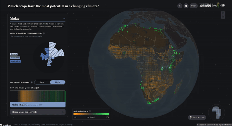
One key data constraint we needed to work around was how to show all the crops at once but not on the same map since our dataset did not encompass every single crop that is grown in Africa, and this could ultimately be misleading for the user. We used filterable small mini-map multiples to show all the crops side by side, giving a similar experience for users without being misleading. We also added different modes for single-crop viewing such as viewing a crop in comparison to other crops in its food group or toggling on the sand and soil data and information. We could not show all of this at once without overwhelming the visualizations and thus distracting from the experience. We relied on careful user interface design to help guide a user towards all the hidden pieces, as we always try to ensure users who choose not to interact with the information will still learn something from even just the static visualizations.
4. Interaction is fun!
We’d be fooling ourselves if we did not admit that part of the reason we make things interactive is because it’s fun. We are living in the information overload age where people are constantly consuming information on screens with low attention spans. Making data interactive makes it engaging and immersive in a way that can draw people in, so they might understand and care about the data. Interaction also allows us to gamify data and help people learn by creating incentives and goals from the data. At the end of the day, interaction is extraordinarily fun for both the user and the designers.
Case study: Living Liquid
The Exploratorium reached out to Stamen to help visualize how different microbes coexist in the ocean with the priority that it needed to be fun. People that go to the Exploratorium are there to have a nice afternoon with their family or evening with their friends. Simply put, if they learn something it’s a bonus! Even further, it needed to cater to all audiences, from overstimulated kids to their proud grandparents playing paparazzi. We built the experience, Living Liquid, to answer these very simple questions museum-goers might have about ocean microbes:
- What eats what?
- What happens if I add these microbes?
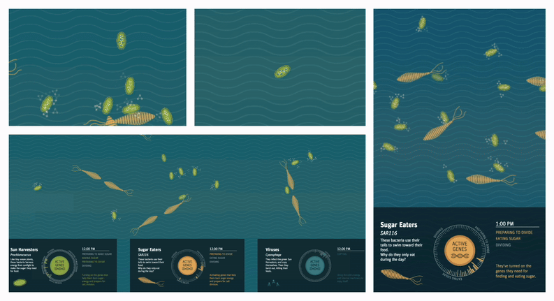
We created an interactive experience for a large multi-user touch screen table that lets people take the data into their own hands. They could release different types of microbes into the ecosystem and see what happens. They could watch how they would multiply, when they would eat, which microbes would eat what, and more. To accommodate larger group sizes such as families, users could work together and manipulate the same ecosystem from different workspaces around the table. We added supplementary information and visualizations for each of the microbes for those users who were so intrigued by what was happening in the ecosystem that they wanted to learn more.
Consider these questions to start
It might seem daunting from these complicated examples to think about how you could make a visualization interactive, but interaction comes in all shapes and sizes. Even something as simple as a button to change a setting or moving a physical object in space can create an interactive experience that helps users understand. It’s best to always start with the user and think about how to answer these questions:
- What story do you want to tell? What action do you want to inspire? What is your bias?
- What questions do you think your user will ask?
- What materials and interactions will engage a user in the ways we’ve described above?
We here at Stamen love designing interactive experiences to tell stories using data. If you’ve got any data that needs to be visualized, please reach out!