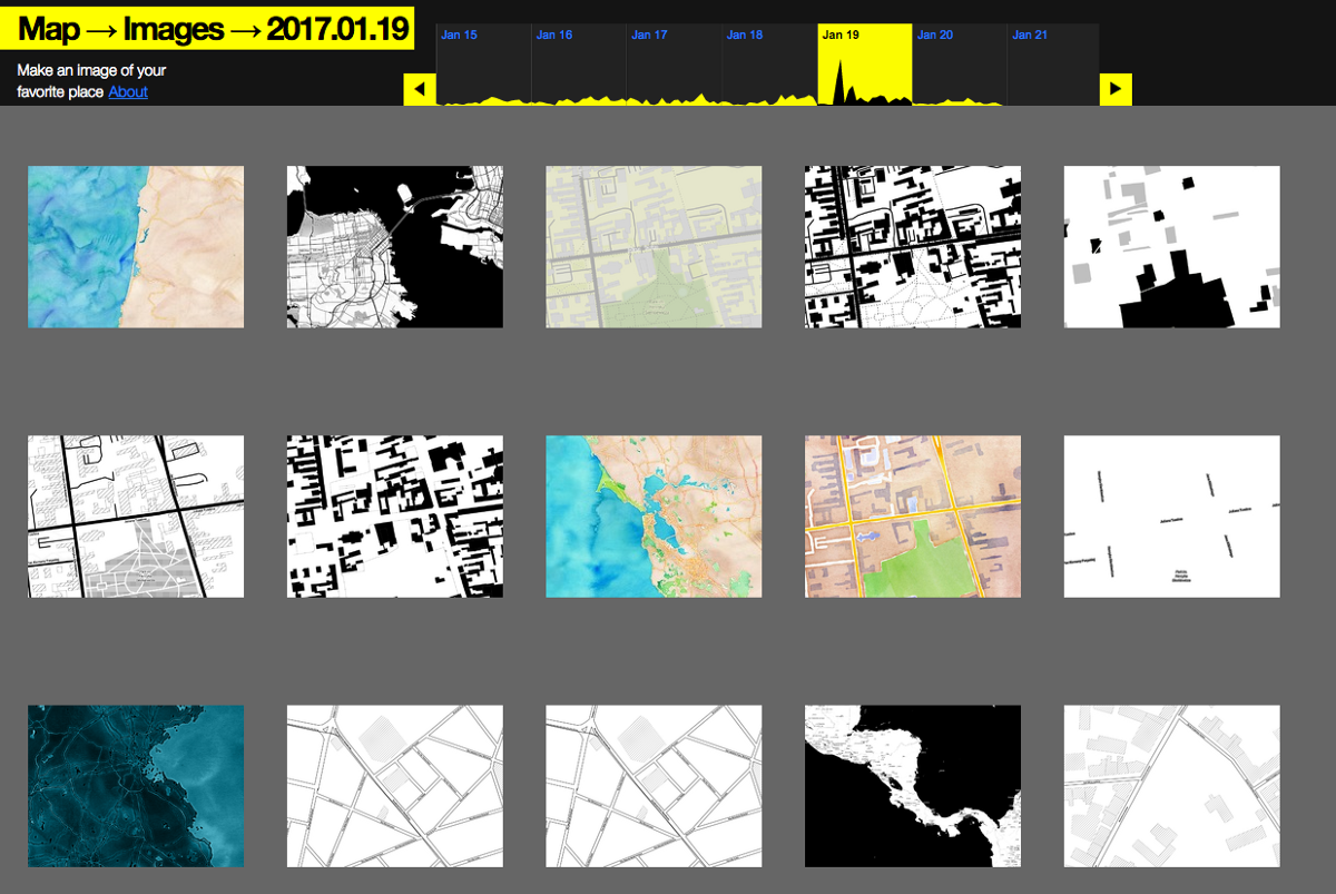
Every year, the team at Stamen is lucky enough to work with a wide range of clients and collaborators. Last year was a banner year for variety! The work ranged from visualizations of the hidden world of genetic ecosystems to an Atlas of Emotion for the Dalai Lama, with a diverse array of other projects adding up to a cross-section of what new kinds of data became available in 2016.
The major threads through this work for me this year were:
- New kinds of data. This year we saw a real break, in our practice, from the ideal of easily-consumable, properly formatted, API-friendly data, ready to visualize in the newest d3 libraries. We worked with enough exhilaratingly messy, scrappy, vital data that needed cleaning, combing, sorting and gathering, that we’ve (internally) changed our mission from “visualizing data” to “doing whatever needs to happen to tell compelling stories with our clients’ data.”
- A “platform-agnostic” approach to data visualization is the way to go. We visualized data from ESRI, OSM, CARTO, MapZen, and drawings in notebooks, in everything from d3 to Leaflet to C++ to Illustrator. The increase in the number and variety of tools and data sources available to do this work has become a full-throated avalanche.
To the work!
Scientific Data Visualization
The Atlas of Emotions
This was the year I got in-person design feedback on a Stamen project from the Dalai Lama. After this I feel pretty confident I can successfully pitch basically anyone on the value of data visualization and strategic communication.
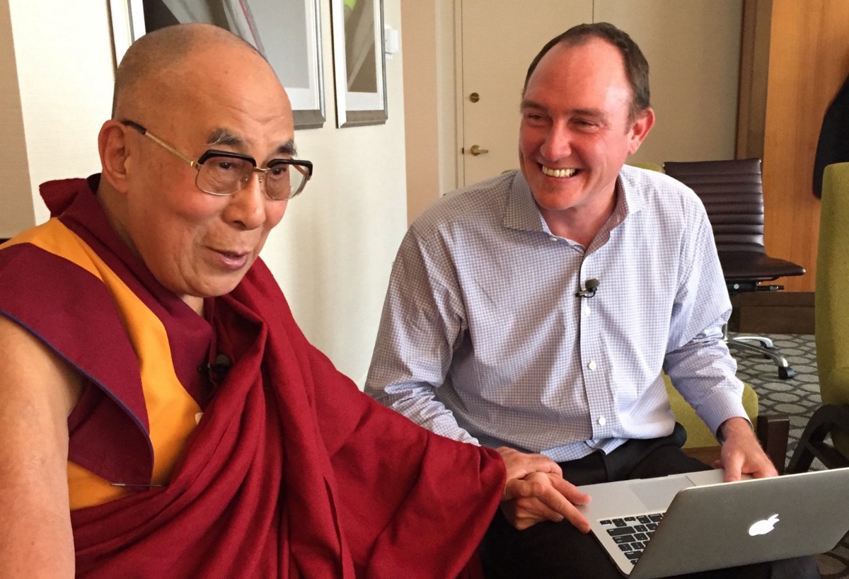
Working with Drs. Paul and Eve Ekman, a father and daughter team whose amazing personal and professional relationship continues to inspire me, we distilled 60 years of scientific research into how emotions work into an interactive Atlas of Emotions that was featured in the New York Times and the BBC World Service. As an example of the unorthodox ways data visualization can stake out new territories, we’ve heard from therapists that patients who may not feel comfortable talking about their emotions using words have found value in the visual nature of the way emotions are expressed.
I got pretty comfortable with experience feeling of Panic, a State of Fear, more than once during this project! Finding the right way to communicate about this strange, beautiful and meaningful field of science in an empathic and accessible way for the spiritual leader of millions of people around the world stretched me way past the limits of what I thought I could do, and I’m profoundly grateful to have been given the chance to engage professionally at this level with three of the most important and compassionate people in the world.
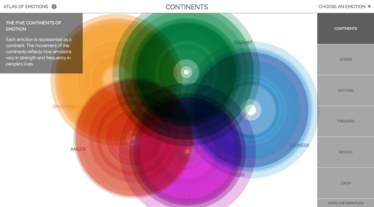
Don’t miss these process posts about the project by Nicolette Hayes, Zan Armstrong, and Eric Socolofsky, without whose efforts this project would still be a sparkle in the Dalai Lama’s eye. Cassidy Curtis provided invaluable feedback at crucial parts of the project, and Dan Rademacher helped guide the early stages of the work.
Visualizing data for genetic scientists
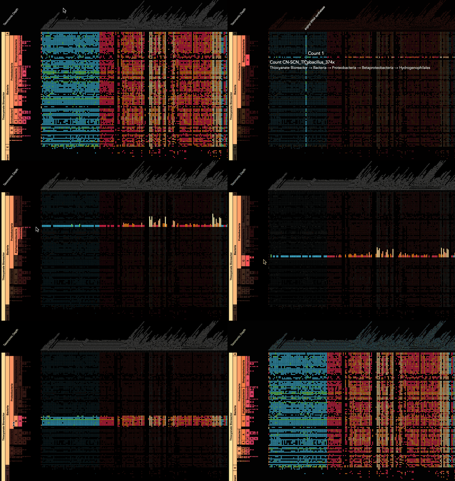
I’d never heard of metagenomics before Brian Thomas approached us to help him visualize the incredible datasets that he team at UC Berkeley’s Banfield Lab work with. It’s easy to think that we’ve discovered most of the species on the planet. In fact, the booming field of metagenomics is using big data to help scientists better understand new and vast unexplored regions of the natural world: the microbiome. In the last few years, the price of genetic sequencing has plummeted to the point where scientists can now study ecosystems in their entirety, not just the parts of it that they already know how to identify. We wrote a blog post about the project, and Kai gave a talk about the project at Data + Creativity workshop in Oklahoma City.
Tracking North American raptors
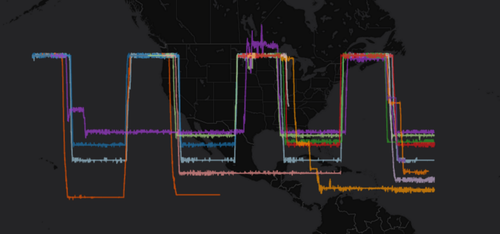
Working with the scientists and conservationists at MPG Ranch in western Montana, we designed and built a web-based system to help them track the locations of tagged birds of prey as they travel from their winter homes in Mexico to their summer homes in Montana. The site’s live here and we wrote about it here.
Communicating about crucial restoration and conservation efforts in Montana
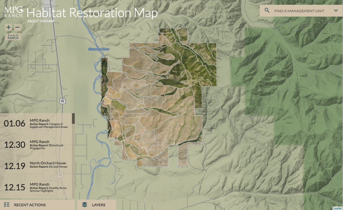
We designed a habitat explorer for MPG Ranch, one of our favorite clients. It’s a dynamic system that helps their scientists communicate about the exciting restoration and other work that they’re doing on the ranch, using the latest web-friendly tools and techniques. Here’s an interview I did with Nicolette about the project. Speaking of interviews, they’re a great way to unstick notoriously procrastination-prone CEOs and writers (like me).
Mapping the human impact on the Amazon with National Geographic
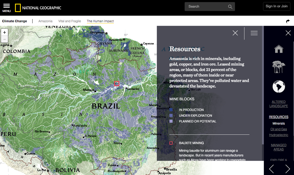
National Geographic asked us to extend the interactive mapping of the Amazon, highlighting the relationships between roads, deforestation, mineral extraction, indigenous peoples’ lands, and other aspects of human involvement with the basin. I interviewed Zan Armstrong about the project, and you can read more about the project on Stamen.com.
Cities
An interest in and investment in cities has always been integral to what we do here at the studio. From early experiments like http://city.stamen.com/ to realtime data visualization of city infrastructure Cabspotting to visualizing the hidden-in-plain sight Google Bus network by paying bicycle messengers to follow the buses around, we’ve always looked to the City for inspiration, investigation and material to do work. Cities are messy, dense, complex, and humans’ most important invention. As we seemingly move into an era where urban values like shared resources, tolerance and cosmopolitanism aren’t valued in many quarters, it’s more important than ever to work on projects that highlight the value that cities provide.
Mapping the Blue Greenway
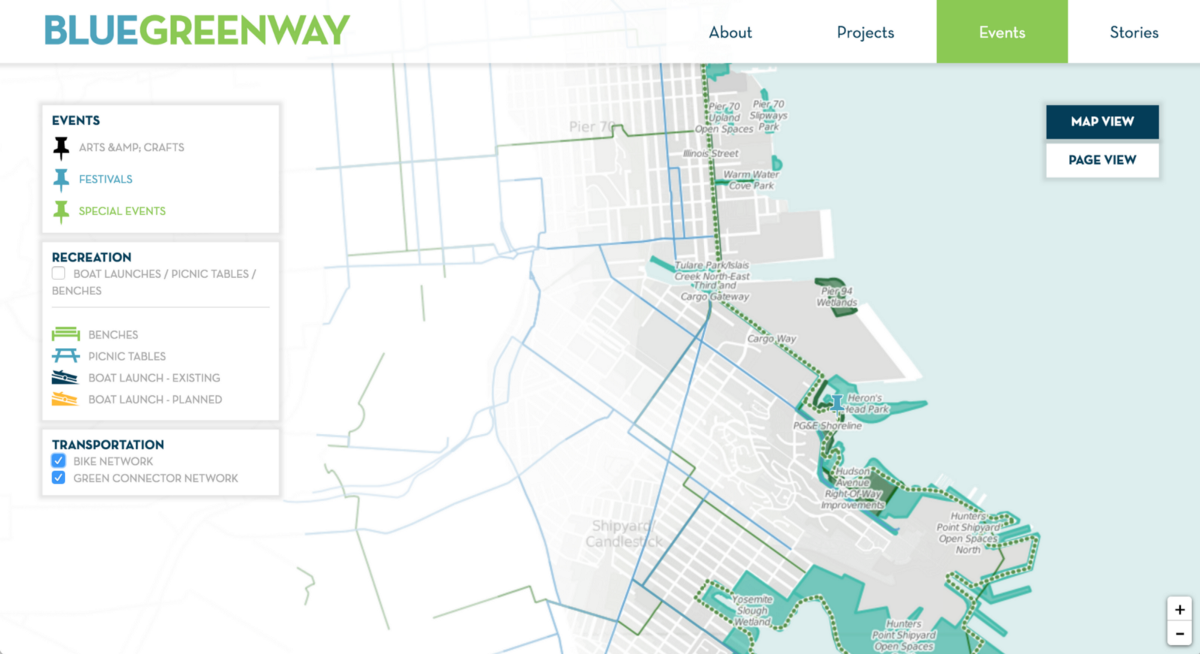
Having designed a custom mapping application about the very well-established parks to the north and west of San Francisco, we were thrilled to be the ones asked by the San Francisco Parks Alliance to develop a similar product for the exciting new parks that are coming to the southeastern waterfront: the Blue Greenway. Communicating the vision for a chain of accessible, connected series of open spaces along the coast from Candlestick Point to AT&T Park that serve a wide range of stakeholders — from environmentalists to neighbors to kayakers — is a major initiative for the Parks Alliance. You can read more about the work involved in navigating the different needs of the project’s many stakeholders at hi.stamen.com.
Using open data to learn about land use in Los Angeles
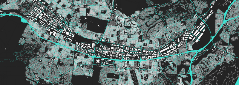
We celebrated the completion of OpenStreetMap’s Los Angeles County building import with the launch of la.stamen.com. Every building is colored according to its’ size: black for small buildings, white for large ones. The colors of the lots those buildings stand on are reversed: black for large lots, white for small ones. What you get here is a view of a city that’s visually different, depending on how the land and buildings have been allocated and used.
American Panorama: telling stories about the intersection of real estate and race in American history
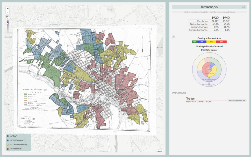
Funded by the Mellon Foundation, American Panorama is a project we designed for the Digital Scholarship Lab at the University of Richmond. In addition to the maps, we also created a set of open source tools for digital scholarship that the scholars at the Lab could use to make maps of their own. The DSL recently launched a new project built using these tools, called Mapping Inequality: Redlining in New Deal America. The project shows, in graphic and exhaustive detail, the degree to which neighborhoods where people of color lived were systematically excluded from the government investment that helped lift the United States out of the Depression. The project got some nice attention from National Geographic, CityLab, NextCity, Forbes, and National Geographic called it one of the best maps of 2016.
Public Health
Visualizing American health for the Stanford Center for Longevity
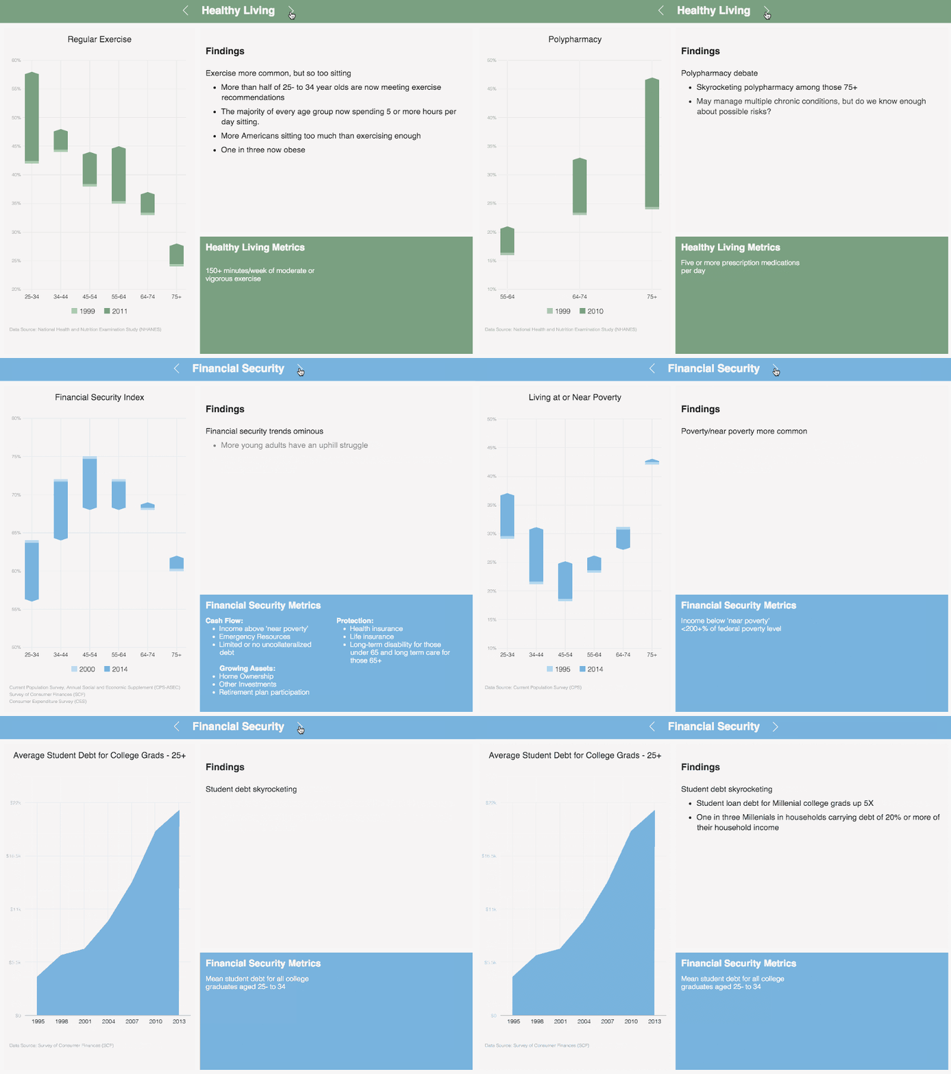
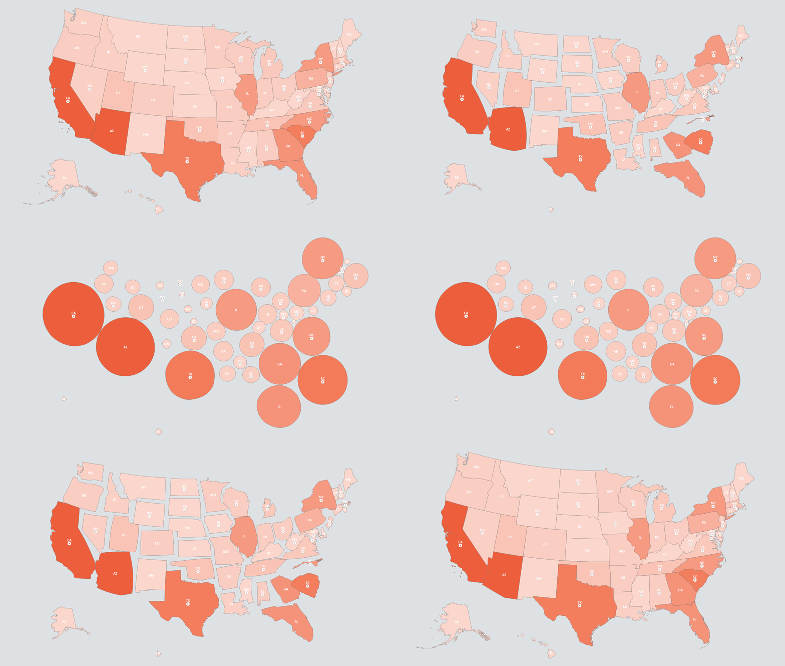
We worked closely with the Stanford Center on Longevity at Stanford University to bring to life their Sightlines Project. Stamen’s role was to review data from eight nationally representative, multi-year studies that involved more than 1.2 million Americans over the last 15 years and to visualize that data in an appealing and informative way. It’s sobering stuff: we’re definitely smoking less, but homeownership is waaaaay down from what it was 20 years ago, the number of people at the poverty line is has skyrocketed, and student debt is off the charts. More on this quickly moving dataset and project here.
W.H.O. / GPEI Website (Polio)
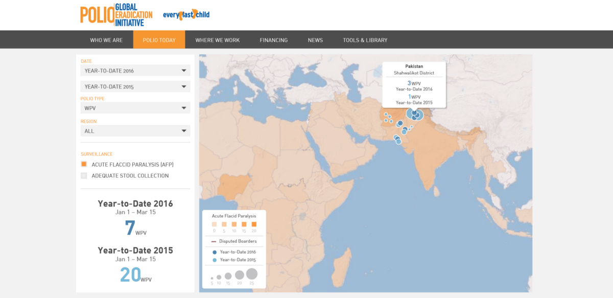
We were lucky to work with the World Health Organization on two projects this year. The first was a series of maps showing the worldwide progress toward eradicating Polio. There is still much work to be done, but these maps highlight how far we’ve come in the fight against this pernicious disease. With any luck, in a few years polio will be completely conquered. We can hope that these will be the last maps of polio that anyone will ever need to make.
WHO — Immunization Report
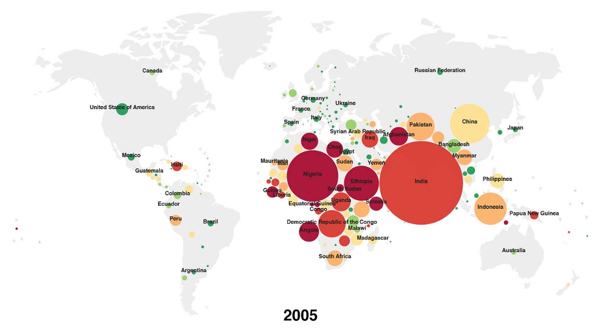
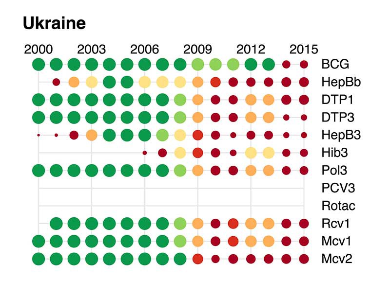
After more than 30 years of publishing their annual immunization report, World Health Organization’s Department of Immunization called on Stamen to bring a new and improved visual approach to their storytelling. We worked with WHO to visualize the progress of global immunization. What’s most striking to me is the degree to which political conflict correlates to infant immunization across the board. Below you can see the effect that the recent unrest in the Ukraine has had on the percentage of children at an increased risk for everything from polio to Hepatitis.
Politics
The Huffington Post — Donors Choose — Best School Day
It’s always fun when someone with the reach of Arianna Huffington sends you kudos in public! We worked with Arianna and Stephen Colbert to deliver http://www.donorschoose.org, an advocacy project that combines what’s great about the internet with the untapped potential of American schools. All told, as a result of this work, over 11,000 projects were funded, over $14 million has been committed (including the $3.2 million in matching funds), and communities spanning 47 states and DC will have projects funded.
YBCA art & activism
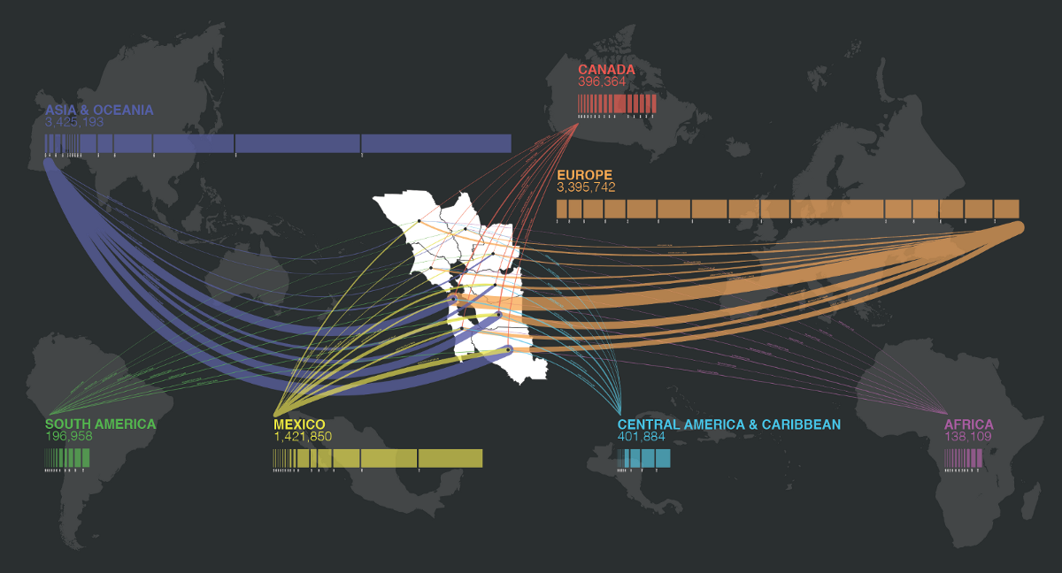
Our American Panorama atlases, including Foreign Born, for the University of Richmond, digitize historical data on migration to and through the United States, including forced migration of slave populations through time, westward expansion on routes such as the Oregon Trail, and global immigrant populations as they changed over the last 150 years. This data sheds light not only on American history, but puts into new context issues that we are dealing with today.
We were asked to include a piece on immigration for Yerba Buena Center for the Arts’ show about radicalism in San Francisco: Take This Hammer because of it’s relevance today. Looking at the continuous flow of immigrants from all every continent to the Bay Area adds perspective to conversations in the media about immigration right now. As Donald Trump talks about building a wall around the country, it’s important to remember that our borders have always been fluid, and that immigration to the United States today is part of a long, complex and historical narrative that’s integral to our identity as Americans.
Teaching data visualization classes and workshops
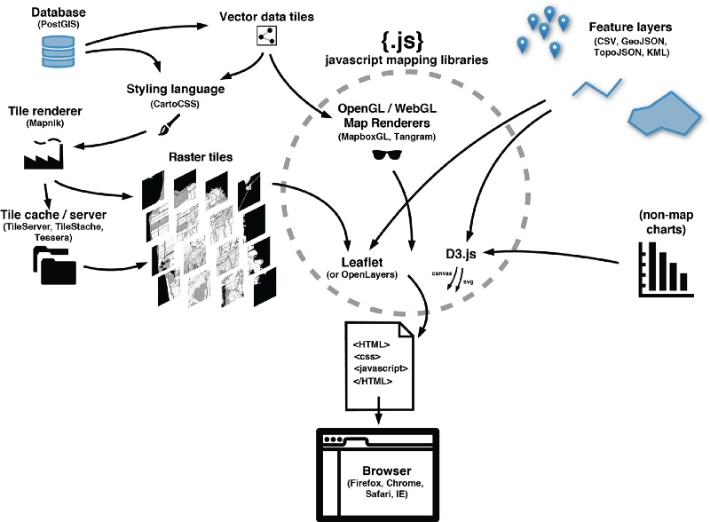
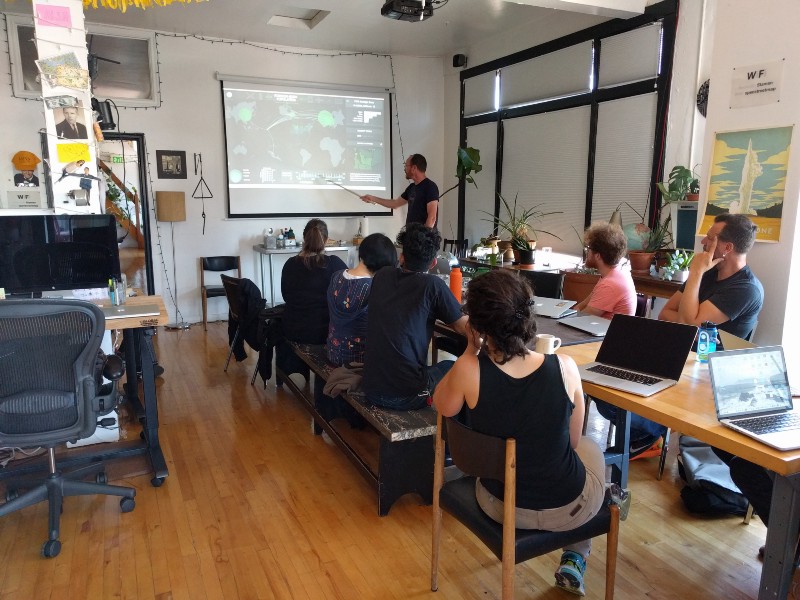
We continued to teach our data visualization classes and workshops at different places around the Bay: universities like UC Berkeley, tech companies like Facebook, and at our sunny Mission District Headquarters.
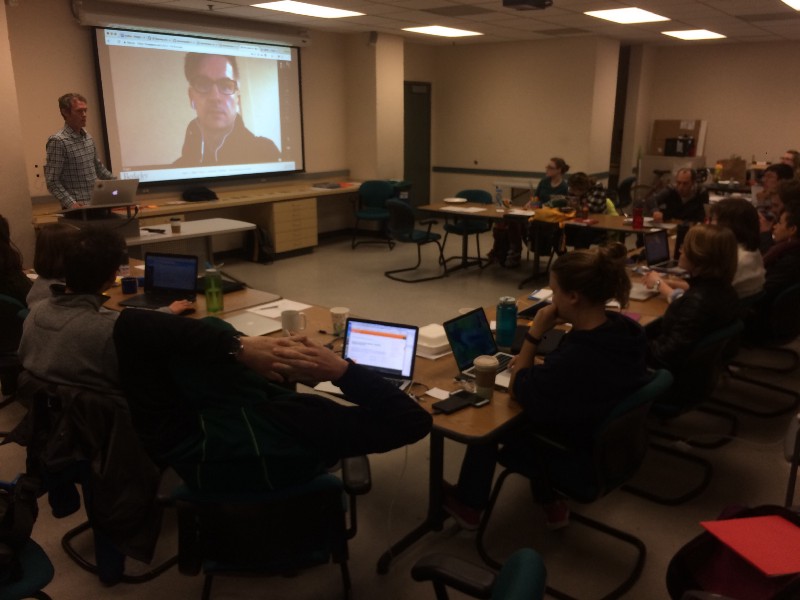
We’ve discovered that there’s a real hunger for custom dataviz training tailored specifically for classroom participants’ needs, and we’re excited to continue the program with upcoming classes in New York City and Geneva, Switzerland. We write unique curricula for each session, depending on feedback from prospective attendees; you can browse some samples of these at https://github.com/stamen/spatial-dataviz-for-data-scientists and https://github.com/stamen/wwsd. It’s been an incredibly rewarding experience so far, as we continue to work to raise the level of data visualization literacy around the world. Please get in touch if this sounds like something you or your organization might benefit from.
Open Source & Open Data
Portable Open Street Map
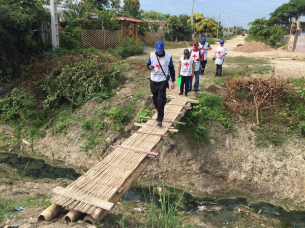
Portable OpenStreetMap (POSM) is a collaboration with SpatialDev and the American Red Cross. Initially conceived to help some of the world’s most vulnerable communities by putting them “on the map.” It quickly grew beyond that, as we realized the possibilities opened up by bringing more of the “humanitarian stack” together in the service of truly open mapping: HOT’s OSM Export Tool, the Overpass API, JOSM, the OSM website, Field Papers, OpenMapKit, and others. Seth and Nicholas Hallahan, OpenMapKit’s lead developer joined American Red Cross GIS staff and the Cruz Roja Ecuatoriana in Huaquillas, Ecuador for a field test in March. You can read more about the project on our blog or at the State of the Map video of Seth’s presentation.
Say hello to global Stamen terrain maps
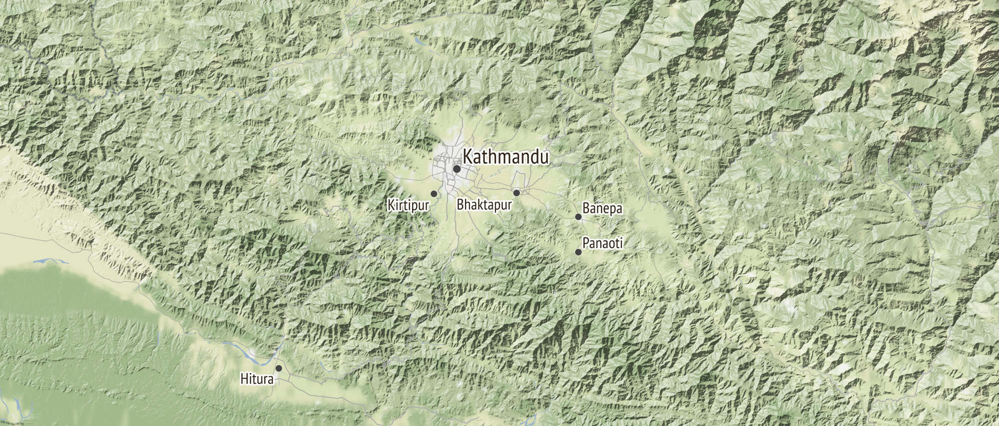
In July we announced a new and improved global version of our terrain map, first launched with the support of the Knight News Challenge, an initiative of the John S. and James L. Knight Foundation, and generously supported by a follow on grant from Knight. The project now covers the entire world, supports hundreds of millions of downloads every month (last year topped out at about 4 billion, give or take). We’re continuing to see rates of a map made every couple of minutes with the project. Thanks to Knight for continuing to support this work, which supports the work of thousands of other projects around the world.
Physical installation of data visualization projects
David Rumsey Library

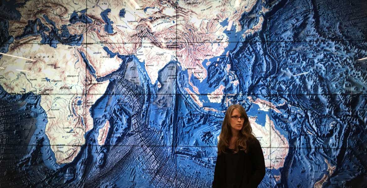
David Rumsey has collected thousands of atlases in there and hundreds of globes. Atlases for the blind. Gigantic collections of watercolor drawings of the Grand Canyon. Ten foot long painted maps of the seven principle rivers of Asia all flowing in to the navel of the world. Wood-block maps hand-annotated in red ink. Swiss mountain ranges, medieval Paris with every house drawn by hand, just incredible detail. The sheer volume of material and the breadth of the collection is just staggering.
All of these maps are now down at the new David Rumsey Map Center at Stanford, which opened to great fanfare this summer. Wired called it “the dopest map collection on earth.” It’s a terrific space, is open to the public every weekday from 1–5, and you can explore the collection both virtually and physically. AND it has gigantic screens on the walls with interactive map applications on them designed by…us!
Tahoe Environmental Research Center
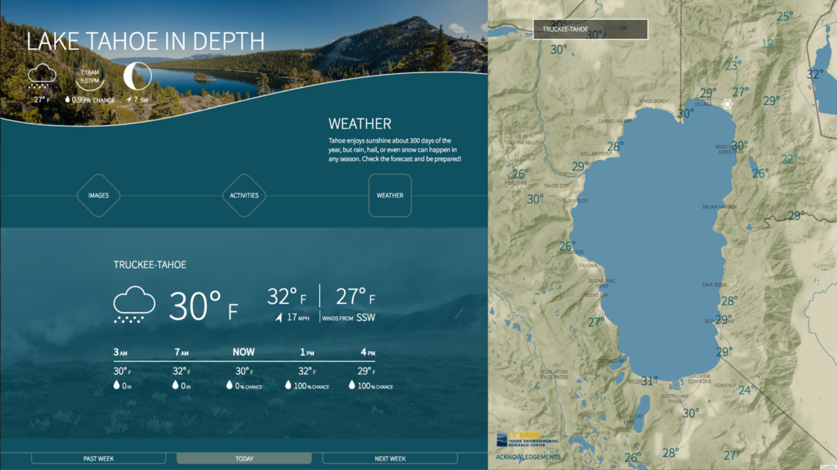
Lake Tahoe, in the Sierra Nevada mountains between California and Nevada, is a unique habitat that draws wildlife, outdoor enthusiasts, vacationers, and scientists in droves. We were commissioned by TERC to develop an interactive exhibit for display in the Incline Village Science Center and the Tahoe Visitor Center. The audience for the piece straddles environmental science students, visiting researchers, and vacationers looking to learn more about the region. With a wealth of activities year-round, there was a lot to pack into the exhibit, offering a range of experiences for users. The exhibit isn’t live in the Visitor Center yet, but look for it to open by this summer.
Thanks!
To our amazing clients, a gigantic word of thanks. We’re delighted to have had the chance to help you tell your stories. Onwards!

