The last year of the decade gave us plenty of opportunities to work and play with data of all kinds, from governance indices to cloud storage data to a mostly unseen but truly vast archive of “motorized photographs” by Ed Ruscha. As always, it’s the diversity of projects that come through here that I’m most proud of, and this year was no exception. Here are some highlights:
Survival by Degrees for the Audubon Society
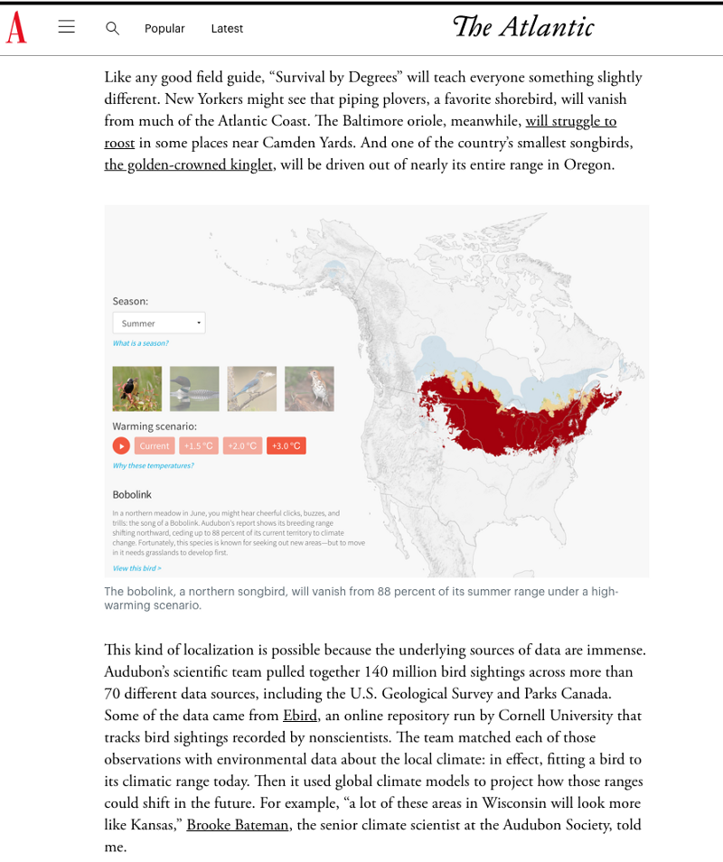
Sometimes you get the chance to go back and improve on something you’ve done before; this was the case for Audubon’s newly released “Survival by Degrees,” a radically more ambitious version of their field guide to the 21st century than our initial collaboration on range maps some time ago.
In this round of collaboration, Audubon’s scientists made projections with much more bird data, and at a much higher resolution — over 140 million observations recorded, with resolution down to the 1km level, or 100 times the resolution of the previous data. They also expanded the number of species they studied. This rich data made it possible to tell a much more personal story: the story of how climate change impacts bird habitats at a very local level — state, county, and zip code — across the U.S.
There’s a lot to cover here, everything from changes in temperature to detailed projections for different kinds of bird species across the whole US. You can read more about the project at hi.stamen.com. Robinson Meyer at was nice enough to say “There’s nothing else like it on line” and you can read more about that at his article in The Atlantic about the project.
The 2019 Berggruen Governance Index: the Future of Democracy
“The 2019 Berggruen Governance Index evaluates countries on the basis of their quality of political governance. To do this, the Index disaggregates governance into three key components: Quality of Democracy (Inputs), Quality of Government (Throughputs) and Quality of Life (Outputs). By disaggregating the capacities of governance, the Index attempts to deepen understanding of the relationship between the democratic feedback, government competence and the provision of public goods.” We helped bring this fascinating global dataset to life by working with Berggruen to build interactive data visualizations of the various aspects of their Index:
- an overview of 38 countries across the globe
- an interface to compare different countries to one another
- an exploratory interface to help better understand the factors that make up the Index
You can explore the project at https://www.berggruen.org/berggruen_governance_index/
How Modern Work Became a Mess for Dropbox
Dropbox asked us to help them tell the story of the state of work today. Rates of productivity are decreasing, even while the speed of technology is speeding up. They’re supposed to be connected, but they’re not? This interactive story helps explain why, and Dropbox’s point of view on the topic.
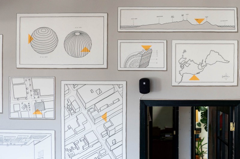
We got to work on the project with our friend Catalina Plé, an amazing illustrator who painted the beautiful mural in the main space at our studio, “You are here,” which I still love looking at and soaking in all the details:

Ed Ruscha and the Streets of Los Angeles for the Getty
I can’t wait until we’re able to share more about this work, but for now I’m able to share that we’ve been working with The Getty on a fascinating exploration of the work of Ed Ruscha in Los Angeles.
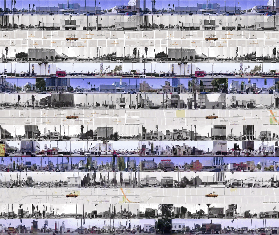
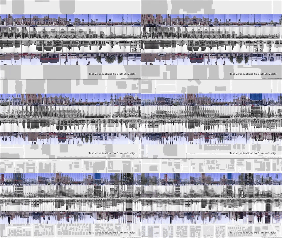
It’s well known that Ed took photos of both sides of the Sunset Strip from a moving car in 1966 and made a book featuring a series of collages titled “Every Building on the Sunset Strip.” What’s less well known is that he didn’t just take photos of the Strip, he took photos of the entire length of Sunset Boulevard (about 22 miles) and some other streets. On top of that, he didn’t just do this in 1966, but he did it more than a dozen times, every couple of years from the ‘60s to today. It’s an extraordinary historical and artistic work that contains over three quarters of a million(!) images of Los Angeles over almost fifty years, and the Getty has been busy acquiring it. Each of the images has been geotagged, run through optical character recognition software (so we can read the signs), and had machine vision analysis done on it. Every. single. image.
We’re in production mode now, with a release happening some time this summer. But some of the work was shown at a gala where Ed was awarded the Getty Medal, and we’re able to share those in the meantime:
Visualized at the Exploratorium
I was lucky enough to be invited to give the first talk at Visualized 2019 in San Francisco, and honored to be on the same stage as Barbara Tversky, Tamara Munzner, Vetria Byrd, Steve Franconeri, Scott McCloud, author of the amazing “Understanding Comics,” and many others.
The talk is called “Objects to think with: Some thoughts about the history and present of data visualization, at Visualized 2019 at the Exploratorium” and you can read it here.

Mapping the arts landscape in San Francisco with Culture Compass
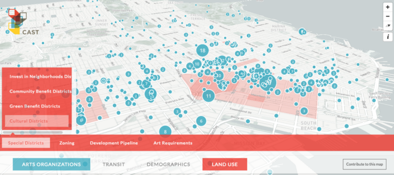
In recent years, San Francisco has become one of the most expensive cities in the world, putting extreme pressure on the arts and culture community that has been an essential part of SF’s unique character. Arts organizations have found it increasingly difficult to find affordable long-term spaces. Thankfully, SF is also home to the Community Arts Stabilization Trust (CAST), an innovative philanthropic organization whose mission is to raise money and purchase buildings to serve as permanent homes for arts and cultural organizations. At Stamen we are big fans of CAST’s work, and we were excited to work with them to build Culture Compass, a map visualization of San Francisco’s arts landscape.
WHO — Immunization Report 2019
We’ve had the pleasure of working with the World Health Organization’s Department of Immunization, Vaccines, and Biologicals going back to 2015. Annually we have helped them to develop their report of global vaccination rates (you can see previous work here: 2016, 2017). We continue to refine and deepen the work as it progresses (like with Audubon!) and you can find out more about the work on hi.stamen.com.
Visualizing superdiversity for the Max Planck Institute
We’ve been working with professors at the Max Planck Institute and the University of British Columbia to show how the nature of diversity in our urban areas around the world has been changing over the past few decades.
We’re now collecting more data and have a better understanding about how and why people immigrate. People coming into a country aren’t all coming from the same place. Even those coming from the same place aren’t all coming for the same reason or with the same background.
The interfaces that we made highlight differences across the board and over time in the diversity of the measured populations in Vancouver, Sydney and Auckland. The changes are partially due to the nature of migration changing, and partially due to the nature of data collection and data bureaus and statistics changing. As with American Panorama, how the data is collected over time is every bit as impactful as the changes in the systems that are being measured. You can find out more about the project at https://superdiv.mmg.mpg.de/ or on our blog.
Google Cloud Services visualization improvements
We also were engaged to refactor and improve upon some work we’d delivered to Google in 2018 (I’m detecting a theme! repeat clients are the best), visualizing activity in Google’s global cloud infrastructure, seen through the lens of countries’ use of the service:
HERE XYZ Studio gallery — phase I
We were asked to create six maps using XYZ Studio, a new web app from HERE that allows users to create custom maps from large datasets. Worldwide migration, California crop parcels, pedestrian casualties, and other datasets were quickly designed using HERE’s platform. I’ve gone from saying that Stamen is platform-agnostic to saying that we are platform-curious, which is to say that we’re always looking for new data delivery mechanisms and platforms to learn about. We interviewed the team about the work on hi.stamen.com, and it was great to collaborate with Stephanie May and Sarah Fortune on the work.
Taking it to the (main) street
2019 was the year I joined two fascinating institutions, each concerned in its own way with our professional practice. I was asked to Chair the Advisory Committee for the UC Berkeley Center for New Media, and I’ve been working closely with Director Abigail De Kosnik, a true science fiction nerd if I ever met one. And I joined the Advisory Board of the newly formed Data Visualization Society at the invitation of Elijah Meeks, whose work I’ve long admired. His end of year post, “2019 Was the Year Data Visualization Hit the Mainstream,” articulates nicely what some of us have been saying for a while now. Notably: that if we think dataviz is only about the presentation of unbiased facts to neutral audiences, we’ll miss out on a huge part of the value of what this medium can do (for better or worse).
And so
That’s all she wrote! It’s been an interesting year, full of growth opportunities, our first maternity leave, a renewed focus on longterm relationships with our most excellent clients, and a reinforcement of our commitment to helping people tell the best stories they can with their data. If you want to up your data visualization communications game, please get in touch, you know how to find us. Cheers and Happy New Year, Happy New Decade!
