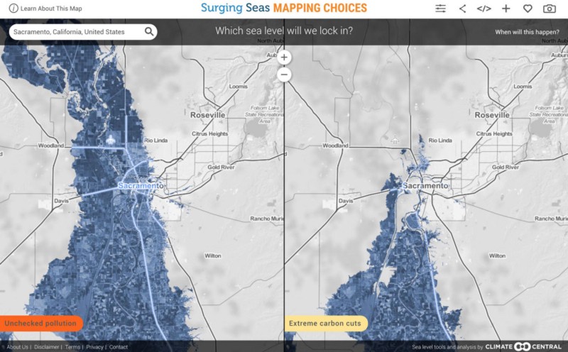
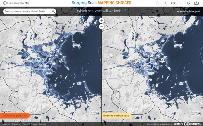
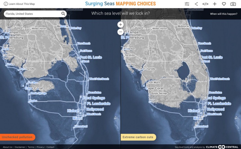
Yesterday, we launched critical new work with our longtime partners at Climate Central: Mapping Choices lays out starkly the stakes of carbon emissions over the next several decades.
It also shows us a much more sobering picture than is often shown in near-term climate change forecasts. That’s partly because this map isn’t about what will happen to us between now and 2050 or now and 2100.
Rather it’s about how the choices we make between now and 2050 or 2100 will lock in very different futures for our heirs, maybe several generations from now. Will New York be underwater? Will the Sacramento Valley once again be an inland sea? Or will we take action now and mitigate the worst possible outcomes?
It’s not easy to think about how choices we make now could mean the world to people living centuries from now.
But that was our challenge for this project. And we needed to make that complex idea clear and compelling in an updated interface that works well on screens large and small. With deep content guidance from Ben Strauss and his team at Climate Central, we were able to focus on getting the designs and interactions just right.
Along with the ss6m.climatecentral.org map that launched earlier this fall, Mapping Choices is the second in a series of new maps we’ve made for Climate Central. Stay tuned for for more this fall.
Already, the work has gotten great notice in Wired. You can read the peer-reviewed science behind the map in the Proceedings of the National Academy of Sciences or get the lay person’s version from ClimateCentral.org.
Try out the map and share what you find! there’s a handy “download screenshot” button (the camera) and a full-featured embed as well.
A few sobering comparisons:


