This year, people across California began getting health insurance coverage in new ways, thanks to President Barack Obama’s signature Affordable Care Act, often called Obamacare.
As the new marketplaces, subsidies, and penalties got discussed and debated in the media this spring, we at Stamen were hard at work with our frequent client the California Healthcare Foundation, creating a system to visualize and communicate a range of key measures to assess the impact and effectiveness of Obamacare.
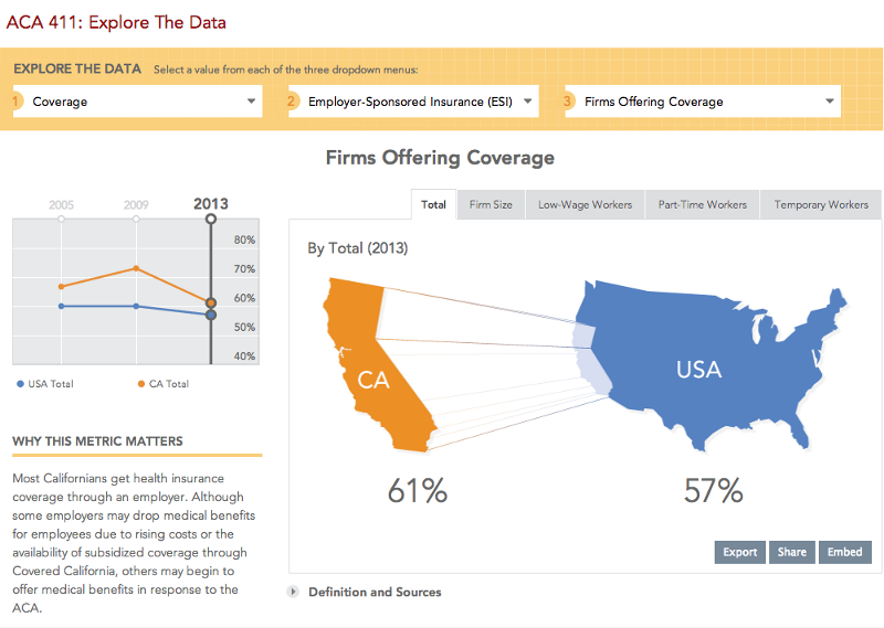
ACA 411 is a deceptively simple interface into a rich dataset that covers everything from how many people are uninsured in the San Joaquin Valley (18.1%) to how much a small firm pays for health insurance per person ($7,379). ACA 411 covers more than 40 different indicators at launch, and CHCF will be adding data over several years, tracking long-term trends and adding new indicators in the future.
It was initially a bit daunting to develop a systematic, dynamic way to display all this raw data, but we were determined to help make the ACA understandable by applying some delight to the figures.
Within each indicator, the data is sliced in several ways: types of care, providers, demographics, enrollment, quality of care, income levels, even geographic averages. With so many categories, the data can give you a general overview or a very specific peek into health coverage. After relentless explorations, we’ve developed a system we think works pretty darn well. And it’s a solution flexible enough to accommodate new data in years to come.
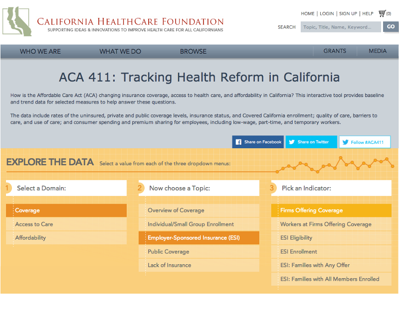
The data is broken down into three categories: Domain, Topic, and Indicator. Once the user makes their selection, they are taken to the indicator’s page, which then has a variety of data points to look at.
By default, the page opens to the Total datapoint and the most recent year of data collected, with trending data displayed on the left. Indicators with data from more than one year also let you browse through the different years. Once you click on another tab, you have the ability to compare those specific data points to the trended totals, as well as the ability to export, share, or embed the data you’re looking at.
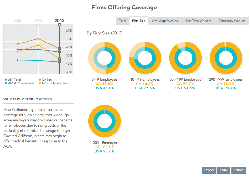
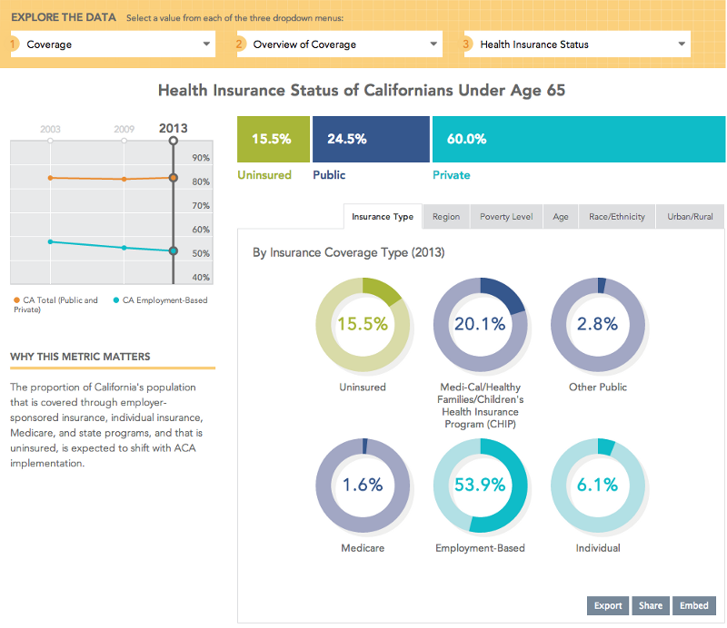
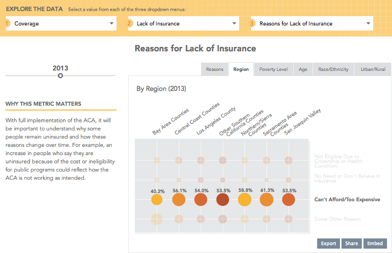
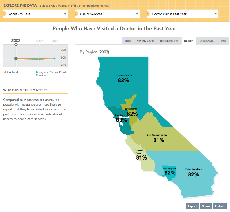
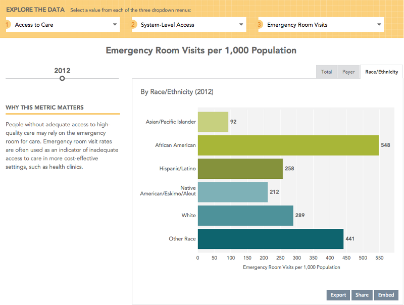
The combination of data points results in thousands of potential exports. Here are some examples of other charts you’ll find in the project:
The technical challenges in the project were in how to make the whole system run off a simple set of spreadsheets that anyone could edit in Excel. We worked hard to make sure that CHCF can manage the project into the future, adding new indicators and assigning chart types to them, all via simple text files they can publish through their existing content management system.
We’re looking forward to seeing those trend lines fill out for years to come — and, we hope, measure ever better health coverage and health care for California.
