Or Tangifying the Intangible
Just over a year ago I showed up to my first day as a designer at Stamen Design and was asked to distill 30 years of scientific knowledge about human emotion into an interactive visualization that would be presented to the Dalai Lama in a few months time.
And then things got tricky.
Working with Dr. Paul Ekman, pre-eminent psychologist and expert in all things scientifically-determined about human emotion, it was easy to err on the side of dense and complex for these visualizations. The unfathomable interrelations, dependencies and layers (often non-linear, qualitative and ambiguous) of the research, all of which were the source of months of riveting entertainment when narrated by the engaging and deeply thoughtful researcher, felt ultimately undistillable. And yet…
As data visualizers it was our job to not just tell a story, but to tell the right story to represent the research, and to tell it in such a way that important distinctions would not be glossed over or simplified to the point of inaccuracy.
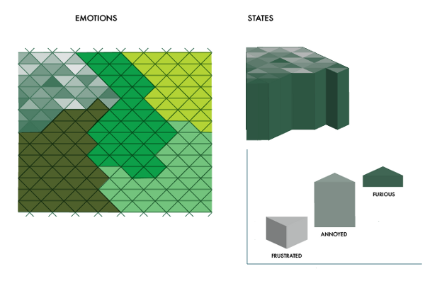
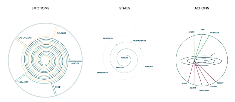
Over the lifetime of this project many designers and technologists at Stamen (and Presence too!) had pored over the content, resulting in some incredible visual explorations. From the heady fluidity of Particle World, to the mesmerizing abstraction of Spiral World, to the intriguing complexity of the Emotions Matrix.
But in an appropriately emotional sense, nothing felt right.
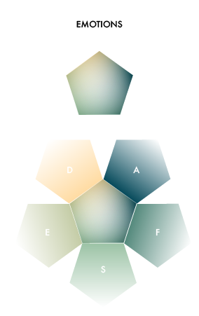
We had boiled the data down to 5 emotions, 44 states, 28 actions, 31 triggers and 5 moods. Turning them into a visual form that was simultaneously intellectually rigorous, fundamentally accurate, and simple enough for the layman to feel informed and delighted — that was another story.
A quick visual tour of things that did NOT feel right:
So after several months of beating my head against the complexity I found myself in a position to do the unthinkable: make something simple.
I stepped back to the visual metaphor that we kept invoking but had never fully engaged: the atlas. A collection of maps, each depicting different aspects of our world, be it topography, migration patterns, political borders or wind patterns. I started to think about human emotion as a collection of places that we visit, the topography of which could be shown, as well as the paths to and from different islands.
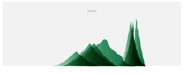
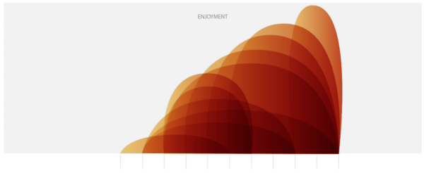
Starting with the concept of basic Emotion (Anger, Fear, Disgust, Sadness and Enjoyment), what would each look like in pseudo-physical form? And to communicate the meaning of emotional states it would be important to show that while some could be felt slightly (disappointment, for example), others were exclusively intense (you can never be just a little bit anguished). Maybe each emotion was like a different mountain on a single land form that climbing would take you to more intense states? Paul said no, because this implied some kind of fixed relationship between the emotions, with one statically occupying the space adjacent to another. And climbing the mountain wouldn’t work, because that implied a set sequence of states, with one giving way to the next, and the most intense occupying only the tiniest tip at the top when it should feel like the largest and most significant of all the states.
Devising Dead Simplicity
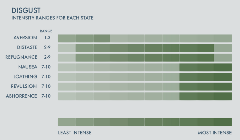
Rather than creating false associations, I decided that each emotion should exist as its own place, unencumbered by direct comparisons to each other. The visual makeup of disgust, for example, should be based off of the intensity of its states.
With an eye toward building a dead simple and relatable world, I set to work unraveling how to make altitude serve as a proxy for intensity. This metaphor would allow me to create basic shapes that were unique to each emotion — the question was, how to encode the metrics?
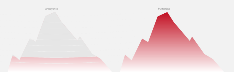
One of the greatest challenges throughout the process had been in finding a way to represent the ranges of intensity that a single state of emotion can express. The temptation to confound a large range with a large value was so great that numerous charts and graphs had been dismissed (despite their technical accuracy) as misleading.
The ordering of states was also somewhat arbitrary, based on taking the average of each range and then ordering states with the same average on gut instinct. In radial graphs, this created a deceptive depiction of the states of emotion. Size (representing range) superseded intensity in visual importance, and created a disconnect between the content and the message.
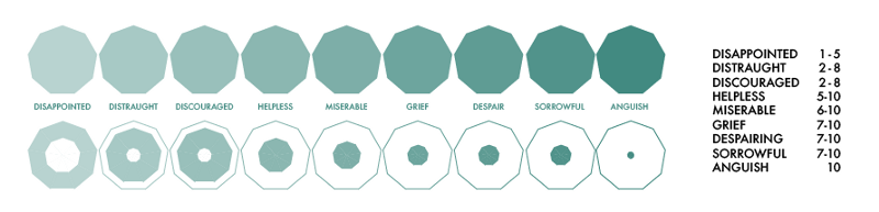
The solution to this in our brave new world of simplicity, was to double encode the range as a proxy for intensity (with average range on the y-axis and range integers on the x-axis):
This resulted in the most intense states (you can never be anything less than very furious, but you can experience degrees of frustration) standing well above their less intense friends — in short, the visual finally felt like the thing it was describing.
With the addition of some qualitative language to define the shapes and textures (harsh spikes of anger, rounded mounds of sadness, drippy points of disgust, jagged spikes of fear, buoyant bubbles of enjoyment) and awesome collaboration from Eric Socolofsky and Zan Armstrong, the coded magic of the atlas began to take form in ways that static Illustrator mocks could only hint at.

For more on the delicate balance between hard data and creative interpretation, keep reading…
Zan describes how we brought the emotions to life in The Shapes of Emotions and Eric narrates our quest for a Calming coda to the site in Finding Calm in the Atlas of Emotions.