To some, Lake Tahoe represents the quintessential winter wonderland — a playground of powdery snow and stunning vistas. Others think of those famously blue waters from a different recreational perspective: a place to sail, swim, and even surf. And still others think of the 2 million year old lake as the ecological treasure lying at the heart of the Tahoe Basin.
To support understanding the science of the lake, the UC Davis Tahoe Environmental Research Center (TERC) releases an annual State of the Lake Report (SOTL) that details the trends, forecasts, and current status of the environmental factors contributing to the Tahoe Basin’s unique ecosystem. Starting in 2016 and continuing through periodic phases in 2018, TERC worked with Stamen to visualize these findings into a Tahoe visitor-focused interactive touchscreen display — currently on display at the Tahoe Science Center as well as at a handful of other visitor-oriented locations around the lake. In addition to highlighting the important scientific findings of SOTL, these exhibits provide additional media and information that helps contextualize the lake for visitors of all interests.
PROCESS
Modular System
There’s no shortage of scientific data about Lake Tahoe. From NASA to NOAA, TERC-specific buoys to citizen science apps , TERC first came to us with literally dozens upon dozens of potential data sources for this experience.
Step one was, therefore, to understand, catalog and organize all the data that would best tell the story of the lake and then narrow down sources for those data streams. With the goal of creating an exhibit that would be easily updatable and navigable, we devised a modular system for displaying this content. Each module would have a map view, a detail display, and the ability to see how the data changed over time.
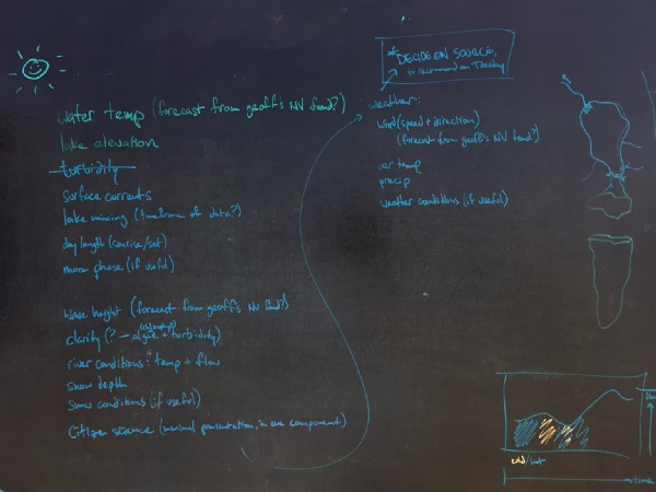
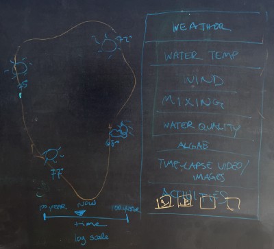
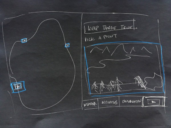
The final modules ended up covering a broad range of interests: pictures and videos in “Images,” ideas about how to spend time in “Activities,” weather data ranging from the immediate to historical in “Weather,” insight into ways the average visitor can document lake ecology in “Citizen Science,” stats about the flow of adjacent streams in “River Conditions,” and the heart of the scientific findings for the lake itself in “Lake Conditions.”

Data Prototyping
Once we knew what we were tackling and had the data streams to support it, our team of design technologists started looking for creative and meaningful ways to express the different datasets.
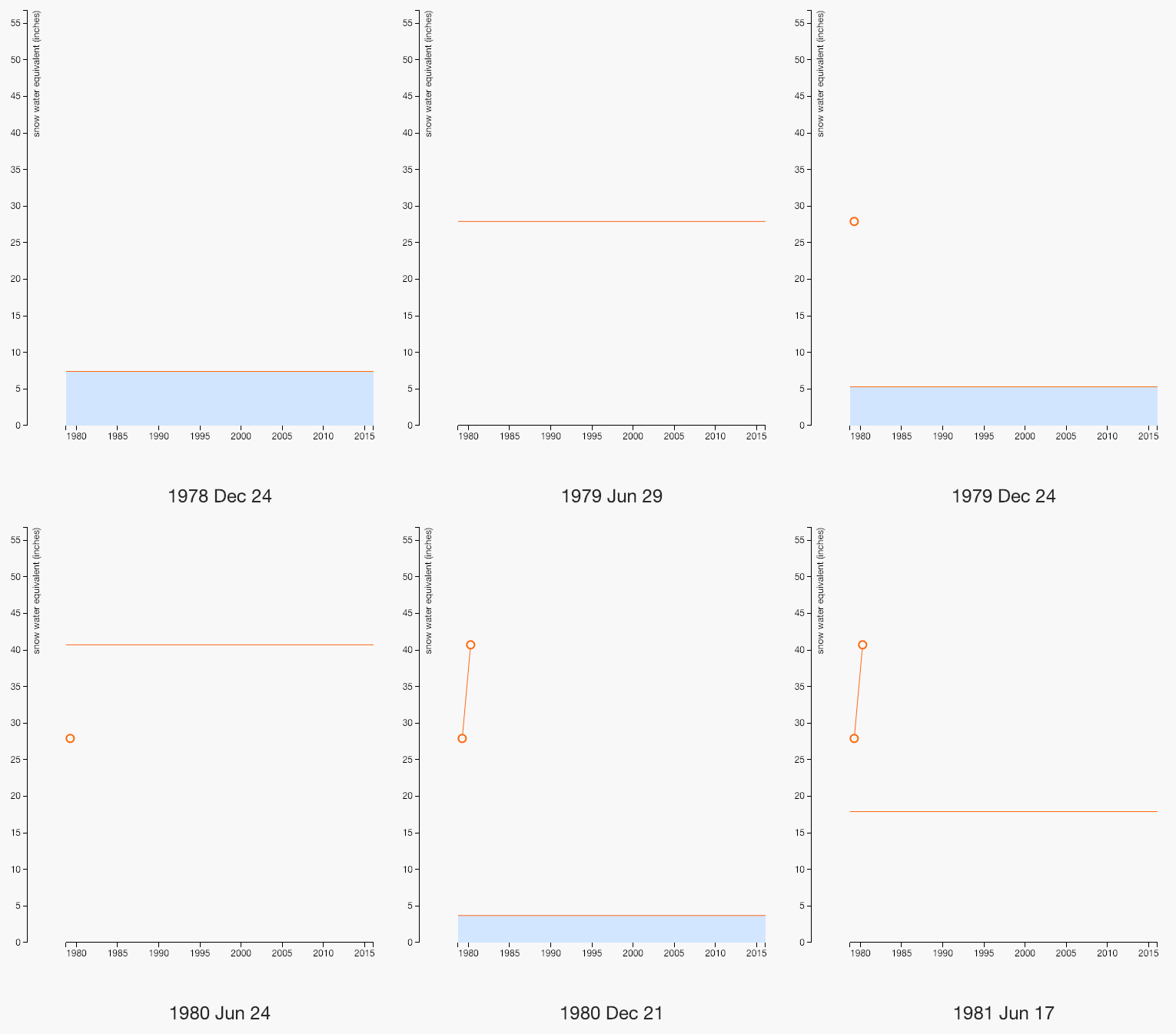
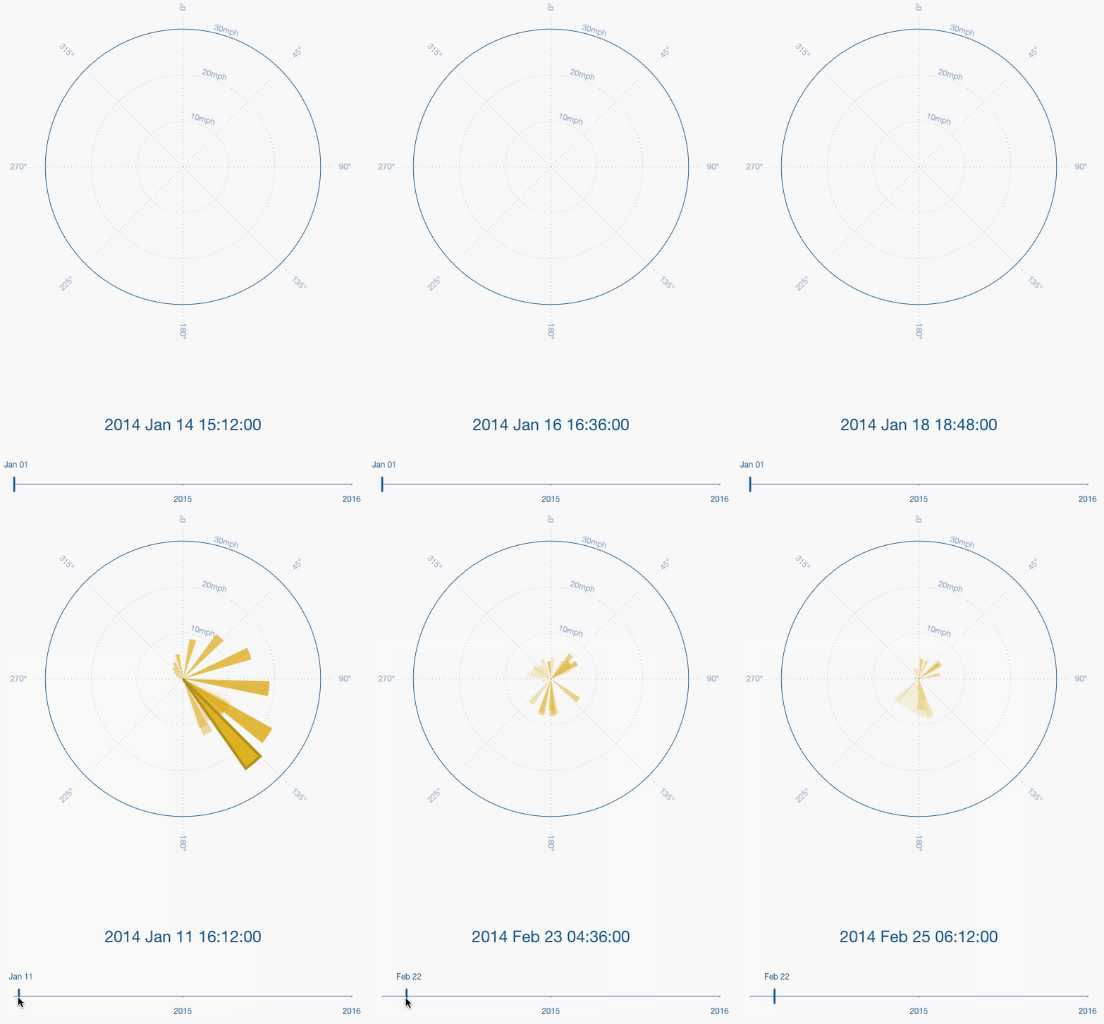
A few of the representations depended on time progressing as an animation (versus as a user-controlled timeline):
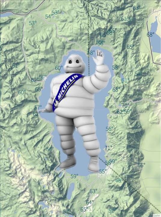
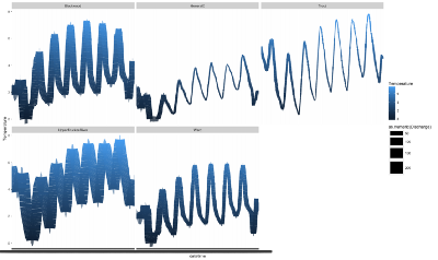
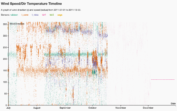
Other prototypes put the diverse spatial data onto a single graph to show ranges over time for all possible locations:
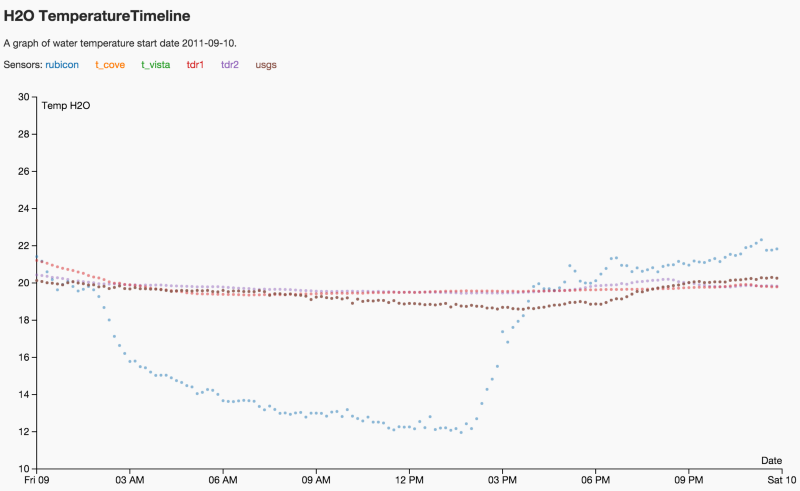
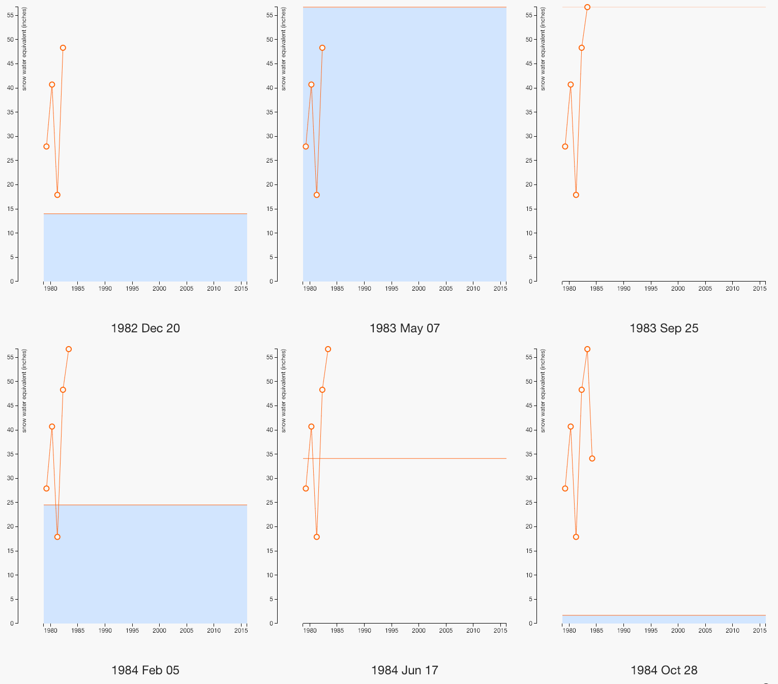
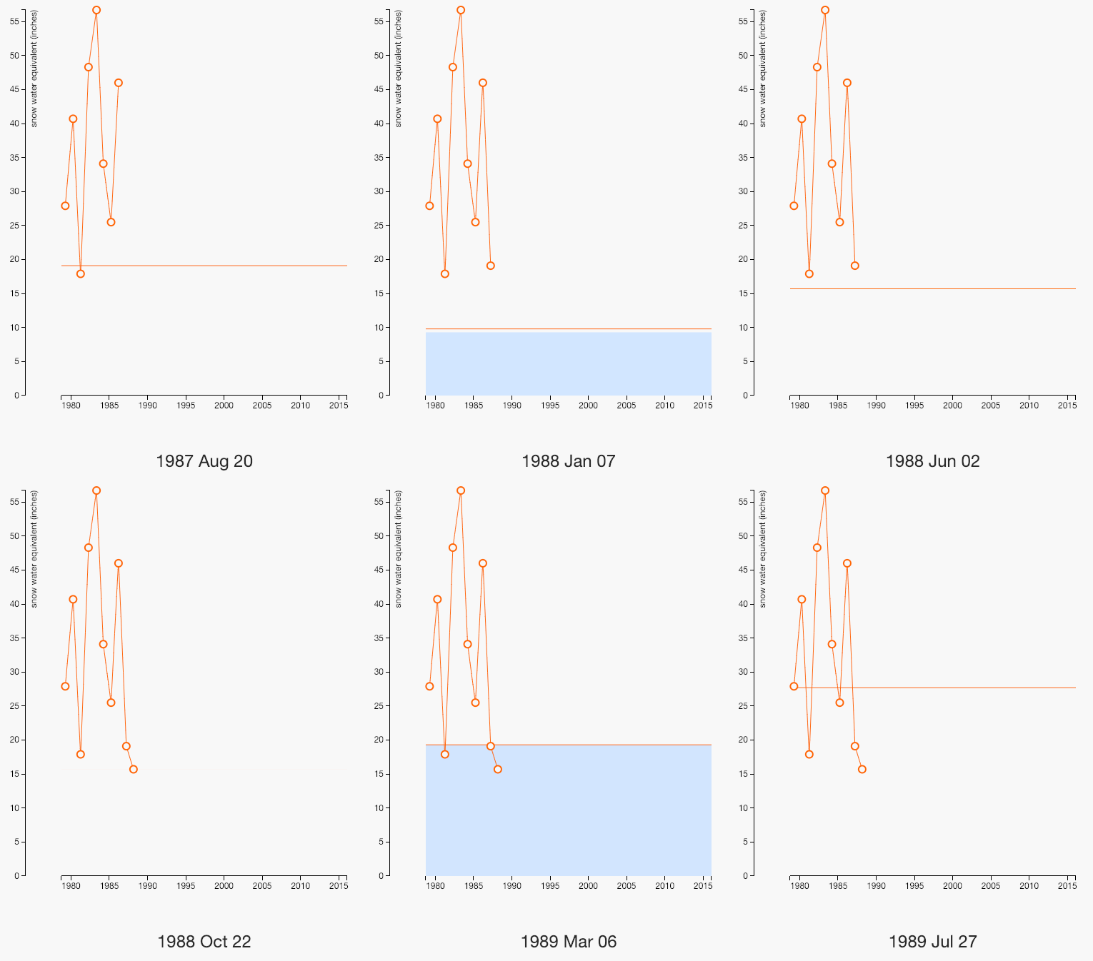
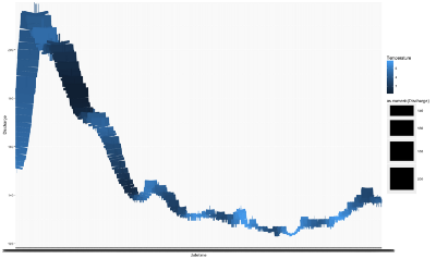
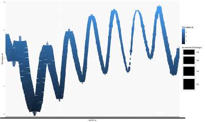
And still others collapsed tremendous amounts of data into a compact representation to pull out seasonal trends while still showing greater trends over time.
Eventually, certain divergent explorations gave us the understanding we needed to focus down to a consistent representation of all the data across modules. We ended up sacrificing variety of form for a more streamlined approach, though with unlimited time (and in a world where our data sources were more stable and consistently populated) we would have loved to fully illustrate each data type with some of the unique character we discovered in the prototyping process.
EXHIBIT
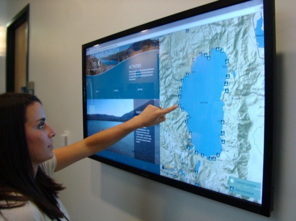
The final exhibit has an interactive map of the Tahoe region on the right and a variety of modules to see and select on the left. Each module is also described on the left along with either a large image or data visualization. Time controls are located at the bottom of the left side and they update depending on the selection. Most of the modules contain subcategories that let visitors see different aspects of the topic, and choosing one of those updates the data shown on the map. In “Images,” for example, there are two sections: “photos” and “live,” with wintertime photos of Hurricane Bay selected in the screen capture below.
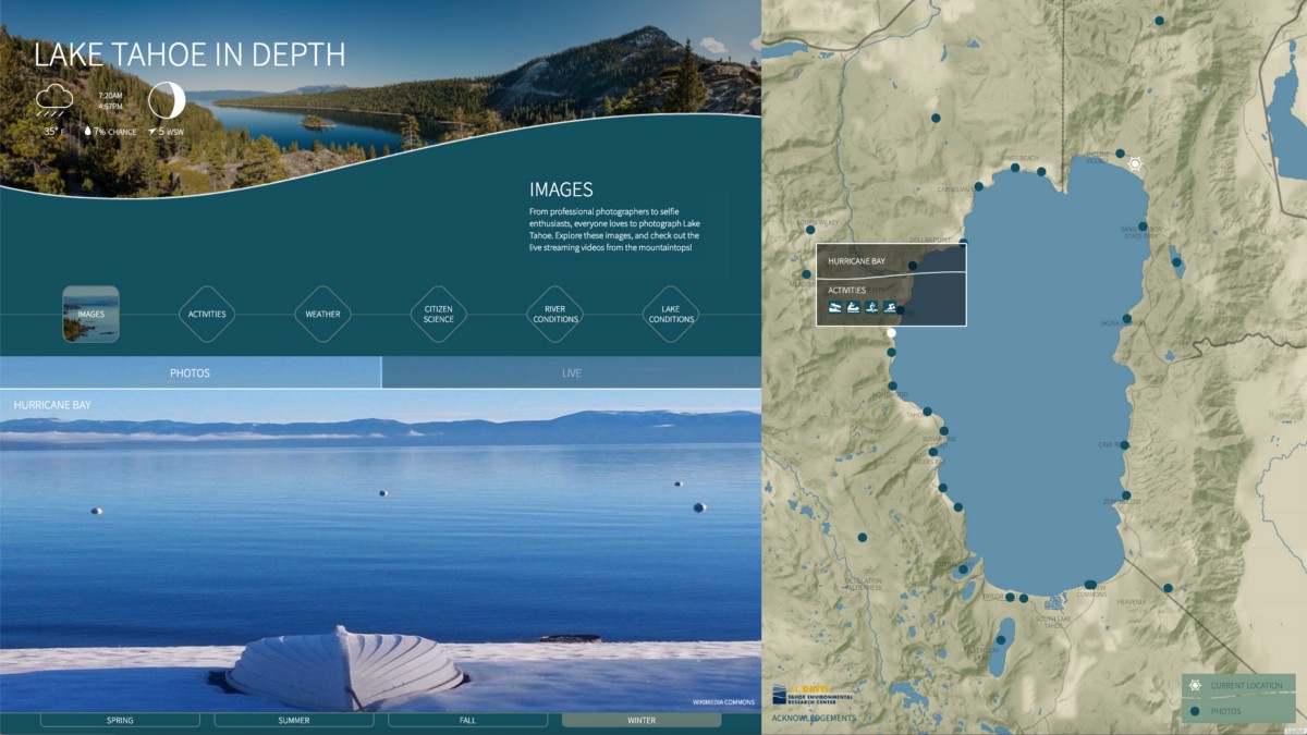
Image Module
There’s a reason photographers flock to Lake Tahoe. For the exhibit, we wanted visitors to not just be able to see beautiful images from locations all around the lake, but also be able to see how those places are transformed from season to season.
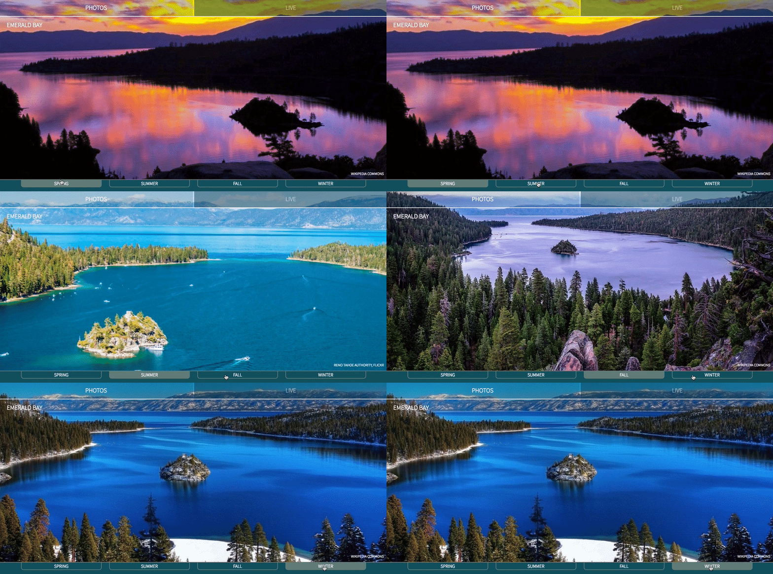

In addition to still images, we also included live feeds for a few locations where visitors can watch a time lapse vista over the course of an entire day.
Activities
The next module included in the exhibit focuses on the activities available at different locations across the basin. The additional toggle allows visitors to refine between water and land recreational options for each season.
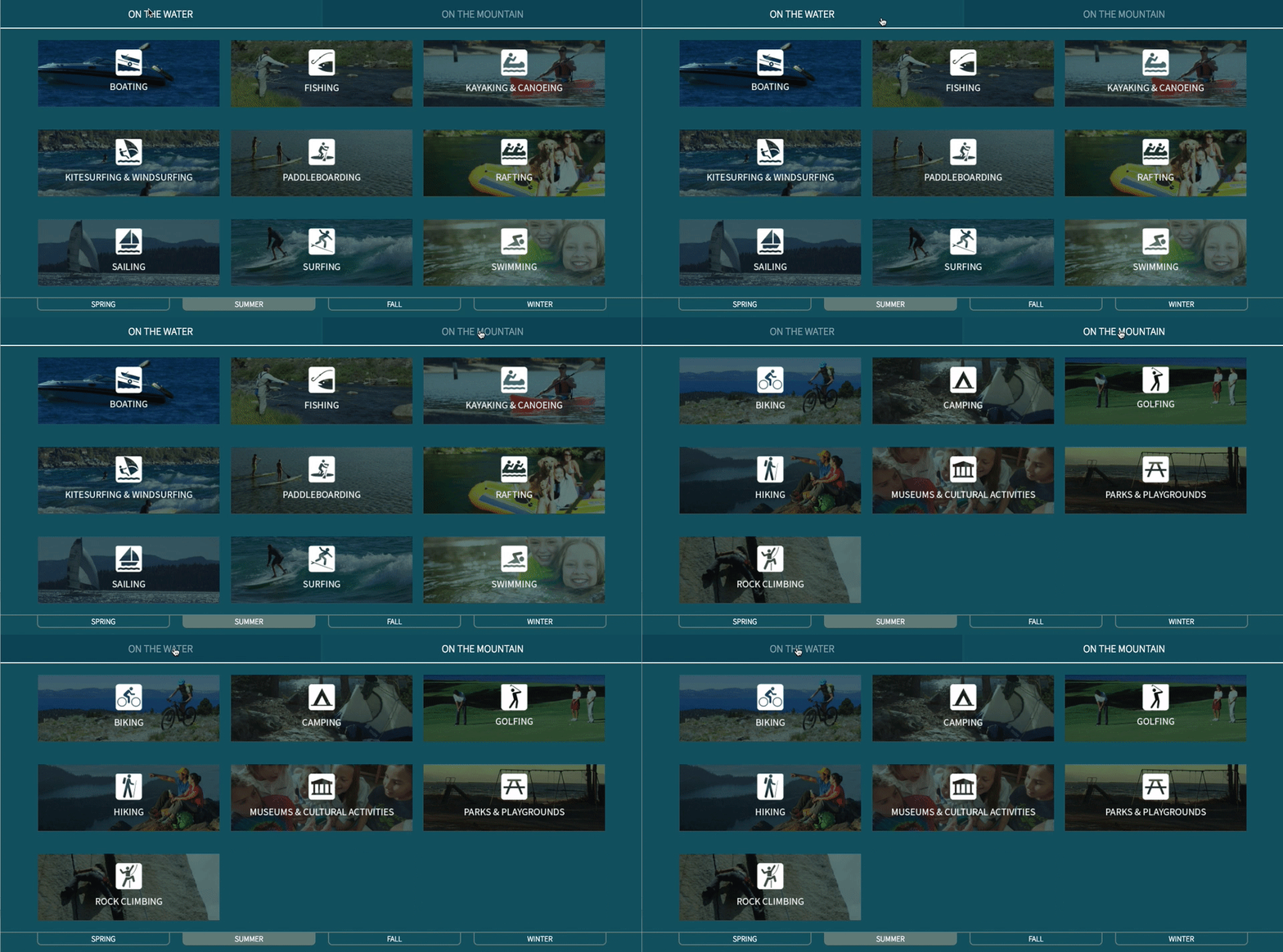
Selecting an activity provides both additional information about that activity and a refined map view that shows specific locations that offer that service.

Weather
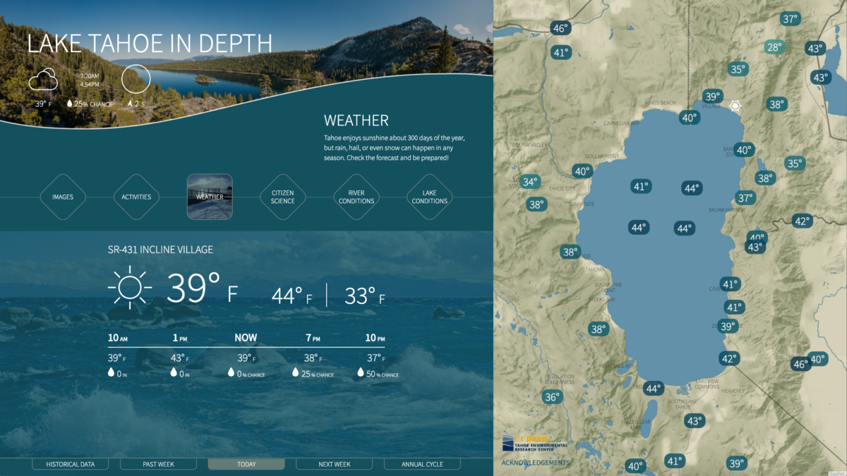
For the weather, we wanted to offer insights that support a broad range of interests: from the visitor who wants to know what the weather will be like for a hike tomorrow, to the enthusiast looking for information about how climate change has impacted weather at the local level over the last 100 years, to the event planner who wants to know typical highs and lows are for the wedding they are planning next spring.
The display for current weather was our starting point, with a display emphasizing all the facets of the current day’s weather and a map of the variation across the basin.
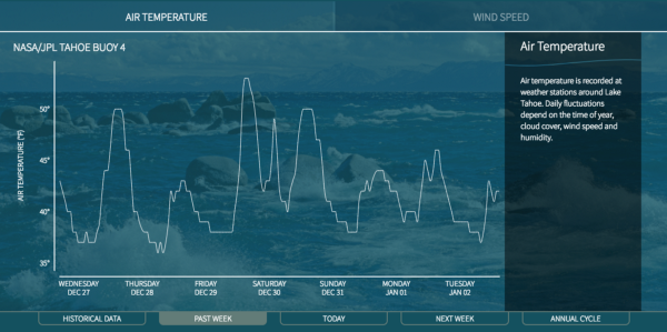
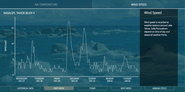
Selecting the “next week” tab shows forecasts for temperature, wind, and precipitation. Selecting the “past week” tab offers insight into recent air temperature and wind speed.
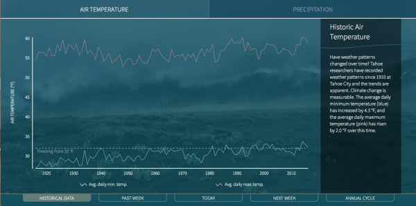
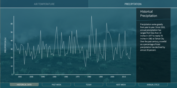
The historical data tab reveals trends on a larger scale. Seeing one hundred years of data at a time both allows us to see larger shifts in value over time and spot the spikes and troughs and note when they occurred.
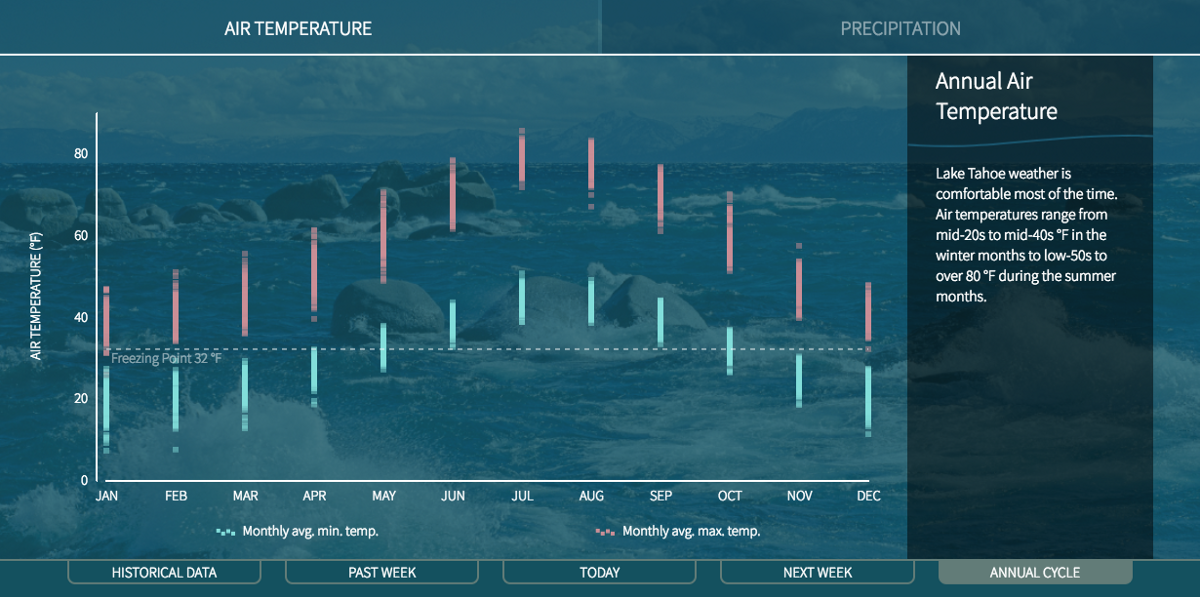
But what about the trends and variation that occur over the course of a single year? The “annual cycle” tab shows temperature and precipitation ranges by month for anyone wondering how to time a visit or simply interested in the meteorology of the area.
Citizen Science
Qualitative observation is a great way to get visitors involved with their surroundings and helping to capture trends in water clarity, algae growth, and more. Challenges in visualization arise when the data reported varies in language and completeness. In the case of algae observation, descriptions of the algae included thickness, texture, and other qualitative information that, while important, we displayed as secondary to the simple “visible/not visible” metric.

Likewise, for beach conditions, visitors were encouraged to report the amount of litter in addition to a description of what they observed. For the purposes of the map representation we decided to focus on litter quantity as the main metric and include the kinds of litter more anecdotally.

And when revealing observations about water quality, we found that the data recorded for color of the water was slightly more meaningful to visualize than the described clarity (which could be clear, murky, or cloudy).

River Conditions
The map for the rivers and creek module indicates both discharge volume and direction of flow. Note that the Truckee River in the north (which is controlled by a dam) is the only outflow from the lake, while there are numerous streams feeding in.
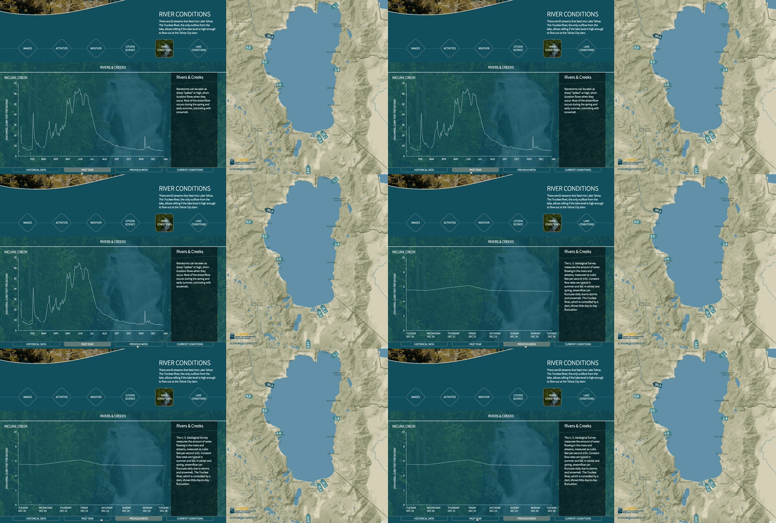
Spikes in the data for streamflow generally correspond to rainstorms or seasonal snowmelt.
Lake Conditions
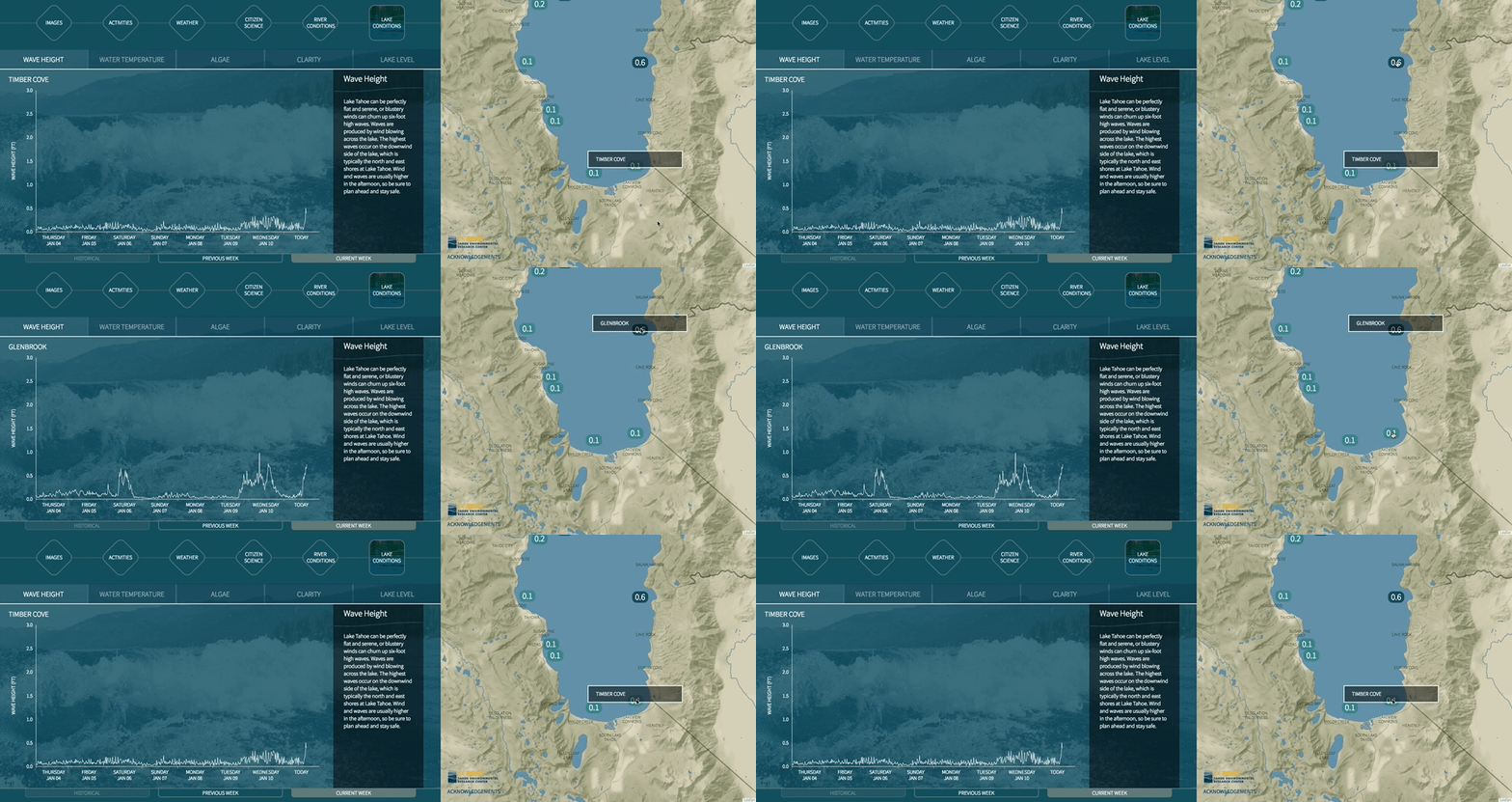
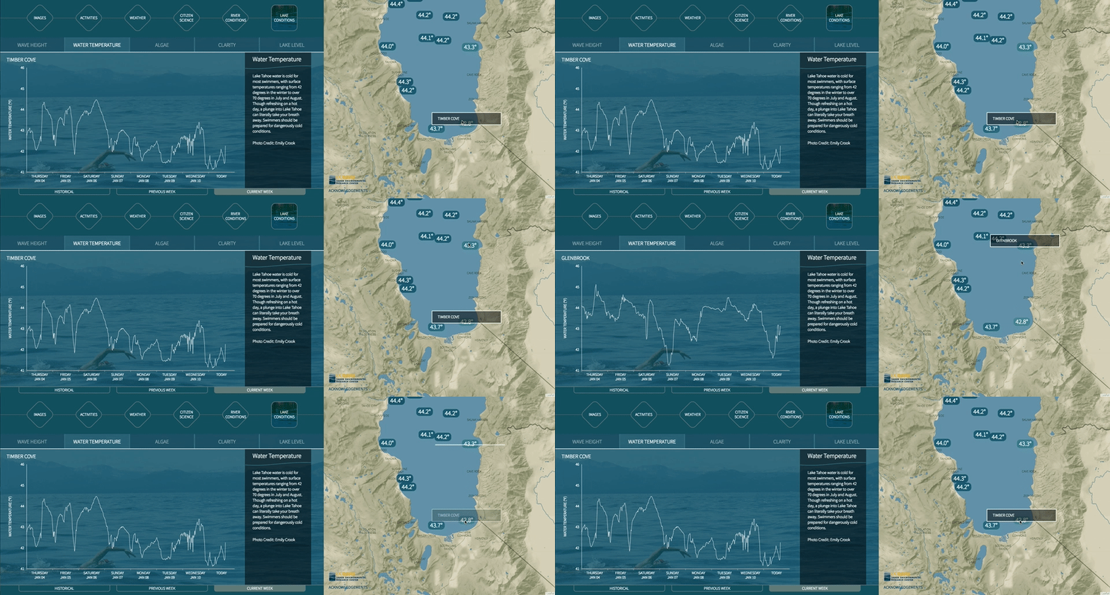
Some lake conditions are useful for recreation — comparing Glenbrook to Timber Cove in a given week shows markedly different patterns of wave height and water temperature (relevant to diehard surfers or polar bear swimmers).
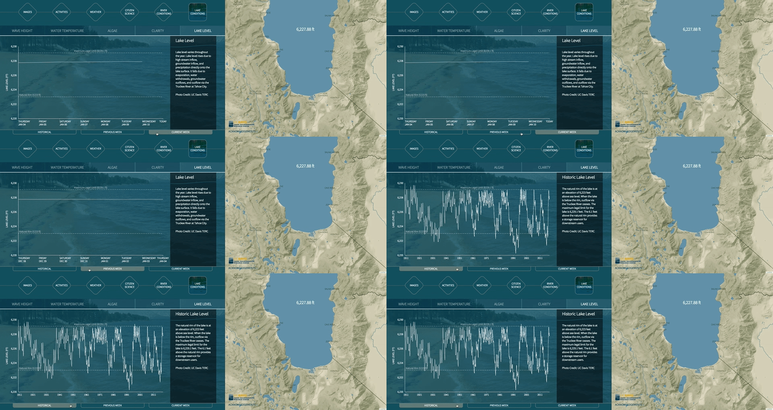
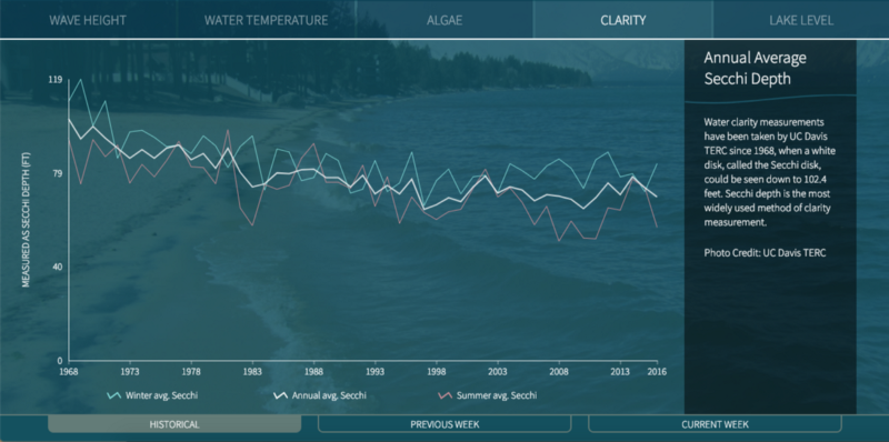
Other metrics seem constant and unlikely to change until you see them from a historical perspective. Comparing the current week to the previous week for lake level may make it seem like nothing ever changes, but a quick comparison to the historical comparison reveals it to be anything but static.
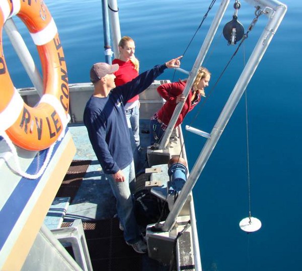
To determine water clarity, Secchi Disks are lowered into the water until they are no longer visible and the depth at which they disappear is noted. Variations in clarity across the lake and over time are measurable using this simple but ingenious technology.
To check out the interface yourself go to the Tahoe Science Center (definitely worth a visit for other exhibits as well, such as their 3D visualization theater and augmented reality sandbox). Otherwise, you can also see a version of it on the web (though optimized for the big screen) at laketahoeindepth.com. And a big thanks to Heather Segale and Geoff Schladow of TERC for their expertise and vision in shepherding this project through its many stages.
