
Today we want to draw back the curtain on our most recent piece for Facebook Stories: Beatquake.
More than 110 million songs, albums and radio stations have been played 40 billion times through apps integrated with open graph. So what does it look like when a song goes viral on Facebook?
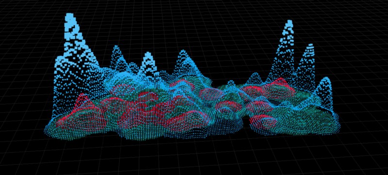
Inspired by old-school graphic equalizers, this Beatquake maps the volume of listens for each of the top three most popular songs in the U.S. each day over a period of 90 days. Colored layers show the number of plays expanding over time, visualizing the response to each song simultaneously across the country, while the texture of the map is driven by BPMs (beats per minute) and changes as one song overtakes another in popularity.
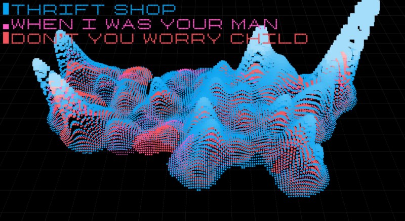
As a data-driven 3D visualization, the piece features a number of moving parts all working together to drive the final look:
Heightmap Generator:
We started with a day’s worth of listening data for a single song; we had about ninety days worth of data for each song, and ten different songs. This was plotted onto a simple heightmap, binning by pixel. Because places like Manhattan have significantly more than 255 song listens per day, we encoded the number of listens using all three channels:
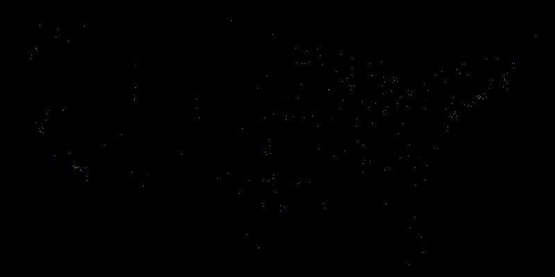
This data is extremely spiky. We discovered that specific versions of the specific songs we’re looking at were hard to find across the Open Graph (and various music services within). There was quite a lot of variety in song and artist names; a noisy dataset. In addition, because location is determined by city in the data, there were a lot of very tall spikes in places like Manhattan. To counteract these giant peaks, we applied some Gaussian filters to smooth things out into more recognizable shapes. The banding is a result of encoding data as RGB:
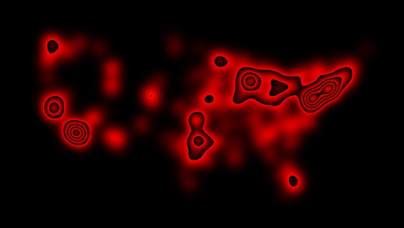
This pre-rendering gave us ten images per day, for ninety days, which we used as heightmaps in the final piece.
Beat Engine:
In addition to the listen data provided by Facebook, we used the tempo of each song to lend a little bit of texture. Using each song’s B.P.M., we set up an engine to simulate the beat and fall-off of sound for each song on each frame. This creates the pulse of the piece.
Song Popularity:
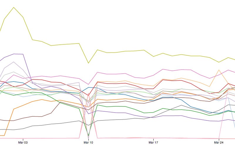
Finally, we built a piece of code which determines the top three songs on any given day; we calculated total US listen counts and fade songs in and out as they rise into and fall from the top 3:
Particle Display:
These two pieces are folded together in a WebGL-based visualization. We used Three.js for a lot of the setup, and then ran everything through some custom GLSL shaders to determine particle height and size. There are four — or six, depending on how you look at it — different cycles which produce the final look of each frame:
- Frames — Simple incremented value
- Beats — One per song, these go up and down according to the Beat Engine
- Days — Each day plays for about a second, and then switches to the next — each day loads one of the blurred heightmaps.
- Crossfade — We’re doing a sine-modulated crossfade between days. If the list of top 3 songs changes, we fade the old song(s) out and the new in.
Ultimately, a particle gets a height based on the two crossfaded heightmaps, and a size based on the song’s beat:
Rendering Engine:
Working in WebGL is fantastic for quick iteration, but a little tricky for final rendering. We used a solution we came up with for our previous Facebook Stories piece Virality, which involves saving out the current state of the canvas via php. In JavaScript, we set up function to bundle up the data and send it out via Ajax:
function saveImage(title, canvas) {
  c = canvas || d3.select("canvas")[0][0];
  var rawImageData = c.toDataURL("image/png;base64");
  var f = frame;

  var ajax = new XMLHttpRequest();
  ajax.open('POST', 'image_catcher.php', true);
  ajax.setRequestHeader('Content-Type', 'application/x-www-form-urlencoded');
  var req = "convert="+encodeURIComponent(rawImageData)+"&id="+title+"&frame="+f;
  ajax.send(req);
  }
The resultant data gets sent to a php script which catches it and saves out an image:
$imageData = $_POST['convert'];
$imageID = $_POST['id'];
$frameNumber = $_POST['frame'];
$filteredData=substr($imageData, strpos($imageData, ",")+1);
// Decode the base64 encoded data
$unencodedData=base64_decode($filteredData);
// Save file.
$fp = fopen( 'frames/img_' . $imageID . "_" . $frameNumber . '.png', 'wb' );
fwrite( $fp, $unencodedData);
fclose( $fp );
In addition, all of the text on screen is rendered in a separate canvas, which uses the same process to save a transparent overlay for each frame. Since these are all identified by frame number, we could simply use them as image sequences to produce the final video.