
An atlas is a guide to the world around us, perhaps most commonly seen as a collection of road maps to help one navigate across a country. But there are hidden patterns and phenomena that exist outside of what we see in the physical world. In this episode, authors James Cheshire and Oliver Uberti pull back the curtain to reveal a panacea of information in Atlas of the Invisible and how thoughtful visualizations alongside rich narratives can bring a new clarity to our understanding of the world.

James and Oliver first worked together on a collaborative project between National Geographic and University College London, mapping the most common surnames in North America. Shortly after graduating with is PhD in GIScience, James was approached to write a book about London based on a blog he had been working on. He pitched the idea to Oliver, who had recently left his position as a senior designer at National Geographic and was in London to receive an award on their surname map. They’ve been collaborating on maps and atlases ever since, the most recent being Atlas of the Invisible.
It wasn’t until the book was half-completed that a common thread surfaced between the maps: they all make the invisible visible in some way. “When you’re making a collection, they take on a mind of their own and they start speaking to you,” Oliver explains, remarking that this isn’t the first time that it’s happened for them, as the same “maps first—title second” order happened with their book of London maps.
The following maps are discussed in the episode and bring focus to concepts, phenomena, and tragedies that can be difficult to picture without visual aid. With every map below and in the book, James and Oliver provide written portions to guide the reader towards the stories and revelations within the graphics.
From Atlas of the Invisible: Maps and Graphics That Will Change How You See the World by James Cheshire and Oliver Uberti. Copyright © 2021 by James Cheshire and Oliver Uberti. With permission of the publisher, W. W. Norton & Company, Inc. All rights reserved.
From Atlas of the Invisible: Maps and Graphics That Will Change How You See the World by James Cheshire and Oliver Uberti. Copyright © 2021 by James Cheshire and Oliver Uberti. With permission of the publisher, W. W. Norton & Company, Inc. All rights reserved.
From Atlas of the Invisible: Maps and Graphics That Will Change How You See the World by James Cheshire and Oliver Uberti. Copyright © 2021 by James Cheshire and Oliver Uberti. With permission of the publisher, W. W. Norton & Company, Inc. All rights reserved.
You can get Atlas of the Invisible online or through your local bookstore! What is your favorite map from the book? Tell us on Twitter! And if you enjoyed the episode, please help us share it!
Transcript — +
[music]
You’re listening to PLN8, a podcast on data design and the people that bring them to life. Brought to you by Stamen Design. The importance of including text with visual visualizations, influencing policy with data throughout the ages and creating the most challenging Sankey diagram of one designer’s career. These are a few of the things that come up in today’s episode. In this conversation, Stamen founder and CEO, Eric Rodenbeck explores hidden stories about our past, present, and future with the authors of The Atlas of the Invisible. Everything from how to leverage the physical form of a book to enhance a narrative to the mythology surrounding John Snow’s famous maps of the London cholera epidemic. Please welcome our guests.
James Cheshire (JC): Hi, my name is James Cheshire and I’m a professor of geographic information and cartography at University College London.
Oliver Uberti (OU): And I’m Oliver Uberti, author and graphic designer.
Eric Rodenbeck (ER): And you two are longtime collaborators. Now, maybe you can just tell us for a moment about how you came to be working together on these fantastic books.
OU: Yes. So in a previous life, I was a graphic designer in the layout department of National Geographic magazine. I was there for about nine years and from 2003 to 2012. And we were making tons of data visualizations and maps there with my colleagues, often having conversations about cool data sets that we had uncovered. And one day, one of my colleagues, Sean McNaughton, told me about a data set that he had come across by this researcher out of University College London, looking at the most popular surnames around the world, and thought that maybe we could make a great map of the most popular surnames in the United States. And so I got to work on that, reached out, and that was how I first connected with James.
ER: And that map is in the book?
OU: It’s not actually.
JC: Yeah, it’s kind of a spinoff. So the original map was just of North American names, and it was an exciting project for me because it was the first time that I’d ever worked with anyone who was kind of focused on kind of design and cartography and storytelling. Up until that point, I was just a PhD student doing kind of data analysis and writing academic articles and things like that. So, yeah, I mean, we kind of hit it off. And I was approached to write a book about London based on a blog that I was working on. And it became clear that in order to do that successfully, to create new maps and graphics, we needed a designer on board who worked collaboratively and kind of on an equal footing with the kind of the data analysis and academic side. And so, it was just chance really I guess that Oliver had won a prize at the Information is Beautiful Awards, was passing through London, and I guess it was at a loose end. Decided to call in and say hi and I pitched this idea to him and we kind of started from there. So hundreds and hundreds of maps later, we’re still at it.
OU: Yeah. I mean, I took that trip. I had left National Geographic in August of 2012. And this trip to London, I got the invitation to go to the Information is Beautiful Awards ceremony for this map that James and I made together of the most popular surnames in the US. And that was I guess in late September of 2012. So, newly unemployed, I decided to leave and go out on my own and kind of make my way to try and be an author and an independent design studio. And I thought, why not? I’ll fly over to London for 48 hours and see what’s going on and say hi. And that was, yeah, 10 years ago this coming September. And James and I have been making maps together ever since.
ER: Most of the good things that have happened to me in my life have come from similar unintentional– you show up, you put on your best face, you meet people and say yes a lot, is how I describe that. We can go to the book then. I would say of The Atlas of the Invisible, first off, that I found it an extraordinary joyful and optimistic book. It really has this kind of– it’s suffused with the sense that we can know the world by looking at the data that underlies it. So I wonder if you could just describe that book and maybe respond to this notion that it is joyful or optimistic.
JC: We were just discussing this earlier, actually, just before talking to you guys. The book itself, the idea of kind of redefining what an atlas can be, took a couple of years for us to settle on. So we had an idea originally where we were trying to create something that showed the promise, the power of data, to help understand who we are as people, population movements, movements of individuals, that kind of thing. But the central idea, the kind of thing that held it all together, took a bit longer to kind of coalesce. And it was really, for us, I think, the idea that atlases no longer need to be about places, about place names, or rivers, or roads or that kind of stuff. They actually have a really powerful role to play in telling stories about data, particularly complex data. And so that was the kind of launching-off point for this book. And I think we wanted to show the power and to a certain extent, the peril of data that we have at our fingertips, and actually to show the ways that it can help us chart a better future, really. I mean, there’s elements of understanding our past and looking at contemporary issues. But I think the part of the book that’s really resonated is how these maps can be used to relate to a better future and to understand the challenges we face. And so, yeah, hopefully, it’s kind of a really strong calling card, really, for why maps are still the most important way we have of showing the power of [the age?], and actually why atlases are still one of the best ways of pulling maps together.
ER: It’s an interesting premise, this notion that the form of an atlas is different in the time that we’re living in, right? And one thing is that atlases typically needed to be comprehensive. And you’ve made something that is luxuriously detailed, and it’s very dense, but I don’t think it makes the same claim to comprehensiveness as the National Geographic atlases that we’ve seen or the world atlases, things like that.
JC: Yeah. And I think where I wanted to distinguish ourselves just from my interests as an academic and as someone who has worked with spatial data for a while, is we’re not competing with the data service industry. We’re not competing with people who create interactive maps, stuff that you guys do, and others in terms of providing a service that is the base map of the world. Interactivity kind of online is the future of a lot of that stuff. So really for us, it was about taking a step back and focusing on the story. Oliver, if you wanted to talk a bit more to that aspect and how, yeah, the motivations around the design and the storytelling kind of influence how the book turned out.
OU: Yeah, I mean, National Geographic had a really strong impact on me as the way I approach editorial design. And you could maybe even say that was the way my brain was always programmed and it just felt like a natural fit at Nat Geo. And then it’s a natural fit in the way I design these books. But what many people may not know is that a magazine like National Geographic is laid out visuals first. So all the photography is pasted out, the articles are pasted out, the designs and layout is pasted out. Yes, a writer is out in the field reporting and writing a story, but ultimately the layout is designed with dummy text and then the text is edited to fit. And that idea of putting a publication together with the visuals first, your maps and your photos and everything, and then writing text as a secondary element, is really antithetical to the way the book publishing industry traditionally works. A manuscript is written, it’s submitted, an editor edits it, and then a designer comes in and copy fits that manuscript between two hard covers.
OU: So when we’re working with publishers, we found a great team at Penguin Random House that has been great to work with in the UK and then WW Norton here in the US. And they both believe that books should be beautiful and they’ve been willing to go against their typical book production process when working with us and allow us to build these books as visuals first. And then I really want you to be able to flip through this book from cover to cover and just grasp a map or given story with your eyes and take in the color and the layout and the arrangement of everything first. And then you can dive into the text for more detail and contextual information and little labels that carry you through. But it’s a book that you can dip in and out of in any order and it’s the way I love to flip through books. I just trust that other people will enjoy that too.
ER: I’ve been thinking about that a bit about Atlas, about how they need to be set up linearly in a sense, and you’ve done that with the different chapters and you’ve grouped them and stuff. But they really are designed to kind of pick up and look at a little bit, get something and then go. They’re not really intended to be finished or completed in a way that, say, a novel would be. I love that about what you’ve done. I also love this blending of text and maps. I think that a lot of times when people are looking to build interactive maps online, there’s this notion that the visuals should tell the whole story and that there’s not a need for accompanying text. And it’s actually really refreshing in this Atlas to see that there are very few pages where the text is not a crucial part of what’s being displayed. There’s a lot of explication, I guess, in this. And it’s unique, I think, in the sense that there’s not a lot of explication in a Road Atlas of the United States or the Ordinance Survey of London, right? So this has a different form.
OU: I find the text to be at least half the job if not more than half. And it’s been a great frustration of mine over the past 20 years and you could say like the new golden age of data visualization in the 21st-century to see so many creators putting work out there is just a pattern without any reporting, without any supplementary captions or notes or texts to lead a viewer through it. And I just personally find that irresponsible. It seems to be more about the creators saying, “Hey, look what I made,” and less about thinking about their audience, the reader, and saying, “Here, let me teach you something.” And James and I are always trying to think about the reader, the end user who’s going to be flipping through our book and make sure that they understand what we found so fascinating.
ER: No, that makes sense. And I find it refreshing because a lot of times what I hear is that people want visualizations and maps that everyone can understand in an instant without any background or context, and that if someone misinterpreting a map or data, visualization is sort of without any explanation, is a failure of the design. You seem to have gone in a very different direction.
OU: Oh, yeah. I mean, we’ll work with clients sometimes on freelance projects with James and I do, and they all have that same instinct of like, “How can we explain everything with just the visuals?” Guys, text can be your friend.
ER: Where do you think that comes from? I’m curious. Just as people who we were in the same boat, I’m kind of grappling with this on a number of different fronts, but people have really funny ideas about visuals and what they can communicate and also what kind of what data is. I don’t know of anything else that people sort of expect. You would never say that about a novel or a play or a movie, but somehow when it comes to a map or a visualization, people sort of have the sense that it should be uniquely legible.
JC: I think a bit about this, particularly with my teaching. So I teach students cartography and follow the roller coaster emotions they go through when they have kind of an endpoint in mind with the graphic or a map they want to create, but then they realized the journey they have to go on to get to it. And my sense is that the most successful graphics, maps, look effortless and there’s a tremendous iceberg of work that goes into them to make them intuitive, to make them relatable, to make them understandable that you don’t burden the reader with. You burden yourself with in order to create it. And I think that that for me is where the most amount of work goes into making the graphic the most successful thing, but it’s the thing that’s least appreciated. I joked the other day, Oliver and I are working on another kind of Atlas-type project with some researchers, and I think I joked that we spent an hour and a half talking about, “Was it three circles or two squares or something like that?” That was the endpoint of the meeting. It was a triangle. That was it. It was three triangles. And the resolution of the problem was really a very simple one. But, of course– and to look at it, you’d have no clue the amount of effort that went into it to create something that was seemingly that straightforward. And I think that the challenge for those of us who create this, particularly for people who obviously have to earn a living from it, is to be able to articulate that value to a client who doesn’t understand they might have to pay you for that time to create that because they see something effortless at the end of it and they assume that it was effortless in its creation.
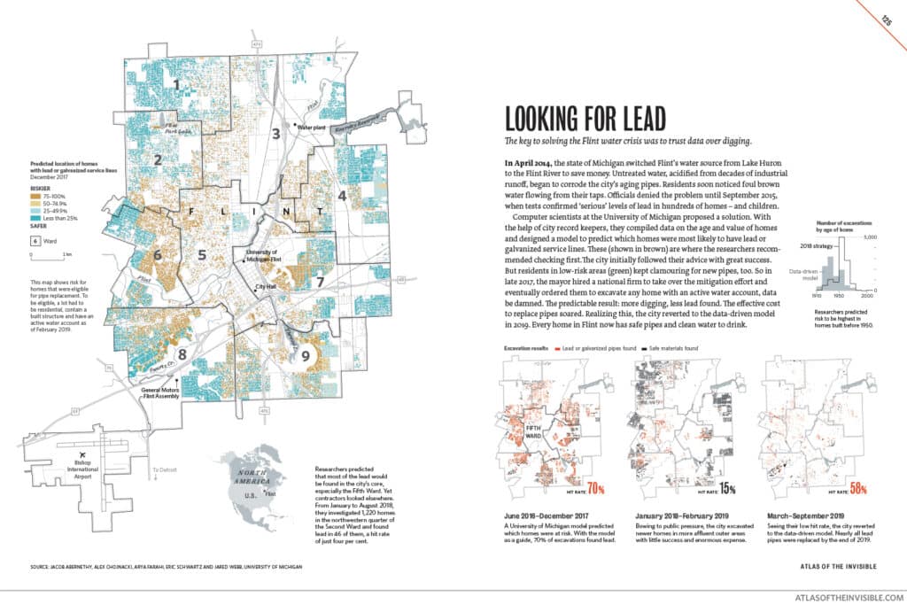
OU: A great example of the power of text, I think, comes from the story Looking for Lead that’s in Atlas of the Invisible. It’s a real personal story for me for having lived in Michigan for a number of years, having gone to school there. And I came across this data set because I was in a bookstore in Ann Arbor that had a coffee shop on the second floor, Literati Bookstore. I’ve done a lot of design work for them, they’re good friends of mine, and they had this great space where different researchers from the university would often be passing by, interacting with each other while getting their coffee. And I saw a friend, I asked him what he was working on. He told me that he and some colleagues were trying to see if they could use data to help combat the Flint water crisis. And at the time, I think maybe James and I were two years into the production of Atlas of the Invisible. I was like, “Tell me more. This sounds like a great story that we could include in our book.” And when you say that this book struck you as being very optimistic, I think this is a perfect example of the way data can really help deal with social and policy and environmental issues. I mean, for your readers and listeners who aren’t familiar, the short story of it all is that you could go around and dig up the pipes in every single house and parcel land at Flint, but that would cost a lot, lot of money.
OU: So the question is what if we could dig through city records of age of homes and the value of homes and the location of homes in the different wards and enter that all into a model that could maybe predict which homes were most likely to have [lead in?] galvanized pipes, and then we could target our digging efforts just in those places. And that’s what the city did using this University of Michigan model. And for the first year and a half of work using that, they had a positive hit rate of 70% of finding lead where they went looking for it. But then a lot of other people in other sections of the city that the model didn’t predict there being lead, they wanted the peace of mind to know that their homes were safe too. In a sense, they didn’t trust the data and so they lobbied the government to dig up their homes too. And so, ultimately, Flint caved to that public pressure and their hit rate dropped to about 15%. And for about a year in 2018, they followed that just-dig-everywhere model and an enormous taxpayer expense. And seeing how that failed, they then reverted to the University of Michigan data-driven model and it’s like this is a case study for mayors all around the world because infrastructure is aging. Maybe when the next city has to do something like this, they will learn their lesson and trust the data.
ER: Something that I find so interesting about this story is it’s nationally known, of course, right? I mean, there’s the– Michael Moore drew a lot of attention to it. And so it’s sort of– you don’t have to introduce the idea that there’s a water crisis in Lead. It would be interesting to talk through the particulars of city elders deciding to make these changes, right? Because there’s a whole– since we’re talking about storytelling, I mean, there’s a whole narrative and dialogue around the cholera maps that John Snow put together in London and this notion that the, kind of, popular story is that he made a map of where all the cholera deaths were, and then that turned into that led him to the pump on Broad Street that he, then, took the handle off. But it’s my understanding, having read it a little bit deeper, that he didn’t use maps in order to do that research. He made the maps in order to demonstrate to the city what he had done, afterwards. So the map in that case was not an analytic device, but was more of a storytelling.
JC: Yes. I mean, the John Snow mythology is really interesting. So there’s a report that he produced, which had some pretty damning statistics in it. So he did some really interesting stuff about the distance that people were from the River Thames and how susceptible they were to getting cholera. So sailors were massively more likely to die or get sick than, say, lawyers. But the problem was the Victorians thought– or a decent chunk of Victorian society thought that it was morality that was going to make you ill, or immorality, I should say, that makes you ill, not whether you’re drinking dirty water. And so a sailor versus a lawyer actually makes sense, right? They were kind of drunken, immoral workers. And the upright lawyers, of course, were not getting so sick. But he actually came up with some really powerful examples of, almost, contact tracing or phrases we use today. He followed people who died from cholera outside of Soho and discovered that they had drunk the water from Soho. So it’s all pretty equivocal, the data. And then, as you say, the map supported that. But actually, the prevailing view that cholera was waterborne didn’t take off until after his death. There were others in London who were pushing for sanitary reform, but to stop the air. They thought it was miasma. They thought it was bad air.
JC: So the stuff that he did do was fascinating. There was things like different maps of different water companies, and how the water companies were a vested interest. They didn’t want to change the status quo because, obviously, they had to invest in it. And even up until the 1920s, in some parts of the world, there were disputes around the causes of cholera and its relationship with water. So it’s a really nice example, that, of how maps were part of the articulation of a problem. But they actually, as you say, there’s a little bit of mythology around there. They weren’t the ultimate slam dunk in finding the solution. They were part of this bigger package of stuff that he worked on. Just to bring it back to the Flint example, all these maps are great, but utterly useless unless someone does something about what they’re telling us. And I think that’s kind of the moral to the Flint story, as was the moral to the John Snow story, as was the moral to many others out there, is that you can create something. You can demonstrate the nature of a problem. But if there’s not the political will to, kind of, put all your faith in what the map is telling you. Then it becomes worthless, and change doesn’t happen in the way that you would hope. So I think that’s one of the other, kind of, really interesting things about maps and map making is how you can create a positive case for them. But it’s been getting other people to come along with you to action the decisions that stem from them.
OU: In that Flint story that we have in the book, I mean, it’s similar to the John Snow story in that the maps were created after the fact, after all the work in digging had already happened in Flint. The decision makers in Flint, working with the University of Michigan researchers, were working on data alone. And we saw an opportunity to visualize something that we hadn’t seen anywhere else, to kind of celebrate the work that had been done there by the city and the researchers and to really show in a smoking gun way that when you dig where the data tells you to, you get better results than when you dig in the places that are driven by public pressure.
ER: So that’s making me think– we could go in a bunch of different directions there, but that’s making me think that in some ways we might say that– at least this map, not necessarily this book, is less an argument to trust in maps, but more to trust the people who have the data that can make the maps because they know what they’re talking about. You’d want to show this to somebody in another place. It’s almost like an argument for the primacy of knowledge and data. You’re sort of arguing there are ways to understand the world.
OU: Well, consider your source. Yeah. I mean, like anything, we want to promote visual literacy, but we also want to permit data literacy and promote being able to parse fact from fiction. And you can see a map of where the president says a hurricane is going to go, and just because it’s a map doesn’t mean you should trust it.
ER: Right? Well, and then there’s another famous one that Trump was using that showed all the counties in geographic way, all the ones that had voted for him, and there was a sort of try and impeach this, and it sort of looked from a certain angle as though the entire country was behind him but in actual fact, it was a map of where there weren’t any people.
OU: Yeah, land doesn’t vote.
JC: Yeah. I think that’s one of the really interesting, but most challenging parts about mapping overall is that these two things can kind of get muddled up, right? So the map that you depend on to take you down the side of an unfamiliar hill when you’re out on a hike has to be correct, or you’d hope it was correct and truthful and impartial. That logic then sometimes gets extended to any map, and so if a map of the US tweeted by the president is published or shown, then it’s given the same level of credibility. And I think there’s nothing else I can think of, really, that suffers from that kind of false equivalence across the different creators and different data sets you see. And if it’s the written word, then I think people are much more aware of the source and what it does and doesn’t mean and similarly, I think even just the reporting of just straight statistics, people have learned to be a bit more skeptical sometimes. We don’t get that so much with maps.
OU: And we touch on the dark side of that a little bit in our chapter three essay on truth to power and how maps have long been thought to offer authoritative views of the world, so those with the resources to create them and [inaudible] often done so to cement their own advantage, and you’re talking about– you can look at the history of colonialism and just taking a map like at the Berlin Conference back in the 19th century and carving up Africa by just drawing lines right through communities and lumping different ethnic groups and communities together that never would have been part of the same sort of nation state. And, yet, these maps, once those lines are drawn, they have a real stickiness to them that many still persist to this day. We are not blind to those issues, no pun intended. Well, actually, pun probably intended. That’s what we’re trying to do, and [inaudible] the invisible is really kind of like broadened our readers’ cartographic literacy as well.
ER: One of the things that’s drawn me to the work is that you’re not shy about having an agenda, which I appreciate. I think it’s easy to pretend that maps don’t have agendas and maps and diagrams don’t, but of course they do, just the way that everything does. And I’m also really appreciating that you’re bringing a sense of history to the maps that we use today. I’m just thinking about these maps that Dan Rather used in 1961 to show– basically use a pencil, radar, and a hand drawn coastline to show the eye of Hurricane Carla off the coast of Galveston, Texas on television kind of for the first time. Which just points to this other aspect of maps is that we assume that they’re sort of unchanging and that they kind of always existed and always will exist and that they’re not kind of embedded in historical contexts, and that the maps that we see today are the maps that always were, but of course, there were expressions of power. As you say, colonialism, right, they were closely guarded military assets for much of human history and I presume some still are.
JC: Yeah. And I think the agenda point, the idea that we’re kind of transparent about kind of the cause that we’re championing in our maps, I mean, that’s something we’ve grown into I think. The first book we did was on London. It’s called London: the Information capital and I was much more concerned about impartiality in that book and presenting the city it was kind of an implicit message around social inequality and all that kind of stuff, but it wasn’t there in the punchy way that we’ve kind of grown into with [inaudible] invisible. We kind of lean into this a lot more. And I think if you’re going to do that, I think it’s then important to pull together the debates and the pros and the cons and the ups and downs of mapping and map making. We’ve seen that even today, Russians’ invasion of Ukraine, people have referred to the map for charting that conflict and understanding what’s going on. And you can look back in history and there’s plenty of previous examples where those things have been used. We tried to find examples people may not have heard of or seen before. So the hurricane map, I mean, Oliver, I’m not sure how you found that. Where was that? Because I hadn’t ever seen that before until you presented it as something we could include in the essay.
OU: We knew that the final chapter of our book was going to be called What We Face. And we really wanted to look at the book has a very loose past, present, future structure to it. And so in the final chapter, we wanted to look to the century ahead and climate change and what data can tell us about a lot of things that are coming our way. And one way to look to the future, I thought, was to look to the past and did a lot of research into the history of weather observation and was just fascinated. I’m a designer, Jamie and I make lots of maps and visualizations, but we love doing reporting and research too, and writing the text. And sometimes people ask us who writes the text for our books. And it’s like, well, we do and that’s why it takes a long time. But we did a really deep dive here to get into the history of weather forecasting and was fascinated to learn how frequently the public and even the US government doubted the ability to forecast weather. I mean, something we take for granted that we can turn on the Weather Channel or open up an app and see that it’s going to rain in 48 hours was sort of heresy 150 years ago. And we kind of are drawing a parallel there towards forecasting climate change. That the same people who doubt the effects of climate change today sound a lot like the people who doubted the ability to predict a rainstorm 150 years ago. And I think just somewhere in the course of my reporting to dig up that history, I came across Dan Rather’s story and it was just too perfect.
ER: The thing I want to take away from that is sometimes when you’re somebody who believes in climate change and you believe in science, and I’ve had this with different people in my family, you come across people who just flat out refuse to believe it and it’s kind of tricky to know what to say to people like that because it’s just hard. Someone who’s denying that the earth is round those kinds of things. And I feel like what you’re opening up is the possibility of going back in history and to the history of climate denialism, especially as it sort of passes through this lens of maps, and whether it could be a really interesting place to start.
JC: Well, I mean, these things just repeat themselves again. So we started with Von Humboldt, who was someone that actually came up with the structure. This philosophy that we still use today around the complete planet, the systems in it. And he was a real inspiration for us. And he worked with a cartographer named Heinrich Berghaus, to articulate this kind of big vision. We’ve discussed the impact of John Snow and the cholera maps. There were deniers of cholera. There were riots about cholera restrictions. There was all this stuff that happened that they had to face that happened in history. And in the same way, we’ve got climate change denial compared to the stuff that happened in the weather map. So these circular narratives that keep repeating themselves are actually shown through the historic maps as well that we’ve fished out. And I think that was one of the most kind of exciting and for me, the most kind of rewarding aspects of the research on this book is actually discovering that maybe we thought we had a good idea, but someone a century ago was having the same conversations, using very similar tools, and bringing those people into the book was really important.
OU: W.E.B. DuBois, I mean, is someone who was doing this work mapping, visualizing, incredible sociological data that he collected 120 years ago, 100 years ago, and much of it was suppressed.
ER: Right. That’s what people need to know.
OU: Yeah, just destroyed by the US Bureau of Labor after a change in the administration. There are these circular narratives, and maps are great at recording a slice in time. And then if we put two slices in time together, we can compare them and we can see parallels, we can see change over time. They’re incredible tools for bringing those circular narratives to light, as long as those historical ones have either, A, been preserved and not destroyed, or two, as we do in our first chapter book, sort of looking into history, there’s all these data digitization efforts to bring historical data into the digital age.
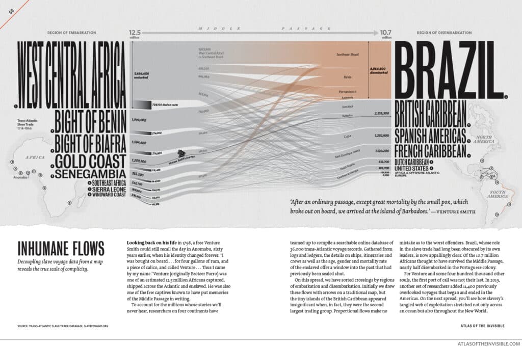
ER: Cool. Well, I thought maybe we could talk about some of the specific maps that are in here. There’s just so many good ones. I’ve got a couple of them here. One of the really intense ones was Inhumane Flows on page 50. And for our readers who don’t have the book, they’re diagrams of the movement of enslaved humans from one country to another or from one region to another. And there are two of them. One of them is about the initial enslavement, and then the other is from the subsequent regions of embarkation and where people went to. And there are these incredibly detailed maps showing that the relative numbers of people that are coming from West Central Africa as related to the Gold Coast, Brazil, just leaps off the page as a gigantic place of importation for enslaved people. And I just wonder if you could just talk about this. You mentioned in your descriptions that the places that had a ton of enslaved people were actually quite small geographically and that the maps, if you were to use geography to try and tell that story, you would lose a crucial part of that story. So I just wanted to get into the kind of choices that you as designers and researchers make to do these things because the number of different kinds of maps that are in this book is one of the really striking things about it. And so there’s kind of– I just wanted to get into a conversation with you about your process of putting these highly differentiated mapping forms together and the kind of choices that you make in telling these really compelling stories.
OU: Having made maps together with James across three books now in over 10 years, we a pretty codified a pretty standard process of what we call topic data angle form. So if we have a given topic that we’re interested in, we’ll go out first and search for what data is available. Or if we come across a really cool data set, the topic is then implicit in that.
ER: Yeah, that’s what I was going to ask about. I’m so curious. Is it more often that you have data or more often that you have an idea or how does that work?
JC: I would always say that the dangerous ones are where you’ve got a data set that you think must have something cool in it and you’re scrambling around for an idea of how to show what the story is because they’re the ones that can be the hardest to crack. And oftentimes, you spend a lot of time working on them and you think, “No, maybe this just isn’t going to work.” The best ideas are often the ones where we see it’s an important issue, something we really want to do. And then we kind of find a way of getting it into the book. And I think actually, just to jump in slightly ahead of Oliver on the Inhumane Flows story, that was my perspective I think when I started thinking about this idea of mapping these flows. I was coming from a very kind of traditional perspective in a way that we needed a map, that we needed arrows, that we needed connections, and that we needed to show everything. And that just wasn’t working. And there’s loads of stuff on the cutting room floor that was kind of me failing, trying and failing to get anywhere. And actually, I think the breakthrough was handing over, almost putting my hand up and saying, “I’m going nowhere with this, and then handing over to Oliver for him to have another go at it and start afresh. And that’s why we ended up with the kind of different visual perspective that we’re showing in that graphic or those two graphics.
OU: Yeah. And when you have any data set like this voyages data set put together by researchers on four continents, there’s so, so much depth to it. There’s so many different variables you can sort through. And you can look at the flag that was flying on the ships, which country they hailed from. You can look at the ages of the enslaved passengers, their gender, their mortality rate. I mean, it just becomes a little overwhelming when you start to think, “Okay. How much can you really fit on one graphic?” And this is where the third step of our process really comes in, which is choosing your angle. So you’ve got your data set. What angle can you reliably and responsibly take, and what’s the story that you feel needs to be told? And in this case, the more we dug through the data, I mean, we looked at the timeline, we looked at which countries were mostly responsible, we had different visualizations that were showing Portugal’s involvement, Britain’s involvement, Spain involvement over time. And when I did that, I saw that Spain was quite absent, it seemed, just from the trade. Just judging by the variable about what flag was flying on the mass. The ship is across the Atlantic Ocean.
OU: And the more we started digging into that, and with the subsequent publication of this inter-American trade database, we realized that so much of Spain’s involvement wasn’t crossing the Atlantic, but it was on a certain sort of secondary trade. Once the enslaved were disembarked in Jamaica and Barbados, that’s when Spain and the Spanish colonies often got involved and then just distributed people throughout the entire Americas. And so we realized that we could do two sankey diagrams, two big flow diagrams. One showing the middle passage across the Atlantic, and then when you turn the page, you get smacked in the face with Spain’s real involvement in the inter-American trade. And so that fourth step of our process, top of data angle form, that last step form is the last step after we’ve chosen what story we want to tell, we find the form that’s going to be most conducive to showing you in an impactful way and what we’re going to do. Then, you got to make it. And this was by far the hardest sankey diagram I have ever created. And yeah, they’re online sankey generators, but trust me, there was so much manual effort to clean that up to make all these lines not look like a complete tangle of spaghetti.
ER: It’s glorious. I have questions for you about your tools, but I also wanted to just flag that you just sort of told the mini story of what it takes to make one of these. And a lot of it is trying visual forms and finding that they don’t work in the way that you want them to, or that they’re not telling the story that you want, which goes to our earlier point of people thinking that these things just sort of fall off the truck, or that you can just plug numbers into a Sankey diagram developing software tool. But then, also, you made two visualizations. This would be much more difficult if you tried to jam it all into one visual, right? You’d have to try and find a way to have ancillary and subsidiary lines on the same map, but by breaking it up into two, you wind up being able to get to a much more sophisticated and robust kind of storytelling.
OU: Well, in the same way like pinching and zooming and scrolling allows some cool design tricks that you can incorporate into your graphics of how you experience something on a phone. In the same way, as a designer, I like to leverage the physicality of a book, and that you have a gutter that divides your graphic into two sides. So you can compare and contrast on left page versus right page, or you can make the middle passage seem like a journey because you’re crossing the gutter from the left to the right. But then, you also get the page turn, and the page turn that goes back to my training at National Geographic of the impact you can make when you just turn the page and suddenly hit someone with a reveal of a really powerful image or the and half of the map.
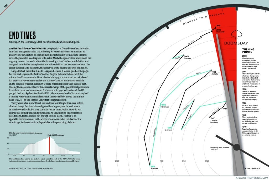
ER: Yeah. At [Starmen?], we talk about zooming with your face. We’ve done that with a couple of murals and things like that. So it is great to see in 2020 or 2022, rather, this notion that the physical form of a book can be used as a storytelling device, and a quite different one. I also wanted to check with you– I’d like to ask you about your tools. But before I do that, I wanted to talk about this other map called End Times, which is a map of the Doomsday Clock over time and maps the closer and further away that we get from doomsday according to the Bulletin of Atomic Scientists. And this is one of the– there’s a few maps in your books that are not geographic maps. And I wonder whether that posed any issue for you. Most everything else, even the ones we just talked about, about enslaved people, they’re all divided by country, and there’s a spatial orientation to it. But this one, there isn’t. And I wonder whether you care whether it’s a map or a diagram or a data visualization or both or neither or whether those labels mean anything to you. I’m just curious about including a map of the Doomsday Clock in an atlas and what your thoughts are about that.
JC: This is one that Oliver worked on as well quite a lot. But I think from the perspective of the book, I think this is, again, another really great example of where an atlas is great because you can take people on a journey, and you can set people up for things. And I think that the power of that graphic is helping people to contextualize the challenges that we face and the importance of what we’re talking about in some of the other maps and graphics in the book, this idea that what was once kind of– well, I say what was once. 12 months ago or more, people thought was the kind of seemingly diminishing threat of nuclear war suddenly kind of has been massively overtaken and more from the threat to the climate crisis and what that takes. And I think it’s a nice example of showing change over time. And actually, you mentioned whether the fact that it’s not a geographic map is problematic. Coming back to our topic data angle form mantra, the form is dictated by the other three. And it may be that the conclusion we reach is that a map is not necessary or not required to tell the story we want to, and we’re very happy to put maps to one side. It’s a nice kind of visual diversity for people as well. And thinking of the historic maps and the kind of precedents that have inspired us, the historic atlases, they had lots of charts in as well. I’m a big fan of these French transport atlases that were published at the end of the 19th century. They had full pages of graphs and charts, and they were not just geographic maps.
OU: And this Doomsday Clock graphic is a time map. It’s another way of thinking about it. You’re mapping events not in spatially but temporarily. And we talked about circular narratives earlier in this conversation. This clock tracing the minute hand movements over time from 1947 to today it shows, yeah, we’ve been in some of these places before. We’ve been in dangerous times and less perilous times.
ER: This is great, you guys. I really appreciate you taking all this time. I have one more question about– as a digital person, I mean, [Starmen?] hasn’t done very much in the way of print publication. So I’m very familiar with the tools for creating digital maps. But I’m just so curious. I just want to emphasize for our listeners. There are hundreds of maps in here, and they’re all unique, and they’re all different from one another, which seems a kind of radical gesture not to just sort of make it according to a single program or application. But I wonder if you could just talk about the tools that you’re using and the process that you’re using to make just this incredible variety of visual styling that you’re tailoring to each story.
JC: Yeah. So I think the key thing to remember here and the thing that enables us to achieve the variety that we have is the fact that we’re working collaboratively, not quite simultaneously on graphics. But we view every stage together. And the reason why that’s important is because I do most of the data processing and creating some of the initial plots and all that kind of stuff, the initial maps. In order for me to do that effectively, I often need to know know what size the image is going to be ultimately. So Oliver needs to be involved in the layout as soon as possible so that we know how large an image is going to be, so I know what kind of– if I’m creating a terrain map, I need to know what resolution my hill-shading image is going to be at, and all that kind of stuff. So that plays out in that way but then also in the storytelling we do, understanding how we might process the data, clean it, and represent it to tell the best story is something that we both need to discuss. So from my side of things, I tend to be kind of fairly across different software packages. So I use GIS QGIS and others, I use R quite a lot for some of the maps and the charts, SQL, PostGIS, those kinds of things. Whatever format the data is in and whatever is most effective at processing it for what we need to do is kind of how I do things. And then, generally speaking, my job is to get this stuff into a format, like a vector format, like a PDF. It doesn’t look good. In fact, most of them look pretty terrible. But the point is, it’s structured layers of data that Oliver can then extract. And so his work is done in InDesign, Photoshop, and Illustrator to put pieces together the final layouts.
ER: I see. So you’re creating structured vector data files that can be then used in a traditional design application?
JC: Yeah.
ER: We’ve done similar things where we would need to make some lines showing population changes from one place to another. And essentially what Alex did was to draw those lines in Illustrator and then give the lines the pixel values, the point widths of the data, and then use the data visualization from there. And so if that’s how you made the Sankey, man, you guys are really hardcore.
OU: That Sankey, man.
ER: [laughter] I know.
JC: Now, I was just going to say, I think where most of our efficiencies have come as a collaboration is understanding. If I’m sat there trying to do something, I kind of think, “Oh, well, Oliver could probably do this quicker in Illustrator.” So me fiddling around with our code to optimize and export for a particular thing, I know when to give up on that and send it his way. And similarly, it works the other way, where he may decide he needs to draw, I don’t know, a whole lot of proportional circles. And he says, “I’ll just kick that over to James, and he can do it fairly quickly.” So we’re in a really nice position that we don’t necessarily need to reproduce things on a regular basis. So we often have to do things once and once only. And that means that when I’m doing my coding, I don’t have to put everything in the code to reproduce something perfectly every single time. Because actually, once we’ve settled on the final idea, it only needs to run once more before we pass it over.
ER: It sounds very similar to the way that we work. It’s highly collaborative, right? There are some things that designers do really well. There’s some things that data people do really well. And recognizing the handing off and also the handing back and forth, I think, sounds like it’s happening quite a bit, right?
OU: Definitely. Definitely. And another key point to make here is the difference between making, A, visualization and making them look at them. And it’s a huge consideration because I’m trying to find consistent baseline grid, consistent typographic styles sheet, consistent color palette, and all of that stuff I try and set up at the get-go of the project, and then I kick the tires on it as we make 100-some graphics to make sure that it’s flexible enough of the color palette, right, to work across all of them. But it’s something that James and I have to be working on every graphic back and forth before he exports something to make sure that say, there’s a great example in this book of ice flows where we’re showing the speed of glaciers slowing down in Alaska and on the Greenland ice sheet. And I tested that concept out first by just drawing very thin, curving lines in Illustrator and testing my color palette at different line breaks to make sure that the patterns would be visible on a single thin line. And once I tested that proof of concept could work, then I could pass those color values and color breaks onto James so that he could export something as an image, not necessarily a vector in that case, as an image vector, and layer onto our fill shade and everything, and build that all out in Photoshop. But that was an example where James is going to export it with the colors baked in. And I needed to test ahead of time to prove that our color belt was going to work.
ER: The craft of this work is one of the things that really drew me to it and made me want to chat with you guys. Very apparent that you really care about how these things work, and they’re just terrific working.
OU: Well, the other thing to say about a collection of graphics is that when you’re making a collection, they take on a mind of their own and they start speaking to you. And so the whole title Atlas of the The Invisible was not the title that we sent to our publisher when we pitched this book in the first place. It’s a title that emerged halfway through as we made a critical mass of graphics and they started to tell us what they were saying. Same thing happened with our London book. The London book was pitched and improved as London infographics, and only about 50% to 75% of the way through the process do we realize, “Hey, London is unique. This is the only city in the world where this wealth of data, at the time at least, was available and open, being collected and shared openly on online data stores.” And so we realized there was an implicit thesis there that London in 2014 was the information capital. And I think it’s just a great lesson to keep in mind that you don’t have to know everything at the start. You can allow your maps to teach you while you’re making them.
ER: It’s a central premise for us where there’s a lot of things that we’re not going to know until we make some things. You can’t just imagine these things and then go out and build them and have them be meaningful. There’s work involved in uncovering what the meaning and what the story is going to be.
JC: I think that’s so crucial as well in the context of thinking about failure, because I think a lot of people assume that ideas that don’t work a failure, but they’re not. They’re just an integral part of the creative process. And that’s something that my students all the time, they’ll say, “I’ve tried five different things and I wasted all this time on these five ideas.” You didn’t. I mean, it’s just what you have to do to get the kind of the best idea the 6th time round. And I think people being comfortable with that is, for me, anyway, it’s something that took a number. It was a few years of working before I kind of realized that if I spent a day and I felt like I got nowhere, I’d be really frustrated. Now I’m a bit more relaxed about it. I’m like, “Well, tomorrow, I think, will be a better day and I will benefit from the exploits of today.” I just don’t know quite how at this point. So that’s something else, I think we’re always keen to remind people of. I think at least half of our ideas didn’t make it into the final book. It’s just part of the process.
OU: James, it’s like looking in a mirror.
JC: We both got a beard, so, yeah, I could see that.
ER: I’ve got a little less hair up here, but this is terrific, you guys. Here on that really positive note, I can close our conversation with James Cheshire and Oliver Uberti, who’s amazing. Atlas of the Invisible has grabbed our attention at stamen. And I think if you take a look at it, you’ll have a similar reaction.
[music]
Thank you for listening to Pollinate. Thanks to James and Oliver for the conversation today. This episode of Pollinate was written by Alan McConkey, Eric Brailsford, Ross Thorne, and Eric Rodenbeck. Music for Pollinate was created by Julian Russell. You can find Atlas of the Invisible in bookstores now. For more of James and Oliver’s work, visit their websites at jchesire.com and oliveruberti.com. If you liked the show today, share it with folks who might find it interesting. You can also tweet at us on Twitter, @stamen using the hashtag PLN8. For a summary and full transcript of today’s conversation, along with some other visual examples discussed in the episode, check out the blog post at stamen.com/blog.