
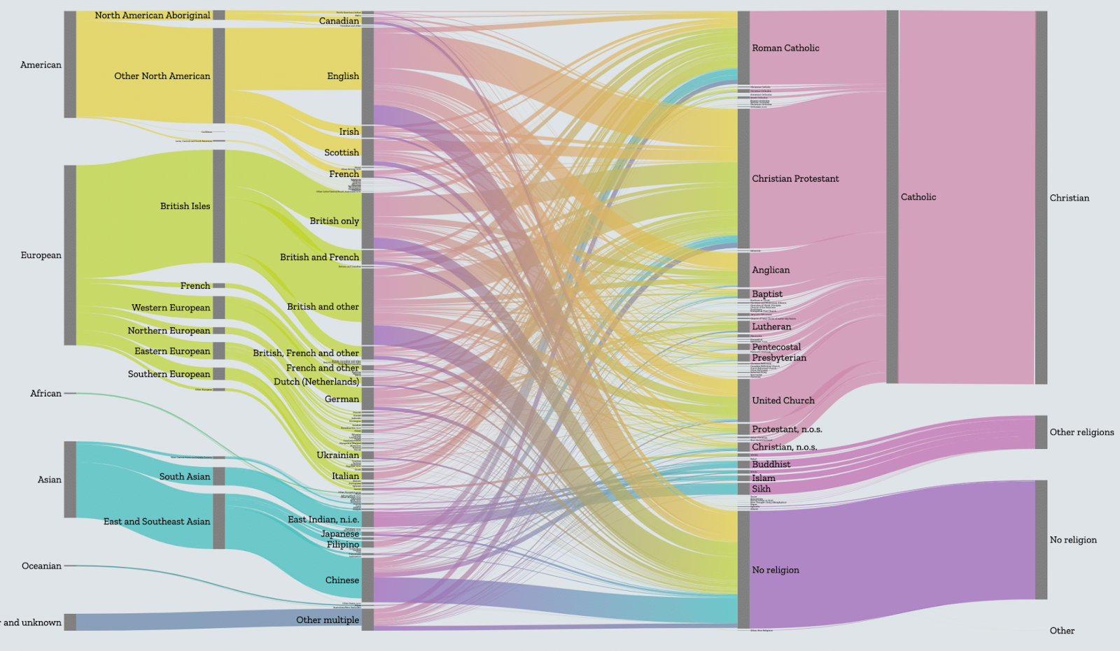
The Max Planck Institute hired Stamen a few years back to create a website to visualize increasingly complex urban transformations due to immigration for a project called Superdiversity. The site we created contains multiple interactive charts of census data to enable better research, analysis, and discussion of this novel phenomenon. Because diversity patterns in cities around the world change over time, the app needs to change as well to reflect that.
Recently, the folks at Max Planck came to us to ask if we’d be able to modularize the application to be more extensible so that their internal developers would be able to handle website updates and addition of new cities more easily.
In this post, we’re going to dive into some of the software code that runs the Superdiversity site, and explain how we improved on our original architecture to make the code more flexible and easier to maintain going forward. You don’t have to understand much about computer programming to follow along (although if you do have some familiarity with coding, you’ll probably get even more out of it). Hopefully, you can skip over the how we did it and you’ll still gain a bit of appreciation about why these are tricky problems and why it’s important to get them right. Even the best programmers can’t predict the best way to solve their problems when they start out designing a website; that’s why it’s always beneficial to revisit your code and improve it when given the opportunity. Let’s dive in and we’ll try to explain what we mean.
The old code
The previous code focused on thematic sections relating to the story of the data. This is a pretty common way of working for us: at the beginning it’s often more efficient to focus on one-offs to problems than to try and account for many different use cases. It’s only after you’ve had a chance to try a few things that the benefits of refactoring become clear.
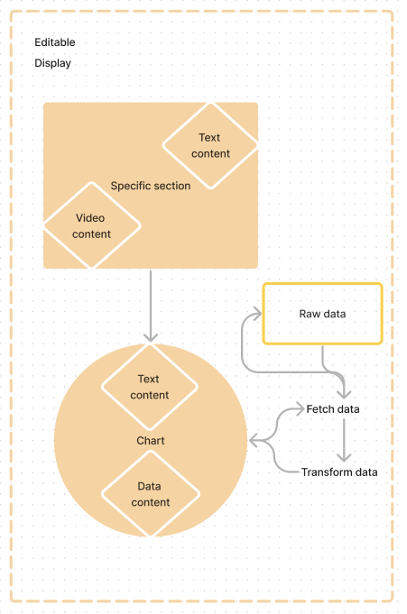
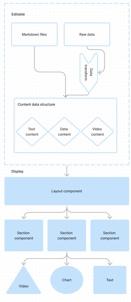
As you can see in the diagram (hopefully), building the application this way meant components contained display text and sometimes data to display chart components that fetched and transformed their own data leading to a lack of separation of concerns. Because these components handled their own content, they were written in very specific ways to cater to that content. To make changes, one would need to dive into many individual components and untangle the specifics of how it had previously handled the data it relied on.
The refactor
Luckily for the refactoring effort, the previous site was well-suited to a modular format. The design resembled a scrolling “blog” format (meaning each section took the same amount of space horizontally and was mostly self-contained). In design updates we took on for the refactor, we decided to maintain this quality.
We began by looking at individual types of sections that could be rendered in a blog-like list. This broke down into:
- Text
- Video
- Chart
- Custom component (designed to be a catch-all for rendering a component in the list without special handling to allow more flexibility)
Since these sections should more or less behave the same with their given inputs, it allowed us to use a simplified data format to provide content to an application that would handle that content according to its specific type. Our goal was to separate concerns of providing content, transforming data, and displaying content. The data format consisted of an array that would render each type of element in a list format.
Organizing the data format in this way keeps the editable content contained, and separates it from the concerns of what should display, removing the need to make significant adjustments to how charts functioned or replacing blocks of text enmeshed in sub-components or charts. It also allows less technical people to make updates to the application without diving deep into code since they now only need to be concerned with content.
Text components
Text elements were simple and had two key needs:
- Allow for hierarchy
- Allow selected additional text to be contained in a modal dialog box
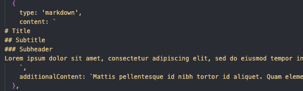
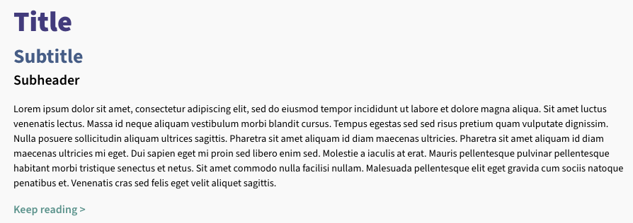
We decided to store all text in Markdown format since it’s more accessible and would allow anyone to add text and see it in the application.
The app takes that markdown and renders it as HTML elements with specific classes based on the hierarchy in markdown (eg #H1, ##H2, body) to be styled by the global CSS. Additional markdown could be specified that would be displayed only on a user selecting to “read more”.
Video components
Video elements had even simpler needs so the simplified data format only required a user to specify the embed url and, optionally, a caption for the video.
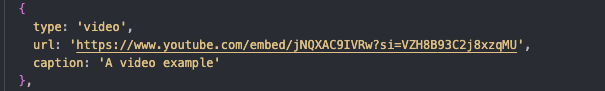

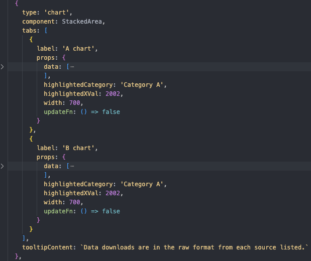
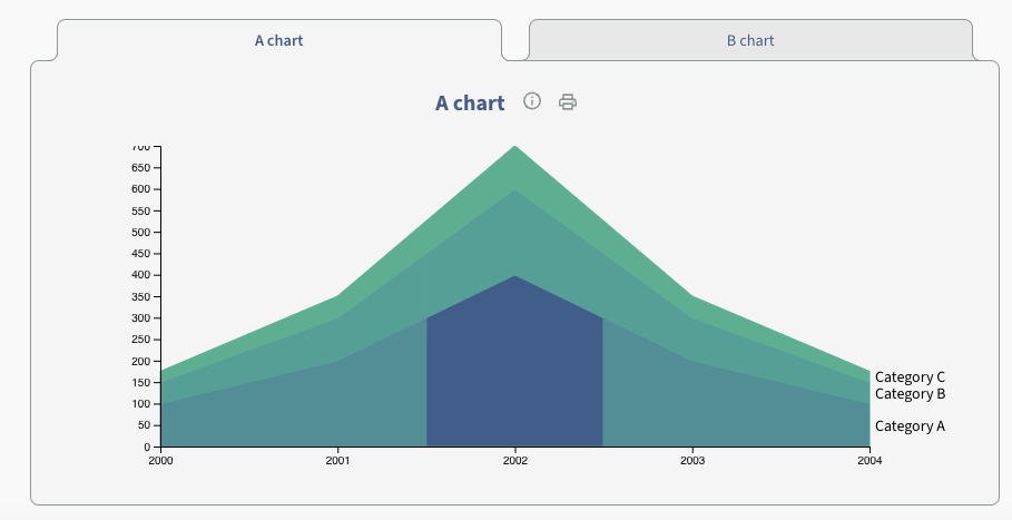
Chart components
We needed to separate each chart component from the specific data it called on so they could be generic. Whereas previously aspects of the chart code relied on both structure and content in the data, the generic form relied only on structure, so that it could be given any dataset that was appropriately formatted and render a chart from it.
After this, inputs to those charts were simplified as much as possible to allow a developer to specify the chart component they wanted, its data, and any other necessary inputs. The chart renders on the page without the need to touch any of the rendering code!
Data transformation was moved to a separate, contained part of the app, so that any new dataset could have a custom transformation to get into the right structure, as different cities have different kinds of raw data and data schemas for the same kinds of information.
Custom components
Lastly, the ability to drop in a custom component with its necessary props (the app is built in React) allows for flexibility when new needs may not match up with the existing system.
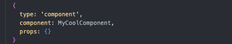
props that the component might needAdding a table of contents using components
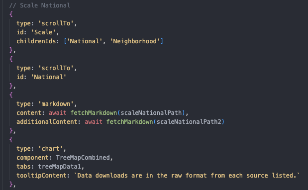
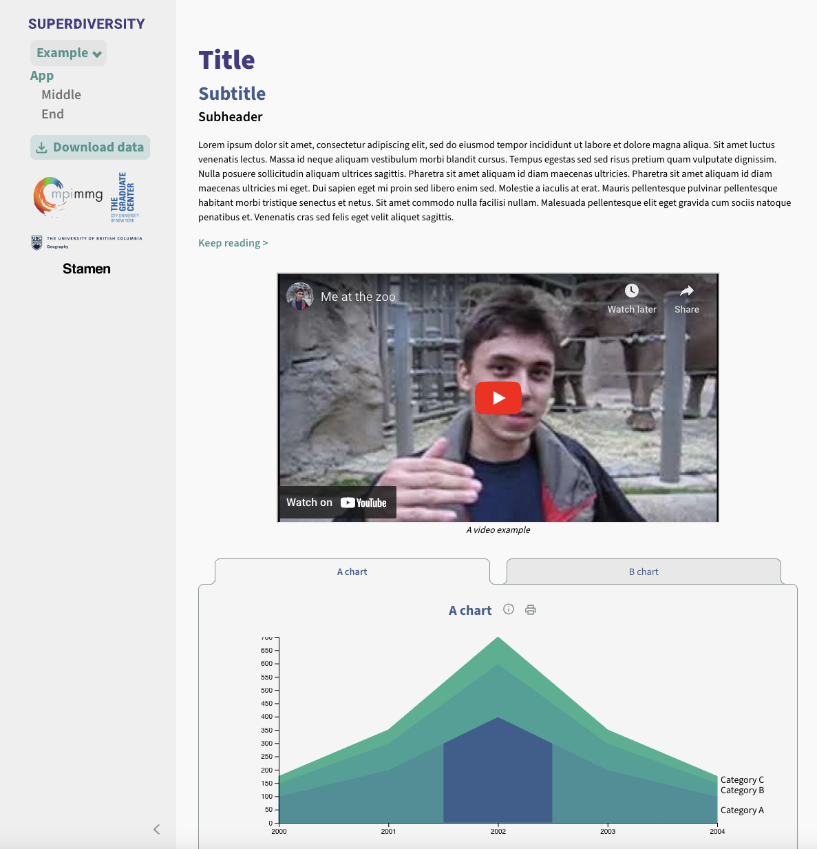
To allow users to navigate the page more easily, we created a sidebar with a table of contents for a user to click and automatically scroll to the desired section.
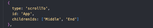
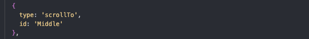

To allow more custom hierarchy in the table of contents, “scroll to” sections are separate from content sections and placed above the section they should correlate to. This tells the app where to scroll, and because these modular sections have no height, brings the user to the section below.
Deploying the site
The initial version of the site was built to support three cities (Vancouver, Sydney, and Auckland) and references to these cities were hard-coded in many places in the site. But one of the goals of this refactoring project was to support deploying the code for different sets of cities, all following the same general structure. To accomplish this, we set up an environment variable that would allow the Max Planck team to deploy customized subsets of the site that are tailored for discrete sets of cities.
This way, a single codebase can contain cities across the world, reducing maintenance, while allowing specificity on deploying to specific domains.
Developing with Storybook
Lastly, the data might require experimentation as it, and its transformations, varies by cities. To handle this, we incorporated Storybook which is a JavaScript library (technically, a “workshop” environment) that allows a developer to experiment with individual components without the context of the whole application.
This lets developers more easily determine which charts might accommodate the data to tell the story they want without involving the rest of the application. Setting up an experimental development environment like Storybook wouldn’t have been possible if not for all of the componentization of the code that we did during this refactoring process.
Conclusion
This newly refactored code base will allow the team at the Max Planck Institute to quickly and easily make changes and add new data to their site(s) without digging into complex code.
Even if a project did not get written initially in a modular way, if there’s a need or even high potential of being reused, then modularizing an application is a worthy investment.
At Stamen our mission is to help our clients tell compelling stories with complex data, and we’re especially pleased when the visualizations we have built continue to grow and evolve with the most up-to-date data and are expanded to apply to more and more datasets. We’re excited to see what new insights the Max Planck team will discover as they roll out the updated site with new data and for many more global cities.