Today, The Atlantic Cities published their favorite maps of the year, and our work with Climate Central on Surging Seas tops the list: “the most frightening, important maps of the year come from Climate Central’s Surging Seas project, which offers an interactive map of all coastal areas of the Lower 48. In the discussion of potential sea level rise, these maps are the most alarming images out there.” The Atlantic has covered this project before.

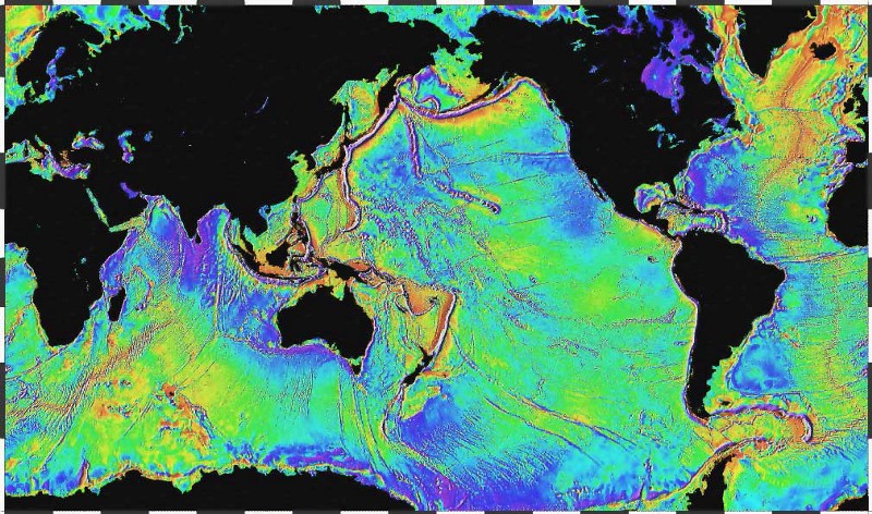
While we could not have predicted the impact of Hurricane Sandy in October, our work with Ben Strauss and Remik Ziemlinski at Climate Central opened our eyes to the emerging behaviors of the world’s oceans on a warming planet and the risk to low-lying areas like New Jersey and New York. The ocean does not merely rise, it surges and bulges due to weather, seafloor topography and tidal forces. “The surface of the ocean bulges outward and inward mimicking the topography of the ocean floor. The bumps, too small to be seen, can be measured by a radar altimeter aboard a satellite.”

One way we communicated this impact was to refocus the map on the land that’s going to be underwater, and try to make it clear that this is the land that we’re going to lose. We wanted to make it responsive and reactive, so we developed a map tiling method based on image sprites, a technique currently making its way from game development to web design.
Each 256 pixel map tile on the site is a tiny map sandwich, a stack of background and foreground images that combine public domain aerial photography from the US Government NAIP program and a custom rendering of data from OpenStreetMap. Using data calculated by Climate Central, we create a background “high tide” image that focuses attention on low-lying areas, and cover that with an image that’s ten tiles in one, an animated film strip of sea level rise from zero on up.
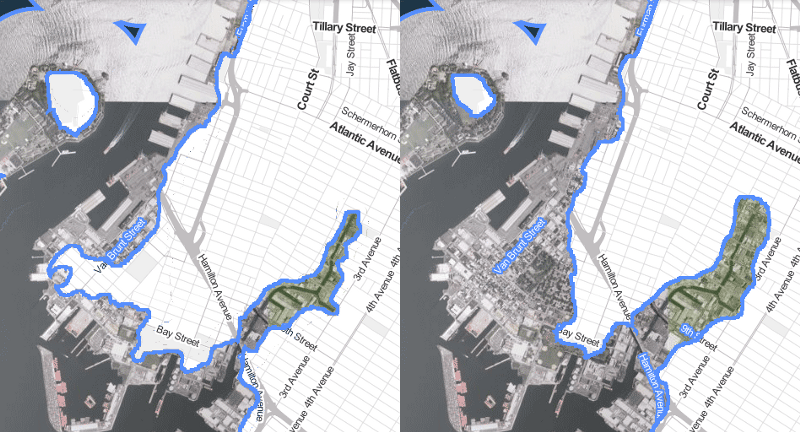
The resulting interactive map lets you quickly investigate the effects of different levels of water rise, something we might have described as “playful” during the development process, but merely terrifying and accurate now. The comparison of Red Hook and Gowanus in Brooklyn above shows one of New York’s hardest-hit neighborhoods.
