
View the project live at https://stateofwork.dropbox.com/
Dropbox came to Stamen with an idea: that work has become too complicated. Much of the new technology that is supposed to make work more efficient has actually made us less productive.
Dropbox wanted to explore this idea — using publicly available data and an editorialized approach — to answer a key question about the modern workplace: How did we get here? The idea was to start a conversation — one that would lead to better tools and better ways of working.
This idea resonated with the Stamen team. Who among us hasn’t been interrupted by a work-related text message in the middle of flow time? Who knew what kind of productivity we were losing with each interruption? So we were excited to find the most impactful visual way to tell this story.
Framing the story
The story came together in three chapters.
“The Productivity Paradox” explores the data behind the thesis that productivity has not maintained parity with technological innovation.
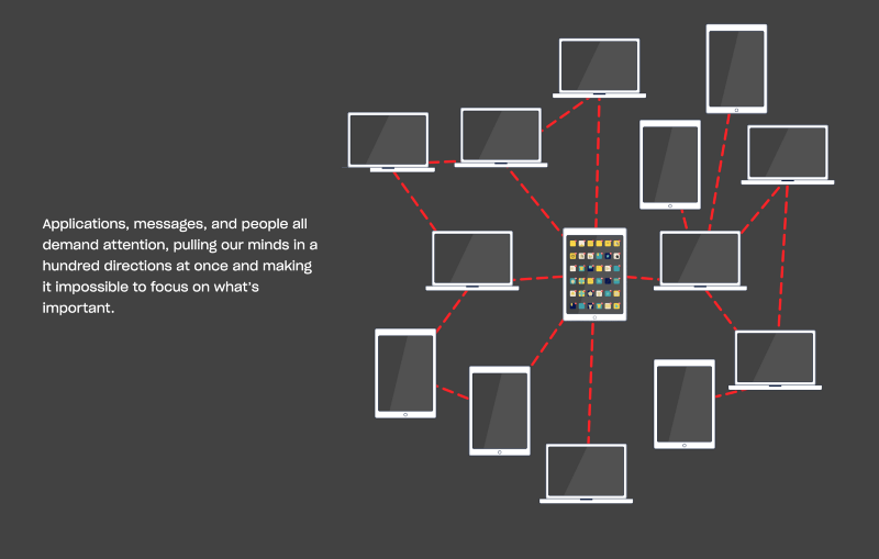
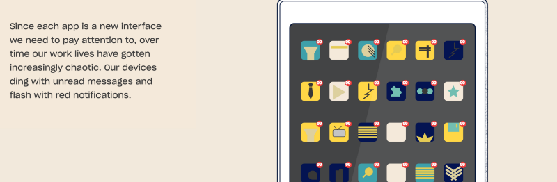
“The Complexity Explosion” compares the workplace of 2000 to the workplace of today, with the explosion of apps and devices as the complexifier.
“The Endless Workday” describes the impact of this technology on our focus at work and our work/life balance.
But first, the data
Behind every great data story is, well, data.
To tell the story of how work became a mess, we knew we would need to bring the reader along on the journey from data to human impact, which would require an illustrated storyline. But we wanted to start with what we knew: the data that would form our first chapter.
We worked with the Dropbox team to identify data that would describe growth in technological progress and computing power over the last decade — total transistors per microprocessor, total data in the datasphere, broadband speed and smartphone penetration — and lined it up against U.S. government productivity data. Indeed, technology data grew exponentially, while productivity growth was much less steep.
Using Scrollama and d3.js, Design Technologist Marc Schroeder built the site in a “scrollytelling” format — a compelling approach that can work especially well on mobile devices. The entire storyline is actually built as a data-driven visualization — from the rising notifications in Chapter 2 to the increments of time on the 24 hour clock in Chapter 3.
Then, the story emerges
Sometimes data is enough to tell an impactful story. In this case, we wanted to connect with people on a more personal level. Illustrator and information designer Catalina Perez worked with the narrative Dropbox provided to convey the stress and distraction of our fragmented modern technology.
Designing the cadence of the visual storytelling structure was crucial on this project, which is why Perez created distinctive elements and colors to differentiate each chapter. This approach, along with the addition of classic charts, illustrations and other visual information, helped bring the topic to life
The result
The end product is a responsive, engaging illustrated story with supporting data charts that tell the story of fragmented modern digital life — “How Work Became a Mess.”