
Big data is a big deal, for sure, but small data can be beautiful too. A work of art, even! We’ve been exploring these themes with Wong Doody Crandall Wiener in a new data viz piece in the lobby of Cedars Sinai Medical Center West Hollywood.
To house their most state-of-the-art research and outpatient care, Cedars Sinai built a new Advanced Health Care Science Pavilion. They envisioned an art piece that could speak to cutting-edge technology and, at the same time, be soothing for visitors and the people who work there. It needed to be both intriguing for the doctors and nurses who’d pass it every day, and accessible for the patients seeing it for the first time.
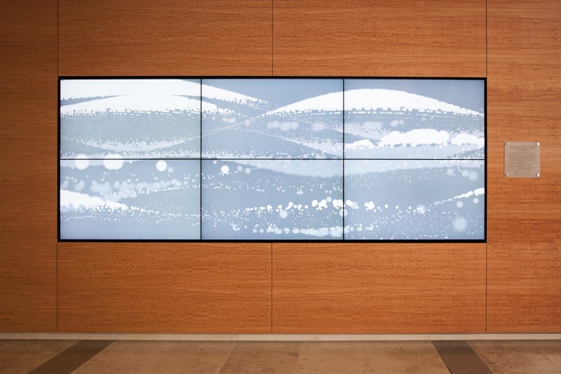
We loved the idea of using their data sets to depart from by-the-numbers visualization to create a work of data art. The video above gives you an idea of what you experience drifting over six large monitors across from a bank of ground-floor elevators.


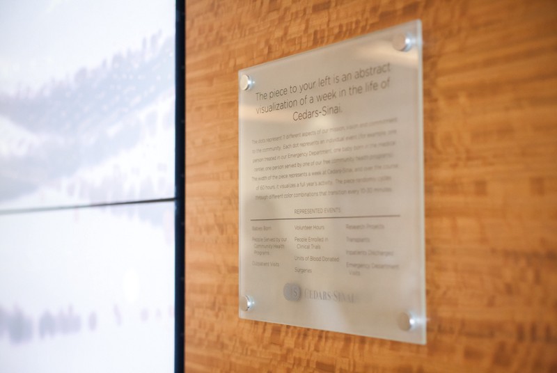
The data set Cedars gave us tracked around 140 monthly metrics from different departments. Geraldine and Zach took that data and assigned each metric a line, with denser lines representing higher numbers. The circles and wave-like motion are designed to project a sense of calm without being too “institutional.”
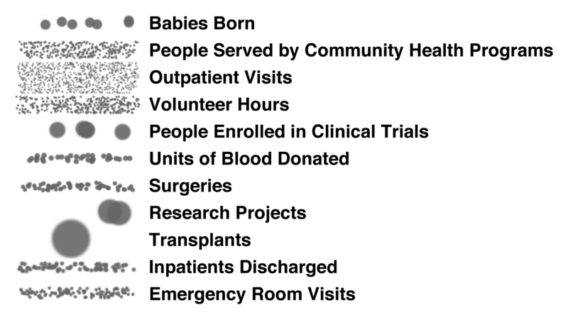
Based on feedback from Cedars Sinai, for the final piece it was narrowed down to just 12 data points per year, including: number of babies born, volunteer hours and pints of blood donated. Now we had a much smaller data set and these higher-concept numbers would be easier to digest while you’re waiting to be whisked up to, say, the Heart Institute or headed to the cafe.
Then it came time to bring it into the real world, which is kind of new territory for us, since most of our work (when it’s not turned into atablecloth or napkins) lives on the Internet.
Zach spent a few days on-site ensuring that the final result would sing. First he had to get it to work, finding himself on that awkward battleground where the design studio Mac world confronts a real-world PC environment. There were a few skirmishes over HDMI cables and countless diplomatic missions to a nearby Apple store, but he found common ground and made it work. (OpenGL also helped.) He also did a bunch of walk-bys of the six monitors at different times of day leading to a few tweaks in speed and color to improve the overall flow.
“When I started the installation, people passing by would see me draped in cables and ask if I was making the world’s biggest Xbox or something. Then when it was done, they would stop and say ‘Dude, that’s awesome!’ You don’t get that visceral reaction to online work so much — at least, not so you can hear it in person.”